- Trending Categories
Data Structure
Networking
RDBMS
Operating System
Java
iOS
HTML
CSS
Android
Python
C Programming
C++
C#
MongoDB
MySQL
Javascript
PHP
Physics
Chemistry
Biology
Mathematics
English
Economics
Psychology
Social Studies
Fashion Studies
Legal Studies
- Selected Reading
- UPSC IAS Exams Notes
- Developer's Best Practices
- Questions and Answers
- Effective Resume Writing
- HR Interview Questions
- Computer Glossary
- Who is Who
How to change the axes labels using plot function in R?
In a plot, the axes labels help us to understand the range of the variables for which the plot is created. While creating a plot in R using plot function, the axes labels are automatically chosen but we can change them. To do this, firstly we have to remove the axes then add each of the axes with the labels we want and then create the box for the plot.
Example
Consider the below data −
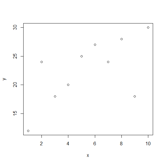
> x<-1:10 > y<-c(12,24,18,20,25,27,24,28,18,30)
Creating the scatterplot between x and y −
> plot(x,y)
Output
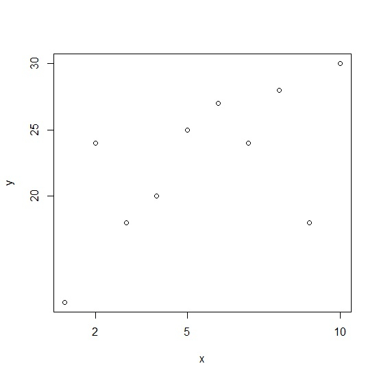
Changing the axes labels for X and Y axes −
> plot(x,y,axes=FALSE)+ + axis(side = 1, at = c(2,5,10))+ + axis(side = 2, at = c(20,25,30))+ + box()
Output
- Related Articles
- How to change the starting and ending points of axes labels using plot function in R?
- How to change the color and size of the axes labels of a plot created by using plot function in R?
- How to extract axes labels for the plot drawn using ggplot2 in R?
- How to display axes ticks and labels inside the plot using ggplot2 in R?
- How to change the background color of a plot created by using plot function in R?
- How to change number formatting from scientific to numbers of axes labels in a scatterplot using ggplot2 package in R?
- How to change the X-axis labels for boxplots created by using boxplot function in R?
- How to create boxplot in base R without axes labels?
- How to create the stacked bar plot using ggplot2 in R with labels on the plot?
- How to change the adjustment of the plot title using ggplot2 to align it above the Y-axis labels in R?
- How to change the position of the title of a plot which is created using plot function in R?
- How to hide axes but keep axis-labels in 3D Plot with Matplotlib?
- How to X-axis labels to the top of the plot using ggplot2 in R?
- How to put labels on a scatterplot that is created plot function in R?
- How to change the title of a graph to italic created by using plot function in R?

Advertisements