
Article Categories
- All Categories
-
 Data Structure
-
 Networking
-
 RDBMS
RDBMS
-
 Operating System
-
 Java
Java
-
 MS Excel
-
 iOS
iOS
-
 HTML
HTML
-
 CSS
CSS
-
 Android
-
 Python
-
 C Programming
-
 C++
C++
-
 C#
C#
-
 MongoDB
-
 MySQL
MySQL
-
 Javascript
-
 PHP
PHP
-
 Economics & Finance
Selected Reading
How to change the color of line of a plot created for an xts object in R?
To change the color of line of a plot created for an xts object in R, we can follow the below steps −
First of all, create a data frame.
Then, convert this data frame into an xts object.
Create the plot for the data in xts object with default color.
Then, create the plot for the data in xts object with different color
Create the data frame
Let's create a data frame as shown below −
Dates<-seq.POSIXt(from=as.POSIXct("2021-01-01"),to=as.POSIXct("2021-01-
25"),length.out=25)
Score<-sample(1:100,25)
df<-data.frame(Dates,Score)
df
On executing, the above script generates the below output(this output will vary on your system due to randomization) −
      Dates   Score
1  2021-01-01  85
2  2021-01-02  60
3  2021-01-03  80
4  2021-01-04  95
5  2021-01-05  93
6  2021-01-06  43
7  2021-01-07  57
8  2021-01-08  27
9  2021-01-09  74
10 2021-01-10  84
11 2021-01-11  18
12 2021-01-12  16
13 2021-01-13  72
14 2021-01-14  100
15 2021-01-15  23
16 2021-01-16  50
17 2021-01-17  2
18 2021-01-18  31
19 2021-01-19  54
20 2021-01-20 73
21 2021-01-21 33
22 2021-01-22 17
23 2021-01-23 6
24 2021-01-24 12
25 2021-01-25 98
Convert the data frame into an xts object
Loading xts package and converting df into an xts object −
Dates<-seq.POSIXt(from=as.POSIXct("2021-01-01"),to=as.POSIXct("2021-01-
25"),length.out=25)
Score<-sample(1:100,25)
df<-data.frame(Dates,Score)
library(xts)
df_ts<-xts(df$Score,df$Dates)
df_ts
Output
   [,1]
2021-01-01 85
2021-01-02 60
2021-01-03 80
2021-01-04 95
2021-01-05 93
2021-01-06 43
2021-01-07 57
2021-01-08 27
2021-01-09 74
2021-01-10 84
2021-01-11 18
2021-01-12 16
2021-01-13 72
2021-01-14 100
2021-01-15 23
2021-01-16 50
2021-01-17 2
2021-01-18 31
2021-01-19 54
2021-01-20 73
2021-01-21 33
2021-01-22 17
2021-01-23 6
2021-01-24 12
2021-01-25 98
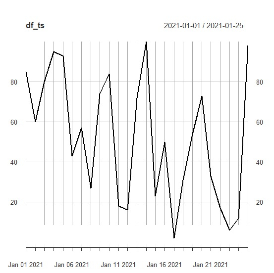
Create the plot of xts object
Use plot function to create the plot of xts object −
Dates<-seq.POSIXt(from=as.POSIXct("2021-01-01"),to=as.POSIXct("2021-01-
25"),length.out=25)
Score<-sample(1:100,25)
df<-data.frame(Dates,Score)
library(xts)
df_ts<-xts(df$Score,df$Dates)
plot(df_ts)
Output
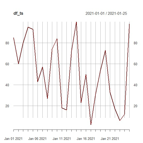
Create the same plot with different color line
Using lines function to create the plot of xts object with different color of lines as shown below −
Dates<-seq.POSIXt(from=as.POSIXct("2021-01-01"),to=as.POSIXct("2021-01-
25"),length.out=25)
Score<-sample(1:100,25)
df<-data.frame(Dates,Score)
library(xts)
df_ts<-xts(df$Score,df$Dates)
plot(df_ts)
lines(df_ts,col="red")
Output

Updated on: 2021-08-14T07:36:45+05:30
322 Views

Advertisements