
Article Categories
- All Categories
-
 Data Structure
-
 Networking
-
 RDBMS
RDBMS
-
 Operating System
-
 Java
Java
-
 MS Excel
-
 iOS
iOS
-
 HTML
HTML
-
 CSS
CSS
-
 Android
-
 Python
-
 C Programming
-
 C++
C++
-
 C#
C#
-
 MongoDB
-
 MySQL
MySQL
-
 Javascript
-
 PHP
PHP
-
 Economics & Finance
Selected Reading
How to change the color of bars of a bar plot using ggplot2 in R?
The default color of the bars created by using ggplot2 package is grey but we can change that color to any depending on our interest. This change is highly required in professions such as academic writing and analytics because everyone wants to look at attractive images. They are not meant to be useful if you just want to learn the concept but when it comes to practical, you need to do it as attractive images gets more attention, thus, they become memorable. To change the color of the bars in ggplot2, we can use fill argument of geom_bar function.
Example
Consider the below data frame −
> Class<-c("A","B","C","D")
> Frequency<-c(45,35,39,51)
> df<-data.frame(Class,Frequency)
> df
Output
   Class Frequency
1    A    45
2    B    35
3    C    39
4    D    51
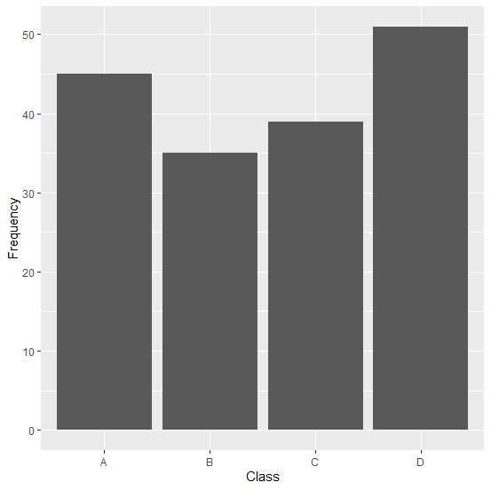
Creating a bar plot without specifying bar colors −
> library(ggplot2)
> ggplot(df,aes(Class,Frequency))+geom_bar(stat='identity')
Output
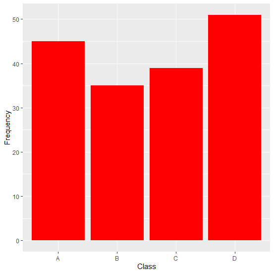
Changing the color of bars in the bar plot −
> ggplot(df,aes(Class,Frequency))+geom_bar(stat='identity',fill="red")
Output
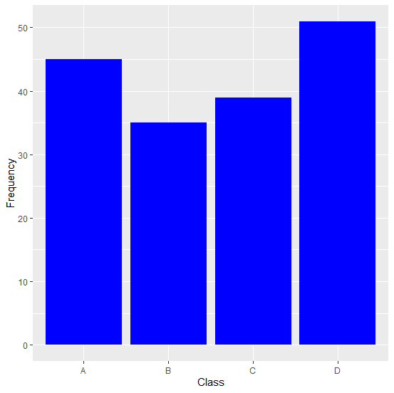
> ggplot(df,aes(Class,Frequency))+geom_bar(stat='identity',fill="blue")
Output
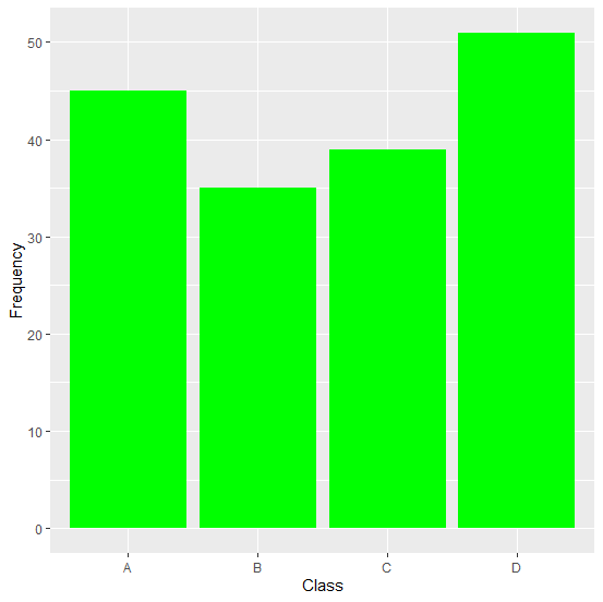
> ggplot(df,aes(Class,Frequency))+geom_bar(stat='identity',fill="green")
Output

Updated on: 2026-03-11T22:50:51+05:30
937 Views

Advertisements