
Article Categories
- All Categories
-
 Data Structure
-
 Networking
-
 RDBMS
RDBMS
-
 Operating System
-
 Java
Java
-
 MS Excel
-
 iOS
iOS
-
 HTML
HTML
-
 CSS
CSS
-
 Android
-
 Python
-
 C Programming
-
 C++
C++
-
 C#
C#
-
 MongoDB
-
 MySQL
MySQL
-
 Javascript
-
 PHP
PHP
-
 Economics & Finance
How to add axis label to chart in Excel?
When you insert a chart in Excel, it has a title that describes what the chart is about. However, this isn't always enough to convey to the user what the chart is all about. This is where axis labels come in.
We always generate charts in Excel to visualise and make the data more understandable. Additionally, adding axis labels to the graphic may help others grasp our data much better.
Add Axis Label to Chart in Excel
Let?s understand step by step with an example.
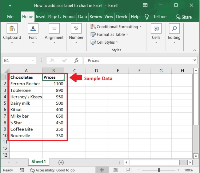
Step 1
At first, we must create a sample data for chart in an Excel sheet in columnar format as shown in the below screenshot.
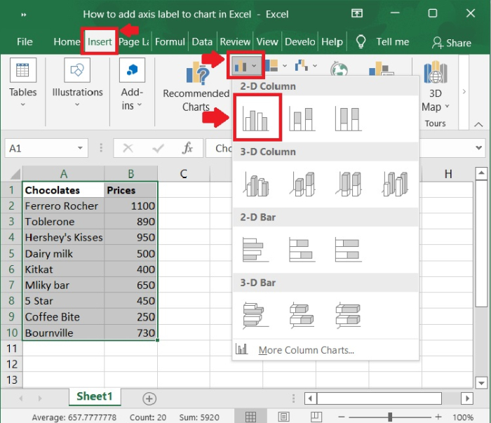
Step 2
Select the cells in the A1:B10 range. Click on Insert tool bar and select chart>2-D column to display the graph for the above sample data.
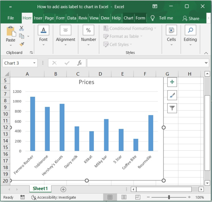
Step 3
Now, the chart is automatically populated upon selecting the above option.
Step 4
Click the pointer on a blank area of your chart. Make certain that you click on a blank region of the chart. The whole border of the chart will be highlighted. When the border around the chart appears, you know the chart editing options are active. Now, select the chart for which you want to insert an axis label by clicking.
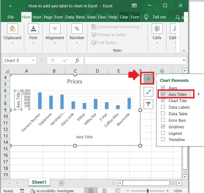
Step 5
Click on the Chart Elements (+) button next to the chart
Then, in the upper-right corner of the chart, click the Chart Elements (+) button. Check the Axis Titles option in the enlarged menu, as seen in the below screenshot.
Step 6
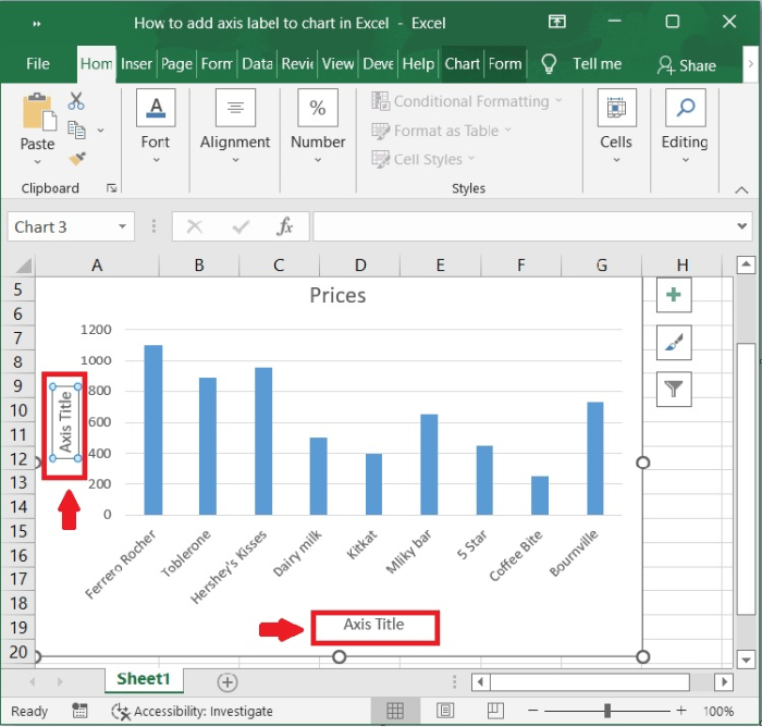
Now, we can see the Axis Titles are enable on the chart. We can now edit the axis title to whatever text we need. Below is the screenshot for the same.
Conclusion
In this tutorial, we used an example to show how to add axis label to a chart in Excel.

438 Views
