
Article Categories
- All Categories
-
 Data Structure
-
 Networking
-
 RDBMS
RDBMS
-
 Operating System
-
 Java
Java
-
 MS Excel
-
 iOS
iOS
-
 HTML
HTML
-
 CSS
CSS
-
 Android
-
 Python
-
 C Programming
-
 C++
C++
-
 C#
C#
-
 MongoDB
-
 MySQL
MySQL
-
 Javascript
-
 PHP
PHP
-
 Economics & Finance
How to Add Secondary Axis to a Pivot Chart in Excel?
A pivot cart can help us understand the data in a very efficient manner. In this tutorial, we will show how you can add a secondary axis to a pivot chart in Excel to help depict and comprehend complex data in a simple way.
Adding Secondary Axis to a Pivot Chart in Excel
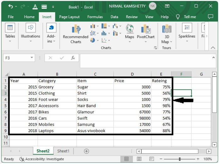
Let us assume we have an Excel sheet which contains data similar to the one shown below:
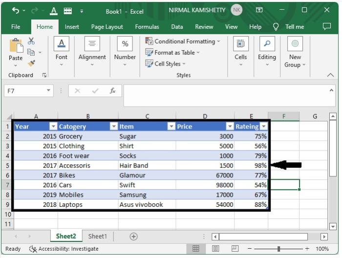
Step 1
We need to create a table for the data. To create the table, select the data ? click Insert ? click table. It will convert our data to a tabular format, as shown below:
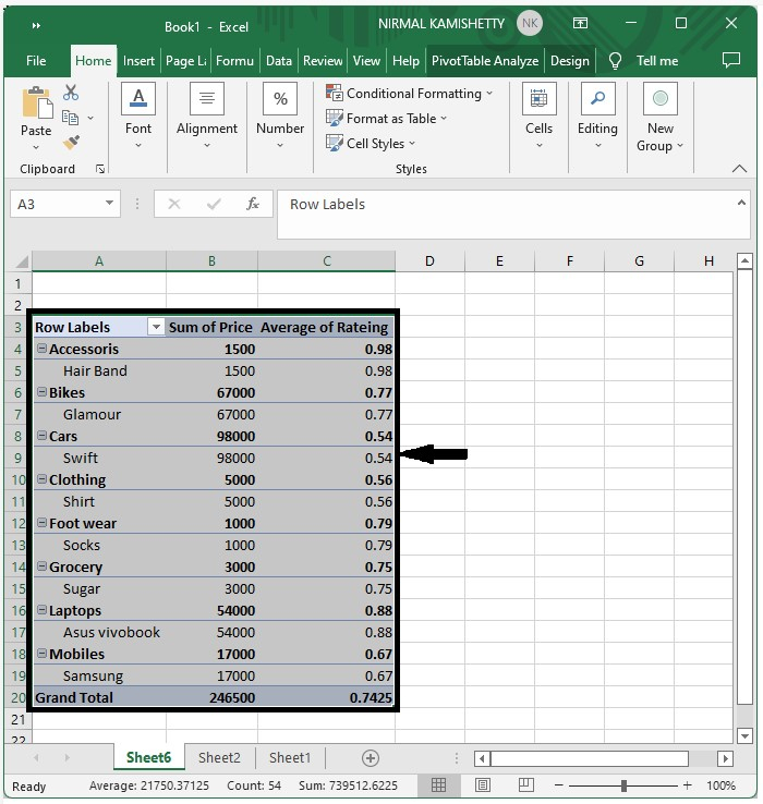
Step 2
Now we need to convert the table into a pivot table. To get the pivot table, select the table ? click Insert ? click Tables ? select Pivot Table. It will open a new pop-up window, where you need to select the new worksheet and click "OK". It will open a new worksheet.
Then select check boxes item, category, price and rating for the pivot table. Double-click on "sum of rating" and select "average of rating" from the drop-down list. Our pivot table will look similar to the below image:
Step 3
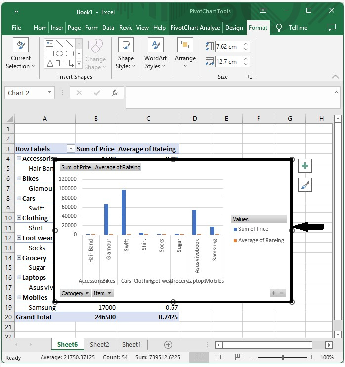
Next, click Pivot ? Pivot Table Analyse ? Pivot Chart ? select Column Chart ? click "OK". You will get to see the following chart:
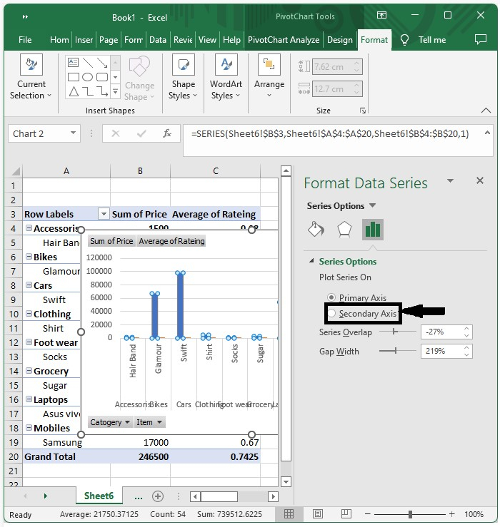
Step 4
Click any of the blue bars which represent the sum of price, then right-click to open a menu box. Select "Format Series" and then click the "Secondary Axis" option. Our chart will now look like the one shown below:
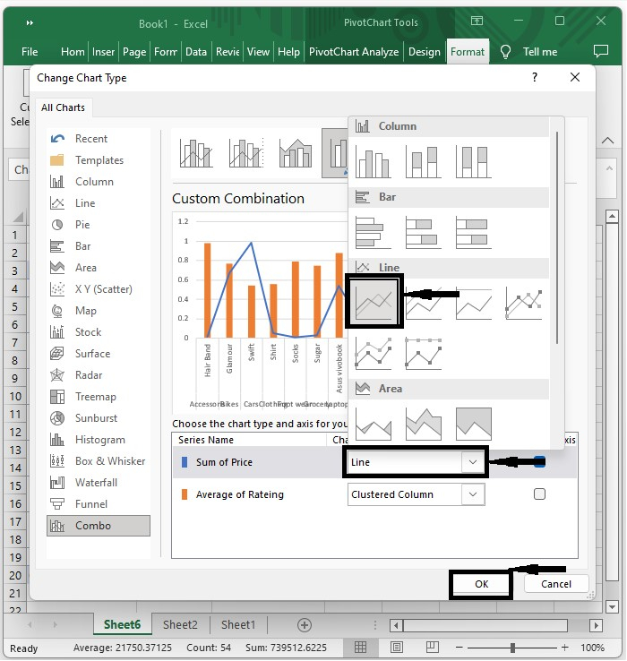
Step 5
Right-click on the blue area and select Change Series Type, which will open a new pop-up window. In the pop-up window, select Combo ? change "Sum of Price" to line chart, as shown in the following image:
Our final output will look similar to the screen shown below:
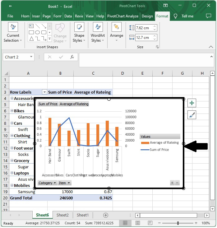
This is how you can add a secondary axis to a pivot table in Excel in a simple way.

8K+ Views
