
Article Categories
- All Categories
-
 Data Structure
-
 Networking
-
 RDBMS
RDBMS
-
 Operating System
-
 Java
Java
-
 MS Excel
-
 iOS
iOS
-
 HTML
HTML
-
 CSS
CSS
-
 Android
-
 Python
-
 C Programming
-
 C++
C++
-
 C#
C#
-
 MongoDB
-
 MySQL
MySQL
-
 Javascript
-
 PHP
PHP
-
 Economics & Finance
How to change X axis in an Excel chart?
Excel is a program that everyone should be familiar with, whether they are students, company owners, or just those who enjoy looking at charts and graphs. How to modify the X-Axis, which is commonly referred to as the horizontal axis, is consistently one of the most popular concerns concerning Excel.
When you are aware of what to anticipate, working with charts in Excel is not that difficult. There is also a Y-axis in addition to the X-axis. The former is laid out in a horizontal fashion, whereas the later is organised vertically. When the horizontal X-axis is altered, the categories that are included within it are also altered. In order to have a better picture of it, you can also modify the scale.
The horizontal axis can show either text or dates, and it can display a variety of time intervals. This axis does not include any numbers like the vertical axis does.
The values of the appropriate categories are represented along the vertical axis. You are free to utilise a large number of categories, but you should be mindful of the size of the chart to ensure it fits on one Excel page. Excel charts can display up to six data sets at once, although the optimal number is between four and six.
If you have more data that you want to display, you should probably divide it up into many charts, which is not difficult to do. The modifications to the X-axis that we are going to demonstrate should work in all versions of Excel.
Changing the X-axis in an Excel Chart
It is not difficult to alter the range of the X-axis; nevertheless, prior planning and consideration are required in order to determine the kinds of adjustments that are desired. You have the ability to alter a great deal of information, such as the type of axis, the labels of categories, the positioning of those labels, and the point at which the X-axis and the Y-axis.
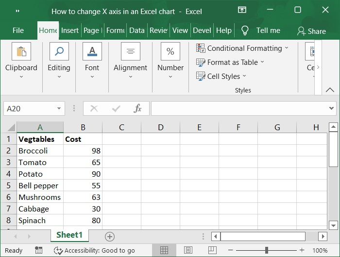
Step 1
At first, we must create sample data for chart in an excel sheet in columnar format, as shown in the following screenshot.
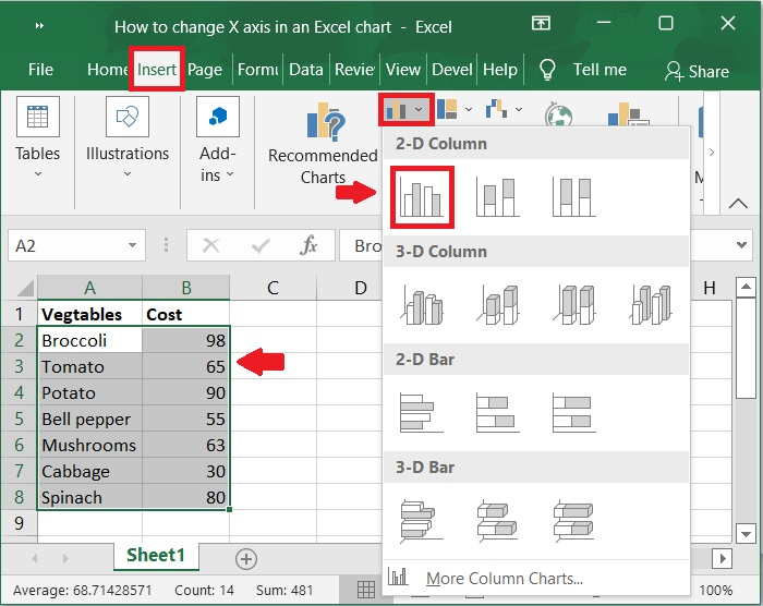
Step 2
Then, select the cells in the A1:B8 range. Click on Insert tool bar and select bar chart>2-D column to display the graph for the above sample data. Below is the screenshot for the same.
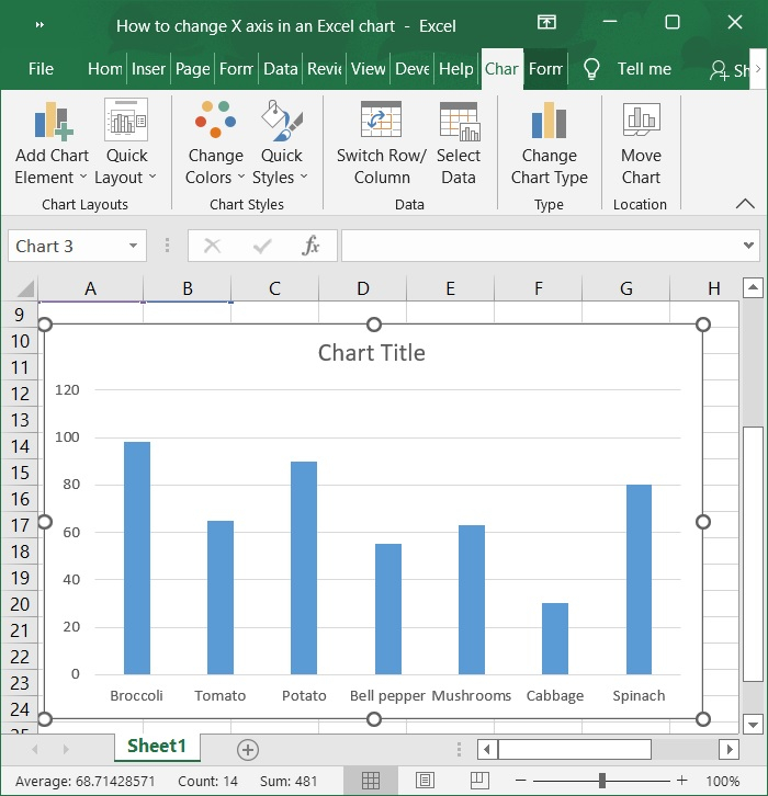
Step 3
Now, the chart is automatically populated upon selecting the above option. Refer to the below screenshot.
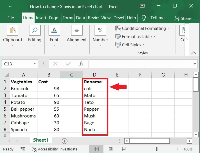
Step 4
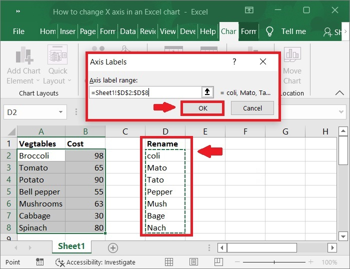
Now, we create some values to change X-axis values. See the following screenshot.
Step 5
Use your right mouse button to click on the X-axis of the chart you want to modify. Because of this, you will have the ability to alter the X-axis specifically. After that, you should click on Select Data.
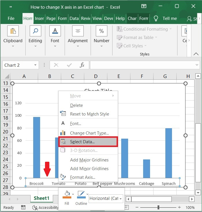
Step 6
Choose Edit Option right next to the tab for the Horizontal Axis Labels.
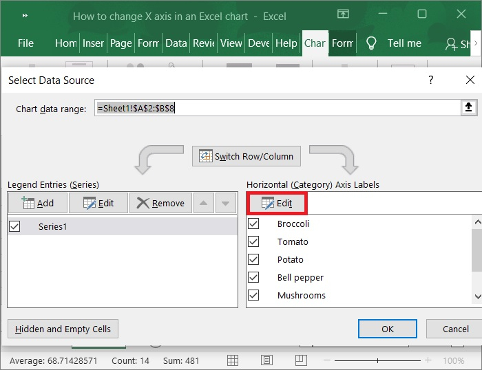
Step 7
select a range by clicking on the Axis label Range button under Axis Label. Select the cells in Excel where you want to change the values on the X-axis of your graph. Now, click OK button to replace the settings with those you've chosen as shown in the below screenshot.
Step 8
To close the Select Data Source window, click OK button once more. Refer to the below screenshot.
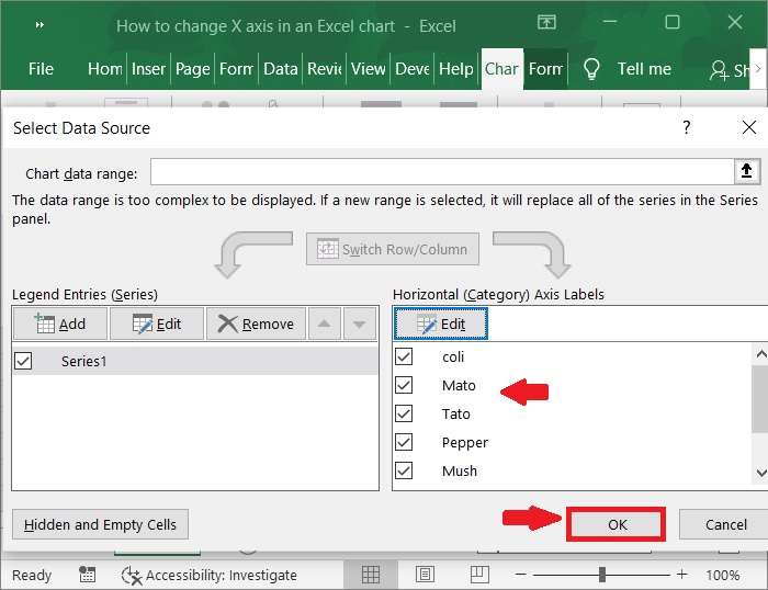
Step 9
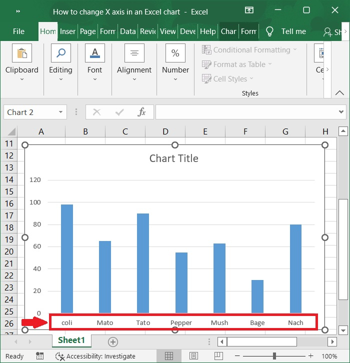
Now, X-axis is changed as per the new selected range. Refer to the below screenshot.
Conclusion
In this tutorial, we used a simple example to explain how you can change the X?axis in an Excel chart.

707 Views
