
Article Categories
- All Categories
-
 Data Structure
-
 Networking
-
 RDBMS
RDBMS
-
 Operating System
-
 Java
Java
-
 MS Excel
-
 iOS
iOS
-
 HTML
HTML
-
 CSS
CSS
-
 Android
-
 Python
-
 C Programming
-
 C++
C++
-
 C#
C#
-
 MongoDB
-
 MySQL
MySQL
-
 Javascript
-
 PHP
PHP
-
 Economics & Finance
How to break chart axis in Excel?
In situations when there are unusually large or small series or points in the source data, the chart's representation of the small series or points will not be exact enough. In situations like these, some users may desire to break the axis in order to achieve precision in both the tiny series and the large series at the same time. You will learn two different techniques to break chart axis in Excel by reading this post.
Break Chart Axis with a Secondary axis in Chart in Excel
Take, for instance, assuming that you have the data in two different ranges, one ranging from B2:B10 and another ranging from C2:C10. You were tasked with producing a line chart using the information found in your worksheet. You have decided that the current chart's axis should be broken in some way. How to get to that point. Simply carry out the processes as follows
Let?s understand step by step with an example.
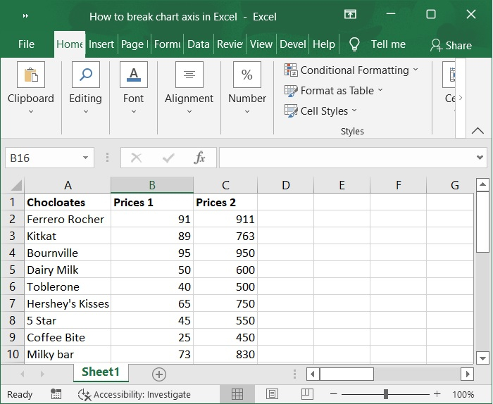
Step 1
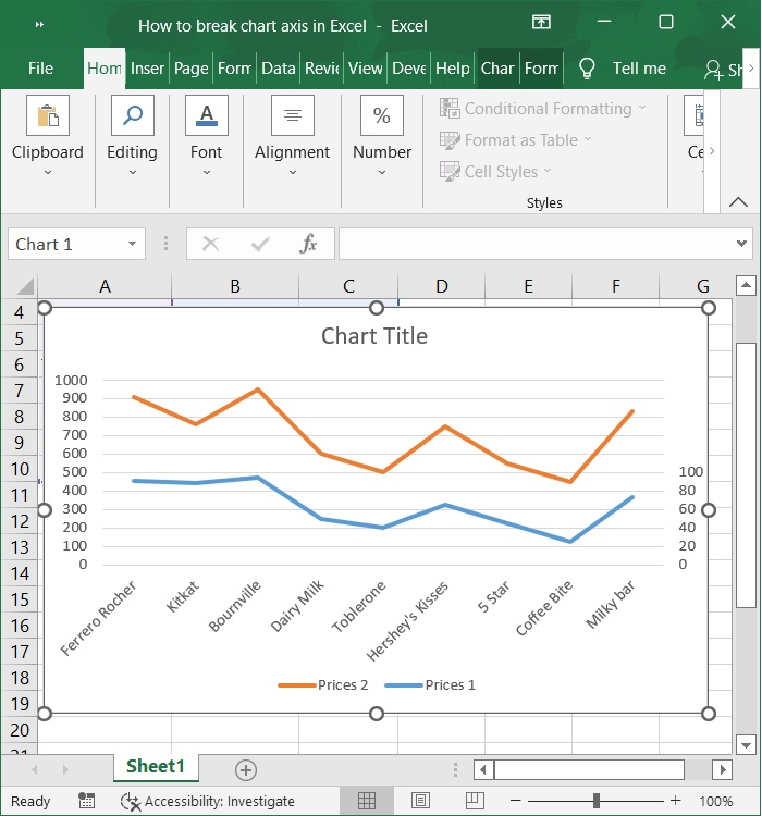
Let?s assume there are two data series in the sample data, as shown in the screenshot below. In this case, it is simple for us to add a chart and then add a secondary axis to the chart so that we can break the chart's axis.
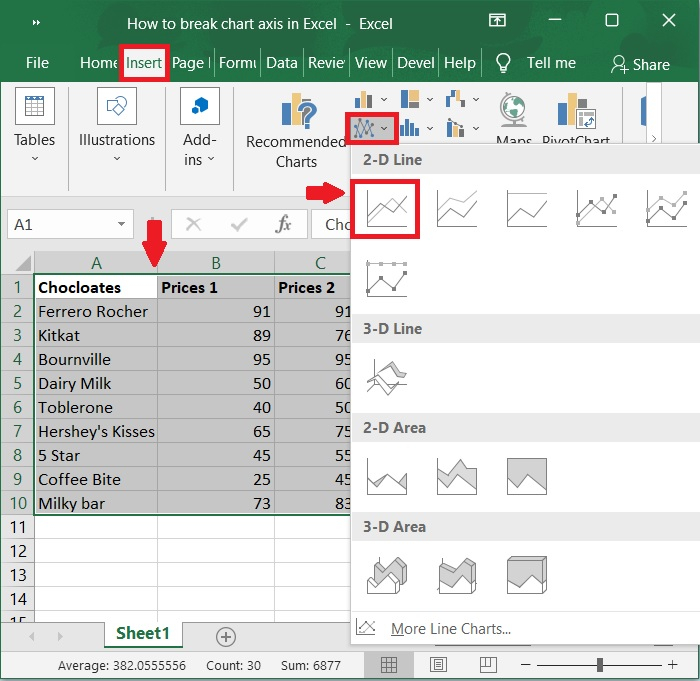
Step 2
After choosing your Sample data, go to the Insert tab and choose the 2-D Line button under the Line and Area Chart subheading to make a line chart. Please checkout the screenshot below for the same.
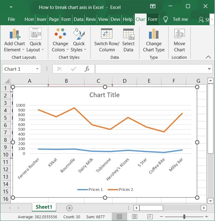
Step 3
Now, the chart is automatically populated upon selecting the above option. Refer to the below screenshot for same.
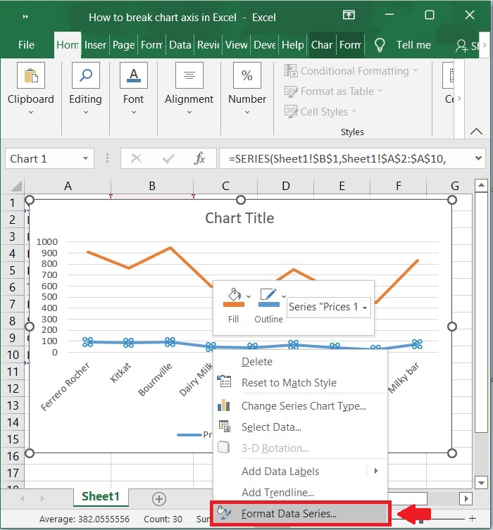
Step 4
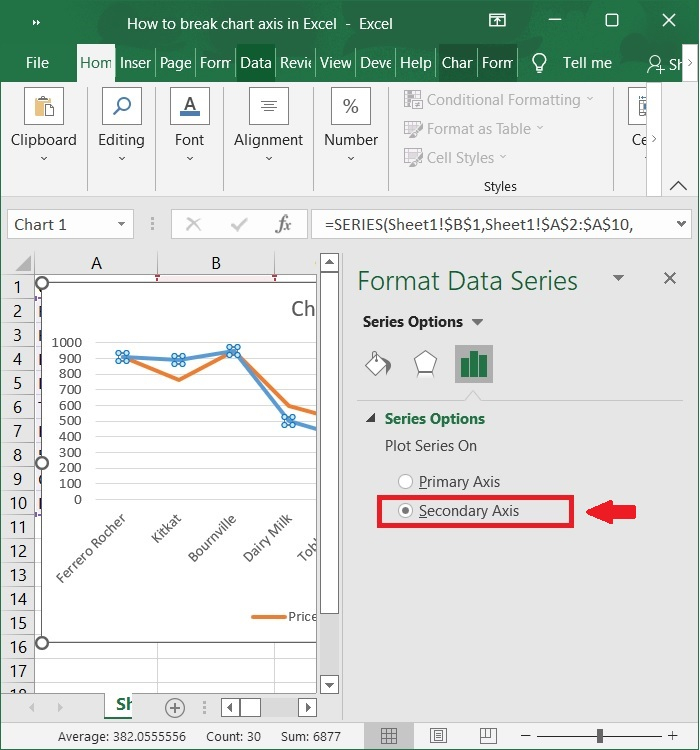
To format the data series in the chart, right-click any of the series below it, and then choose Format Data Series from the context menu that appears. See the below screenshot.
Step 5
Check the Secondary Axis box in the Format Data Series pane that opens. Then, close the pane. As shown in the below screenshot.
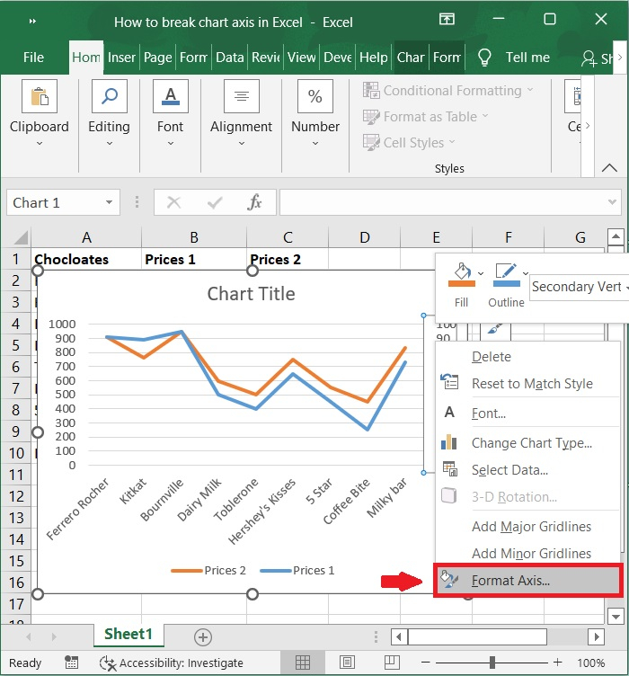
Step 6
To format the secondary vertical axis, right-click the chart's rightmost vertical axis, and then choose Format Axis from the context menu that appears. Please refer to the below screenshot.
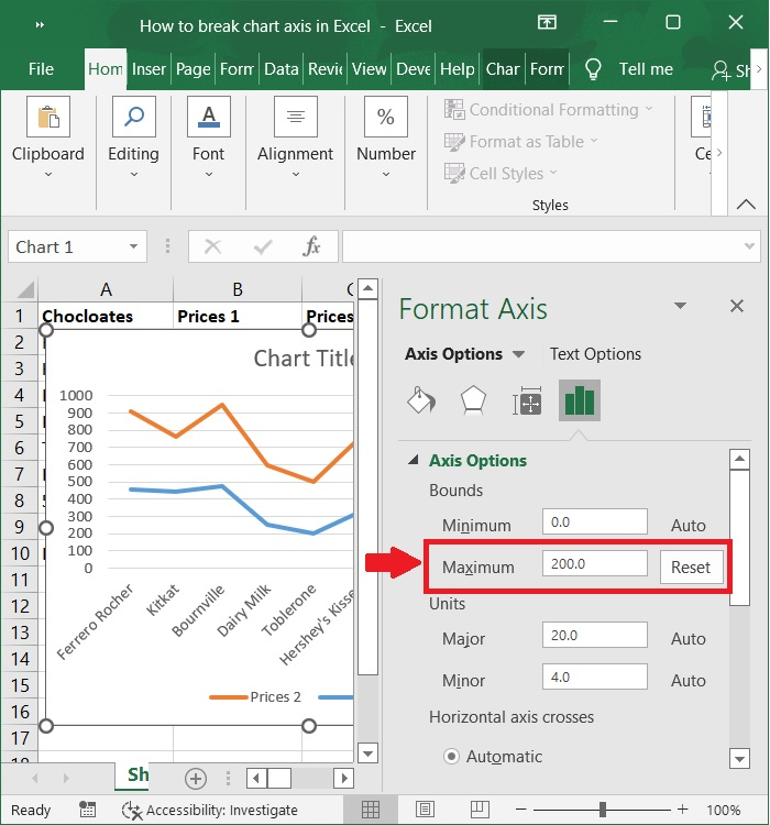
Step 7
Enter 200 into the Maximum box in the Bounds section of the Format Axis pane. Below screenshot for the same.
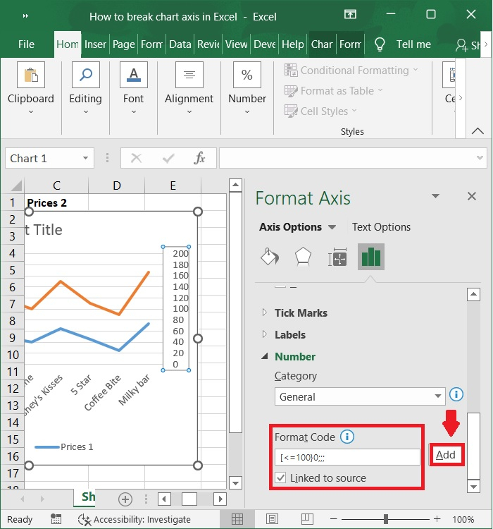
Step 8
Then, in the Number group, enter [=100]0;;; into the Format code box and click the Add button. Finally, close the Format Axis pane. Refer to the below screenshot.
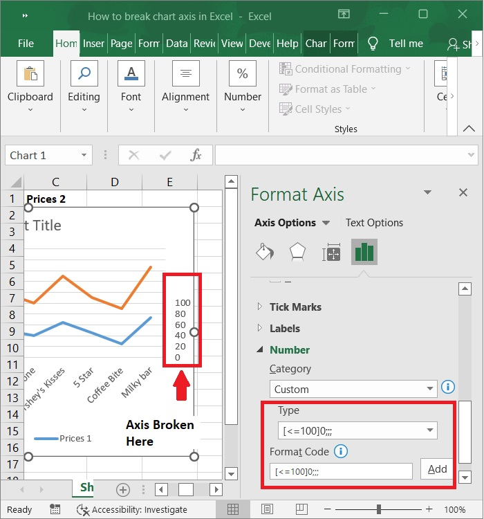
Step 9
Finally, you may see the broken chart axis in the below screenshot.
Conclusion
In this tutorial, we used a simple example to demonstrate how you can break a chart axis with a secondary axis in Excel.

2K+ Views
