
Article Categories
- All Categories
-
 Data Structure
-
 Networking
-
 RDBMS
RDBMS
-
 Operating System
-
 Java
Java
-
 MS Excel
-
 iOS
iOS
-
 HTML
HTML
-
 CSS
CSS
-
 Android
-
 Python
-
 C Programming
-
 C++
C++
-
 C#
C#
-
 MongoDB
-
 MySQL
MySQL
-
 Javascript
-
 PHP
PHP
-
 Economics & Finance
How to hide or show chart axis in Excel?
What is an Axis?
An Axis on a chart in excel or google sheets is a horizontal or vertical line containing units of measure. The axes border the plot vicinity of column charts, bar graphs, line graphs, and different charts. An axis shows devices of measure and offers a body of reference for the facts displayed in the chart.
Most charts, such as column and line charts, would have two axes that are used to measure and categorize data.
The vertical axis: The Y or value axis.
The horizonal axis: The X or category axis.
Hide or show chart Axes
You can follow the steps given below to hide or display the axes in an Excel sheet.
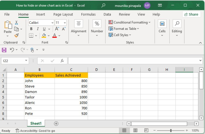
Step 1
Open an Excel sheet with Sales data as shown below.
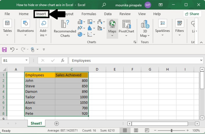
Step 2
Select the complete sales data and then click the Insert tab, as shown below.
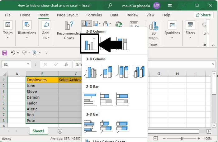
Step 3
In Charts select graph 2-D column. You will see the graph with the Sales achieved, as shown below.
Step 4
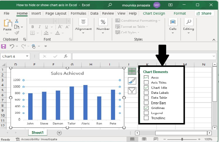
Select Chart Elements, the Plus (+) sign to open the chart elements menu in the Excel sheet.
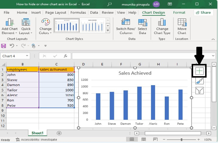
After clicking the "+" sign, you will get to see the following screen ?
Step 5
To hide all the axes, clear or uncheck the Axes check box.
Step 6
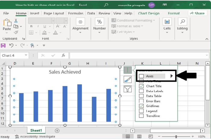
If you want to hide one or more axes, click the "right" arrow, as shown below.
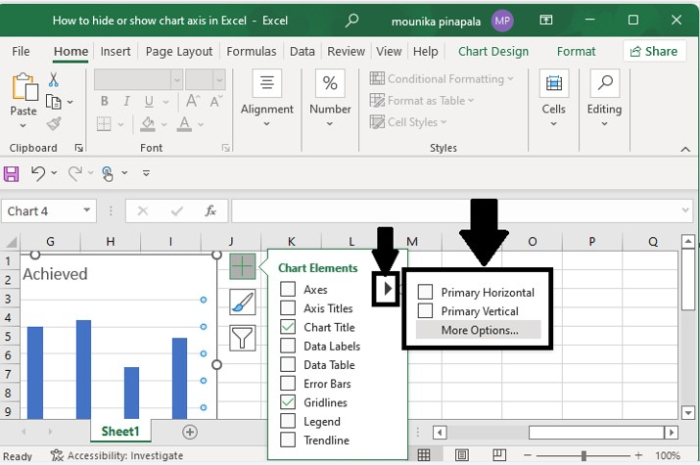
Now you can clear the check box for the axes you want to hide and select the check box for the axes if you want to display.
This is how you will hide or display the axes in an Excel sheet.

3K+ Views
