
Article Categories
- All Categories
-
 Data Structure
-
 Networking
-
 RDBMS
RDBMS
-
 Operating System
-
 Java
Java
-
 MS Excel
-
 iOS
iOS
-
 HTML
HTML
-
 CSS
CSS
-
 Android
-
 Python
-
 C Programming
-
 C++
C++
-
 C#
C#
-
 MongoDB
-
 MySQL
MySQL
-
 Javascript
-
 PHP
PHP
-
 Economics & Finance
How to change 3d chart depth axis in Excel?
You have the ability to adjust the positioning of the tick marks as well as axis labels along the axis, as well as reverse the order of how the series are presented. You can also select the interval that exists between the tick marks and the axis labels.
In Excel, the 3D Draw function is used to map the graph for all those data sets that may not offer much visibility, to plot the area when there are vast sets of data points, and to compare the feasibility of matching those data sets with other data sets.
Excel's 3D Plot feature offers a novel approach to transform a standard 2D graph into an eye-catching 3D representation. It's possible that you're perplexed by the reason why it is that the z axis doesn't display all of the labels just on chart, as seen in the picture below. With order to overcome this issue in Excel, I will now discuss modifying the scale of both the depth axis of the three-dimensional chart.
Step 1
The only thing you need to do to modify the size of the 3D chart depth axis is to vary the settings for the interval among both tick marks and the Specify interval unit. I will now go into more specifics with you.
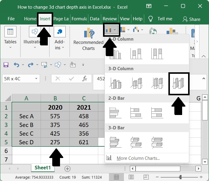
Step 2
After that, under the chart section of the Insert menu tab, pick the column chart option. When we tap on it, a menu pertaining to it will slide down for us to choose from. After that, choose a 3D Column exactly it's shown down below.
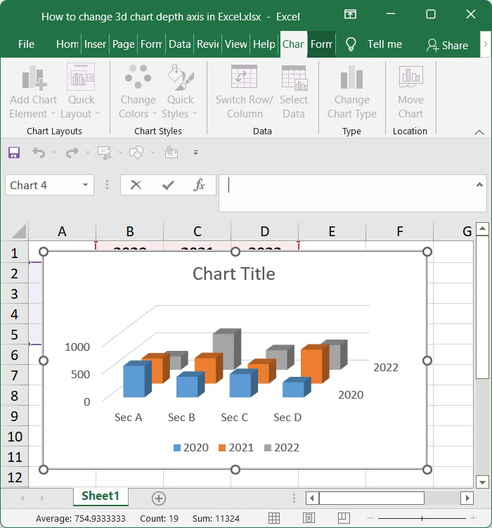
Step 3
Following the selection of a 3D Column option, a 3D plot using Column will be generated for us to examine, as is seen below. Within this section, we have the ability to modify the layout of the 3D columns, as well as add labels, axis titles, and headings.
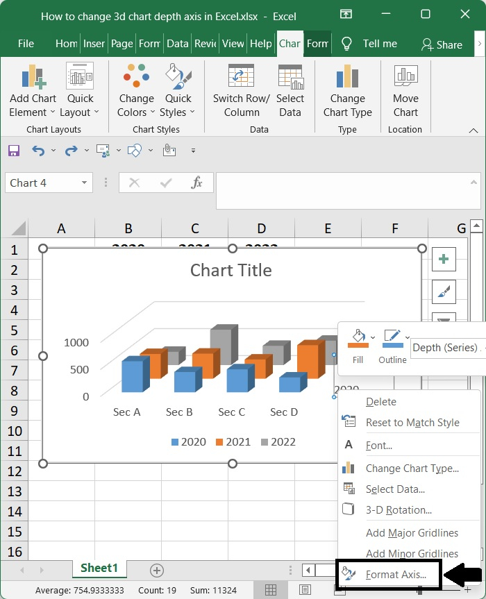
Step 4
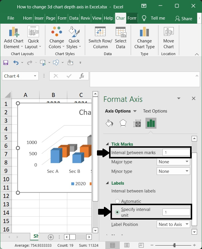
Use the context menu that appears when you right-click on the depth axis to get the option to Format Axis.
Step 5
go to the Axis Options section, and write 1 into the text box under the Interval between labels option, after which you should check the Specific interval unit option then type 1 through into text box beside it.
Step 6
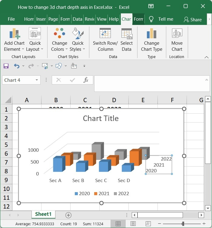
To close the Format Axis dialogue, just click the Close button; the labels should now be shown along the depth axis.
Conclusion
In this tutorial, we used a simple example to demonstrate how you can change the 3D chart depth axis in Excel.

717 Views
