
Article Categories
- All Categories
-
 Data Structure
-
 Networking
-
 RDBMS
RDBMS
-
 Operating System
-
 Java
Java
-
 MS Excel
-
 iOS
iOS
-
 HTML
HTML
-
 CSS
CSS
-
 Android
-
 Python
-
 C Programming
-
 C++
C++
-
 C#
C#
-
 MongoDB
-
 MySQL
MySQL
-
 Javascript
-
 PHP
PHP
-
 Economics & Finance
Selected Reading
How to remove ticks in a plot created by using gglot2 in R?
In a plot created by using ggplot2, the axes values are generated with tick marks such as representing X-axis labels from 1 to 10 and Y-axis labels from 10 to 1 but we can get rid of this tick marks by using theme function. If we want to create a plot without ticks then we just need to add the following code to the plot code.
theme(axis.ticks.x=element_blank(),axis.ticks.y=element_blank())
Example
Consider the below data frame.
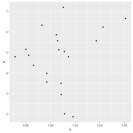
> set.seed(321)
> x<-rnorm(20,1,0.025)
> y<-rnorm(20,5,1.35)
> df<-data.frame(x,y)
> df
Output
x y
1 1.0426226 6.238295
2 0.9821990 4.855467
3 0.9930504 6.334253
4 0.9970088 3.552478
5 0.9969010 3.976679
6 1.0067046 5.128251
7 1.0181710 1.853243
8 1.0058284 5.563647
9 1.0084778 3.487558
10 0.9862021 4.359176
11 1.0086925 2.933944
12 1.0371148 5.561215
13 1.0047081 5.856167
14 1.0610815 6.661644
15 0.9711640 4.791339
16 0.9798832 5.154628
17 1.0114017 1.994545
18 1.0105083 7.208317
19 1.0144396 4.784917
20 1.0111589 5.038161
Loading ggplot2 package and creating a point chart between x and y.
> library(ggplot2)
> ggplot(df,aes(x,y))+geom_point()
Output
Creating point chart using ggplot2 without ticks on the axes.
Example
> ggplot(df,aes(x,y))+geom_point()+theme(axis.ticks.x=element_blank(),axis.ticks.y=element_blank())
Output


Updated on: 2026-03-11T22:50:53+05:30
303 Views

Advertisements