
Article Categories
- All Categories
-
 Data Structure
-
 Networking
-
 RDBMS
RDBMS
-
 Operating System
-
 Java
Java
-
 MS Excel
-
 iOS
iOS
-
 HTML
HTML
-
 CSS
CSS
-
 Android
-
 Python
-
 C Programming
-
 C++
C++
-
 C#
C#
-
 MongoDB
-
 MySQL
MySQL
-
 Javascript
-
 PHP
PHP
-
 Economics & Finance
Selected Reading
How to add a horizontal line to the plot created by ggplot2 in R?
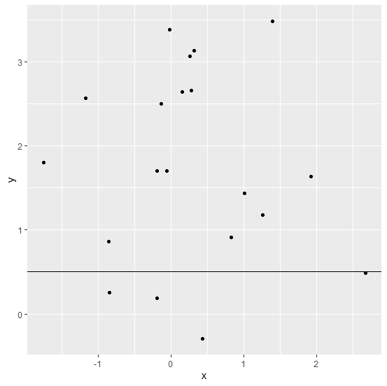
When we create a plot, it shows the values passed by the function for creating the plot but we might want to display some other values to provide some information through the plot and that information could be a threshold value as a horizontal line or we can also call it a cut off value. This can be done by using geom_hline function of ggplot2 package.
Example
Consider the below data frame −
> x<-rnorm(20)
> y<-rnorm(20,1.5)
> df<-data.frame(x,y)
> df
Output
      x       y
1 0.27810573 2.6545571
2 1.39185082 3.4845292
3 -0.19068920 1.7043852
4 1.00791317 1.4324814
5 -1.74964913 1.7996093
6 -0.13123079 2.5004350
7 0.15729145 2.6425085
8 0.42815918 -0.2970325
9 -0.84252471 0.2579510
10 0.25413824 3.0670546
11 -0.05608811 1.6974104
12 -0.85671276 0.8638574
13 -1.17183043 2.5650640
14 2.67224782 0.4832468
15 -0.01763065 3.3835275
16 1.26122484 1.1755709
17 1.91652453 1.6351443
18 0.82211772 0.9123337
19 -0.19153555 0.1831160
20 0.31878745 3.1280550
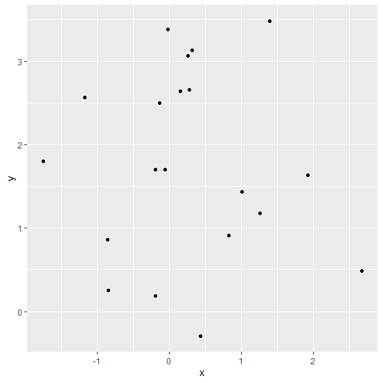
Creating a scatterplot between x and y −
> library(ggplot2)
> ggplot(df,aes(x,y))+geom_point()
Output
Adding a horizontal line in the above plot −
> ggplot(df,aes(x,y))+geom_point()+geom_hline(yintercept=0.5)
Output

Updated on: 2020-09-04T08:54:26+05:30
415 Views

Advertisements