- Angular Material - Home
- Angular Material - Overview
- Angular Material - Environment Setup
- Angular Material - First Application
Form Controls
- Angular Material - Auto-Complete
- Angular Material - Check Box
- Angular Material - Date Picker
- Angular Material - Form Field
- Angular Material - Input
- Angular Material - Radio Button
- Angular Material - Select
- Angular Material - Slider
- Angular Material - Toggle Slider
Navigation
Layout
- Angular Material - Card
- Angular Material - Divider
- Angular Material - Expansion Panel
- Angular Material - Grid List
- Angular Material - List
- Angular Material - Stepper
- Angular Material - Tabs
- Angular Material - Tree
Buttons & Indicators
- Angular Material - Button
- Angular Material - Button Toggle
- Angular Material - Badge
- Angular Material - Chips
- Angular Material - Icons
- Angular Material - Progress Spinner
- Angular Material - Progress Bar
- Angular Material - Ripples
Popups & Modals
Data table
Angular Material Resources
Selected Reading
Angular Material - Tree
The <mat-tree>, an Angular Directive, is used to create a tree with material styling to display hierachical data.
In this chapter, we will showcase the configuration required to draw a tree using Angular Material.
Create Angular Application
Follow the following steps to update the Angular application we created in Angular Material - First Application chapter −
| Step | Description |
|---|---|
| 1 | Create a project with a name material-app as explained in the Angular Material - First Application chapter. |
| 2 | Modify app.ts and app.html as explained below. Keep rest of the files unchanged. |
| 3 | Compile and run the application to verify the result of the implemented logic. |
app.ts
Following is the content of the modified app.ts.
import { Component, signal } from '@angular/core';
import { FormsModule, ReactiveFormsModule } from '@angular/forms';
import { MatButtonModule } from '@angular/material/button';
import { MatFormFieldModule } from '@angular/material/form-field';
import { MatIconModule } from '@angular/material/icon';
import { MatTreeModule } from '@angular/material/tree';
interface FileNode {
name: string;
children?: FileNode[];
}
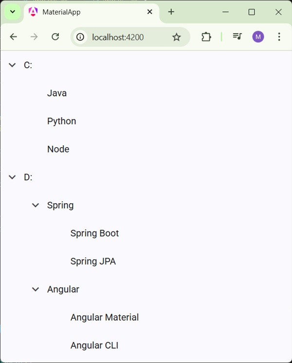
const EXAMPLE_DATA: FileNode[] = [
{
name: 'C:',
children: [{name: 'Java'}, {name: 'Python'}, {name: 'Node'}],
},
{
name: 'D:',
children: [
{
name: 'Spring',
children: [{name: 'Spring Boot'}, {name: 'Spring JPA'}],
},
{
name: 'Angular',
children: [{name: 'Angular Material'}, {name: 'Angular CLI'}],
},
],
},
];
@Component({
selector: 'app-root',
imports: [
FormsModule,
MatFormFieldModule,
MatTreeModule,
MatIconModule,
MatButtonModule,
ReactiveFormsModule,
],
templateUrl: './app.html',
styleUrl: './app.css'
})
export class App {
protected readonly title = signal('material-app');
dataSource = EXAMPLE_DATA;
childrenAccessor = (node: FileNode) => node.children ?? [];
hasChild = (_: number, node: FileNode) => !!node.children && node.children.length > 0;
}
app.html
Following is the content of the modified HTML host file app.html.
<mat-tree #tree [dataSource]="dataSource" [childrenAccessor]="childrenAccessor">
  <mat-tree-node *matTreeNodeDef="let node" matTreeNodePadding>
    <button matIconButton disabled></button>
    {{node.name}}
  </mat-tree-node>
  <mat-tree-node *matTreeNodeDef="let node;when: hasChild" matTreeNodePadding matTreeNodeToggle
                 [cdkTreeNodeTypeaheadLabel]="node.name">
    <button matIconButton matTreeNodeToggle
            [attr.aria-label]="'Toggle ' + node.name">
      <mat-icon class="mat-icon-rtl-mirror">
        {{tree.isExpanded(node) ? 'expand_more' : 'chevron_right'}}
      </mat-icon>
    </button>
    {{node.name}}
  </mat-tree-node>
</mat-tree>
Result
Verify the result.
Details
- As first, we've created tree using mat-tree and mat-tree-node.
- Then, we've created the data source in ts file and bind it with mat-tree.

Advertisements