- Angular Material - Home
- Angular Material - Overview
- Angular Material - Environment Setup
- Angular Material - First Application
Form Controls
- Angular Material - Auto-Complete
- Angular Material - Check Box
- Angular Material - Date Picker
- Angular Material - Form Field
- Angular Material - Input
- Angular Material - Radio Button
- Angular Material - Select
- Angular Material - Slider
- Angular Material - Toggle Slider
Navigation
Layout
- Angular Material - Card
- Angular Material - Divider
- Angular Material - Expansion Panel
- Angular Material - Grid List
- Angular Material - List
- Angular Material - Stepper
- Angular Material - Tabs
- Angular Material - Tree
Buttons & Indicators
- Angular Material - Button
- Angular Material - Button Toggle
- Angular Material - Badge
- Angular Material - Chips
- Angular Material - Icons
- Angular Material - Progress Spinner
- Angular Material - Progress Bar
- Angular Material - Ripples
Popups & Modals
Data table
Angular Material Resources
Angular Material - AutoComplete
The <mat-autocomplete>, an Angular Directive, is used as a special input control with an inbuilt dropdown to show all possible matches to a custom query. This control acts as a real-time suggestion box as soon as the user types in the input area. <mat-autocomplete> can be used to provide search results from local or remote data sources.
In this chapter, we will showcase the configuration required to draw a autocomplete control using Angular Material.
Create Angular Application
Follow the following steps to update the Angular application we created in Angular Material - First Application chapter −
| Step | Description |
|---|---|
| 1 | Create a project with a name material-app as explained in the Angular Material - First Application chapter. |
| 2 | Modify app.ts, app.css and app.html as explained below. Keep rest of the files unchanged. |
| 3 | Compile and run the application to verify the result of the implemented logic. |
app.ts
Following is the content of the modified app.ts.
import { Component, OnInit, signal } from '@angular/core';
import { MatAutocompleteModule } from '@angular/material/autocomplete';
import { MatFormFieldModule } from '@angular/material/form-field';
import { FormsModule, ReactiveFormsModule } from '@angular/forms';
import { FormControl } from '@angular/forms';
import { MatInputModule } from '@angular/material/input';
import { AsyncPipe } from '@angular/common';
import { map, Observable, startWith } from 'rxjs';

export interface State {
   value: string,
   display: string
}

@Component({
   selector: 'app-root',
   imports: [
      FormsModule,
      MatFormFieldModule,
      MatInputModule,
      MatAutocompleteModule,
      ReactiveFormsModule,
      AsyncPipe
   ],
   templateUrl: './app.html',
   styleUrl: './app.css'
})
export class App implements OnInit {
   protected readonly title = signal('material-app');

   myControl = new FormControl<String | State>('');
   states: State[] = [];
   filteredStates: Observable<State[]> | undefined;

   constructor(){
      this.loadStates();
   }

   //build list of states as map of key-value pairs
   loadStates() {
      var allStates = 'Alabama, Alaska, Arizona, Arkansas, California, Colorado, Connecticut, Delaware,\
         Florida, Georgia, Hawaii, Idaho, Illinois, Indiana, Iowa, Kansas, Kentucky, Louisiana,\
         Maine, Maryland, Massachusetts, Michigan, Minnesota, Mississippi, Missouri, Montana,\
         Nebraska, Nevada, New Hampshire, New Jersey, New Mexico, New York, North Carolina,\
         North Dakota, Ohio, Oklahoma, Oregon, Pennsylvania, Rhode Island, South Carolina,\
         South Dakota, Tennessee, Texas, Utah, Vermont, Virginia, Washington, West Virginia,\
         Wisconsin, Wyoming';
      this.states =  allStates.split(/, +/g).map( function (state) {
      return {
         value: state.toUpperCase(),
         display: state
      };
      });
   }

   ngOnInit() {
      this.filteredStates = this.myControl.valueChanges.pipe(
         startWith(''),
         map((entry: any) => {
            const name = typeof entry === 'string' ? entry : entry.value;
            return name ? this._filter(name as string) : this.states.slice();
         }),
      );
   }

   displayFn(state: State): string {
      return state && state.display ? state.display : '';
   }

   private _filter(value: string): State[] {
      const filterValue = value.toLowerCase();
      return this.states.filter(option => option.value.toLowerCase().includes(filterValue));
   }
}
app.html
Following is the content of the modified HTML host file app.html.
<form class = "tp-form">
   <mat-form-field class = "tp-full-width">
      <mat-label>US State</mat-label>
      <input type = "text"
         placeholder = "US State"
         matInput
         [formControl] = "myControl"
         [matAutocomplete] = "auto">
      <mat-autocomplete autoActiveFirstOption #auto="matAutocomplete" [displayWith]="displayFn">
         @for (option of filteredStates | async; track option) {
            <mat-option [value]="option">{{option.value}}</mat-option>
         }
      </mat-autocomplete>
   </mat-form-field>
</form>
app.css
Following is the content of the modified CSS file app.css.
.tp-form {
   min-width: 150px;
   max-width: 500px;
   width: 100%;
}
.tp-full-width {
   width: 100%;
}
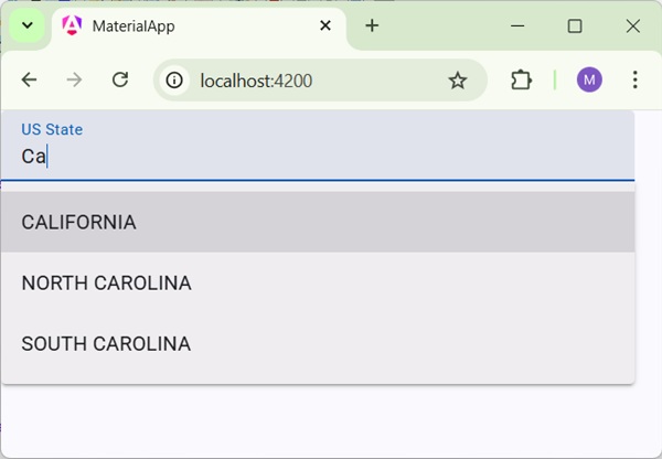
Result
Verify the result.
Details
As first, we've created an input box and bind an autocomplete named auto using [matAutocomplete] attribute.
Then, we've created an autocomplete named auto using mat-autocomplete tag.
As next, using @For loop, options are created.
