- Angular Material - Home
- Angular Material - Overview
- Angular Material - Environment Setup
- Angular Material - First Application
Form Controls
- Angular Material - Auto-Complete
- Angular Material - Check Box
- Angular Material - Date Picker
- Angular Material - Form Field
- Angular Material - Input
- Angular Material - Radio Button
- Angular Material - Select
- Angular Material - Slider
- Angular Material - Toggle Slider
Navigation
Layout
- Angular Material - Card
- Angular Material - Divider
- Angular Material - Expansion Panel
- Angular Material - Grid List
- Angular Material - List
- Angular Material - Stepper
- Angular Material - Tabs
- Angular Material - Tree
Buttons & Indicators
- Angular Material - Button
- Angular Material - Button Toggle
- Angular Material - Badge
- Angular Material - Chips
- Angular Material - Icons
- Angular Material - Progress Spinner
- Angular Material - Progress Bar
- Angular Material - Ripples
Popups & Modals
Data table
Angular Material Resources
Selected Reading
Angular Material - DatePicker
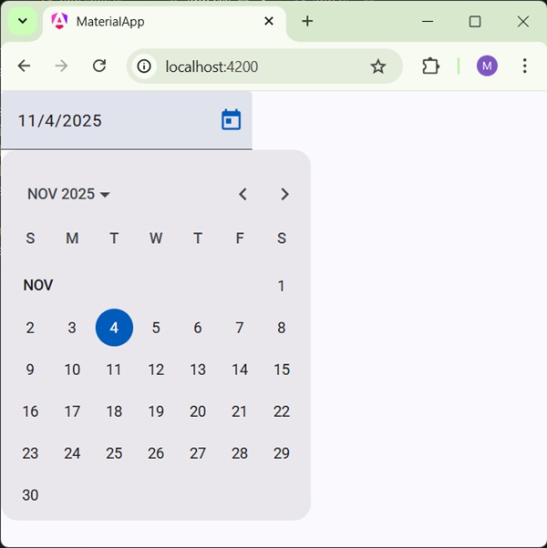
The <mat-datepicker>, an Angular Directive, is used to create a datepicker control using which date can be selected from a calendar or can be input directly using input box.
In this chapter, we will showcase the configuration required to draw a datepicker control using Angular Material.
Create Angular Application
Follow the following steps to update the Angular application we created in Angular Material - First Application chapter −
| Step | Description |
|---|---|
| 1 | Create a project with a name material-app as explained in the Angular Material - First Application chapter. |
| 2 | Modify app.ts, and app.html as explained below. Keep rest of the files unchanged. |
| 3 | Compile and run the application to verify the result of the implemented logic. |
app.ts
Following is the content of the modified app.ts.
import { Component, model, signal } from '@angular/core';
import { MatFormFieldModule } from '@angular/material/form-field';
import { FormsModule, ReactiveFormsModule } from '@angular/forms';
import { MatInputModule } from '@angular/material/input';
import { MatDatepickerModule } from '@angular/material/datepicker';
import { MatNativeDateModule } from '@angular/material/core';

@Component({
   selector: 'app-root',
   imports: [
      FormsModule,
      MatFormFieldModule,
      MatInputModule,
      MatDatepickerModule,
      MatNativeDateModule,
      ReactiveFormsModule,
   ],
   templateUrl: './app.html',
   styleUrl: './app.css'
})
export class App {
   protected readonly title = signal('material-app');
}
app.html
Following is the content of the modified HTML host file app.html.
<mat-form-field>
   <input matInput [matDatepicker] = "picker" placeholder = "Choose a date">
   <mat-datepicker-toggle matSuffix [for] = "picker"></mat-datepicker-toggle>
   <mat-datepicker #picker></mat-datepicker>
</mat-form-field>
Result
Verify the result.
Details
As first, we've created an input box and bind an datepicker named picker using [matDatepicker] attribute.
Then, we've created an datepicker named picker using mat-datepicker tag.

Advertisements