- Angular Material - Home
- Angular Material - Overview
- Angular Material - Environment Setup
- Angular Material - First Application
Form Controls
- Angular Material - Auto-Complete
- Angular Material - Check Box
- Angular Material - Date Picker
- Angular Material - Form Field
- Angular Material - Input
- Angular Material - Radio Button
- Angular Material - Select
- Angular Material - Slider
- Angular Material - Toggle Slider
Navigation
Layout
- Angular Material - Card
- Angular Material - Divider
- Angular Material - Expansion Panel
- Angular Material - Grid List
- Angular Material - List
- Angular Material - Stepper
- Angular Material - Tabs
- Angular Material - Tree
Buttons & Indicators
- Angular Material - Button
- Angular Material - Button Toggle
- Angular Material - Badge
- Angular Material - Chips
- Angular Material - Icons
- Angular Material - Progress Spinner
- Angular Material - Progress Bar
- Angular Material - Ripples
Popups & Modals
Data table
Angular Material Resources
Selected Reading
Angular Material - Progress Spinner
The <mat-progress-spinner>, an Angular Directive, is used to show a progress spinner with material styling.
In this chapter, we will showcase the configuration required to draw a deterministic as well as indeterministic progress spinner using Angular Material.
Create Angular Application
Follow the following steps to update the Angular application we created in Angular Material - First Application chapter −
| Step | Description |
|---|---|
| 1 | Create a project with a name material-app as explained in the Angular Material - First Application chapter. |
| 2 | Modify app.ts,app.css and app.html as explained below. Keep rest of the files unchanged. |
| 3 | Compile and run the application to verify the result of the implemented logic. |
app.ts
Following is the content of the modified app.ts.
import { Component, signal } from '@angular/core';
import { FormsModule, ReactiveFormsModule } from '@angular/forms';
import { MatFormFieldModule } from '@angular/material/form-field';
import { MatProgressSpinnerModule, ProgressSpinnerMode } from '@angular/material/progress-spinner';
import { MatRadioModule } from '@angular/material/radio';
import { MatSliderModule } from '@angular/material/slider';

@Component({
   selector: 'app-root',
   imports: [
      FormsModule,
      MatFormFieldModule,
      MatProgressSpinnerModule,
      MatRadioModule,
      MatSliderModule,
      ReactiveFormsModule,
   ],
   templateUrl: './app.html',
   styleUrl: './app.css'
})
export class App {
   protected readonly title = signal('material-app');
   mode: ProgressSpinnerMode = 'determinate';
   value = 50;
}
app.html
Following is the content of the modified HTML host file app.html.
<section class = "tp-section">
   <label class = "tp-margin">Mode:</label>
   <mat-radio-group [(ngModel)] = "mode">
      <mat-radio-button class = "tp-margin" value = "determinate">
         Determinate
      </mat-radio-button>
      <mat-radio-button class = "tp-margin" value = "indeterminate">
         Indeterminate
      </mat-radio-button>
   </mat-radio-group>
</section>
@if (mode === 'determinate') {
   <section class = "tp-section">
      <label class = "tp-margin">Progress:</label>
      <mat-slider class = "tp-margin" [(ngModel)] = "value"></mat-slider>
   </section>
}
<section class = "tp-section">
   <label class = "tp-margin">Mode: {{mode}}</label>
   <mat-progress-spinner
      class = "tp-margin"
      [color] = "color"
      [mode] = "mode"
      [value] = "value">
   </mat-progress-spinner>
</section>
app.css
Following is the content of the modified ts file app.component.css.
.tp-section {
   display: flex;
   align-content: center;
   align-items: center;
   height: 60px;
}
.tp-margin {
   margin: 0 10px;
}
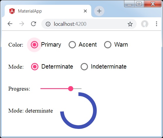
Result
Verify the result.
Details
- Here, we've created progress spinner using mat-progress-spinner.

Advertisements