- Angular Material - Home
- Angular Material - Overview
- Angular Material - Environment Setup
- Angular Material - First Application
Form Controls
- Angular Material - Auto-Complete
- Angular Material - Check Box
- Angular Material - Date Picker
- Angular Material - Form Field
- Angular Material - Input
- Angular Material - Radio Button
- Angular Material - Select
- Angular Material - Slider
- Angular Material - Toggle Slider
Navigation
Layout
- Angular Material - Card
- Angular Material - Divider
- Angular Material - Expansion Panel
- Angular Material - Grid List
- Angular Material - List
- Angular Material - Stepper
- Angular Material - Tabs
- Angular Material - Tree
Buttons & Indicators
- Angular Material - Button
- Angular Material - Button Toggle
- Angular Material - Badge
- Angular Material - Chips
- Angular Material - Icons
- Angular Material - Progress Spinner
- Angular Material - Progress Bar
- Angular Material - Ripples
Popups & Modals
Data table
Angular Material Resources
Selected Reading
Angular Material - Badge
The <mat-badge>, an Angular Directive, is used to create a badges which is a small status descriptor for UI elements. A badge typically carries a number or other short set of characters, that appears in proximity to another UI element.
In this chapter, we will showcase the configuration required to draw a badge control using Angular Material.
Create Angular Application
Follow the following steps to update the Angular application we created in Angular Material - First Application chapter −
| Step | Description |
|---|---|
| 1 | Create a project with a name material-app as explained in the Angular Material - First Application chapter. |
| 2 | Modify app.ts,app.css and app.html as explained below. Keep rest of the files unchanged. |
| 3 | Compile and run the application to verify the result of the implemented logic. |
app.ts
Following is the content of the modified app.ts.
import { Component, signal } from '@angular/core';
import { FormsModule, ReactiveFormsModule } from '@angular/forms';
import { MatBadgeModule } from '@angular/material/badge';
import { MatButtonModule } from '@angular/material/button';
import { MatFormFieldModule } from '@angular/material/form-field';
import { MatIconModule } from '@angular/material/icon';

@Component({
   selector: 'app-root',
   imports: [
      FormsModule,
      MatFormFieldModule,
      MatBadgeModule,
      MatIconModule,
      MatButtonModule,
      ReactiveFormsModule,
   ],
   templateUrl: './app.html',
   styleUrl: './app.css'
})
export class App {
   protected readonly title = signal('material-app');
}
app.html
Following is the content of the modified HTML host file app.html.
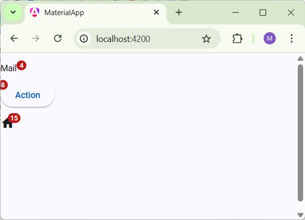
<p><span matBadge = "4" matBadgeOverlap = "false">Mail</span></p>
<p>
   <button mat-raised-button color = "primary"
      matBadge = "8" matBadgePosition = "before" matBadgeColor = "accent">
      Action
   </button>
</p>
<p><mat-icon matBadge = "15" matBadgeColor = "warn">home</mat-icon></p>
Result
Verify the result.
Details
- As first, we've created a span, a button and a icon.
- Then, we've added badges to each element using mat-badge attribute.

Advertisements