- Angular Material - Home
- Angular Material - Overview
- Angular Material - Environment Setup
- Angular Material - First Application
Form Controls
- Angular Material - Auto-Complete
- Angular Material - Check Box
- Angular Material - Date Picker
- Angular Material - Form Field
- Angular Material - Input
- Angular Material - Radio Button
- Angular Material - Select
- Angular Material - Slider
- Angular Material - Toggle Slider
Navigation
Layout
- Angular Material - Card
- Angular Material - Divider
- Angular Material - Expansion Panel
- Angular Material - Grid List
- Angular Material - List
- Angular Material - Stepper
- Angular Material - Tabs
- Angular Material - Tree
Buttons & Indicators
- Angular Material - Button
- Angular Material - Button Toggle
- Angular Material - Badge
- Angular Material - Chips
- Angular Material - Icons
- Angular Material - Progress Spinner
- Angular Material - Progress Bar
- Angular Material - Ripples
Popups & Modals
Data table
Angular Material Resources
Selected Reading
Angular Material - Input
The <mat-input>, an Angular Directive, is used for <input> and <textarea> elements to work under <mat-form-field>.
Following input types can be used within <mat-input>.
- color
- date
- datetime-local
- month
- number
- password
- search
- tel
- text
- time
- url
- week
In this chapter, we will showcase the configuration required to use a mat-input control in Angular Material.
Create Angular Application
Follow the following steps to update the Angular application we created in Angular Material - First Application chapter −
| Step | Description |
|---|---|
| 1 | Create a project with a name material-app as explained in the Angular Material - First Application chapter. |
| 2 | Modify app.ts, app.css and app.html as explained below. Keep rest of the files unchanged. |
| 3 | Compile and run the application to verify the result of the implemented logic. |
app.ts
Following is the content of the modified app.ts.
import { Component, signal } from '@angular/core';
import { MatFormFieldModule } from '@angular/material/form-field';
import { FormControl, FormsModule, ReactiveFormsModule, Validators } from '@angular/forms';
import { MatInputModule } from '@angular/material/input';
import { MatOptionModule } from '@angular/material/core';
import { MatSelectModule } from '@angular/material/select';
import { MatIconModule } from '@angular/material/icon';

@Component({
   selector: 'app-root',
   imports: [
      FormsModule,
      MatFormFieldModule,
      MatInputModule,
      MatOptionModule,
      MatSelectModule,
      MatIconModule,
      ReactiveFormsModule,
   ],
   templateUrl: './app.html',
   styleUrl: './app.css'
})
export class App {
   protected readonly title = signal('material-app');
   emailFormControl = new FormControl('', [
      Validators.required,
      Validators.email,
   ]);
}
app.html
Following is the content of the modified HTML host file app.html.
<form class = "tp-form">
   <mat-form-field class = "tp-full-width">
      <input matInput placeholder = "Favorite Food" value = "Pasta">
   </mat-form-field>
   <mat-form-field class = "tp-full-width">
      <textarea matInput placeholder = "Enter your comment"></textarea>
   </mat-form-field>
   <mat-form-field class = "tp-full-width">
      <mat-label>Enter your email</mat-label>
      <input matInput placeholder = "Email" [formControl] = "emailFormControl">
      @if (emailFormControl.hasError('email') && !emailFormControl.hasError('required')) {
         <mat-error>Please enter a valid email address</mat-error>
      }
      @if(emailFormControl.hasError('required')){
         <mat-error>Email is <strong>required</strong></mat-error>
      }
   </mat-form-field>
</form>
app.css
Following is the content of the modified CSS file app.css.
.tp-form {
   min-width: 150px;
   max-width: 500px;
   width: 100%;
}
.tp-full-width {
   width: 100%;
}
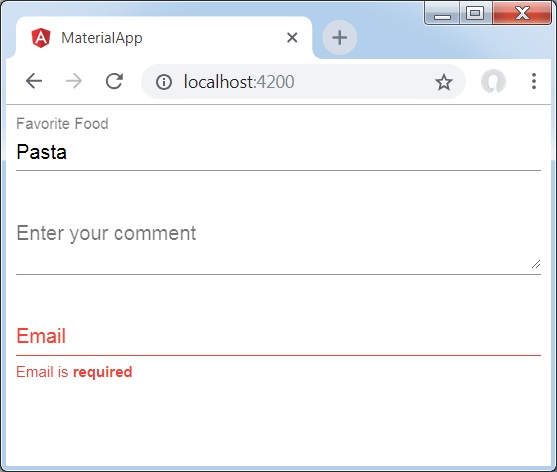
Result
Verify the result.
Details
As first, we've created an form field using mat-form-field wrapper.
Then, a form control is added to the form field using input and matInput attribute.

Advertisements