- Angular Material - Home
- Angular Material - Overview
- Angular Material - Environment Setup
- Angular Material - First Application
Form Controls
- Angular Material - Auto-Complete
- Angular Material - Check Box
- Angular Material - Date Picker
- Angular Material - Form Field
- Angular Material - Input
- Angular Material - Radio Button
- Angular Material - Select
- Angular Material - Slider
- Angular Material - Toggle Slider
Navigation
Layout
- Angular Material - Card
- Angular Material - Divider
- Angular Material - Expansion Panel
- Angular Material - Grid List
- Angular Material - List
- Angular Material - Stepper
- Angular Material - Tabs
- Angular Material - Tree
Buttons & Indicators
- Angular Material - Button
- Angular Material - Button Toggle
- Angular Material - Badge
- Angular Material - Chips
- Angular Material - Icons
- Angular Material - Progress Spinner
- Angular Material - Progress Bar
- Angular Material - Ripples
Popups & Modals
Data table
Angular Material Resources
Angular Material - Quick Guide
Angular Material - Overview
Angular Material is a UI component library for Angular developers. Angular Material's reusable UI components help in constructing attractive, consistent, and functional web pages and web applications while adhering to modern web design principles like browser portability, device independence, and graceful degradation.
Following are a few salient features of Angular Material −
In-built responsive designing.
Standard CSS with minimal footprint.
Includes new versions of common user interface controls such as buttons, check boxes, and text fields which are adapted to follow Material Design concepts.
Includes enhanced and specialized features like cards, toolbar, speed dial, side nav, swipe, and so on.
Cross-browser, and can be used to create reusable web components.
Responsive Design
Angular Material has in-built responsive designing so that the website created using Angular Material will redesign itself as per the device size.
Angular Material classes are created in such a way that the website can fit any screen size.
The websites created using Angular Material are fully compatible with PC, tablets, and mobile devices.
Extensible
Angular Material is by design very minimal and flat.
It is designed considering the fact that it is much easier to add new CSS rules than to overwrite existing CSS rules.
It supports shadows and bold colors.
The colors and shades remain uniform across various platforms and devices.
And most important of all, Angular Material is absolutely free to use.
Angular Material - Environment Setup
This tutorial will guide you on how to prepare a development environment to start your work with Angular Framework and Angular Material. In this chapter, we will discuss the Environment Setup required for Angular Material. To install Angular, we require the following −
Nodejs
Npm
Angular CLI
IDE for writing your code
Nodejs has to be greater than 8.11 and npm has to be greater than 5.6.
Nodejs
To check if nodejs is installed on your system, type node -v in the terminal. This will help you see the version of nodejs currently installed on your system.
C:\>node -v
v24.11.0
If it does not print anything, install nodejs on your system. To install nodejs, go the homepage https://nodejs.org/en/download/ of nodejs and install the package based on your OS.
The homepage of nodejs will look like the following −
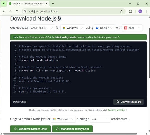
Based on your OS, install the required package. Once nodejs is installed, npm will also get installed along with it. To check if npm is installed or not, type npm -v in the terminal. It should display the version of the npm.
C:\>npm -v
11.6.1
Angular Material installations are very simple with the help of angular CLI. Visit the homepage https://cli.angular.io/ of angular to get the reference of the command.
Type npm install -g @angular/cli, to install angular cli on your system.
C:\>npm install -g @angular/cli

added 121 packages, removed 48 packages, and changed 226 packages in 22s

65 packages are looking for funding
  run `npm fund` for details
Once Angular CLI is installed. You can use any IDE of your choice, i.e., WebStorm, Atom, Visual Studio Code, etc.
Install Angular Material
Run the following command to install Angular Material module and its related components in the project created.
materialApp>npm install --save @angular/material

+ @angular/material@20.2.11
updated 1 package in 39.699s
Add the following entry in app.module.ts file
import {BrowserAnimationsModule} from '@angular/platform-browser/animations';
import {FormsModule, ReactiveFormsModule} from '@angular/forms';

imports: [
    ...
   FormsModule,
   ReactiveFormsModule,
   BrowserAnimationsModule
],
Add the following entry in styles.css file to get a theme.
@import "~@angular/material/prebuilt-themes/indigo-pink.css";
Add the following entry in index.htm file to get a material icons support.
<link href = "https://fonts.googleapis.com/icon?family=Material+Icons" rel = "stylesheet">
Angular Material - First Application
In this tutorial, we will learn how to create and run our first Angular application on a local machine. We also analyze its project structure. Before we proceed, please ensure that you have set up an Angular development environment on your system. You can refer to our Angular Material - Environment Setup tutorial, where we explain the installation of all the necessary tools required for the Angular development process.
Steps to Create and Run First Angular Application
The following steps are necessary to create and run each Angular application successfully −
Install Angular CLI
Create Angular Application
Start Angular Application
Install Angular CLI
Angular CLI is a command line interface used to maintain Angular applications directly from a command shell. It uses Node and node package manager to install and run JavaScript tools outside the browser.
Use the following command to install Angular CLI −
npm install -g @angular/cli
Let us check whether the Angular is installed in our system and the version of the installed Angular using below command −
ng --version
20.3.8
Here,
ng is the prefix that stands for Angular. It is used to denote Angular-specific directives, components, and modules. It runs in NodeJS environment.
The result shows the details of the Angular version −
So, Angular is installed in our system and the version is 20.3.8.
Create Angular Application
To create a new Angular application ng new command is used.
ng new application-name
Let us create an Angular application to check Angular Material Components. Give it a name material-app. But, first navigate to the folder where you want to create an Angular application using the cd command. Then, use below command to create the new application −
cd d:\projects
ng new material-app
When you run the above command a new folder with the name material-app will be created in the current working directory. Inside this folder, the Angular CLI install all the necessary Angular npm packages and other dependencies.
You will be asked some basic question in order to create new application like type of style sheet, enable SSR and SSG. For style sheet, choose CSS and do not enable SSR and SSG for the time being.
Once the basic questions are answered, a new Angular application will be created under material-app folder. Let us move into the our newly created application folder −
cd material-app
Install Angular Material
ng add @angular/material
It will give the following output.
...
CREATE src/custom-theme.scss (1147 bytes)
UPDATE angular.json (2546 bytes)
UPDATE src/index.html (510 bytes)
UPDATE src/styles.css (182 bytes)
The important directories of the application are −
src: This directory contains all the source code for your Angular application, including components, services, modules, templates, styles, and assets.
app: It is a sub-folder of src directory. It contains component files.
angular.json: This is the workspace configuration file which means it defines the configuration options for the entire Angular workspace.
node_modules: This directory contains all the npm packages installed as dependencies for the project.
package.json: This file contains metadata about the project and lists the npm dependencies required for the project.
tsconfig.json: It is the TypeScript configuration file that specifies the compiler options for TypeScript files.
public: This file is used to store asset files.
Start Angular Application
To start an Angular application, we use the ng serve CLI command.
ng serve
Here, the above sub command compile and run the Angular application using a local development web server. It will start a development web server and serves the application under port, 4200.
Let us fire up a browser and open http://localhost:4200. The browser will show the application as shown below −

We will change the application and learn how to code an Angular Material application in the upcoming chapters.
Angular Material - AutoComplete
The <mat-autocomplete>, an Angular Directive, is used as a special input control with an inbuilt dropdown to show all possible matches to a custom query. This control acts as a real-time suggestion box as soon as the user types in the input area. <mat-autocomplete> can be used to provide search results from local or remote data sources.
In this chapter, we will showcase the configuration required to draw a autocomplete control using Angular Material.
Create Angular Application
Follow the following steps to update the Angular application we created in Angular Material - First Application chapter −
| Step | Description |
|---|---|
| 1 | Create a project with a name material-app as explained in the Angular Material - First Application chapter. |
| 2 | Modify app.ts, app.css and app.html as explained below. Keep rest of the files unchanged. |
| 3 | Compile and run the application to verify the result of the implemented logic. |
app.ts
Following is the content of the modified app.ts.
import { Component, OnInit, signal } from '@angular/core';
import { MatAutocompleteModule } from '@angular/material/autocomplete';
import { MatFormFieldModule } from '@angular/material/form-field';
import { FormsModule, ReactiveFormsModule } from '@angular/forms';
import { FormControl } from '@angular/forms';
import { MatInputModule } from '@angular/material/input';
import { AsyncPipe } from '@angular/common';
import { map, Observable, startWith } from 'rxjs';

export interface State {
   value: string,
   display: string
}

@Component({
   selector: 'app-root',
   imports: [
      FormsModule,
      MatFormFieldModule,
      MatInputModule,
      MatAutocompleteModule,
      ReactiveFormsModule,
      AsyncPipe
   ],
   templateUrl: './app.html',
   styleUrl: './app.css'
})
export class App implements OnInit {
   protected readonly title = signal('material-app');

   myControl = new FormControl<String | State>('');
   states: State[] = [];
   filteredStates: Observable<State[]> | undefined;

   constructor(){
      this.loadStates();
   }

   //build list of states as map of key-value pairs
   loadStates() {
      var allStates = 'Alabama, Alaska, Arizona, Arkansas, California, Colorado, Connecticut, Delaware,\
         Florida, Georgia, Hawaii, Idaho, Illinois, Indiana, Iowa, Kansas, Kentucky, Louisiana,\
         Maine, Maryland, Massachusetts, Michigan, Minnesota, Mississippi, Missouri, Montana,\
         Nebraska, Nevada, New Hampshire, New Jersey, New Mexico, New York, North Carolina,\
         North Dakota, Ohio, Oklahoma, Oregon, Pennsylvania, Rhode Island, South Carolina,\
         South Dakota, Tennessee, Texas, Utah, Vermont, Virginia, Washington, West Virginia,\
         Wisconsin, Wyoming';
      this.states =  allStates.split(/, +/g).map( function (state) {
      return {
         value: state.toUpperCase(),
         display: state
      };
      });
   }

   ngOnInit() {
      this.filteredStates = this.myControl.valueChanges.pipe(
         startWith(''),
         map((entry: any) => {
            const name = typeof entry === 'string' ? entry : entry.value;
            return name ? this._filter(name as string) : this.states.slice();
         }),
      );
   }

   displayFn(state: State): string {
      return state && state.display ? state.display : '';
   }

   private _filter(value: string): State[] {
      const filterValue = value.toLowerCase();
      return this.states.filter(option => option.value.toLowerCase().includes(filterValue));
   }
}
app.html
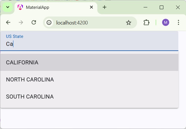
Following is the content of the modified HTML host file app.html.
<form class = "tp-form">
   <mat-form-field class = "tp-full-width">
      <mat-label>US State</mat-label>
      <input type = "text"
         placeholder = "US State"
         matInput
         [formControl] = "myControl"
         [matAutocomplete] = "auto">
      <mat-autocomplete autoActiveFirstOption #auto="matAutocomplete" [displayWith]="displayFn">
         @for (option of filteredStates | async; track option) {
            <mat-option [value]="option">{{option.value}}</mat-option>
         }
      </mat-autocomplete>
   </mat-form-field>
</form>
app.css
Following is the content of the modified CSS file app.css.
.tp-form {
   min-width: 150px;
   max-width: 500px;
   width: 100%;
}
.tp-full-width {
   width: 100%;
}
Result
Verify the result.
Details
As first, we've created an input box and bind an autocomplete named auto using [matAutocomplete] attribute.
Then, we've created an autocomplete named auto using mat-autocomplete tag.
As next, using @For loop, options are created.
Angular Material - CheckBox
The <mat-checkbox>, an Angular Directive, is used as a enhanced checkbox with material design styling and animation capabilities.
In this chapter, we will showcase the configuration required to draw a checkbox control using Angular Material.
Create Angular Application
Follow the following steps to update the Angular application we created in Angular Material - First Application chapter −
| Step | Description |
|---|---|
| 1 | Create a project with a name material-app as explained in the Angular Material - First Application chapter. |
| 2 | Modify app.ts, app.css and app.html as explained below. Keep rest of the files unchanged. |
| 3 | Compile and run the application to verify the result of the implemented logic. |
app.ts
Following is the content of the modified app.ts.
import { Component, model, OnInit, signal } from '@angular/core';
import { MatFormFieldModule } from '@angular/material/form-field';
import { FormsModule, ReactiveFormsModule } from '@angular/forms';
import { MatInputModule } from '@angular/material/input';
import { MatCheckboxModule } from '@angular/material/checkbox';

@Component({
   selector: 'app-root',
   imports: [
      FormsModule,
      MatFormFieldModule,
      MatInputModule,
      MatCheckboxModule,
      ReactiveFormsModule,
   ],
   templateUrl: './app.html',
   styleUrl: './app.css'
})
export class App {
   protected readonly title = signal('material-app');

   readonly checked = model(false);
   readonly indeterminate = model(false);
   readonly labelPosition = model<'before' | 'after'>('after');
   readonly disabled = model(false);
}
app.html
Following is the content of the modified HTML host file app.html.
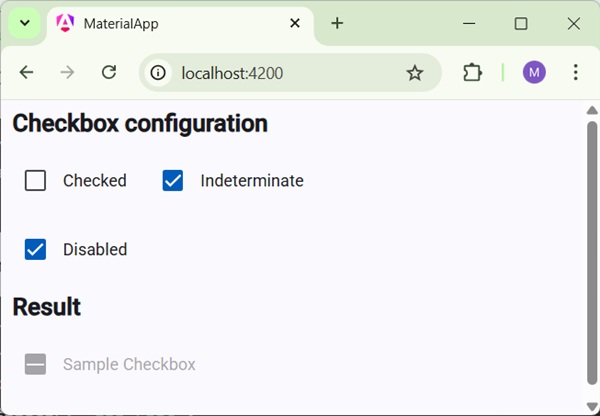
<h2 class = "tp-h2">Checkbox configuration</h2>
<section class = "tp-section">
   <mat-checkbox class = "tp-margin" [(ngModel)] = "checked">Checked</mat-checkbox>
   <mat-checkbox class = "tp-margin" [(ngModel)] = "indeterminate">Indeterminate</mat-checkbox>
</section>
<section class = "tp-section">
   <mat-checkbox class = "tp-margin" [(ngModel)] = "disabled">Disabled</mat-checkbox>
</section>
<h2 class = "tp-h2">Result</h2>
<section class = "tp-section">
   <mat-checkbox
      class = "tp-margin"
      [(ngModel)] = "checked"
      [(indeterminate)] = "indeterminate"
      [labelPosition] = "labelPosition()"
      [disabled] = "disabled()">
      Sample Checkbox
   </mat-checkbox>
</section>
app.css
Following is the content of the modified CSS file app.css.
.tp-h2 {
   margin: 10px;
}
.tp-section {
   display: flex;
   align-content: center;
   align-items: center;
   height: 60px;
}
.tp-margin {
   margin: 0 10px;
}
Result
Verify the result.
Details
As first, we've created three check boxes using mat-checkbox and bind them using ngModel with variables.
Then, we've created another checkbox and showcased its various attributes bound with variables in .ts file.
Angular Material - DatePicker
The <mat-datepicker>, an Angular Directive, is used to create a datepicker control using which date can be selected from a calendar or can be input directly using input box.
In this chapter, we will showcase the configuration required to draw a datepicker control using Angular Material.
Create Angular Application
Follow the following steps to update the Angular application we created in Angular Material - First Application chapter −
| Step | Description |
|---|---|
| 1 | Create a project with a name material-app as explained in the Angular Material - First Application chapter. |
| 2 | Modify app.ts, and app.html as explained below. Keep rest of the files unchanged. |
| 3 | Compile and run the application to verify the result of the implemented logic. |
app.ts
Following is the content of the modified app.ts.
import { Component, model, signal } from '@angular/core';
import { MatFormFieldModule } from '@angular/material/form-field';
import { FormsModule, ReactiveFormsModule } from '@angular/forms';
import { MatInputModule } from '@angular/material/input';
import { MatDatepickerModule } from '@angular/material/datepicker';
import { MatNativeDateModule } from '@angular/material/core';

@Component({
   selector: 'app-root',
   imports: [
      FormsModule,
      MatFormFieldModule,
      MatInputModule,
      MatDatepickerModule,
      MatNativeDateModule,
      ReactiveFormsModule,
   ],
   templateUrl: './app.html',
   styleUrl: './app.css'
})
export class App {
   protected readonly title = signal('material-app');
}
app.html
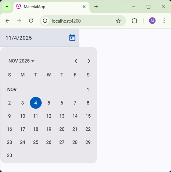
Following is the content of the modified HTML host file app.html.
<mat-form-field>
   <input matInput [matDatepicker] = "picker" placeholder = "Choose a date">
   <mat-datepicker-toggle matSuffix [for] = "picker"></mat-datepicker-toggle>
   <mat-datepicker #picker></mat-datepicker>
</mat-form-field>
Result
Verify the result.
Details
As first, we've created an input box and bind an datepicker named picker using [matDatepicker] attribute.
Then, we've created an datepicker named picker using mat-datepicker tag.
Angular Material - Form Field
The <mat-form-field>, an Angular Directive, is used to create a wrapper over angular components and is used to apply text styles like underline, bold, hints etc.
Following angular component can be used within <mat-form-field>.
<input matNativeControl>
<textarea matNativeControl>
<select matNativeControl>
<mat-select>
<mat-chip-list>
In this chapter, we will showcase the configuration required to use a mat-form-field control in Angular Material.
Create Angular Application
Follow the following steps to update the Angular application we created in Angular Material - First Application chapter −
| Step | Description |
|---|---|
| 1 | Create a project with a name material-app as explained in the Angular Material - First Application chapter. |
| 2 | Modify app.ts, app.css and app.html as explained below. Keep rest of the files unchanged. |
| 3 | Compile and run the application to verify the result of the implemented logic. |
app.ts
Following is the content of the modified app.ts.
import { Component, signal } from '@angular/core';
import { MatFormFieldModule } from '@angular/material/form-field';
import { FormsModule, ReactiveFormsModule } from '@angular/forms';
import { MatInputModule } from '@angular/material/input';
import { MatOptionModule } from '@angular/material/core';
import { MatSelectModule } from '@angular/material/select';
import { MatIconModule } from '@angular/material/icon';

@Component({
   selector: 'app-root',
   imports: [
      FormsModule,
      MatFormFieldModule,
      MatInputModule,
      MatOptionModule,
      MatSelectModule,
      MatIconModule,
      ReactiveFormsModule,
   ],
   templateUrl: './app.html',
   styleUrl: './app.css'
})
export class App {
   protected readonly title = signal('material-app');
}
app.html
Following is the content of the modified HTML host file app.html.
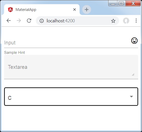
<div class = "tp-container">
   <mat-form-field appearance = "fill">
      <input matInput placeholder = "Input">
      <mat-icon matSuffix>sentiment_very_satisfied</mat-icon>
      <mat-hint>Sample Hint</mat-hint>
   </mat-form-field>
   <mat-form-field appearance = "fill">
      <textarea matInput placeholder = "Textarea"></textarea>
   </mat-form-field>
   <mat-form-field appearance = "outline">
      <mat-select placeholder = "Select">
         <mat-option value = "A">A</mat-option>
         <mat-option value = "B">B</mat-option>
         <mat-option value = "C">C</mat-option>
      </mat-select>
   </mat-form-field>
</div>
app.css
Following is the content of the modified CSS file app.css.
.tp-container {
   display: flex;
   flex-direction: column;
}
.tp-container > * {
   width: 100%;
}
Result
Verify the result.
Details
As first, we've created an form field using mat-form-field wrapper. We've changed the appearance of form field using appearance attribute.
Then, a form control is added to the form field.
Angular Material - Input
The <mat-input>, an Angular Directive, is used for <input> and <textarea> elements to work under <mat-form-field>.
Following input types can be used within <mat-input>.
- color
- date
- datetime-local
- month
- number
- password
- search
- tel
- text
- time
- url
- week
In this chapter, we will showcase the configuration required to use a mat-input control in Angular Material.
Create Angular Application
Follow the following steps to update the Angular application we created in Angular Material - First Application chapter −
| Step | Description |
|---|---|
| 1 | Create a project with a name material-app as explained in the Angular Material - First Application chapter. |
| 2 | Modify app.ts, app.css and app.html as explained below. Keep rest of the files unchanged. |
| 3 | Compile and run the application to verify the result of the implemented logic. |
app.ts
Following is the content of the modified app.ts.
import { Component, signal } from '@angular/core';
import { MatFormFieldModule } from '@angular/material/form-field';
import { FormControl, FormsModule, ReactiveFormsModule, Validators } from '@angular/forms';
import { MatInputModule } from '@angular/material/input';
import { MatOptionModule } from '@angular/material/core';
import { MatSelectModule } from '@angular/material/select';
import { MatIconModule } from '@angular/material/icon';

@Component({
   selector: 'app-root',
   imports: [
      FormsModule,
      MatFormFieldModule,
      MatInputModule,
      MatOptionModule,
      MatSelectModule,
      MatIconModule,
      ReactiveFormsModule,
   ],
   templateUrl: './app.html',
   styleUrl: './app.css'
})
export class App {
   protected readonly title = signal('material-app');
   emailFormControl = new FormControl('', [
      Validators.required,
      Validators.email,
   ]);
}
app.html
Following is the content of the modified HTML host file app.html.
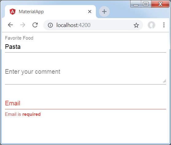
<form class = "tp-form">
   <mat-form-field class = "tp-full-width">
      <input matInput placeholder = "Favorite Food" value = "Pasta">
   </mat-form-field>
   <mat-form-field class = "tp-full-width">
      <textarea matInput placeholder = "Enter your comment"></textarea>
   </mat-form-field>
   <mat-form-field class = "tp-full-width">
      <mat-label>Enter your email</mat-label>
      <input matInput placeholder = "Email" [formControl] = "emailFormControl">
      @if (emailFormControl.hasError('email') && !emailFormControl.hasError('required')) {
         <mat-error>Please enter a valid email address</mat-error>
      }
      @if(emailFormControl.hasError('required')){
         <mat-error>Email is <strong>required</strong></mat-error>
      }
   </mat-form-field>
</form>
app.css
Following is the content of the modified CSS file app.css.
.tp-form {
   min-width: 150px;
   max-width: 500px;
   width: 100%;
}
.tp-full-width {
   width: 100%;
}
Result
Verify the result.
Details
As first, we've created an form field using mat-form-field wrapper.
Then, a form control is added to the form field using input and matInput attribute.
Angular Material - Radiobutton
The <mat-radiobutton>, an Angular Directive, is used for <input type="radio"> for enhance material design based styling.
In this chapter, we will showcase the configuration required to draw a radio button control using Angular Material.
Create Angular Application
Follow the following steps to update the Angular application we created in Angular Material - First Application chapter −
| Step | Description |
|---|---|
| 1 | Create a project with a name material-app as explained in the Angular Material - First Application chapter. |
| 2 | Modify app.ts, app.css and app.html as explained below. Keep rest of the files unchanged. |
| 3 | Compile and run the application to verify the result of the implemented logic. |
app.ts
Following is the content of the modified app.ts.
import { Component, signal } from '@angular/core';
import { FormsModule, ReactiveFormsModule } from '@angular/forms';
import { MatFormFieldModule } from '@angular/material/form-field';
import { MatRadioModule } from '@angular/material/radio';

@Component({
   selector: 'app-root',
   imports: [
      FormsModule,
      MatFormFieldModule,
      MatRadioModule,
      ReactiveFormsModule,
   ],
   templateUrl: './app.html',
   styleUrl: './app.css'
})
export class App {
   protected readonly title = signal('material-app');
   favoriteSeason: string = '';
   seasons: string[] = ['Winter', 'Spring', 'Summer', 'Autumn'];
}
app.html
Following is the content of the modified HTML host file app.html.
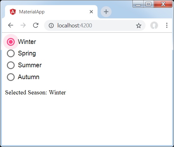
<mat-radio-group class = "tp-radio-group" [(ngModel)] = "favoriteSeason">
   @for (season of seasons; track season) {
      <mat-radio-button class = "tp-radio-button" [value] = "season">{{season}}</mat-radio-button>
   }
</mat-radio-group>
<div class = "tp-selected-value">
   Selected Season: {{favoriteSeason}}
</div>
app.css
Following is the content of the modified CSS file app.css.
.tp-radio-group {
   display: inline-flex;
   flex-direction: column;
}
.tp-radio-button {
   margin: 5px;
}
.tp-selected-value {
   margin: 15px 0;
}
Result
Verify the result.
Details
As first, we've created an radio button group using mat-radio-group bound with ngModel.
Then, we've added radio buttons using mat-radio-button.
Angular Material - Select
The <mat-select>, an Angular Directive, is used for <select> for enhance material design based styling..
In this chapter, we will showcase the configuration required to draw a select control using Angular Material.
Create Angular Application
Follow the following steps to update the Angular application we created in Angular Material - First Application chapter −
| Step | Description |
|---|---|
| 1 | Create a project with a name material-app as explained in the Angular Material - First Application chapter. |
| 2 | Modify app.ts, and app.html as explained below. Keep rest of the files unchanged. |
| 3 | Compile and run the application to verify the result of the implemented logic. |
app.ts
Following is the content of the modified app.ts.
import { Component, signal } from '@angular/core';
import { FormsModule, ReactiveFormsModule } from '@angular/forms';
import { MatFormFieldModule } from '@angular/material/form-field';
import { MatSelectModule } from '@angular/material/select';

export interface Food {
  value: string;
  display: string;
}

@Component({
   selector: 'app-root',
   imports: [
      FormsModule,
      MatFormFieldModule,
      MatSelectModule,
      ReactiveFormsModule,
   ],
   templateUrl: './app.html',
   styleUrl: './app.css'
})
export class App {
   protected readonly title = signal('material-app');
   selectedValue: string='';
   foods: Food[] = [
      {value: 'steak', display: 'Steak'},
      {value: 'pizza', display: 'Pizza'},
      {value: 'tacos', display: 'Tacos'}
   ];
}
app.html
Following is the content of the modified HTML host file app.html.
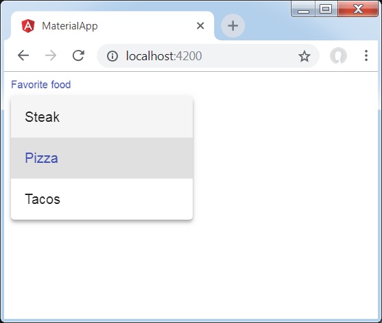
<form>
   <h4>mat-select</h4>
   <mat-form-field>
      <mat-select placeholder = "Favorite food"
         [(ngModel)] = "selectedValue" name = "food">
         @for (food of foods; track food) {
            <mat-option [value] = "food.value">{{food.display}}</mat-option>
         }
      </mat-select>
   </mat-form-field>
   <p> Selected food: {{selectedValue}} </p>
</form>
Result
Verify the result.
Details
As first, we've created a select using mat-select bound with ngModel.
Then, we've added options using mat-option.
Angular Material - Slider
The <mat-slider>, an Angular Directive, is used as a enhanced range selector with material design styling and animation capabilities.
In this chapter, we will showcase the configuration required to draw a slider control using Angular Material.
Create Angular Application
Follow the following steps to update the Angular application we created in Angular Material - First Application chapter −
| Step | Description |
|---|---|
| 1 | Create a project with a name material-app as explained in the Angular Material - First Application chapter. |
| 2 | Modify app.ts, app.css and app.html as explained below. Keep rest of the files unchanged. |
| 3 | Compile and run the application to verify the result of the implemented logic. |
app.ts
Following is the content of the modified app.ts.
import { Component, signal } from '@angular/core';
import { FormsModule, ReactiveFormsModule } from '@angular/forms';
import { MatCheckboxModule } from '@angular/material/checkbox';
import { MatFormFieldModule } from '@angular/material/form-field';
import { MatSliderModule } from '@angular/material/slider';

@Component({
   selector: 'app-root',
   imports: [
      FormsModule,
      MatFormFieldModule,
      MatSliderModule,
      MatCheckboxModule,
      ReactiveFormsModule,
   ],
   templateUrl: './app.html',
   styleUrl: './app.css'
})
export class App {
   protected readonly title = signal('material-app');
   disabled = false;
   max = 100;
   min = 0;
   showTicks = false;
   step = 1;
   thumbLabel = false;
   value = 0;
}
app.html
Following is the content of the modified HTML host file app.html.
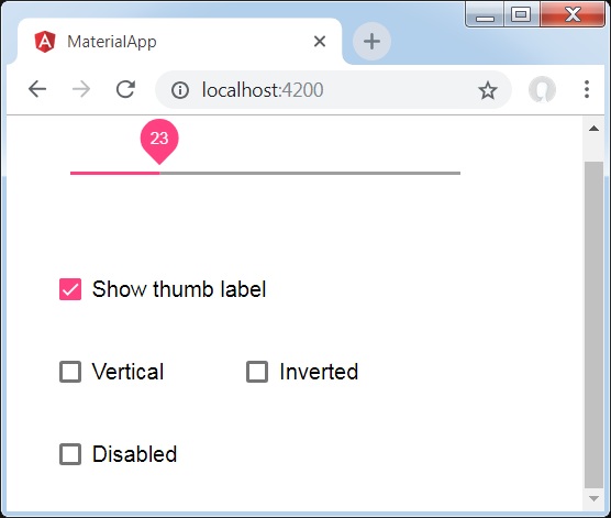
<mat-slider
   class = "tp-margin"
   [disabled]="disabled"
   [max]="max"
   [min]="min"
   [step]="step"
   [discrete]="thumbLabel"
   [showTickMarks]="showTicks">
   <input matSliderThumb [(ngModel)]="value" #slider>
</mat-slider>
<section class = "tp-section">
   <mat-checkbox class = "tp-margin" [(ngModel)] = "thumbLabel">Show thumb label</mat-checkbox>
</section>
<section class = "tp-section">
   <mat-checkbox class = "tp-margin" [(ngModel)] = "showTicks">Show Ticks</mat-checkbox>
</section>
<section class = "tp-section">
   <mat-checkbox class = "tp-margin" [(ngModel)] = "disabled">Disabled</mat-checkbox>
</section>
app.css
Following is the content of the modified CSS file app.css.
.tp-section {
   display: flex;
   align-content: center;
   align-items: center;
   height: 60px;
}
.tp-margin {
   margin: 30px;
}

.mat-slider-horizontal {
   width: 300px;
}
.mat-slider-vertical {
   height: 300px;
}
Result
Verify the result.
Details
As first, we've created three check boxes using mat-checkbox and bind them using ngModel with variables. These properties will be used to customize the slider.
Then, we've created the slider and showcased its various attributes bound with variables in .ts file.
Angular Material - Slide Toggle
The <mat-slide-toggle>, an Angular Directive, is used as a on/off switch with material design styling and animation capabilities.
In this chapter, we will showcase the configuration required to draw a slide toggle control using Angular Material.
Create Angular Application
Follow the following steps to update the Angular application we created in Angular Material - First Application chapter −
| Step | Description |
|---|---|
| 1 | Create a project with a name material-app as explained in the Angular Material - First Application chapter. |
| 2 | Modify app.ts, app.css and app.html as explained below. Keep rest of the files unchanged. |
| 3 | Compile and run the application to verify the result of the implemented logic. |
app.ts
Following is the content of the modified app.ts.
import { Component, signal } from '@angular/core';
import { FormsModule, ReactiveFormsModule } from '@angular/forms';
import { MatCheckboxModule } from '@angular/material/checkbox';
import { MatFormFieldModule } from '@angular/material/form-field';
import { MatSlideToggleModule } from '@angular/material/slide-toggle';

@Component({
   selector: 'app-root',
   imports: [
      FormsModule,
      MatFormFieldModule,
      MatSlideToggleModule,
      MatCheckboxModule,
      ReactiveFormsModule,
   ],
   templateUrl: './app.html',
   styleUrl: './app.css'
})
export class App {
   protected readonly title = signal('material-app');
   disabled = false;
   checked = false;
}
app.html
Following is the content of the modified HTML host file app.html.
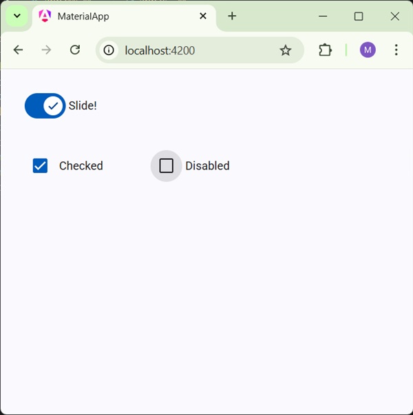
<mat-slide-toggle
   class = "tp-margin"
   [checked] = "checked"
   [disabled] = "disabled">
   Slide!
</mat-slide-toggle>
<section class = "tp-section">
   <mat-checkbox class = "tp-margin" [(ngModel)] = "checked">Checked</mat-checkbox>
   <mat-checkbox class = "tp-margin" [(ngModel)] = "disabled">Disabled</mat-checkbox>
</section>
app.css
Following is the content of the modified CSS file app.css.
.tp-section {
   display: flex;
   align-content: center;
   align-items: center;
   height: 60px;
}
.tp-margin {
   margin: 30px;
}
Result
Verify the result.
Details
As first, we've created two check boxes using mat-checkbox and bind them using ngModel with variables. These properties will be used to handle the slide toggle.
Then, we've created the slide toggle and showcased its various attributes bound with variables in .ts file.
Angular Material - Menu
The <mat-menu>, an Angular Directive, is used to create a menu and attach it with a control with material design styling and animation capabilities.
In this chapter, we will showcase the configuration required to draw a menu control using Angular Material.
Create Angular Application
Follow the following steps to update the Angular application we created in Angular Material - First Application chapter −
| Step | Description |
|---|---|
| 1 | Create a project with a name material-app as explained in the Angular Material - First Application chapter. |
| 2 | Modify app.ts and app.html as explained below. Keep rest of the files unchanged. |
| 3 | Compile and run the application to verify the result of the implemented logic. |
app.ts
Following is the content of the modified app.ts.
import { Component, signal } from '@angular/core';
import { FormsModule, ReactiveFormsModule } from '@angular/forms';
import { MatButtonModule } from '@angular/material/button';
import { MatCheckboxModule } from '@angular/material/checkbox';
import { MatFormFieldModule } from '@angular/material/form-field';
import { MatMenuModule } from '@angular/material/menu';

@Component({
   selector: 'app-root',
   imports: [
      FormsModule,
      MatFormFieldModule,
      MatMenuModule,
      MatButtonModule,
      MatCheckboxModule,
      ReactiveFormsModule,
   ],
   templateUrl: './app.html',
   styleUrl: './app.css'
})
export class App {
   protected readonly title = signal('material-app');
   disabled = false;
   checked = false;
}
app.html
Following is the content of the modified HTML host file app.html.
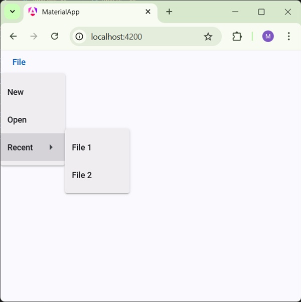
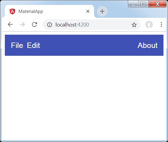
<button mat-button [matMenuTriggerFor] = "menu">File</button>
<mat-menu #menu = "matMenu">
   <button mat-menu-item>New</button>
   <button mat-menu-item>Open</button>
   <button mat-menu-item [matMenuTriggerFor] = "recent">Recent</button>
</mat-menu>
<mat-menu #recent = "matMenu">
   <button mat-menu-item>File 1</button>
   <button mat-menu-item>File 2</button>
</mat-menu>
Result
Verify the result.
Details
As first, we've created two menus using mat-menu and bind them to buttons using matMenuTriggerFor.
matMenuTriggerFor is passed the menu identifier to attach the menus.
Angular Material - SideNav
The <mat-sidenav>, an Angular Directive, is used to create a side navigation bar and main content panel with material design styling and animation capabilities.
<mat-sidenav-container> - Represents the main container.
<mat-sidenav-content> - Represents the content panel.
<mat-sidenav> - Represents the side panel.
In this chapter, we will showcase the configuration required to draw a sidenav control using Angular Material.
Create Angular Application
Follow the following steps to update the Angular application we created in Angular Material - First Application chapter −
| Step | Description |
|---|---|
| 1 | Create a project with a name material-app as explained in the Angular Material - First Application chapter. |
| 2 | Modify app.ts and app.html as explained below. Keep rest of the files unchanged. |
| 3 | Compile and run the application to verify the result of the implemented logic. |
app.ts
Following is the content of the modified app.ts.
import { Component, signal } from '@angular/core';
import { FormsModule, ReactiveFormsModule } from '@angular/forms';
import { MatButtonModule } from '@angular/material/button';
import { MatCheckboxModule } from '@angular/material/checkbox';
import { MatFormFieldModule } from '@angular/material/form-field';
import { MatSidenavModule } from '@angular/material/sidenav';

@Component({
   selector: 'app-root',
   imports: [
      FormsModule,
      MatFormFieldModule,
      MatSidenavModule,
      MatButtonModule,
      MatCheckboxModule,
      ReactiveFormsModule,
   ],
   templateUrl: './app.html',
   styleUrl: './app.css'
})
export class App {
   protected readonly title = signal('material-app');
}
app.html
Following is the content of the modified HTML host file app.html.
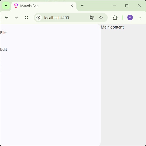
<mat-sidenav-container class = "tp-container">
   <mat-sidenav mode = "side" opened>
      <section class = "tp-section">
         <span>File</span>
      </section>
      <section class = "tp-section">
         <span>Edit</span>
      </section>
   </mat-sidenav>
   <mat-sidenav-content>Main content</mat-sidenav-content>
</mat-sidenav-container>
app.css
Following is the content of the modified CSS file app.css.
.tp-container {
   position: absolute;
   top: 0;
   bottom: 0;
   left: 0;
   right: 0;
   background: #eee;
}
.tp-section {
   display: flex;
   align-content: center;
   align-items: center;
   height: 60px;
   width:100px;
}
Result
Verify the result.
Details
As first, we've created a main container spanning the complete page.
Then side nav is created using mat-sidenav and content panel using mat-sidenav-content.
Angular Material - Toolbar
The <mat-toolbar>, an Angular Directive, is used to create a toolbar to show title, header or any action button.
<mat-toolbar> - Represents the main container.
<mat-toolbar-row> - Add a new row.
In this chapter, we will showcase the configuration required to draw a toolbar control using Angular Material.
Create Angular Application
Follow the following steps to update the Angular application we created in Angular Material - First Application chapter −
| Step | Description |
|---|---|
| 1 | Create a project with a name material-app as explained in the Angular Material - First Application chapter. |
| 2 | Modify app.ts and app.html as explained below. Keep rest of the files unchanged. |
| 3 | Compile and run the application to verify the result of the implemented logic. |
app.ts
Following is the content of the modified app.ts.
import { Component, signal } from '@angular/core';
import { FormsModule, ReactiveFormsModule } from '@angular/forms';
import { MatButtonModule } from '@angular/material/button';
import { MatCheckboxModule } from '@angular/material/checkbox';
import { MatFormFieldModule } from '@angular/material/form-field';
import { MatIconModule } from '@angular/material/icon';
import { MatToolbarModule } from '@angular/material/toolbar';

@Component({
   selector: 'app-root',
   imports: [
      FormsModule,
      MatFormFieldModule,
      MatToolbarModule,
      MatIconModule,
      MatButtonModule,
      MatCheckboxModule,
      ReactiveFormsModule,
   ],
   templateUrl: './app.html',
   styleUrl: './app.css'
})
export class App {
   protected readonly title = signal('material-app');
}
app.html
Following is the content of the modified HTML host file app.html.
<mat-toolbar>
   <button matIconButton aria-label="menu icon">
      <mat-icon>menu</mat-icon>
  </button>
  <span>File</span>
  <span class="tp-spacer"></span>
  <button matIconButton aria-label="heart icon">
      <mat-icon>favorite</mat-icon>
  </button>
  <button matIconButton aria-label="share icon">
      <mat-icon>share</mat-icon>
  </button>
</mat-toolbar>
app.css
Following is the content of the modified CSS file app.css.
.tp-spacer {
  flex: 1 1 auto;
}
Result
Verify the result.
Details
- As first, we've created a toolbar spanning the complete page.
- Then labels are added.
Angular Material - Toolbar
The <mat-card>, an Angular Directive, is used to create a card with material design styling and animation capabilities. It provides preset styles for the common card sections.
<mat-card-title> − Represents the section for title.
<mat-card-subtitle> − Represents the section for subtitle.
<mat-card-content> − Represents the section for content.
<mat-card-actions> − Represents the section for actions.
<mat-card-footer> − Represents the section for footer.
In this chapter, we will showcase the configuration required to draw a card control using Angular Material.
Create Angular Application
Follow the following steps to update the Angular application we created in Angular Material - First Application chapter −
| Step | Description |
|---|---|
| 1 | Create a project with a name material-app as explained in the Angular Material - First Application chapter. |
| 2 | Modify app.ts,app.css and app.html as explained below. Keep rest of the files unchanged. |
| 3 | Compile and run the application to verify the result of the implemented logic. |
app.ts
Following is the content of the modified app.ts.
import { Component, signal } from '@angular/core';
import { FormsModule, ReactiveFormsModule } from '@angular/forms';
import { MatButtonModule } from '@angular/material/button';
import { MatCardModule } from '@angular/material/card';
import { MatCheckboxModule } from '@angular/material/checkbox';
import { MatFormFieldModule } from '@angular/material/form-field';
import { MatIconModule } from '@angular/material/icon';
import { MatToolbarModule } from '@angular/material/toolbar';

@Component({
   selector: 'app-root',
   imports: [
      FormsModule,
      MatFormFieldModule,
      MatCardModule,
      MatButtonModule,
      MatCheckboxModule,
      ReactiveFormsModule,
   ],
   templateUrl: './app.html',
   styleUrl: './app.css'
})
export class App {
   protected readonly title = signal('material-app');
}
app.html
Following is the content of the modified HTML host file app.html.
<mat-card class = "tp-card">
   <mat-card-header>
      <div mat-card-avatar class = "tp-header-image"></div>
      <mat-card-title>HTML5</mat-card-title>
      <mat-card-subtitle>HTML Basics</mat-card-subtitle>
   </mat-card-header>
   <img mat-card-image src = "https://www.tutorialspoint.com/materialize/src/html5-mini-logo.jpg" alt = "Learn HTML5">
   <mat-card-content>
      <p>
         HTML5 is the next major revision of the HTML standard superseding
         HTML 4.01, XHTML 1.0, and XHTML 1.1. HTML5 is a standard for
         structuring and presenting content on the World Wide Web.
      </p>
   </mat-card-content>
   <mat-card-actions>
      <button mat-button>LIKE</button>
      <button mat-button>SHARE</button>
   </mat-card-actions>
</mat-card>
app.css
Following is the content of the modified CSS file app.css.
.tp-card {
   max-width: 400px;
}
.tp-header-image {
   background-image: url('https://www.tutorialspoint.com/materialize/src/html5-mini-logo.jpg');
   background-size: cover;
}
Result
Verify the result.

Details
- Here, we've created a card using mat-card.
Angular Material - Divider
The <mat-divider>, an Angular Directive, is used to create a divider with material design styling and animation capabilities. It provide a separator between two items.
In this chapter, we will showcase the configuration required to draw a divider control using Angular Material.
Create Angular Application
Follow the following steps to update the Angular application we created in Angular Material - First Application chapter −
| Step | Description |
|---|---|
| 1 | Create a project with a name material-app as explained in the Angular Material - First Application chapter. |
| 2 | Modify app.ts and app.html as explained below. Keep rest of the files unchanged. |
| 3 | Compile and run the application to verify the result of the implemented logic. |
app.ts
Following is the content of the modified app.ts.
import { Component, signal } from '@angular/core';
import { FormsModule, ReactiveFormsModule } from '@angular/forms';
import { MatButtonModule } from '@angular/material/button';
import { MatCheckboxModule } from '@angular/material/checkbox';
import { MatDividerModule } from '@angular/material/divider';
import { MatFormFieldModule } from '@angular/material/form-field';
import { MatListModule } from '@angular/material/list';

@Component({
   selector: 'app-root',
   imports: [
      FormsModule,
      MatFormFieldModule,
      MatDividerModule,
      MatListModule,
      MatButtonModule,
      MatCheckboxModule,
      ReactiveFormsModule,
   ],
   templateUrl: './app.html',
   styleUrl: './app.css'
})
export class App {
   protected readonly title = signal('material-app');
}
app.html
Following is the content of the modified HTML host file app.html.
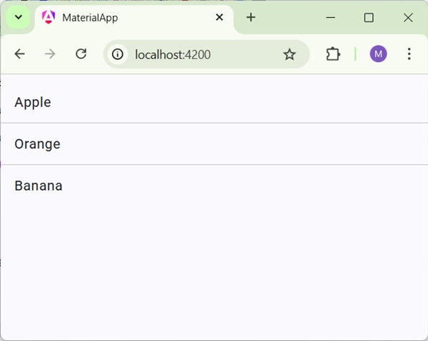
<mat-list>
   <mat-list-item>Apple</mat-list-item>
   <mat-divider></mat-divider>
   <mat-list-item>Orange</mat-list-item>
   <mat-divider></mat-divider>
   <mat-list-item>Banana</mat-list-item>
</mat-list>
Result
Verify the result.
Details
- As first, we've created a list using mat-list.
- Then, we've added dividers between list items using mat-divider.
Angular Material - Expansion Panel
The <mat-expansion-panel>, an Angular Directive, is used to create an expandable detail v/s summary view.
<mat-expansion-panel-header> − Represents the header section. Contains summary of panel and acts as control to expand or collapse the panel.
<mat-panel-title> − Represents the panel title.
<mat-panel-description> − Represents the panel summary.
<mat-action-row> − Represents the actions panel at the bottom.
In this chapter, we will showcase the configuration required to draw a expansion control using Angular Material.
Create Angular Application
Follow the following steps to update the Angular application we created in Angular Material - First Application chapter −
| Step | Description |
|---|---|
| 1 | Create a project with a name material-app as explained in the Angular Material - First Application chapter. |
| 2 | Modify app.ts and app.html as explained below. Keep rest of the files unchanged. |
| 3 | Compile and run the application to verify the result of the implemented logic. |
app.ts
Following is the content of the modified app.ts.
import { Component, signal } from '@angular/core';
import { FormsModule, ReactiveFormsModule } from '@angular/forms';
import { MatButtonModule } from '@angular/material/button';
import { MatCheckboxModule } from '@angular/material/checkbox';
import { MatExpansionModule } from '@angular/material/expansion';
import { MatFormFieldModule } from '@angular/material/form-field';
import { MatInputModule } from '@angular/material/input';

@Component({
   selector: 'app-root',
   imports: [
      FormsModule,
      MatFormFieldModule,
      MatExpansionModule,
      MatInputModule,
      MatButtonModule,
      MatCheckboxModule,
      ReactiveFormsModule,
   ],
   templateUrl: './app.html',
   styleUrl: './app.css'
})
export class App {
   protected readonly title = signal('material-app');
}
app.html
Following is the content of the modified HTML host file app.html.
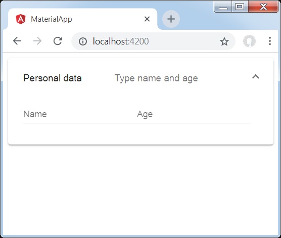
<mat-expansion-panel>
   <mat-expansion-panel-header>
      <mat-panel-title>
         Personal data
      </mat-panel-title>
      <mat-panel-description>
         Type name and age
      </mat-panel-description>
   </mat-expansion-panel-header>
   <mat-form-field>
      <input matInput placeholder="Name">
   </mat-form-field>
   <mat-form-field>
      <input matInput placeholder="Age">
   </mat-form-field>
</mat-expansion-panel>
Result
Verify the result.
Details
- As first, we've created expansion panel using mat-expansion-panel.
- Then, we've added title, subtitle and content to it.
Angular Material - Grid List
The <mat-grid-list>, an Angular Directive, is used to create a two dimensional view arranging cells into grid based layout.
In this chapter, we will showcase the configuration required to draw a grid list control using Angular Material.
Create Angular Application
Follow the following steps to update the Angular application we created in Angular Material - First Application chapter −
| Step | Description |
|---|---|
| 1 | Create a project with a name material-app as explained in the Angular Material - First Application chapter. |
| 2 | Modify app.ts,app.css and app.html as explained below. Keep rest of the files unchanged. |
| 3 | Compile and run the application to verify the result of the implemented logic. |
app.ts
Following is the content of the modified app.ts.
import { Component, signal } from '@angular/core';
import { FormsModule, ReactiveFormsModule } from '@angular/forms';
import { MatFormFieldModule } from '@angular/material/form-field';
import { MatGridListModule } from '@angular/material/grid-list';

@Component({
   selector: 'app-root',
   imports: [
      FormsModule,
      MatFormFieldModule,
      MatGridListModule,
      ReactiveFormsModule,
   ],
   templateUrl: './app.html',
   styleUrl: './app.css'
})
export class App {
   protected readonly title = signal('material-app');
}
app.html
Following is the content of the modified HTML host file app.html.
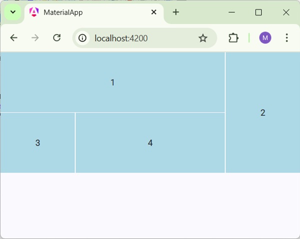
<mat-grid-list cols = "4" rowHeight = "100px">
   <mat-grid-tile
   [colspan] = "3"
   [rowspan] = "1">1
   </mat-grid-tile>
   <mat-grid-tile
   [colspan] = "1"
   [rowspan] = "2">2
   </mat-grid-tile>
   <mat-grid-tile
   [colspan] = "1"
   [rowspan] = "1">3
   </mat-grid-tile>
   <mat-grid-tile
   [colspan] = "2"
   [rowspan] = "1">4
   </mat-grid-tile>
</mat-grid-list>
app.css
Following is the content of the modified CSS file app.css.
mat-grid-tile {
   background: lightblue;
}
Result
Verify the result.
Details
- As first, we've created grid list using mat-grid-list.
- Then, we've added content using mat-grid-tile.
Angular Material - List
The <mat-list>, an Angular Directive, is used to create a container to carry and format a series of items.
In this chapter, we will showcase the configuration required to draw a list control using Angular Material.
Create Angular Application
Follow the following steps to update the Angular application we created in Angular Material - First Application chapter −
| Step | Description |
|---|---|
| 1 | Create a project with a name material-app as explained in the Angular Material - First Application chapter. |
| 2 | Modify app.ts and app.html as explained below. Keep rest of the files unchanged. |
| 3 | Compile and run the application to verify the result of the implemented logic. |
app.ts
Following is the content of the modified app.ts.
import { Component, signal } from '@angular/core';
import { FormsModule, ReactiveFormsModule } from '@angular/forms';
import { MatFormFieldModule } from '@angular/material/form-field';
import { MatListModule } from '@angular/material/list';

@Component({
   selector: 'app-root',
   imports: [
      FormsModule,
      MatFormFieldModule,
      MatListModule,
      ReactiveFormsModule,
   ],
   templateUrl: './app.html',
   styleUrl: './app.css'
})
export class App {
   protected readonly title = signal('material-app');
}
app.html
Following is the content of the modified HTML host file app.html.
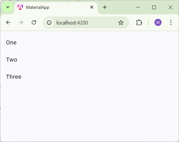
<mat-list role = "list">
   <mat-list-item role = "listitem">One</mat-list-item>
   <mat-list-item role = "listitem">Two</mat-list-item>
   <mat-list-item role = "listitem">Three</mat-list-item>
</mat-list>
Result
Verify the result.
Details
- As first, we've created list using mat-list.
- Then, we've added content using mat-list-item.
Angular Material - Stepper
The <mat-stepper>, an Angular Directive, is used to create a wizard like work-flow steps.
In this chapter, we will showcase the configuration required to draw a stepper control using Angular Material.
Create Angular Application
Follow the following steps to update the Angular application we created in Angular Material - First Application chapter −
| Step | Description |
|---|---|
| 1 | Create a project with a name material-app as explained in the Angular Material - First Application chapter. |
| 2 | Modify app.ts and app.html as explained below. Keep rest of the files unchanged. |
| 3 | Compile and run the application to verify the result of the implemented logic. |
app.ts
Following is the content of the modified app.ts.
import { Component, signal } from '@angular/core';
import { FormsModule, ReactiveFormsModule } from '@angular/forms';
import { MatButtonModule } from '@angular/material/button';
import { MatFormFieldModule } from '@angular/material/form-field';
import { MatInputModule } from '@angular/material/input';
import { MatStepperModule } from '@angular/material/stepper';

@Component({
   selector: 'app-root',
   imports: [
      FormsModule,
      MatFormFieldModule,
      MatStepperModule,
      MatInputModule,
      MatButtonModule,
      ReactiveFormsModule,
   ],
   templateUrl: './app.html',
   styleUrl: './app.css'
})
export class App {
   protected readonly title = signal('material-app');
}
app.html
Following is the content of the modified HTML host file app.html.
<mat-horizontal-stepper [linear] = "isLinear" #stepper>
   <mat-step [stepControl] = "firstFormGroup">
      <form [formGroup] = "firstFormGroup">
         <ng-template matStepLabel>Enter your name</ng-template>
         <mat-form-field>
            <input matInput placeholder = "Last name, First name" formControlName = "firstCtrl" required>
         </mat-form-field>
         <div>
           <button mat-button matStepperNext>Next</button>
         </div>
      </form>
   </mat-step>
   <mat-step [stepControl] = "secondFormGroup">
      <form [formGroup] = "secondFormGroup">
         <ng-template matStepLabel>Enter your address</ng-template>
         <mat-form-field>
           <input matInput placeholder = "Address" formControlName = "secondCtrl" required>
         </mat-form-field>
         <div>
           <button mat-button matStepperPrevious>Back</button>
           <button mat-button matStepperNext>Next</button>
         </div>
      </form>
   </mat-step>
   <mat-step>
      <ng-template matStepLabel>Done</ng-template>
         Details taken.
      <div>
         <button mat-button matStepperPrevious>Back</button>
         <button mat-button (click) = "stepper.reset()">Reset</button>
      </div>
   </mat-step>
</mat-horizontal-stepper>
Result
Verify the result.
Details
- As first, we've created list using mat-list.
- Then, we've added content using mat-list-item.
Angular Material - Tabs
The <mat-tab-group>, an Angular Directive, is used to create a tabbed layout.
In this chapter, we will showcase the configuration required to draw a tab control using Angular Material.
Create Angular Application
Follow the following steps to update the Angular application we created in Angular Material - First Application chapter −
| Step | Description |
|---|---|
| 1 | Create a project with a name material-app as explained in the Angular Material - First Application chapter. |
| 2 | Modify app.ts and app.html as explained below. Keep rest of the files unchanged. |
| 3 | Compile and run the application to verify the result of the implemented logic. |
app.ts
Following is the content of the modified app.ts.
import { Component, signal } from '@angular/core';
import { FormsModule, ReactiveFormsModule } from '@angular/forms';
import { MatButtonModule } from '@angular/material/button';
import { MatFormFieldModule } from '@angular/material/form-field';
import { MatTabsModule } from '@angular/material/tabs';

@Component({
   selector: 'app-root',
   imports: [
      FormsModule,
      MatFormFieldModule,
      MatTabsModule,
      MatButtonModule,
      ReactiveFormsModule,
   ],
   templateUrl: './app.html',
   styleUrl: './app.css'
})
export class App {
   protected readonly title = signal('material-app');
}
app.html
Following is the content of the modified HTML host file app.html.
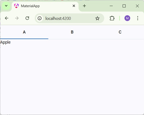
<mat-tab-group>
   <mat-tab label = "A"> Apple </mat-tab>
   <mat-tab label = "B"> Banana </mat-tab>
   <mat-tab label = "C"> Carrot </mat-tab>
</mat-tab-group>
Result
Verify the result.
Details
- As first, we've created tabs using mat-tab-group.
- Then, we've added content using mat-tab where each mat-tab represents a different tab.
Angular Material - Tree
The <mat-tree>, an Angular Directive, is used to create a tree with material styling to display hierachical data.
In this chapter, we will showcase the configuration required to draw a tree using Angular Material.
Create Angular Application
Follow the following steps to update the Angular application we created in Angular Material - First Application chapter −
| Step | Description |
|---|---|
| 1 | Create a project with a name material-app as explained in the Angular Material - First Application chapter. |
| 2 | Modify app.ts and app.html as explained below. Keep rest of the files unchanged. |
| 3 | Compile and run the application to verify the result of the implemented logic. |
app.ts
Following is the content of the modified app.ts.
import { Component, signal } from '@angular/core';
import { FormsModule, ReactiveFormsModule } from '@angular/forms';
import { MatButtonModule } from '@angular/material/button';
import { MatFormFieldModule } from '@angular/material/form-field';
import { MatIconModule } from '@angular/material/icon';
import { MatTreeModule } from '@angular/material/tree';
interface FileNode {
name: string;
children?: FileNode[];
}
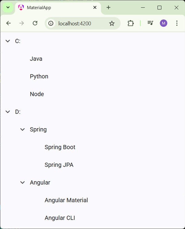
const EXAMPLE_DATA: FileNode[] = [
{
name: 'C:',
children: [{name: 'Java'}, {name: 'Python'}, {name: 'Node'}],
},
{
name: 'D:',
children: [
{
name: 'Spring',
children: [{name: 'Spring Boot'}, {name: 'Spring JPA'}],
},
{
name: 'Angular',
children: [{name: 'Angular Material'}, {name: 'Angular CLI'}],
},
],
},
];
@Component({
selector: 'app-root',
imports: [
FormsModule,
MatFormFieldModule,
MatTreeModule,
MatIconModule,
MatButtonModule,
ReactiveFormsModule,
],
templateUrl: './app.html',
styleUrl: './app.css'
})
export class App {
protected readonly title = signal('material-app');
dataSource = EXAMPLE_DATA;
childrenAccessor = (node: FileNode) => node.children ?? [];
hasChild = (_: number, node: FileNode) => !!node.children && node.children.length > 0;
}
app.html
Following is the content of the modified HTML host file app.html.
<mat-tree #tree [dataSource]="dataSource" [childrenAccessor]="childrenAccessor">
  <mat-tree-node *matTreeNodeDef="let node" matTreeNodePadding>
    <button matIconButton disabled></button>
    {{node.name}}
  </mat-tree-node>
  <mat-tree-node *matTreeNodeDef="let node;when: hasChild" matTreeNodePadding matTreeNodeToggle
                 [cdkTreeNodeTypeaheadLabel]="node.name">
    <button matIconButton matTreeNodeToggle
            [attr.aria-label]="'Toggle ' + node.name">
      <mat-icon class="mat-icon-rtl-mirror">
        {{tree.isExpanded(node) ? 'expand_more' : 'chevron_right'}}
      </mat-icon>
    </button>
    {{node.name}}
  </mat-tree-node>
</mat-tree>
Result
Verify the result.
Details
- As first, we've created tree using mat-tree and mat-tree-node.
- Then, we've created the data source in ts file and bind it with mat-tree.
Angular Material - Button
The <mat-button>, an Angular Directive, is used to create a button with material styling and animations.
In this chapter, we will showcase the configuration required to draw a button control using Angular Material.
Create Angular Application
Follow the following steps to update the Angular application we created in Angular Material - First Application chapter −
| Step | Description |
|---|---|
| 1 | Create a project with a name material-app as explained in the Angular Material - First Application chapter. |
| 2 | Modify app.ts,app.css and app.html as explained below. Keep rest of the files unchanged. |
| 3 | Compile and run the application to verify the result of the implemented logic. |
app.ts
Following is the content of the modified app.ts.
import { Component, signal } from '@angular/core';
import { FormsModule, ReactiveFormsModule } from '@angular/forms';
import { MatButtonModule } from '@angular/material/button';
import { MatFormFieldModule } from '@angular/material/form-field';
import { MatIconModule } from '@angular/material/icon';

@Component({
   selector: 'app-root',
   imports: [
      FormsModule,
      MatFormFieldModule,
      MatIconModule,
      MatButtonModule,
      ReactiveFormsModule,
   ],
   templateUrl: './app.html',
   styleUrl: './app.css'
})
export class App {
   protected readonly title = signal('material-app');
}
app.html
Following is the content of the modified HTML host file app.html.
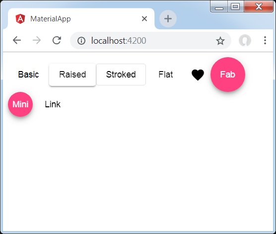
<div class = "example-button-row">
   <button mat-button>Basic</button>
   <button mat-raised-button>Raised</button>
   <button mat-stroked-button>Stroked</button>
   <button mat-flat-button>Flat</button>
   <button mat-icon-button>
      <mat-icon aria-label="Heart">favorite</mat-icon>
   </button>
   <button mat-fab>Fab</button>
   <button mat-mini-fab>Mini</button>
   <a mat-button routerLink = ".">Link</a>
</div>
app.css
Following is the content of the modified CSS file app.css.
.tp-button-row button,
.tp-button-row a {
   margin-right: 8px;
}
Result
Verify the result.
Details
- Here, we've created buttons using various variants of mat-buttons.
Angular Material - Toggle Button
The <mat-button-toggle>, an Angular Directive, is used to create a toggle or on/off button with material styling and animations. mat-button-toggle buttons can be configured to behave as radio buttons or checkboxes. Typically they are part of <mat-button-toggle-group>.
In this chapter, we will showcase the configuration required to draw a button toggle control using Angular Material.
Create Angular Application
Follow the following steps to update the Angular application we created in Angular Material - First Application chapter −
| Step | Description |
|---|---|
| 1 | Create a project with a name material-app as explained in the Angular Material - First Application chapter. |
| 2 | Modify app.ts,app.css and app.html as explained below. Keep rest of the files unchanged. |
| 3 | Compile and run the application to verify the result of the implemented logic. |
app.ts
Following is the content of the modified app.ts.
import { Component, signal } from '@angular/core';
import { FormsModule, ReactiveFormsModule } from '@angular/forms';
import { MatButtonToggleModule } from '@angular/material/button-toggle';
import { MatFormFieldModule } from '@angular/material/form-field';
import { MatIconModule } from '@angular/material/icon';

@Component({
   selector: 'app-root',
   imports: [
      FormsModule,
      MatFormFieldModule,
      MatIconModule,
      MatButtonToggleModule,
      ReactiveFormsModule,
   ],
   templateUrl: './app.html',
   styleUrl: './app.css'
})
export class App {
   protected readonly title = signal('material-app');
}
app.html
Following is the content of the modified HTML host file app.html.
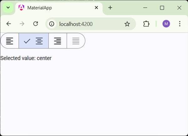
<mat-button-toggle-group #group = "matButtonToggleGroup">
   <mat-button-toggle value = "left">
      <mat-icon>format_align_left</mat-icon>
   </mat-button-toggle>
   <mat-button-toggle value = "center">
      <mat-icon>format_align_center</mat-icon>
   </mat-button-toggle>
   <mat-button-toggle value = "right">
      <mat-icon>format_align_right</mat-icon>
   </mat-button-toggle>
   <mat-button-toggle value = "justify" disabled>
      <mat-icon>format_align_justify</mat-icon>
   </mat-button-toggle>
</mat-button-toggle-group>
<div class = "tp-selected-value">Selected value: {{group.value}}</div>
app.css
Following is the content of the modified CSS file app.css.
.tp-selected-value {
   margin: 15px 0;
}
Result
Verify the result.
Details
- As first, we've created a toggle button group using mat-button-toggle-group.
- Then, we've added toggle buttons to the group using mat-button-toggle.
Angular Material - Badge
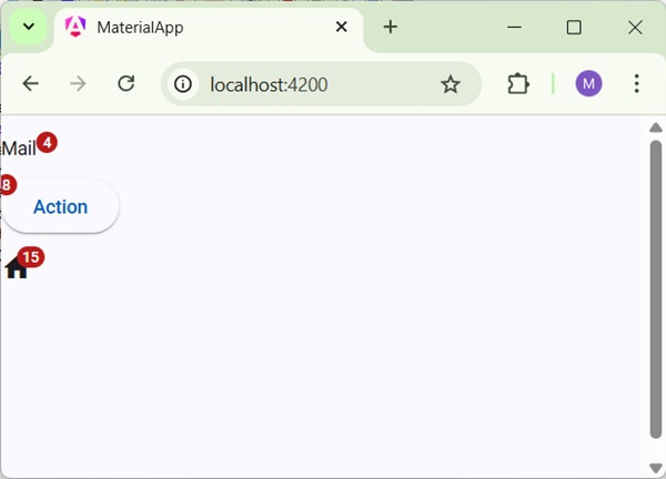
The <mat-badge>, an Angular Directive, is used to create a badges which is a small status descriptor for UI elements. A badge typically carries a number or other short set of characters, that appears in proximity to another UI element.
In this chapter, we will showcase the configuration required to draw a badge control using Angular Material.
Create Angular Application
Follow the following steps to update the Angular application we created in Angular Material - First Application chapter −
| Step | Description |
|---|---|
| 1 | Create a project with a name material-app as explained in the Angular Material - First Application chapter. |
| 2 | Modify app.ts,app.css and app.html as explained below. Keep rest of the files unchanged. |
| 3 | Compile and run the application to verify the result of the implemented logic. |
app.ts
Following is the content of the modified app.ts.
import { Component, signal } from '@angular/core';
import { FormsModule, ReactiveFormsModule } from '@angular/forms';
import { MatBadgeModule } from '@angular/material/badge';
import { MatButtonModule } from '@angular/material/button';
import { MatFormFieldModule } from '@angular/material/form-field';
import { MatIconModule } from '@angular/material/icon';

@Component({
   selector: 'app-root',
   imports: [
      FormsModule,
      MatFormFieldModule,
      MatBadgeModule,
      MatIconModule,
      MatButtonModule,
      ReactiveFormsModule,
   ],
   templateUrl: './app.html',
   styleUrl: './app.css'
})
export class App {
   protected readonly title = signal('material-app');
}
app.html
Following is the content of the modified HTML host file app.html.
<p><span matBadge = "4" matBadgeOverlap = "false">Mail</span></p>
<p>
   <button mat-raised-button color = "primary"
      matBadge = "8" matBadgePosition = "before" matBadgeColor = "accent">
      Action
   </button>
</p>
<p><mat-icon matBadge = "15" matBadgeColor = "warn">home</mat-icon></p>
Result
Verify the result.
Details
- As first, we've created a span, a button and a icon.
- Then, we've added badges to each element using mat-badge attribute.
Angular Material - Chips
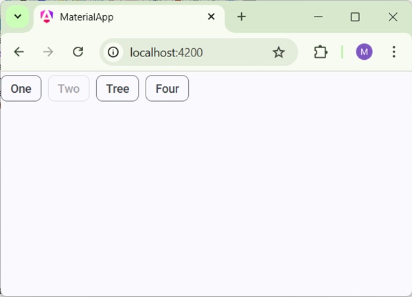
The <mat-chip-set>, an Angular Directive, is used to a list of values as chips.
In this chapter, we will showcase the configuration required to draw a chip control using Angular Material.
Create Angular Application
Follow the following steps to update the Angular application we created in Angular Material - First Application chapter −
| Step | Description |
|---|---|
| 1 | Create a project with a name material-app as explained in the Angular Material - First Application chapter. |
| 2 | Modify app.ts,app.css and app.html as explained below. Keep rest of the files unchanged. |
| 3 | Compile and run the application to verify the result of the implemented logic. |
app.ts
Following is the content of the modified app.ts.
import { Component, signal } from '@angular/core';
import { FormsModule, ReactiveFormsModule } from '@angular/forms';
import { MatChipsModule } from '@angular/material/chips';
import { MatFormFieldModule } from '@angular/material/form-field';

@Component({
   selector: 'app-root',
   imports: [
      FormsModule,
      MatFormFieldModule,
      MatChipsModule,
      ReactiveFormsModule,
   ],
   templateUrl: './app.html',
   styleUrl: './app.css'
})
export class App {
   protected readonly title = signal('material-app');
}
app.html
Following is the content of the modified HTML host file app.html.
<mat-chip-set>
   <mat-chip>One</mat-chip>
   <mat-chip disabled>Two</mat-chip>
   <mat-chip>Tree</mat-chip>
   <mat-chip>Four</mat-chip>
</mat-chip-set>
Result
Verify the result.
Details
- As first, we've created chip list using mat-chip-list.
- Then, we've added chips to each chip list using mat-chip.
Angular Material - Icons
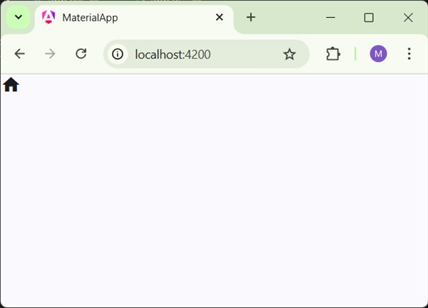
The <mat-icon>, an Angular Directive, is used to add a vector/svg based icon with material styling.
In this chapter, we will showcase the configuration required to draw a icon control using Angular Material.
Create Angular Application
Follow the following steps to update the Angular application we created in Angular Material - First Application chapter −
| Step | Description |
|---|---|
| 1 | Create a project with a name material-app as explained in the Angular Material - First Application chapter. |
| 2 | Modify app.ts,app.css and app.html as explained below. Keep rest of the files unchanged. |
| 3 | Compile and run the application to verify the result of the implemented logic. |
app.ts
Following is the content of the modified app.ts.
import { Component, signal } from '@angular/core';
import { FormsModule, ReactiveFormsModule } from '@angular/forms';
import { MatFormFieldModule } from '@angular/material/form-field';
import { MatIconModule } from '@angular/material/icon';

@Component({
   selector: 'app-root',
   imports: [
      FormsModule,
      MatFormFieldModule,
      MatIconModule,
      ReactiveFormsModule,
   ],
   templateUrl: './app.html',
   styleUrl: './app.css'
})
export class App {
   protected readonly title = signal('material-app');
}
app.html
Following is the content of the modified HTML host file app.html.
<mat-icon>home</mat-icon>
Result
Verify the result.
Details
- Here, we've created home icon using mat-icon. We're using google material icons.
Angular Material - Progress Spinner
The <mat-progress-spinner>, an Angular Directive, is used to show a progress spinner with material styling.
In this chapter, we will showcase the configuration required to draw a deterministic as well as indeterministic progress spinner using Angular Material.
Create Angular Application
Follow the following steps to update the Angular application we created in Angular Material - First Application chapter −
| Step | Description |
|---|---|
| 1 | Create a project with a name material-app as explained in the Angular Material - First Application chapter. |
| 2 | Modify app.ts,app.css and app.html as explained below. Keep rest of the files unchanged. |
| 3 | Compile and run the application to verify the result of the implemented logic. |
app.ts
Following is the content of the modified app.ts.
import { Component, signal } from '@angular/core';
import { FormsModule, ReactiveFormsModule } from '@angular/forms';
import { MatFormFieldModule } from '@angular/material/form-field';
import { MatProgressSpinnerModule, ProgressSpinnerMode } from '@angular/material/progress-spinner';
import { MatRadioModule } from '@angular/material/radio';
import { MatSliderModule } from '@angular/material/slider';

@Component({
   selector: 'app-root',
   imports: [
      FormsModule,
      MatFormFieldModule,
      MatProgressSpinnerModule,
      MatRadioModule,
      MatSliderModule,
      ReactiveFormsModule,
   ],
   templateUrl: './app.html',
   styleUrl: './app.css'
})
export class App {
   protected readonly title = signal('material-app');
   mode: ProgressSpinnerMode = 'determinate';
   value = 50;
}
app.html
Following is the content of the modified HTML host file app.html.
<section class = "tp-section">
   <label class = "tp-margin">Mode:</label>
   <mat-radio-group [(ngModel)] = "mode">
      <mat-radio-button class = "tp-margin" value = "determinate">
         Determinate
      </mat-radio-button>
      <mat-radio-button class = "tp-margin" value = "indeterminate">
         Indeterminate
      </mat-radio-button>
   </mat-radio-group>
</section>
@if (mode === 'determinate') {
   <section class = "tp-section">
      <label class = "tp-margin">Progress:</label>
      <mat-slider class = "tp-margin" [(ngModel)] = "value"></mat-slider>
   </section>
}
<section class = "tp-section">
   <label class = "tp-margin">Mode: {{mode}}</label>
   <mat-progress-spinner
      class = "tp-margin"
      [color] = "color"
      [mode] = "mode"
      [value] = "value">
   </mat-progress-spinner>
</section>
app.css
Following is the content of the modified ts file app.component.css.
.tp-section {
   display: flex;
   align-content: center;
   align-items: center;
   height: 60px;
}
.tp-margin {
   margin: 0 10px;
}
Result
Verify the result.
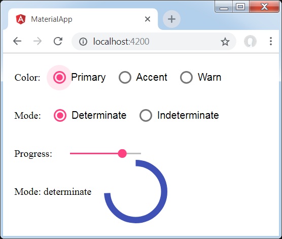
Details
- Here, we've created progress spinner using mat-progress-spinner.
Angular Material - Progress Bar
The <mat-progress-spinner>, an Angular Directive, is used to show a progress spinner with material styling.
In this chapter, we will showcase the configuration required to draw a deterministic as well as indeterministic progress spinner using Angular Material.
Create Angular Application
Follow the following steps to update the Angular application we created in Angular Material - First Application chapter −
| Step | Description |
|---|---|
| 1 | Create a project with a name material-app as explained in the Angular Material - First Application chapter. |
| 2 | Modify app.ts,app.css and app.html as explained below. Keep rest of the files unchanged. |
| 3 | Compile and run the application to verify the result of the implemented logic. |
app.ts
Following is the content of the modified app.ts.
import { Component, signal } from '@angular/core';
import { FormsModule, ReactiveFormsModule } from '@angular/forms';
import { MatFormFieldModule } from '@angular/material/form-field';
import { MatProgressBarModule, ProgressBarMode } from '@angular/material/progress-bar';
import { MatRadioModule } from '@angular/material/radio';
import { MatSliderModule } from '@angular/material/slider';

@Component({
   selector: 'app-root',
   imports: [
      FormsModule,
      MatFormFieldModule,
      MatProgressBarModule,
      MatRadioModule,
      MatSliderModule,
      ReactiveFormsModule,
   ],
   templateUrl: './app.html',
   styleUrl: './app.css'
})
export class App {
   protected readonly title = signal('material-app');
   mode: ProgressBarMode = 'determinate';
   value = 50;
   bufferValue = 75;
}
app.html
Following is the content of the modified HTML host file app.html.
<section class = "tp-section">
   <label class = "tp-margin">Mode:</label>
   <mat-radio-group [(ngModel)] = "mode">
      <mat-radio-button class = "tp-margin" value = "determinate">
         Determinate
      </mat-radio-button>
      <mat-radio-button class = "tp-margin" value = "indeterminate">
         Indeterminate
      </mat-radio-button>
      <mat-radio-button class = "tp-margin" value = "buffer">
         Buffer
      </mat-radio-button>
      <mat-radio-button class = "tp-margin" value = "query">
         Query
      </mat-radio-button>
   </mat-radio-group>
</section>
@if (mode === 'determinate') {
<section class = "tp-section" >
   <label class = "tp-margin">Progress:</label>
   <mat-slider class = "tp-margin" [(ngModel)] = "value"></mat-slider>
</section>
}
@if (mode === 'buffer') {
<section class = "tp-section">
   <label class = "tp-margin">Buffer:</label>
   <mat-slider class = "tp-margin" [(ngModel)] = "bufferValue"></mat-slider>
</section>
}
<section class = "tp-section">
   <label class = "tp-margin">Mode: {{mode}}</label>
   <mat-progress-bar
      class = "tp-margin"
      [mode] = "mode"
      [value] = "value"
      [bufferValue] = "bufferValue"
      >
   </mat-progress-bar>
</section>
app.css
Following is the content of the modified ts file app.component.css.
.tp-section {
   display: flex;
   align-content: center;
   align-items: center;
   height: 60px;
}
.tp-margin {
   margin: 0 10px;
}
Result
Verify the result.
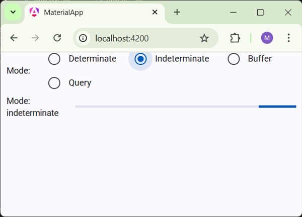
Details
- Here, we've created progress bar using mat-progress-bar.
Angular Material - Ripples
The <mat-ripple>, an Angular Directive, is used to define an area depicting the user interaction.
In this chapter, we will showcase the configuration required to draw a ripple effect using Angular Material.
Create Angular Application
Follow the following steps to update the Angular application we created in Angular Material - First Application chapter −
| Step | Description |
|---|---|
| 1 | Create a project with a name material-app as explained in the Angular Material - First Application chapter. |
| 2 | Modify app.ts,app.css and app.html as explained below. Keep rest of the files unchanged. |
| 3 | Compile and run the application to verify the result of the implemented logic. |
app.ts
Following is the content of the modified app.ts.
import { Component, signal } from '@angular/core';
import { FormsModule, ReactiveFormsModule } from '@angular/forms';
import { MatCheckboxModule } from '@angular/material/checkbox';
import { MatRippleModule } from '@angular/material/core';
import { MatFormFieldModule } from '@angular/material/form-field';
import { MatInputModule } from '@angular/material/input';

@Component({
   selector: 'app-root',
   imports: [
      FormsModule,
      MatFormFieldModule,
      MatRippleModule,
      MatCheckboxModule,
      MatInputModule,
      ReactiveFormsModule,
   ],
   templateUrl: './app.html',
   styleUrl: './app.css'
})
export class App {
   protected readonly title = signal('material-app');
   centered = false;
   disabled = false;
   unbounded = false;
   radius!: number;
   color!: string;
}
app.html
Following is the content of the modified HTML host file app.html.
<mat-checkbox [(ngModel)] = "centered" class = "tp-ripple-checkbox">Centered</mat-checkbox>
<mat-checkbox [(ngModel)] = "disabled" class = "tp-ripple-checkbox">Disabled</mat-checkbox>
<mat-checkbox [(ngModel)] = "unbounded" class = "tp-ripple-checkbox">Unbounded</mat-checkbox>
<section>
   <mat-form-field class = "tp-ripple-form-field">
      <input matInput [(ngModel)] = "radius" type = "number" placeholder = "Radius">
   </mat-form-field>
   <mat-form-field class = "tp-ripple-form-field">
      <input matInput [(ngModel)] = "color" type = "text" placeholder = "Color">
   </mat-form-field>
</section>
<div class = "tp-ripple-container mat-elevation-z4"
   matRipple
   [matRippleCentered] = "centered"
   [matRippleDisabled] = "disabled"
   [matRippleUnbounded] = "unbounded"
   [matRippleRadius] = "radius"
   [matRippleColor] = "color">
   Click me
</div>
app.css
Following is the content of the modified ts file app.component.css.
.tp-ripple-container {
   cursor: pointer;
   text-align: center;
   width: 300px;
   height: 300px;
   line-height: 300px;
   user-select: none;
   -webkit-user-select: none;
   -moz-user-select: none;
   -ms-user-select: none;
   -webkit-user-drag: none;
   -webkit-tap-highlight-color: transparent;
}
.tp-ripple-checkbox {
   margin: 6px 12px 6px 0;
}
.tp-ripple-form-field {
   margin: 0 12px 0 0;
}
Result
Verify the result.
Details
As first, we've created check boxes using mat-checkbox and bind them using ngModel with variables. These properties will be used to customize the ripple.
Then, we've created the ripple and showcased its various attributes bound with variables in .ts file.
Angular Material - SnackBar
The <MatSnackBar>, an Angular Directive, is used to show a notification bar to show on mobile devices as an alternative of dialogs/popups.
In this chapter, we will showcase the configuration required to show a snack bar using Angular Material.
Create Angular Application
Follow the following steps to update the Angular application we created in Angular Material - First Application chapter −
| Step | Description |
|---|---|
| 1 | Create a project with a name material-app as explained in the Angular Material - First Application chapter. |
| 2 | Modify app.ts and app.html as explained below. Keep rest of the files unchanged. |
| 3 | Compile and run the application to verify the result of the implemented logic. |
app.ts
Following is the content of the modified app.ts.
import { Component, signal } from '@angular/core';
import { FormsModule, ReactiveFormsModule } from '@angular/forms';
import { MatButtonModule } from '@angular/material/button';
import { MatCheckboxModule } from '@angular/material/checkbox';
import { MatFormFieldModule } from '@angular/material/form-field';
import { MatInputModule } from '@angular/material/input';
import { MatSnackBar, MatSnackBarModule } from '@angular/material/snack-bar';

@Component({
   selector: 'app-root',
   imports: [
      FormsModule,
      MatFormFieldModule,
      MatSnackBarModule,
      MatButtonModule,
      ReactiveFormsModule,
   ],
   templateUrl: './app.html',
   styleUrl: './app.css'
})
export class App {
   protected readonly title = signal('material-app');

   constructor(public snackBar: MatSnackBar) {}
   openSnackBar(message: string, action: string) {
      this.snackBar.open(message, action, {
         duration: 2000,
      });
   }
}
app.html
Following is the content of the modified HTML host file app.html.
<button mat-button (click)="openSnackBar('Party', 'act')">Show snack-bar</button>
Result
Verify the result.
Details
- Here, we've created a button using mat-button on whose click we shows the snack bar.
Angular Material - Tooltip
The <MatTooltip>, an Angular Directive, is used to show a material styled tooltip.
In this chapter, we will showcase the configuration required to show a tooltip using Angular Material.
Create Angular Application
Follow the following steps to update the Angular application we created in Angular Material - First Application chapter −
| Step | Description |
|---|---|
| 1 | Create a project with a name material-app as explained in the Angular Material - First Application chapter. |
| 2 | Modify app.ts and app.html as explained below. Keep rest of the files unchanged. |
| 3 | Compile and run the application to verify the result of the implemented logic. |
app.ts
Following is the content of the modified app.ts.
import { Component, signal } from '@angular/core';
import { FormsModule, ReactiveFormsModule } from '@angular/forms';
import { MatButtonModule } from '@angular/material/button';
import { MatFormFieldModule } from '@angular/material/form-field';
import { MatTooltipModule } from '@angular/material/tooltip';

@Component({
   selector: 'app-root',
   imports: [
      FormsModule,
      MatFormFieldModule,
      MatTooltipModule,
      MatButtonModule,
      ReactiveFormsModule,
   ],
   templateUrl: './app.html',
   styleUrl: './app.css'
})
export class App {
   protected readonly title = signal('material-app');
}
app.html
Following is the content of the modified HTML host file app.html.
<button mat-raised-button
   matTooltip = "Sample Tooltip"
   aria-label = "Sample Tooltip">
   Click Me!
</button>
Result
Verify the result.
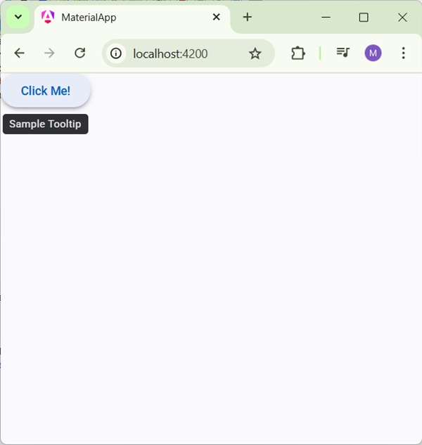
Details
- Here, we've created a button using mat-button on hover, we'll show a tooltip.
Angular Material - Paginator
The <mat-paginator>, an Angular Directive, is used to show a navigator with paged information.
In this chapter, we will showcase the configuration required to show a paginator using Angular Material.
Create Angular Application
Follow the following steps to update the Angular application we created in Angular Material - First Application chapter −
| Step | Description |
|---|---|
| 1 | Create a project with a name material-app as explained in the Angular Material - First Application chapter. |
| 2 | Modify app.ts and app.html as explained below. Keep rest of the files unchanged. |
| 3 | Compile and run the application to verify the result of the implemented logic. |
app.ts
Following is the content of the modified app.ts.
import { Component, signal } from '@angular/core';
import { FormsModule, ReactiveFormsModule } from '@angular/forms';
import { MatFormFieldModule } from '@angular/material/form-field';
import { MatPaginatorModule, PageEvent } from '@angular/material/paginator';

@Component({
   selector: 'app-root',
   imports: [
      FormsModule,
      MatFormFieldModule,
      MatPaginatorModule,
      ReactiveFormsModule,
   ],
   templateUrl: './app.html',
   styleUrl: './app.css'
})
export class App {
   protected readonly title = signal('material-app');

   pageEvent!: PageEvent;
}
app.html
Following is the content of the modified HTML host file app.html.
<mat-paginator [length]="100"
              [pageSize]="10"
              [pageSizeOptions]="[5, 10, 25, 100]"
              aria-label="Select page"
              (page)="pageEvent = $event"
              >
</mat-paginator>
@if(pageEvent){
<div>
   <h5>Page Change Event</h5>
   <div>List length: {{pageEvent.length}}</div>
   <div>Page size: {{pageEvent.pageSize}}</div>
   <div>Page index: {{pageEvent.pageIndex}}</div>
</div>
}
Result
Verify the result.
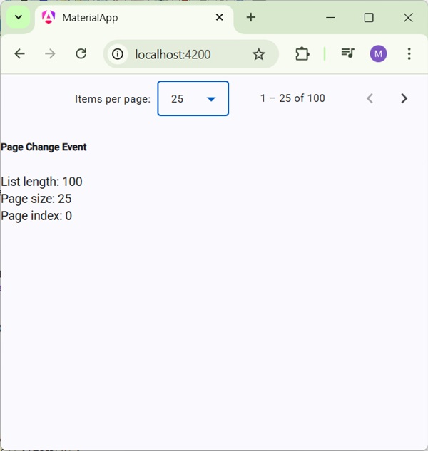
Details
- Here, we've created a paginator using mat-paginator and handles its change event.
Angular Material - Sort Header
The <mat-sort-header> and matSort, an Angular Directives, are used to add sorting capability to a table header.
In this chapter, we will showcase the configuration required to show a Sort Header using Angular Material.
Create Angular Application
Follow the following steps to update the Angular application we created in Angular Material - First Application chapter −
| Step | Description |
|---|---|
| 1 | Create a project with a name material-app as explained in the Angular Material - First Application chapter. |
| 2 | Modify app.ts and app.html as explained below. Keep rest of the files unchanged. |
| 3 | Compile and run the application to verify the result of the implemented logic. |
app.ts
Following is the content of the modified app.ts.
import { Component, signal } from '@angular/core';
import { FormsModule, ReactiveFormsModule } from '@angular/forms';
import { MatFormFieldModule } from '@angular/material/form-field';
import { MatSortModule, Sort } from '@angular/material/sort';

export interface Food {
   calories: number;
   carbs: number;
   fat: number;
   name: string;
   protein: number;
}

@Component({
   selector: 'app-root',
   imports: [
      FormsModule,
      MatFormFieldModule,
      MatSortModule,
      ReactiveFormsModule,
   ],
   templateUrl: './app.html',
   styleUrl: './app.css'
})
export class App {
   protected readonly title = signal('material-app');
   foods: Food[] = [
      {name: 'Yogurt', calories: 159, fat: 6, carbs: 24, protein: 4},
      {name: 'Sandwich', calories: 237, fat: 9, carbs: 37, protein: 4},
      {name: 'Eclairs', calories: 262, fat: 16, carbs: 24, protein: 6},
      {name: 'Cupcakes', calories: 305, fat: 4, carbs: 67, protein: 4},
      {name: 'Gingerbreads', calories: 356, fat: 16, carbs: 49, protein: 4},
   ];
   sortedFood: Food[];
   constructor() {
      this.sortedFood = this.foods.slice();
   }
   sortFood(sort: Sort) {
      const data = this.foods.slice();
      if (!sort.active || sort.direction === '') {
         this.sortedFood = data;
         return;
      }
      this.sortedFood = data.sort((a, b) => {
         const isAsc = sort.direction === 'asc';
         switch (sort.active) {
            case 'name': return compare(a.name, b.name, isAsc);
            case 'calories': return compare(a.calories, b.calories, isAsc);
            case 'fat': return compare(a.fat, b.fat, isAsc);
            case 'carbs': return compare(a.carbs, b.carbs, isAsc);
            case 'protein': return compare(a.protein, b.protein, isAsc);
            default: return 0;
         }
      });
   }
}
function compare(a: number | string, b: number | string, isAsc: boolean) {
   return (a < b ? -1 : 1) * (isAsc ? 1 : -1);
}
app.html
Following is the content of the modified HTML host file app.html.
<table matSort (matSortChange) = "sortFood($event)">
   <tr>
      <th mat-sort-header = "name">Dessert (100g)</th>
      <th mat-sort-header = "calories">Calories</th>
      <th mat-sort-header = "fat">Fat (g)</th>
      <th mat-sort-header = "carbs">Carbs (g)</th>
      <th mat-sort-header = "protein">Protein (g)</th>
   </tr>
   @for (food of sortedFood; track food) {
   <tr>
      <td>{{food.name}}</td>
      <td>{{food.calories}}</td>
      <td>{{food.fat}}</td>
      <td>{{food.carbs}}</td>
      <td>{{food.protein}}</td>
   </tr>
   }
</table>
Result
Verify the result.
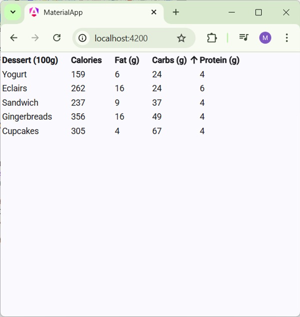
Details
- Here, we've created a table. Added matSort and handles its matSortChange event.
Angular Material - Table
The <mat-table>, an Angular Directives, is used to create table with material design and styling.
In this chapter, we will showcase the configuration required to show a Table using Angular Material.
Create Angular Application
Follow the following steps to update the Angular application we created in Angular Material - First Application chapter −
| Step | Description |
|---|---|
| 1 | Create a project with a name material-app as explained in the Angular Material - First Application chapter. |
| 2 | Modify app.ts and app.html as explained below. Keep rest of the files unchanged. |
| 3 | Compile and run the application to verify the result of the implemented logic. |
app.ts
Following is the content of the modified app.ts.
import { Component, signal } from '@angular/core';
import { FormsModule, ReactiveFormsModule } from '@angular/forms';
import { MatFormFieldModule } from '@angular/material/form-field';
import { MatSortModule, Sort } from '@angular/material/sort';
import { MatTableModule } from '@angular/material/table';

export interface Food {
   calories: number;
   carbs: number;
   fat: number;
   name: string;
   protein: number;
}

@Component({
   selector: 'app-root',
   imports: [
      FormsModule,
      MatFormFieldModule,
      MatTableModule,
      ReactiveFormsModule,
   ],
   templateUrl: './app.html',
   styleUrl: './app.css'
})
export class App {
   protected readonly title = signal('material-app');
   dataSource: Food[] = [
      {name: 'Yogurt', calories: 159, fat: 6, carbs: 24, protein: 4},
      {name: 'Sandwich', calories: 237, fat: 9, carbs: 37, protein: 4},
      {name: 'Eclairs', calories: 262, fat: 16, carbs: 24, protein: 6},
      {name: 'Cupcakes', calories: 305, fat: 4, carbs: 67, protein: 4},
      {name: 'Gingerbreads', calories: 356, fat: 16, carbs: 49, protein: 4},
   ];
   displayedColumns: string[] = ['name', 'calories', 'fat', 'carbs','protein'];
}
app.html
Following is the content of the modified HTML host file app.html.
<table mat-table [dataSource] = "dataSource" class = "mat-elevation-z8">
   <ng-container matColumnDef = "name">
      <th mat-header-cell *matHeaderCellDef> Dessert (100g)</th>
      <td mat-cell *matCellDef = "let element"> {{element.name}} </td>
   </ng-container>
   <ng-container matColumnDef = "calories">
      <th mat-header-cell *matHeaderCellDef>Calories</th>
      <td mat-cell *matCellDef = "let element"> {{element.calories}} </td>
   </ng-container>
   <ng-container matColumnDef = "fat">
      <th mat-header-cell *matHeaderCellDef>Fat (g)</th>
      <td mat-cell *matCellDef = "let element"> {{element.fat}} </td>
   </ng-container>
   <ng-container matColumnDef = "carbs">
      <th mat-header-cell *matHeaderCellDef>Carbs (g)</th>
      <td mat-cell *matCellDef = "let element"> {{element.carbs}} </td>
   </ng-container>
   <ng-container matColumnDef = "protein">
      <th mat-header-cell *matHeaderCellDef>Protein (g)</th>
     <td mat-cell *matCellDef = "let element"> {{element.protein}} </td>
   </ng-container>
   <tr mat-header-row *matHeaderRowDef = "displayedColumns"></tr>
   <tr mat-row *matRowDef = "let row; columns: displayedColumns;"></tr>
</table>
app.css
Following is the content of the modified CSS file app.css.
table {
   width: 100%;
}
Result
Verify the result.
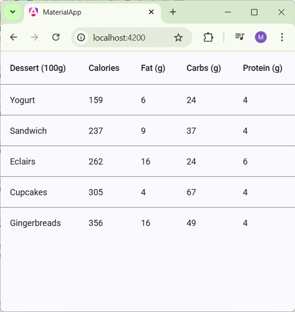
Details
- Here, we've created a table. Added mat-Table and handles tr and th using mat-row and mat-header-row.