- Angular Material - Home
- Angular Material - Overview
- Angular Material - Environment Setup
- Angular Material - First Application
Form Controls
- Angular Material - Auto-Complete
- Angular Material - Check Box
- Angular Material - Date Picker
- Angular Material - Form Field
- Angular Material - Input
- Angular Material - Radio Button
- Angular Material - Select
- Angular Material - Slider
- Angular Material - Toggle Slider
Navigation
Layout
- Angular Material - Card
- Angular Material - Divider
- Angular Material - Expansion Panel
- Angular Material - Grid List
- Angular Material - List
- Angular Material - Stepper
- Angular Material - Tabs
- Angular Material - Tree
Buttons & Indicators
- Angular Material - Button
- Angular Material - Button Toggle
- Angular Material - Badge
- Angular Material - Chips
- Angular Material - Icons
- Angular Material - Progress Spinner
- Angular Material - Progress Bar
- Angular Material - Ripples
Popups & Modals
Data table
Angular Material Resources
Angular Material - Form Field
The <mat-form-field>, an Angular Directive, is used to create a wrapper over angular components and is used to apply text styles like underline, bold, hints etc.
Following angular component can be used within <mat-form-field>.
<input matNativeControl>
<textarea matNativeControl>
<select matNativeControl>
<mat-select>
<mat-chip-list>
In this chapter, we will showcase the configuration required to use a mat-form-field control in Angular Material.
Create Angular Application
Follow the following steps to update the Angular application we created in Angular Material - First Application chapter −
| Step | Description |
|---|---|
| 1 | Create a project with a name material-app as explained in the Angular Material - First Application chapter. |
| 2 | Modify app.ts, app.css and app.html as explained below. Keep rest of the files unchanged. |
| 3 | Compile and run the application to verify the result of the implemented logic. |
app.ts
Following is the content of the modified app.ts.
import { Component, signal } from '@angular/core';
import { MatFormFieldModule } from '@angular/material/form-field';
import { FormsModule, ReactiveFormsModule } from '@angular/forms';
import { MatInputModule } from '@angular/material/input';
import { MatOptionModule } from '@angular/material/core';
import { MatSelectModule } from '@angular/material/select';
import { MatIconModule } from '@angular/material/icon';

@Component({
   selector: 'app-root',
   imports: [
      FormsModule,
      MatFormFieldModule,
      MatInputModule,
      MatOptionModule,
      MatSelectModule,
      MatIconModule,
      ReactiveFormsModule,
   ],
   templateUrl: './app.html',
   styleUrl: './app.css'
})
export class App {
   protected readonly title = signal('material-app');
}
app.html
Following is the content of the modified HTML host file app.html.
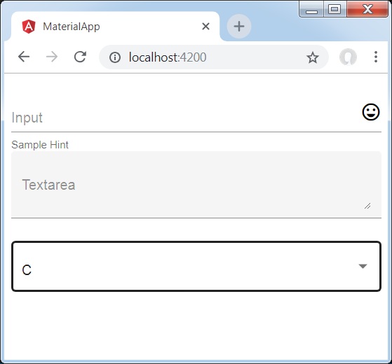
<div class = "tp-container">
   <mat-form-field appearance = "fill">
      <input matInput placeholder = "Input">
      <mat-icon matSuffix>sentiment_very_satisfied</mat-icon>
      <mat-hint>Sample Hint</mat-hint>
   </mat-form-field>
   <mat-form-field appearance = "fill">
      <textarea matInput placeholder = "Textarea"></textarea>
   </mat-form-field>
   <mat-form-field appearance = "outline">
      <mat-select placeholder = "Select">
         <mat-option value = "A">A</mat-option>
         <mat-option value = "B">B</mat-option>
         <mat-option value = "C">C</mat-option>
      </mat-select>
   </mat-form-field>
</div>
app.css
Following is the content of the modified CSS file app.css.
.tp-container {
   display: flex;
   flex-direction: column;
}
.tp-container > * {
   width: 100%;
}
Result
Verify the result.
Details
As first, we've created an form field using mat-form-field wrapper. We've changed the appearance of form field using appearance attribute.
Then, a form control is added to the form field.