- Angular Google Charts - Home
- Angular Google Charts - Overview
- Angular Google Charts - Environment Setup
- Angular Google Charts - Configuration Syntax
- Angular Google Charts - Area Charts
- Angular Google Charts - Bar Charts
- Angular Google Charts - Bubble Charts
- Angular Google Charts - Candlestick
- Angular Google Charts - Column Charts
- Angular Google Charts - Combination
- Angular Google Charts - Histogram
- Angular Google Charts - Line Charts
- Angular Google Charts - Maps
- Angular Google Charts - Organization
- Angular Google Charts - Pie Charts
- Angular Google Charts - Sankey Charts
- Angular Google Charts - Scatter Chart
- Angular Google Charts - Stepped Area Charts
- Angular Google Charts - Table Chart
- Angular Google Charts - TreeMap Chart
Angular Google Charts Resources
- Angular Google Charts - Quick Guide
- Angular Google Charts - Resources
- Angular Google Charts - Discussion
Angular Google Charts - Quick Guide
Angular Google Charts - Overview
Google Charts is a pure JavaScript based charting library meant to enhance web applications by adding interactive charting capability. It supports a wide range of charts. Charts are drawn using SVG in standard browsers like Chrome, Firefox, Safari, Internet Explorer(IE). In legacy IE 6, VML is used to draw the graphics.
angular-google-charts is a open source angular based wrapper for Google Charts to provides an elegant and feature rich Google Charts visualizations within an Angular application and can be used along with Angular components seamlessly. There are chapters discussing all the basic components of Google Charts with suitable examples within a Angular application.
Features
Following are the salient features of Google Charts library.
Compatability − Works seemlessly on all major browsers and mobile platforms like android and iOS.
Multitouch Support − Supports multitouch on touch screen based platforms like android and iOS. Ideal for iPhone/iPad and android based smart phones/ tablets.
Free to Use − Open source and is free to use for non-commercial purpose.
Lightweight − loader.js core library, is extremely lightweight library.
Simple Configurations − Uses json to define various configuration of the charts and very easy to learn and use.
Dynamic − Allows to modify chart even after chart generation.
Multiple axes − Not restricted to x, y axis. Supports multiple axis on the charts.
Configurable tooltips − Tooltip comes when a user hover over any point on a charts. googlecharts provides tooltip inbuilt formatter or callback formatter to control the tooltip programmatically.
DateTime support − Handle date time specially. Provides numerous inbuilt controls over date wise categories.
Print − Print chart using web page.
External data − Supports loading data dynamically from server. Provides control over data using callback functions.
Text Rotation − Supports rotation of labels in any direction.
Supported Chart Types
Google Charts library provides following types of charts:
| Sr.No. | Chart Type / Description |
|---|---|
| 1 |
Line Charts Used to draw line/spline based charts. |
| 2 |
Area Charts Used to draw area wise charts. |
| 3 |
Pie Charts Used to draw pie charts. |
| 4 |
Sankey Charts, Scatter Charts, Stepped area charts, Table, Timelines, TreeMap, Trendlines Used to draw scattered charts. |
| 5 |
Bubble Charts Used to draw bubble based charts. |
| 6 |
Dynamic Charts Used to draw dynamic charts where user can modify charts. |
| 7 |
Combinations Used to draw combinations of variety of charts. |
| 8 |
3D Charts Used to draw 3D charts. |
| 9 |
Angular Gauges Used to draw speedometer type charts. |
| 10 |
Heat Maps Used to draw heat maps. |
| 11 |
Tree Maps Used to draw tree maps. |
In next chapters, we're going to discuss each type of above mentioned charts in details with examples.
Licence
Google Charts is open source and is free to use. Follow the link − Terms of Service.
Angular Google Charts - Environment Setup
This tutorial will guide you on how to prepare a development environment to start your work with Google Charts and Angular Framework. In this chapter, we will discuss the Environment Setup required for Angular. To install Angular, we require the following −
- Node
- Npm
- Angular CLI
- IDE for writing your code
Nodejs has to be greater than 8.11 and npm has to be greater than 5.6.
Nodejs
To check if nodejs is installed on your system, type node -v in the terminal. This will help you see the version of nodejs currently installed on your system.
C:\>node -v
v24.11.0
If it does not print anything, install nodejs on your system. To install nodejs, go the homepage https://nodejs.org/en/download/ of nodejs and install the package based on your OS.
Based on your OS, install the required package. Once nodejs is installed, npm will also get installed along with it. To check if npm is installed or not, type npm -v in the terminal. It should display the version of the npm.
C:\>npm -v
11.6.1
Angular installations are very simple with the help of angular CLI. Visit the homepage https://cli.angular.io/ of angular to get the reference of the command.
Type following command, to install angular cli on your system.
D:\Projects> mkdir googleChartsApp

D:\Projects> cd googleChartsApp

D:\Projects\googleChartsApp> npm install -g @angular/cli@20.0.0
You will get the above installation in your terminal, once Angular CLI is installed. You can use any IDE of your choice, i.e., WebStorm, Atom, Visual Studio Code, etc.
Create new Project
Create a new angular project.
D:\Projects]\googleChartsApp > ng new google-charts-app
Update package.json to use Angular 20.0.0 version.
package.json
{
  "name": "google-charts-app",
  "version": "0.0.0",
  "scripts": {
    "ng": "ng",
    "start": "ng serve",
    "build": "ng build",
    "watch": "ng build --watch --configuration development",
    "test": "ng test"
  },
  "prettier": {
    "printWidth": 100,
    "singleQuote": true,
    "overrides": [
      {
        "files": "*.html",
        "options": {
          "parser": "angular"
        }
      }
    ]
  },
  "private": true,
  "packageManager": "npm@11.6.1",
  "dependencies": {
    "@angular/common": "^20.0.0",
    "@angular/compiler": "^20.0.0",
    "@angular/core": "^20.0.0",
    "@angular/forms": "^20.0.0",
    "@angular/platform-browser": "^20.0.0",
    "@angular/router": "^20.0.0",
    "angular-google-charts": "^16.1.0",
    "rxjs": "~7.8.0",
    "tslib": "^2.3.0"
  },
  "devDependencies": {
    "@angular/build": "^20.0.0",
    "@angular/cli": "^20.0.0",
    "@angular/compiler-cli": "^20.0.0",
    "jsdom": "^27.1.0",
    "typescript": "~5.9.2",
    "vitest": "^3.1.1"
  }
}
Install Google Charts Wrapper
Run the following command to install Google Charts Wrapper module in the project created.
D:\Projects\googleChartsApp\google-charts-app>npm install angular-google-charts

added 97 packages, removed 47 packages, changed 131 packages, and audited 682 packages in 30s
Update app.config.ts file to include google charts and make it zoneless.
import { ApplicationConfig, provideBrowserGlobalErrorListeners, provideZonelessChangeDetection } from '@angular/core';
import { provideRouter } from '@angular/router';

import { routes } from './app.routes';
import { provideGoogleCharts } from 'angular-google-charts';

export const appConfig: ApplicationConfig = {
  providers: [
    provideBrowserGlobalErrorListeners(),
    provideRouter(routes),
    provideGoogleCharts(),
    provideZonelessChangeDetection(),
  ]
};
Angular Google Charts - Configuration Syntax
In this chapter, we will showcase the configuration required to draw a chart using the Google Chart API in Angular.
Step 1 - Create Angular Application
Follow the following steps to update the Angular application we created in Angular Google Charts - Environment Setup chapter −
| Step | Description |
|---|---|
| 1 | Create a project with a name google-charts-app as explained in the Angular Google Charts - Environment Setup chapter. |
| 2 | Modify app.ts and app.html as explained below. Keep rest of the files unchanged. |
| 3 | Compile and run the application to verify the result of the implemented logic. |
Following is the content of the modified HTML host file app.html.
app.html
<google-chart #chart
   [type]="type"
   [data]="data"
   [columns]="columnNames"
   [options]="options"
   [width]="width"
   [height]="height">
</google-chart>
We'll see the updated app.ts in the end after understanding configurations.
Step 2 - Use Configurations
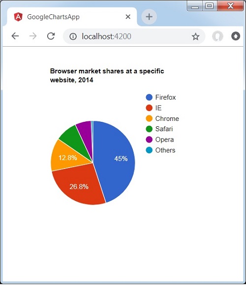
Set Title using Options
options = {
   title: 'Browser market shares at a specific website, 2014',
   pieHole: 0.4
};
Set Chart Type
type = ChartType.PieChart;
data
Configure the data to be displayed on the chart.
data = [
   ['Firefox', 45.0],
   ['IE', 26.8],
   ['Chrome', 12.8],
   ['Safari', 8.5],
   ['Opera', 6.2],
   ['Others', 0.7]
];
column names
Configure the column names to be displayed.
columnNames = ['Browser', 'Percentage'];
options
Configure the other options.
options = {
   colors: ['#e0440e', '#e6693e', '#ec8f6e', '#f3b49f', '#f6c7b6'], is3D: true
};
Example - Usage of a Google Chart
Consider the following example to further understand the Configuration Syntax −
app.ts
import { Component, signal } from '@angular/core';
import { ChartType, GoogleChart } from 'angular-google-charts';

@Component({
   selector: 'app-root',
   imports: [GoogleChart],
   templateUrl: './app.html',
   styleUrl: './app.css'
})
export class App {
   protected readonly title = signal('google-charts-app');
   type: ChartType = ChartType.PieChart;
   data = [
      ['Firefox', 45.0],
      ['IE', 26.8],
      ['Chrome', 12.8],
      ['Safari', 8.5],
      ['Opera', 6.2],
      ['Others', 0.7]
   ];
   columnNames = ['Browser', 'Percentage'];
   options = {
      title: 'Browser market shares at a specific website, 2014',
      pieHole: 0.4
   };
   width = 550;
   height = 400;
}
Result
Verify the result.
Angular Google Charts - Area Charts
Area charts are used to draw area based charts. In this section we're going to discuss following types of area based charts.
| Sr.No | Chart Type / Description |
|---|---|
| 1 |
Basic Area
Basic area chart |
| 2 |
Area with negative values
Area chart having negative values. |
| 3 |
Stacked area
Chart having areas stacked over one another. |
| 4 |
Area with missing points
Chart with missing points in the data. |
Angular Google Charts - Bubble Charts
Bubble charts are used to draw bubble based charts. In this section we're going to discuss following types of bubble based charts.
| Sr.No | Chart Type / Description |
|---|---|
| 1 |
Basic Bubble
Basic bubble chart. |
| 2 |
Bubble chart with data labels
Bubble chart with data labels. |
Angular Google Charts - Candlestick Charts
Candlestick charts are used to show opening and closing value over a value variance and are normally used to represent stocks. In this section we're going to discuss following types of candlestick based charts.
| Sr.No | Chart Type / Description |
|---|---|
| 1 |
Basic Candlestick
Basic Candlestick chart. |
| 2 |
Candlestick with customized colors
Customized Candlestick Chart. |
Angular Google Charts - Column Charts
Colummn charts are used to draw colummn based charts. In this section we're going to discuss following types of colummn based charts.
| Sr.No | Chart Type / Description |
|---|---|
| 1 |
Basic Column
Basic colummn chart |
| 2 |
Grouped Column Chart
Grouped Colummn chart. |
| 3 |
Stacked Column
Colummn chart having colummn stacked over one another. |
| 4 |
Negative Stacked Column
Colummn chart with negative stack. |
Angular Google Charts - Combination Chart
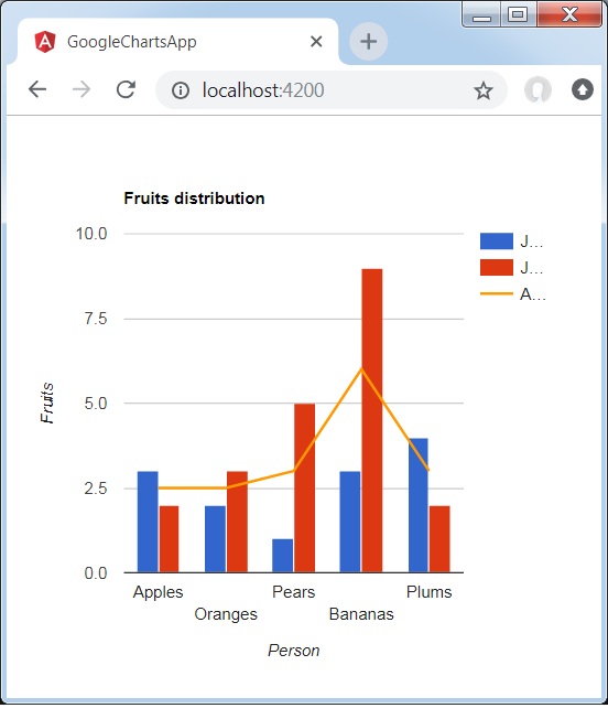
Combination chart helps in rendering each series as a different marker type from the following list: line, area, bars, candlesticks, and stepped area. To assign a default marker type for series, use the seriesType property. Series property is to be used to specify properties of each series individually. Following is an example of a Column Chart showing differences.
We have already seen the configurations used to draw a chart in Google Charts Configuration Syntax chapter. Now, let us see an example of a Column Chart showing differences.
Configurations
We've used ComboChart value to show a Combination Chart.
type=ChartType.ComboChart;
Example - Usage of ComboChart
app.ts
import { Component, signal } from '@angular/core';
import { ChartType, GoogleChart } from 'angular-google-charts';

@Component({
   selector: 'app-root',
   imports: [GoogleChart],
   templateUrl: './app.html',
   styleUrl: './app.css'
})
export class App {
   protected readonly title = signal('google-charts-app');
   type = ChartType.ComboChart;
   data = [
      ["Apples", 3, 2, 2.5],
      ["Oranges",2, 3, 2.5],
      ["Pears", 1, 5, 3],
      ["Bananas", 3, 9, 6],
      ["Plums", 4, 2, 3]
   ];
   columnNames = ['Fruits', 'Jane','Jone','Average'];
   options = {
      title: 'Fruits distribution',
      hAxis: {
         title: 'Person'
      },
      vAxis:{
         title: 'Fruits'
      },
      seriesType: 'bars',
      series: {2: {type: 'line'}}
   };
   width = 550;
   height = 400;
}
Result
Verify the result.
Angular Google Charts - Histogram Charts
A histogram is a chart that groups numeric data into buckets, displaying the buckets as segmented columns. They're used to depict the distribution of a dataset as how often values fall into ranges. Google Charts automatically chooses the number of buckets for you. All buckets are equal width and have a height proportional to the number of data points in the bucket. Histograms are similar to column charts in other aspects. In this section we're going to discuss following types of histogram based charts.
| Sr.No | Chart Type / Description |
|---|---|
| 1 |
Basic Histogram
Basic Histogram chart. |
| 2 |
Controlling Color
Customized Color of Histrogram Chart. |
| 3 |
Controlling Buckets
Customized Buckets of Histrogram Chart. |
| 4 |
Multiple Series
Histrogram Chart having multiple series. |
Angular Google Charts - Line Charts
Line charts are used to draw line based charts. In this section we're going to discuss following types of line based charts.
| Sr.No | Chart Type / Description |
|---|---|
| 1 |
Basic line
Basic line chart. |
| 2 |
With visible points
Chart with visible data points. |
| 3 |
Customizable background color
Chart with customized background color. |
| 4 |
Customizable line color
Chart with customized line color. |
| 5 |
Customizable axis and tick labels
Chart with customized axis and tick labels. |
| 6 |
Crosshairs
Line charts showing crosshairs at data point on selection. |
| 7 |
Customizable line style
Chart with customized line color. |
| 8 |
Line Charts with curved lines
Chart with smooth curve lines. |
Angular Google Charts - Map Charts
A Google Map Chart uses Google Maps API to display Map. Data values are displayed as markers on the map. Data values may be coordinates (lat-long pairs) or actual addresses. The map will be scaled accordingly so that it includes all the identified points.
| Sr.No | Chart Type / Description |
|---|---|
| 1 |
Basic Map
Basic Google Map. |
| 2 |
Map using Latitude/Longitude
Map having locations specified using Latitude and Longitude. |
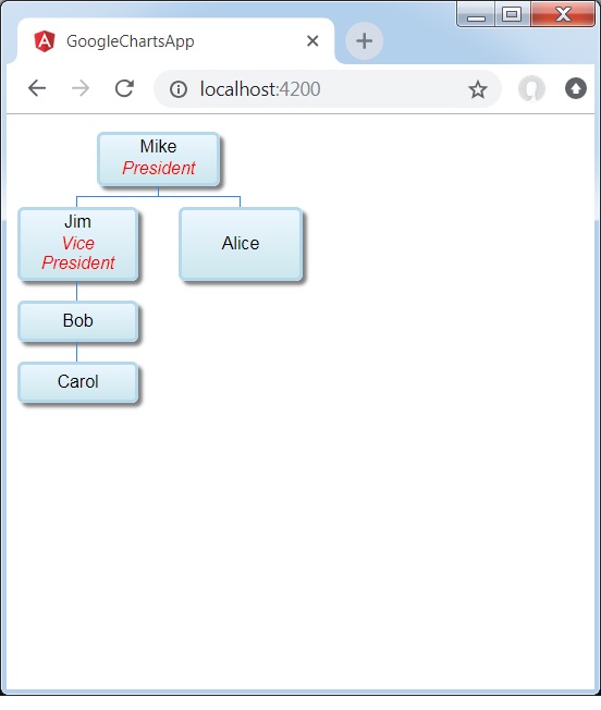
Angular Google Charts - Organization Chart
Organization chart helps in rendering a hierarchy of nodes, used to portray superior/subordinate relationships in an organization. For example, A family tree is a type of org chart. Following is an example of an Organization Chart.
We have already seen the configurations used to draw a chart in Google Charts Configuration Syntax chapter. Now, let us see an example of an Organization Chart.
Configurations
We've used OrgChart value to show Line based chart.
type = ChartType.OrgChart;
Example - Usage of Organization Chart
app.ts
import { Component, signal } from '@angular/core';
import { ChartType, GoogleChart } from 'angular-google-charts';

@Component({
   selector: 'app-root',
   imports: [GoogleChart],
   templateUrl: './app.html',
   styleUrl: './app.css'
})
export class App {
   protected readonly title = signal('google-charts-app');
   type = ChartType.OrgChart;
   data = [
      [{v:'Mike', f:'Mike<div style="color:red; font-style:italic">President</div>'},
         '', 'The President'],
      [{v:'Jim', f:'Jim<div style="color:red; font-style:italic">Vice President</div>'},
         'Mike', 'VP'],
      ['Alice', 'Mike', ''],
      ['Bob', 'Jim', 'Bob Sponge'],
      ['Carol', 'Bob', '']
   ];
   columnNames = ["Name","Manager","Tooltip"];
   options = {
       allowHtml: true
   };
   width = 550;
   height = 400;
}
Result
Verify the result.
Angular Google Charts - Pie Charts
Pie charts are used to draw pie based charts. In this section we're going to discuss following types of pie based charts.
| Sr.No | Chart Type / Description |
|---|---|
| 1 |
Basic Pie
Basic pie chart. |
| 2 |
Donut Chart
Donut Chart. |
| 3 |
3D Pie chart
3D Pie chart. |
| 4 |
Pie chart with exploded slices
Pie chart with exploded slices. |
Angular Google Charts - Sankey Charts
A sankey chart is a visualization tool and is used to depict a flow from one set of values to another. Connected objects are called nodes and the connections are called links. Sankeys are used to show a many-to-many mapping between two domains or multiple paths through a set of stages.
| Sr.No | Chart Type / Description |
|---|---|
| 1 |
Basic Sankey Chart
Basic Sankey Chart. |
| 2 |
Multilevel Sankey Chart
Multilevel Sankey Chart. |
| 3 |
Customizing Sankey Chart
Customized Sankey Chart. |
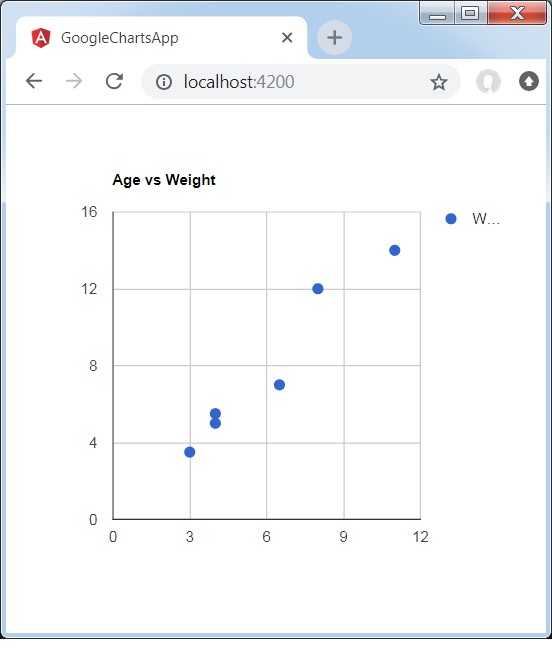
Angular Google Charts - Scatter Chart
Following is an example of a Scatter Chart.
We have already seen the configurations used to draw a chart in Google Charts Configuration Syntax chapter. Now, let us see an example of a Scatter Chart.
Configurations
We've used ScatterChart value to show Scatter chart.
type = ChartType.ScatterChart;
Example - Usage of Scatter Chart
app.ts
import { Component, signal } from '@angular/core';
import { ChartType, GoogleChart } from 'angular-google-charts';

@Component({
   selector: 'app-root',
   imports: [GoogleChart],
   templateUrl: './app.html',
   styleUrl: './app.css'
})
export class App {
   protected readonly title = signal('google-charts-app');
   type = ChartType.ScatterChart;
   data = [
      [8,12],
      [4, 5.5],
      [11,14],
      [4,5],
      [3,3.5],
      [6.5,7]
   ];
   columnNames = ['Age', 'Weight'];
   options = {
      title:'Age vs Weight'
   };
   width = 550;
   height = 400;
}
Result
Verify the result.
Angular Google Charts - Stepped Area Charts
A stepped area chart is a step based area chart. We're going to discuss following types of stepped area charts.
| Sr.No | Chart Type / Description |
|---|---|
| 1 |
Basic Stepped Chart
Basic Stepped Area Chart. |
| 2 |
Stacked Stepped Chart
Stacked Stepped Area Chart. |
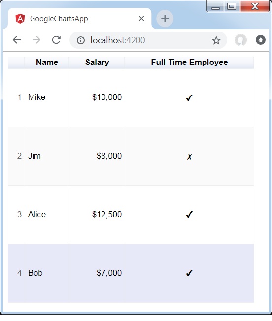
Angular Google Charts - Table Chart
Table chart helps in rendering a table which can be sorted and paged. Table cells can be formatted using format strings, or by directly inserting HTML as cell values. Numeric values are right-aligned by default; boolean values are displayed as check marks or cross marks. Users can select single rows either with the keyboard or the mouse. Column headers can be used for sorting. The header row remains fixed during scrolling. The table fires events corresponding to user interaction.
We have already seen the configurations used to draw a chart in Google Charts Configuration Syntax chapter. Now, let us see an example of a Table Chart.
Configurations
We've used Table value to show a Table Chart.
type = ChartType.Table;
Example - Usage of Table Chart
app.ts
import { Component, signal } from '@angular/core';
import { ChartType, GoogleChart } from 'angular-google-charts';

@Component({
   selector: 'app-root',
   imports: [GoogleChart],
   templateUrl: './app.html',
   styleUrl: './app.css'
})
export class App {
   protected readonly title = signal('google-charts-app');
   type = ChartType.Table;
   data = [
      ['Mike',  {v: 10000, f: '$10,000'}, true],
      ['Jim',   {v:8000,   f: '$8,000'},  false],
      ['Alice', {v: 12500, f: '$12,500'}, true],
      ['Bob',   {v: 7000,  f: '$7,000'},  true]
   ];
   columnNames = ["Name", "Salary","Full Time Employee"];
   options = {
     alternatingRowStyle:true,
     showRowNumber:true
   };
   width = 550;
   height = 400;
}
Result
Verify the result.
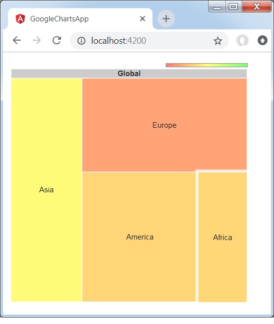
Angular Google Charts - TreeMap Chart
TreeMap is a visual representation of a data tree, where each node may have zero or more children, and one parent (except for the root). Each node is displayed as a rectangle, can be sized and colored according to values that we assign. Sizes and colors are valued relative to all other nodes in the graph. Following is an example of a treemap chart.
We have already seen the configurations used to draw a chart in Google Charts Configuration Syntax chapter. Now, let us see an example of a TreeMap Chart.
Configurations
We've used TreeMap value to show a TreeMap Chart.
type = ChartType.TreeMap;
Example - Usage of TreeMap Chart
app.ts
import { Component, signal } from '@angular/core';
import { ChartType, GoogleChart } from 'angular-google-charts';

@Component({
   selector: 'app-root',
   imports: [GoogleChart],
   templateUrl: './app.html',
   styleUrl: './app.css'
})
export class App {
   protected readonly title = signal('google-charts-app');
   type = ChartType.TreeMap;
   data = [
      ["Global",null,0,0],
      ["America","Global",0,0],
      ["Europe","Global",0,0],
      ["Asia","Global",0,0],
      ["Australia","Global",0,0],
      ["Africa","Global",0,0],

      ["USA","America",52,31],
      ["Mexico","America",24,12],
      ["Canada","America",16,-23],

      ["France","Europe",42,-11],
      ["Germany","Europe",31,-2],
      ["Sweden","Europe",22,-13],

      ["China","Asia",36,4],
      ["Japan","Asia",20,-12],
      ["India","Asia",40,63],

      ["Egypt","Africa",21,0],
      ["Congo","Africa",10,12],
      ["Zaire","Africa",8,10],

   ];
   columnNames = ["Location", "Parent","Market trade volume (size)","Market increase/decrease (color)"];
   options = {
      minColor:"#ff7777",
      midColor:'#ffff77',
      maxColor:'#77ff77',
      headerHeight:15,
      showScale:true
   };
   width = 550;
   height = 400;
}
Result
Verify the result.