- Angular Google Charts - Home
- Angular Google Charts - Overview
- Angular Google Charts - Environment Setup
- Angular Google Charts - Configuration Syntax
- Angular Google Charts - Area Charts
- Angular Google Charts - Bar Charts
- Angular Google Charts - Bubble Charts
- Angular Google Charts - Candlestick
- Angular Google Charts - Column Charts
- Angular Google Charts - Combination
- Angular Google Charts - Histogram
- Angular Google Charts - Line Charts
- Angular Google Charts - Maps
- Angular Google Charts - Organization
- Angular Google Charts - Pie Charts
- Angular Google Charts - Sankey Charts
- Angular Google Charts - Scatter Chart
- Angular Google Charts - Stepped Area Charts
- Angular Google Charts - Table Chart
- Angular Google Charts - TreeMap Chart
Angular Google Charts Resources
- Angular Google Charts - Quick Guide
- Angular Google Charts - Resources
- Angular Google Charts - Discussion
Selected Reading
Angular Google Charts - Combination Chart
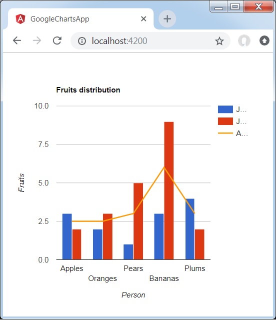
Combination chart helps in rendering each series as a different marker type from the following list: line, area, bars, candlesticks, and stepped area. To assign a default marker type for series, use the seriesType property. Series property is to be used to specify properties of each series individually. Following is an example of a Column Chart showing differences.
We have already seen the configurations used to draw a chart in Google Charts Configuration Syntax chapter. Now, let us see an example of a Column Chart showing differences.
Configurations
We've used ComboChart value to show a Combination Chart.
type=ChartType.ComboChart;
Example - Usage of ComboChart
app.ts
import { Component, signal } from '@angular/core';
import { ChartType, GoogleChart } from 'angular-google-charts';

@Component({
   selector: 'app-root',
   imports: [GoogleChart],
   templateUrl: './app.html',
   styleUrl: './app.css'
})
export class App {
   protected readonly title = signal('google-charts-app');
   type = ChartType.ComboChart;
   data = [
      ["Apples", 3, 2, 2.5],
      ["Oranges",2, 3, 2.5],
      ["Pears", 1, 5, 3],
      ["Bananas", 3, 9, 6],
      ["Plums", 4, 2, 3]
   ];
   columnNames = ['Fruits', 'Jane','Jone','Average'];
   options = {
      title: 'Fruits distribution',
      hAxis: {
         title: 'Person'
      },
      vAxis:{
         title: 'Fruits'
      },
      seriesType: 'bars',
      series: {2: {type: 'line'}}
   };
   width = 550;
   height = 400;
}
Result
Verify the result.

Advertisements