- Angular Google Charts - Home
- Angular Google Charts - Overview
- Angular Google Charts - Environment Setup
- Angular Google Charts - Configuration Syntax
- Angular Google Charts - Area Charts
- Angular Google Charts - Bar Charts
- Angular Google Charts - Bubble Charts
- Angular Google Charts - Candlestick
- Angular Google Charts - Column Charts
- Angular Google Charts - Combination
- Angular Google Charts - Histogram
- Angular Google Charts - Line Charts
- Angular Google Charts - Maps
- Angular Google Charts - Organization
- Angular Google Charts - Pie Charts
- Angular Google Charts - Sankey Charts
- Angular Google Charts - Scatter Chart
- Angular Google Charts - Stepped Area Charts
- Angular Google Charts - Table Chart
- Angular Google Charts - TreeMap Chart
Angular Google Charts Resources
- Angular Google Charts - Quick Guide
- Angular Google Charts - Resources
- Angular Google Charts - Discussion
Selected Reading
Angular Google Charts - Histogram with Custom Color
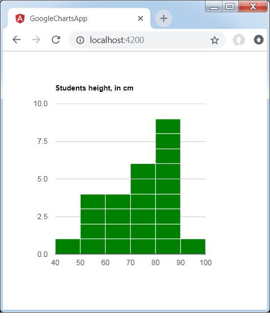
Following is an example of a customized Histogram Chart.
We have already seen the configurations used to draw a chart in Google Charts Configuration Syntax chapter. Now, let us see an example of a Histogram Chart with custom color.
Configurations
We've used color configuration to change default color of histogram chart.
options = {
   legend:'none',
   colors:['green']
};
Example - Usage of Customized Histogram Chart
app.ts
import { Component, signal } from '@angular/core';
import { ChartType, GoogleChart } from 'angular-google-charts';

@Component({
   selector: 'app-root',
   imports: [GoogleChart],
   templateUrl: './app.html',
   styleUrl: './app.css'
})
export class App {
   protected readonly title = signal('google-charts-app');
   type = ChartType.Histogram;
   data = [
      ["1", 80],["2", 55],["3", 68],["4", 80],["5", 54],
      ["6", 70],["7", 85],["8", 78],["9", 70],["10", 58],
      ["11", 90],["12", 65],["13", 88],["14", 82],["15", 65],
      ["16", 86],["17", 45],["18", 62],["19", 84],["20", 75],
      ["21", 82],["22", 75],["23", 58],["24", 70],["25", 85]
   ];
   columnNames = ["Student Roll No", "height"];
   options = {
      title: 'Students height, in cm',
      legend:'none',
	  colors:['green']
   };
   width = 550;
   height = 400;
}
Result
Verify the result.
angular_googlecharts_histogram_charts.htm

Advertisements