- Angular Google Charts - Home
- Angular Google Charts - Overview
- Angular Google Charts - Environment Setup
- Angular Google Charts - Configuration Syntax
- Angular Google Charts - Area Charts
- Angular Google Charts - Bar Charts
- Angular Google Charts - Bubble Charts
- Angular Google Charts - Candlestick
- Angular Google Charts - Column Charts
- Angular Google Charts - Combination
- Angular Google Charts - Histogram
- Angular Google Charts - Line Charts
- Angular Google Charts - Maps
- Angular Google Charts - Organization
- Angular Google Charts - Pie Charts
- Angular Google Charts - Sankey Charts
- Angular Google Charts - Scatter Chart
- Angular Google Charts - Stepped Area Charts
- Angular Google Charts - Table Chart
- Angular Google Charts - TreeMap Chart
Angular Google Charts Resources
- Angular Google Charts - Quick Guide
- Angular Google Charts - Resources
- Angular Google Charts - Discussion
Selected Reading
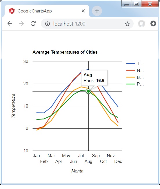
Angular Google Charts - Line Chart with Crosshairs
Following is an example of a basic line chart with crosshairs to appear on selecting a data point.
We have already seen the configurations used to draw a chart in Google Charts Configuration Syntax chapter. Now, let us see an example of a Line Chart with a crosshair.
Configurations
We've used crosshar configuration to set crosshair.
options = {
   crosshair:{
      color:'#000000',
      trigger:'selection'
   }
};
Example - Usage of Line Chart with Crosshair
app.ts
import { Component, signal } from '@angular/core';
import { ChartType, GoogleChart } from 'angular-google-charts';

@Component({
   selector: 'app-root',
   imports: [GoogleChart],
   templateUrl: './app.html',
   styleUrl: './app.css'
})
export class App {
   protected readonly title = signal('google-charts-app');
   type = ChartType.LineChart;
   data = [
      ["Jan",  7.0, -0.2, -0.9, 3.9],
      ["Feb",  6.9, 0.8, 0.6, 4.2],
      ["Mar",  9.5,  5.7, 3.5, 5.7],
      ["Apr",  14.5, 11.3, 8.4, 8.5],
      ["May",  18.2, 17.0, 13.5, 11.9],
      ["Jun",  21.5, 22.0, 17.0, 15.2],
      ["Jul",  25.2, 24.8, 18.6, 17.0],
      ["Aug",  26.5, 24.1, 17.9, 16.6],
      ["Sep",  23.3, 20.1, 14.3, 14.2],
      ["Oct",  18.3, 14.1, 9.0, 10.3],
      ["Nov",  13.9,  8.6, 3.9, 6.6],
      ["Dec",  9.6,  2.5,  1.0, 4.8]
   ];
   columnNames = ["Month", "Tokyo", "New York","Berlin", "Paris"];
   options = {
      title: 'Average Temperatures of Cities',
      hAxis: {
         title: 'Month'
      },
      vAxis:{
         title: 'Temperature'
      },
      crosshair:{
	     color:'#000000',
	     trigger:'selection'
      }
   };
   width = 550;
   height = 400;
}
Result
Verify the result.
angular_googlecharts_line_charts.htm

Advertisements