- Project Management Concepts
- Project Management Home
- Activity Based Costing
- Agile Project Management
- Basic Management Skills
- Basic Quality Tools
- Benchmarking Process
- Cause and Effect Diagram
- Change Management Process
- Communication Blockers
- Communication Channels
- Communication Methods
- Communication Models
- Communications Management
- Conflict Management
- Crisis Management
- Critical Chain Scheduling
- Critical Path Method
- Decision Making Process
- Design of Experiment
- Effective Communication Skills
- Effective Presentation Skills
- Enterprise Resource Planning
- Event Chain Methodology
- Extreme Project Management
- Gantt Chart Tool
- Just-In-Time Manufacturing
- Knowledge Management
- Leads, Lags and Floats
- Management Best Practices
- Management Styles
- Management by Objectives
- Monte Carlo Analysis
- Motivation Theories
- Negotiation Skills
- Organizational Structures
- PERT Estimation Technique
- PRINCE2 Project Methodology
- Pareto Chart Tool
- Powerful Leadership Skills
- Process Based Management
- Procurement Documents
- Procurement Management
- Project Activity Diagram
- Project Charter
- Project Contract Types
- Project Cost Control
- Project Kick-off Meeting
- Project Lessons Learned
- Project Management Methodologies
- Project Management Office
- Project Management Processes
- Project Management Tools
- Project Management Triangle
- Project Manager Goals
- Project Portfolio Management
- Project Quality Plan
- Project Records Management
- Project Risk Categories
- Project Risk Management
- Project Scope Definition
- Project Selection Method
- Project Success Criteria
- Project Time Management
- Project Workforce Management
- Project Management Softwares
- QC and QA Processes
- RACI Chart Tool
- Recognition and Rewards
- Requirement Collection
- Resource Leveling
- Staffing Management Plan
- Stakeholder Management
- Statement of Work (SOW)
- Stress Management Techniques
- Structured Brainstorming
- Succession Planning
- Supply Chain Management
- Team Building Program
- Team Motivation
- The Balanced Scorecard
- The Halo Effect
- The Make or Buy Decision
- The Rule of Seven
- The Virtual Team
- Total Productive Maintenance
- Total Quality Management
- Traditional Project Management
- Work Breakdown Structure
Pareto Chart Tool
Introduction
Setting priorities is one of the main management functions of an organization. If the managers do not prioritize their tasks and organizational objectives, the organization will head towards the wrong direction and eventually collapse.
Therefore, management is required to prioritize their tasks and focus on the priority items that will have a high impact on the organization.
Pareto Chart tool is one of the most effective tools that the management can use when it comes to identifying the facts needed for setting priorities. Pareto charts clearly illustrate the information in an organized and relative manner.
This way, the management can find out the relative importance of problems or causes of the problems. When it comes to prioritizing the causes of the problem, a Pareto chart can be used together with a cause-and-effect diagram.
Once the Pareto chart is created, it shows you a vertical bar chart with the highest importance to the lowest. The importance of each parameter is measured by several factors such as frequency, time, cost, etc.
The Pareto Principle
Pareto charts are created based on the Pareto principle. The principle suggests that when a number of factors affect a situation, fewer factors will be accountable for the most of the affect.
This is almost the same as 80/20 theory that you may have heard of. It says that 80% of the impact is made by 20% of causes.
The Practical Importance
When a team works together in a large and complex project, it can be quite tricky to understand the importance of certain issues. Pareto charts can show the team a few important things that really matter the most.
Most teams use Pareto charts over time in order to identify whether the suggested solution really answers the problem. If the solution is effective, the relative importance of the identified factor should take a lesser value over time.
Creating a Pareto Chart
Step 1
First of all, list down everything you need to compare. This can be a list of issues, items, or a list of problem causes.
Step 2
Decide on the standard measures to compare the list items. You need to consider organizational objectives and current trends in order to determine the measures. Some measures are:
Frequency - How often it occurs (Errors, complaints, complications, etc.)
Cost - How many resources are being utilized or affected
Time - How long it takes
Step 3
Select a timeframe for the data collection process.
Step 4
Now, we do some simple math with the data we collected. Take each list item (or cause) and record it against the measurement selected. Then, determine its percentage in the context and all item occurrences.
As an example, if the list of item contains causes behind late comers to office, the tallying table will look like below.
| Cause For Late Coming | Occurrences | % Count |
|---|---|---|
| Road Traffic | 32 | 44 |
| Rain or Snow | 3 | 4 |
| Not Feeling Good | 6 | 8 |
| Late Public Transportation | 4 | 6 |
| Personal Commitments | 8 | 11 |
| Work till Late Night | 20 | 27 |
| Total | 73 | 100 |
Step 5
Now, rearrange the list and list the item in decreasing order. In our example, list it from the highest number of occurrences to the least number of occurrences. Then, record the cumulative percentage when you travel from the top item to the bottom item.
Refer the following example:
| Cause For Late Coming | Occurrences | % Count | Cumulative % |
|---|---|---|---|
| Road Traffic | 32 | 44 | 44 |
| Work till Late Night | 20 | 27 | 71 |
| Personal Commitments | 8 | 11 | 82 |
| Not Feeling Good | 6 | 8 | 90 |
| Late Public Transportation | 4 | 6 | 96 |
| Rain or Snow | 73 | 100 | 100 |
Step 6
Create a bar chart. The list items should be displayed along the 'Y' axis from highest to the lowest. Left vertical axis should be the measure that you selected.
In our example, it should be the number of occurrences. Select the right vertical axis as the cumulative percentage. Each item should have a bar.
Step 7
Now, draw a line graph for cumulative percentages. The first point of the line should be on the top of the first bar. You can use spreadsheet software such as Microsoft Excel for this step.
It offers many tools for creating and analyzing graphs. Now, you should have something like this.
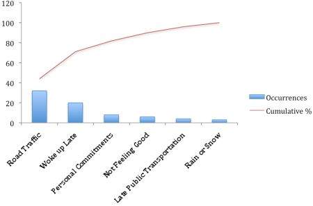
Step 8
Analyze your chart. You now need to identify the items that appear to have the most impact. Identify the breakpoint (a rapid change) in the graph (refer the red circle).
If there is no breakpoint, account the causes/items that have 50% or more impact. In our example, there is a visible breakpoint.
There are two causes before the breakpoint, Road traffic and Work till Late Night. Therefore, the two causes that have the most affect to our problem are Road Traffic and Work till Late Night.
Conclusion
Pareto charts can be really useful when used in the proper context. This helps the management to prioritize tasks, risks, activities and causes.
Therefore, Pareto charts should be used as much as possible when it comes to day-to-day prioritization.