- Excel Charts Tutorial
- Excel Charts - Home
- Excel Charts - Introduction
- Excel Charts - Creating Charts
- Excel Charts - Types
- Excel Charts - Column Chart
- Excel Charts - Line Chart
- Excel Charts - Pie Chart
- Excel Charts - Doughnut Chart
- Excel Charts - Bar Chart
- Excel Charts - Area Chart
- Excel Charts - Scatter (X Y) Chart
- Excel Charts - Bubble Chart
- Excel Charts - Stock Chart
- Excel Charts - Surface Chart
- Excel Charts - Radar Chart
- Excel Charts - Combo Chart
- Excel Charts - Chart Elements
- Excel Charts - Chart Styles
- Excel Charts - Chart Filters
- Excel Charts - Fine Tuning
- Excel Charts - Design Tools
- Excel Charts - Quick Formatting
- Excel Charts - Aesthetic Data Labels
- Excel Charts - Format Tools
- Excel Charts - Sparklines
- Excel Charts - PivotCharts
- Excel Charts Useful Resources
- Excel Charts - Quick Guide
- Excel Charts - Useful Resources
- Excel Charts - Discussion
Excel Charts - Scatter (X Y) Chart
Scatter (X Y) charts are typically used for showing and comparing numeric values, like scientific, statistical, and engineering data.
A Scatter Chart has two value axes −
- Horizontal (x) value axis
- Vertical (y) value axis
It combines x and y values into single data points and shows them in irregular intervals, or clusters.
Consider using a Scatter chart when −
You want to change the scale of the horizontal axis.
You want to make that axis a logarithmic scale.
Values for horizontal axis are not evenly spaced.
There are many data points on the horizontal axis.
You want to adjust the independent axis scales of a scatter chart to reveal more information about the data that includes pairs or grouped sets of values.
You want to show similarities between large sets of data instead of the differences between the data points.
You want to compare many data points regardless of the time.
The more data that you include in a Scatter chart, the better the comparisons.
Follow the steps given below to insert a Scatter chart in your worksheet.
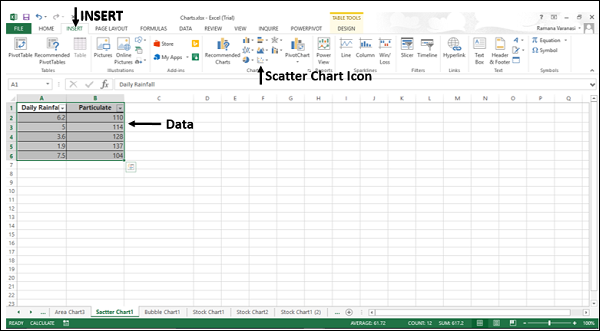
Step 1 − Arrange the data in columns or rows on the worksheet.
Step 2 − Place the x values in one row or column, and then enter the corresponding y values in the adjacent rows or columns.
Step 3 − Select the data.
Step 4 − On the INSERT tab, in the Charts group, click the Scatter chart icon on the Ribbon.
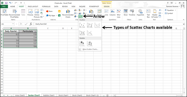
You will see the different types of available Scatter charts.
A Scatter chart has the following sub-types −
Scatter
Scatter with Smooth Lines and Markers
Scatter with Smooth Lines
Scatter with Straight Lines and Markers
Scatter with Straight Lines
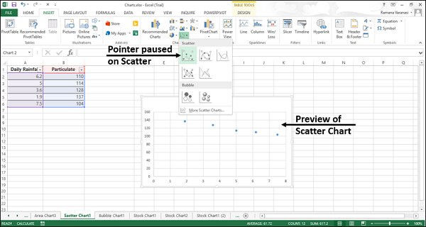
Step 5 − Point your mouse on each of the icons. A preview of that chart type will be shown on the worksheet.
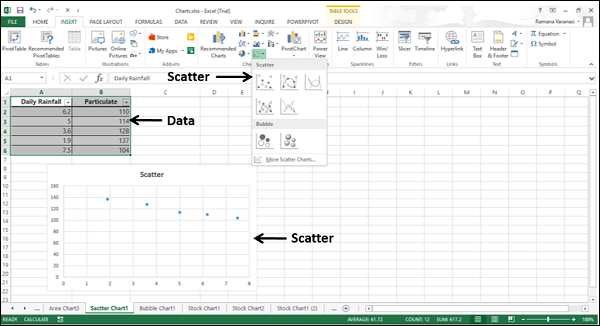
Step 6 − Double-click the chart type that suits your data.
In this chapter, you will understand when each of the Scatter chart is useful.
Scatter Chart
Scatter charts are useful to compare at least two sets of values or pairs of data. Scatter charts show relationships between sets of values.
Use Scatter charts when the data represents separate measurements.
Types of Scatter Charts
The following section explains the different options available to display a Scatter chart.
Scatter with smooth lines and markers and scatter with smooth lines.
Scatter with Smooth Lines and Markers and Scatter with Smooth Lines display a smooth curve that connects the data points. Scatter with Smooth Lines and Markers and Scatter with Smooth Lines are useful to compare at least two sets of values or pairs of data.
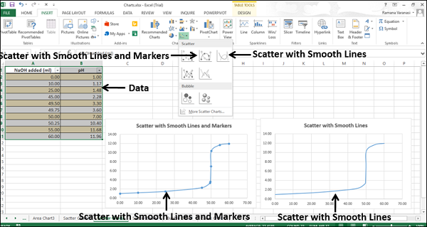
Use Scatter with Smooth Lines and Markers and Scatter with Smooth Lines charts when the data represents a set of x, y pairs based on a formula.
Use Scatter with Smooth Lines and Markers when there are a few data points.
Use Scatter with Smooth Lines when there are many data points.
Scatter with Straight Lines and Markers and Scatter with Straight Lines
Scatter with Straight Lines and Markers and Scatter with Straight Lines connects the data points with straight lines. Scatter with Straight Lines and Markers and Scatter with Straight Lines are useful to compare at least two sets of values or pairs of data.
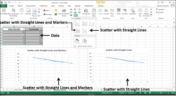
Use Scatter with Straight Lines and Markers and Scatter with Straight Lines charts when the data represents separate measurements.
Use Scatter with Straight Lines and Markers when there are a few data points.
Use Scatter with Straight Lines when there are many data points.