- Excel Charts Tutorial
- Excel Charts - Home
- Excel Charts - Introduction
- Excel Charts - Creating Charts
- Excel Charts - Types
- Excel Charts - Column Chart
- Excel Charts - Line Chart
- Excel Charts - Pie Chart
- Excel Charts - Doughnut Chart
- Excel Charts - Bar Chart
- Excel Charts - Area Chart
- Excel Charts - Scatter (X Y) Chart
- Excel Charts - Bubble Chart
- Excel Charts - Stock Chart
- Excel Charts - Surface Chart
- Excel Charts - Radar Chart
- Excel Charts - Combo Chart
- Excel Charts - Chart Elements
- Excel Charts - Chart Styles
- Excel Charts - Chart Filters
- Excel Charts - Fine Tuning
- Excel Charts - Design Tools
- Excel Charts - Quick Formatting
- Excel Charts - Aesthetic Data Labels
- Excel Charts - Format Tools
- Excel Charts - Sparklines
- Excel Charts - PivotCharts
- Excel Charts Useful Resources
- Excel Charts - Quick Guide
- Excel Charts - Useful Resources
- Excel Charts - Discussion
Excel Charts - Radar Chart
Radar charts compare the aggregate values of several data series.
To insert a Radar chart in your worksheet, follow the steps given below.
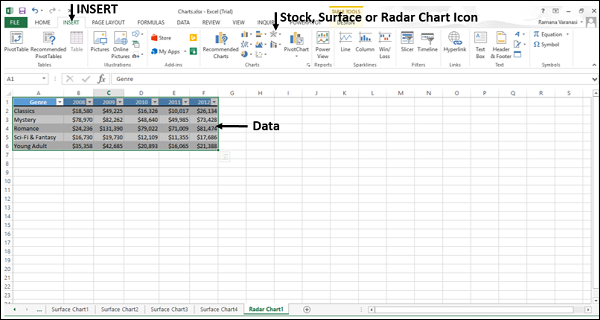
Step 1 − Arrange the data in columns or rows on the worksheet.
Step 2 − Select the data.
Step 3 − On the INSERT tab, in the Charts group, click the Stock, Surface or Radar Chart icon on the Ribbon.
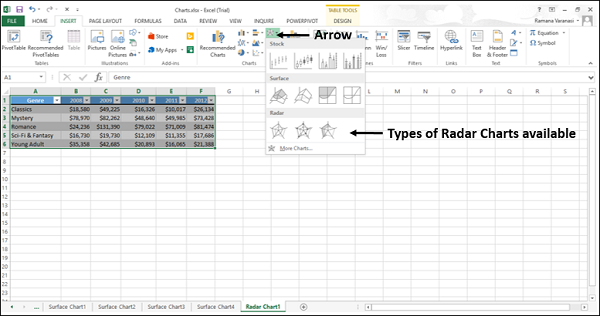
You will see the different types of available Radar charts.
A Radar chart has the following sub-types −
- Radar
- Radar with Markers
- Filled Radar
Step 4 − Point your mouse on each of the icons. A preview of that chart type will be shown on the worksheet.
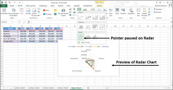
Step 5 − Double-click the chart type that suits your data.
In this chapter, you will understand when each of the Radar chart types is useful.
Radar and Radar with Markers
Radar and Radar with Markers show values relative to a center point. Radar with Markers shows with the markers for the individual points and Radar shows without the markers for the individual points.
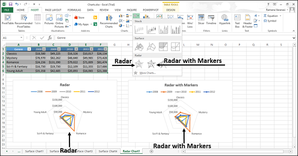
You can use the Radar and Radar with Marker charts when the categories are not directly comparable.
Filled Radar
In a Filled Radar chart, the area covered by a data series is filled with a color. As in Radar chart, Filled Radar chart shows values relative to a center point.
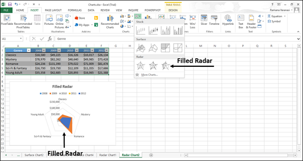
You can use Filled Radar charts when the categories are not directly comparable.