- Excel Charts Tutorial
- Excel Charts - Home
- Excel Charts - Introduction
- Excel Charts - Creating Charts
- Excel Charts - Types
- Excel Charts - Column Chart
- Excel Charts - Line Chart
- Excel Charts - Pie Chart
- Excel Charts - Doughnut Chart
- Excel Charts - Bar Chart
- Excel Charts - Area Chart
- Excel Charts - Scatter (X Y) Chart
- Excel Charts - Bubble Chart
- Excel Charts - Stock Chart
- Excel Charts - Surface Chart
- Excel Charts - Radar Chart
- Excel Charts - Combo Chart
- Excel Charts - Chart Elements
- Excel Charts - Chart Styles
- Excel Charts - Chart Filters
- Excel Charts - Fine Tuning
- Excel Charts - Design Tools
- Excel Charts - Quick Formatting
- Excel Charts - Aesthetic Data Labels
- Excel Charts - Format Tools
- Excel Charts - Sparklines
- Excel Charts - PivotCharts
- Excel Charts Useful Resources
- Excel Charts - Quick Guide
- Excel Charts - Useful Resources
- Excel Charts - Discussion
Excel Charts - Line Chart
Line charts can show continuous data over time on an evenly scaled Axis. Therefore, they are ideal for showing trends in data at equal intervals, such as days, months, quarters or years.
In a Line chart −
Category data is distributed evenly along the horizontal axis.
Value data is distributed evenly along the vertical axis.
Follow the steps given below to insert a Line chart in your worksheet.
Step 1 − Arrange the data in columns or rows on the worksheet.
Step 2 − Select the data.
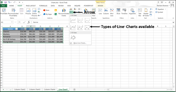
Step 3 − On the INSERT tab, in the Charts group, click the Line chart icon on the Ribbon.
You will see the different Line charts available.
A Line chart has the following sub-types −
2-D Line charts
Line
100% Stacked Line
Line with Markers
Stacked Line with Markers
100% Stacked Line with Markers
3-D Line charts
3-D Line
Step 4 − Point your mouse on each of the icons. A preview of that line type will be shown on the worksheet.
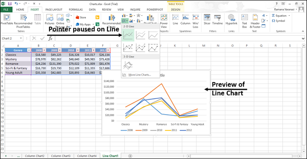
Step 5 − Double-click the chart type that suits your data.
In this chapter, you will understand when each of the line chart types is useful.
Line and Line with Markers
Line charts indicate individual data values. Line charts work best when you have multiple data series in your chart.
Line charts can show trends over −
Time (days, months, quarters or years), or
Evenly spaced Categories.
A Line chart can be with or without markers.
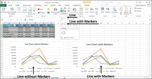
You can use a Line chart without markers when −
The order of categories is important.
There are many categories or if the values are approximate.
You can use a Line chart with Markers when −
The order of categories is important.
There are only a few categories.
Stacked Line and Stacked Line with Markers
Stacked Line charts indicate individual data values. Stacked Line Charts can show the trend of the contribution of each value over −
- Time, or
- Evenly spaced Categories.
Stacked Line charts can be with or without markers.

You can use a stacked line chart without markers when there are many categories or if the values are approximate. You can use a stacked line chart with markers when there are only a few categories.
Reading Stacked Line charts can be difficult as −
They sum the data, which might not be the result you want.
It might not be easy to see that the lines are stacked.
To overcome the difficulties, you can use a Stacked Area chart instead.
100% Stacked Line and 100% Stacked Line with Markers
100% Stacked Line charts indicate individual data values. 100% Stacked Line charts can show the trend of the percentage of each value over −
- Time, or
- Evenly spaced Categories
100% Stacked Line chart can be with or without Markers.
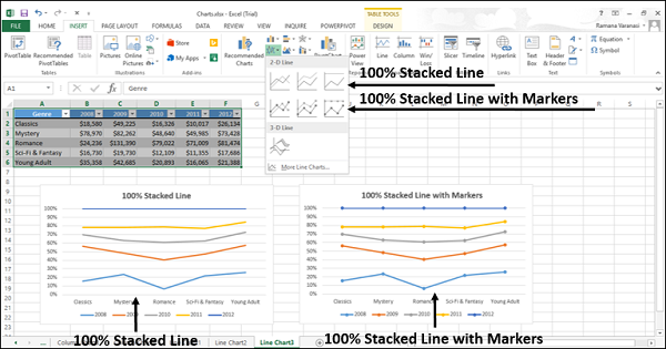
You can use a 100% Stacked Line chart without Markers when there are many categories or if the values are approximate. You can use a 100% Stacked Line chart with markers when there are a few categories.
Reading Stacked Line charts can be difficult. You can use a 100% Stacked Area chart instead.
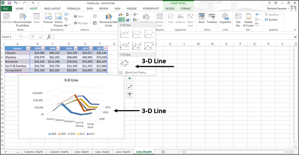
3-D Line
3-D Line charts show each row or column of data as a 3-D Ribbon. 3-D Line charts can show trends over −
- Time (days, months, quarters or years), or
- Categories.
A 3-D Line chart has horizontal, vertical, and depth axes that you can change. The third axis can show some lines in front of others.