- Excel Charts Tutorial
- Excel Charts - Home
- Excel Charts - Introduction
- Excel Charts - Creating Charts
- Excel Charts - Types
- Excel Charts - Column Chart
- Excel Charts - Line Chart
- Excel Charts - Pie Chart
- Excel Charts - Doughnut Chart
- Excel Charts - Bar Chart
- Excel Charts - Area Chart
- Excel Charts - Scatter (X Y) Chart
- Excel Charts - Bubble Chart
- Excel Charts - Stock Chart
- Excel Charts - Surface Chart
- Excel Charts - Radar Chart
- Excel Charts - Combo Chart
- Excel Charts - Chart Elements
- Excel Charts - Chart Styles
- Excel Charts - Chart Filters
- Excel Charts - Fine Tuning
- Excel Charts - Design Tools
- Excel Charts - Quick Formatting
- Excel Charts - Aesthetic Data Labels
- Excel Charts - Format Tools
- Excel Charts - Sparklines
- Excel Charts - PivotCharts
- Excel Charts Useful Resources
- Excel Charts - Quick Guide
- Excel Charts - Useful Resources
- Excel Charts - Discussion
Excel Charts - Chart Elements
Chart elements give more descriptions to your charts, thus making your data more meaningful and visually appealing. In this chapter, you will learn about the chart elements.
Follow the steps given below to insert the chart elements in your graph.
Step 1 − Click the chart. Three buttons appear at the upper-right corner of the chart. They are −
 Chart Elements
 Chart Styles and Colors, and
 Chart Filters
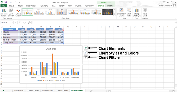
Step 2 − Click the Chart Elements icon. A list of available elements will be displayed.
The following chart elements are available −
- Axes
- Axis titles
- Chart titles
- Data labels
- Data table
- Error bars
- Gridlines
- Legend
- Trendline
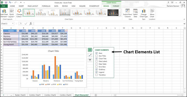
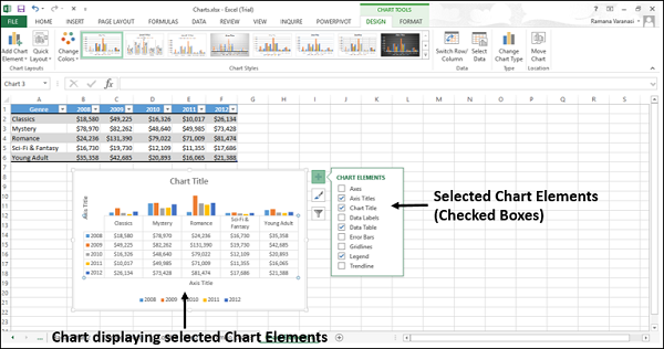
You can add, remove or change these chart elements.
Step 3 − Point on each of these chart elements to see a preview of how they are displayed. For example, select Axis Titles. The Axis Titles of both, the horizontal and the vertical axes appear and are highlighted.
A ![]() appears next to Axis Titles in the chart elements list.
appears next to Axis Titles in the chart elements list.
Step 4 − Click ![]() to see the options for Axis Titles.
to see the options for Axis Titles.
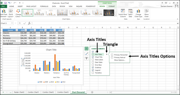
Step 5 − Select/deselect the chart elements, which you want in your chart to be displayed, from the list.
In this chapter, you will understand the different chart elements and their usage.
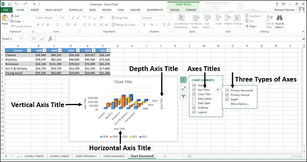
Axes
Charts typically have two axes that are used to measure and categorize the data −
- A vertical axis (also known as value axis or y axis), and
- A horizontal axis (also known as category axis or x axis)
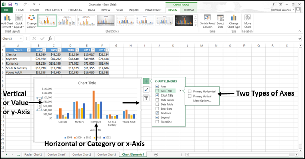
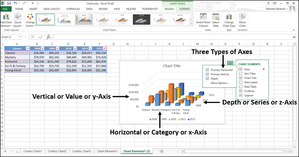
3-D Column charts have a third axis, the depth axis (also known as the series axis or the z axis), so that the data can be plotted along the depth of a chart.
Radar charts do not have horizontal (Category) axes. Pie and Doughnut charts do not have any axes.
Not all chart types display axes the same way.
x y (Scatter) charts and Bubble charts show numeric values on both the horizontal axis and the vertical axes.
Column, Line, and Area charts, show numeric values on the vertical (value) axis only and show textual groupings (or categories) on the horizontal axis. The depth (series) axis is another form of category axis.
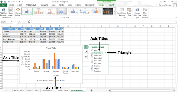
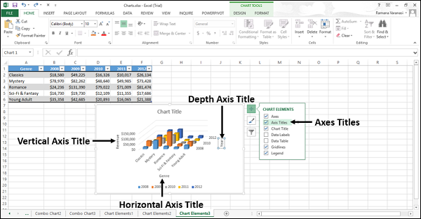
Axis Titles
Axis titles give the understanding of the data of what the chart is all about.
You can add axis titles to any horizontal, vertical, or the depth axes in the chart.
You cannot add axis titles to charts that do not have axes (Pie or Doughnut charts).
To add Axis Titles,
Step 1 − Click on the chart.
Step 2 − Click the Chart Elements icon.
Step 3 − From the list, select Axes Titles. Axes titles appear for horizontal, vertical and depth axes.
Step 4 − Click the Axis Title on the chart and modify the axes titles to give meaningful names to the data they represent.
You can link the axes titles to the cells containing text on the worksheet. When the text on the worksheet changes, the axes titles also change accordingly.
Step 1 − On the chart, click any axis title box.
Step 2 − On the worksheet, in the formula bar, type an equal-to sign (=). Select the worksheet cell that contains the text that you want to use for the axis title. Press Enter.
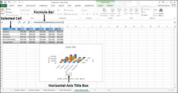
The axis title changes to the text contained in the linked cell.
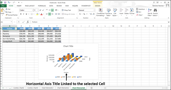
Chart Title
When you create a chart, a Chart Title box appears above the chart.
To add a chart title −
Step 1 − Click on the chart.
Step 2 − Click the Chart Elements icon.
Step 3 − From the list, select Chart Title. A Chart Title box appears above the graph chart.
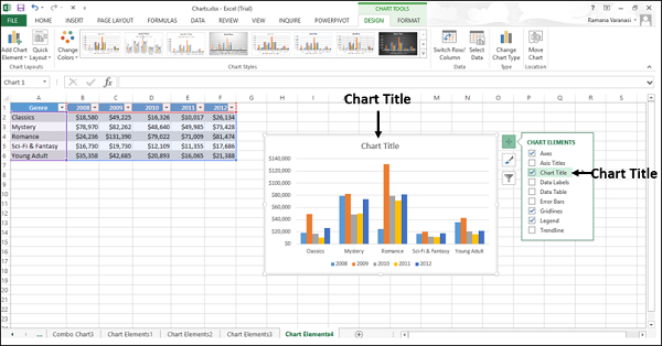
Step 4 − Select Chart Title and type the title you want.
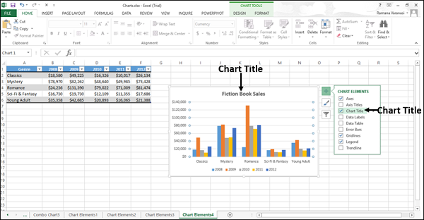
You can link the chart title to the cells containing text on the worksheet. When the text on the worksheet changes, the chart title also changes accordingly.
To link the chart title to a cell follow the steps given below.
Step 1 − On the chart, click the chart title box.
Step 2 − On the worksheet, in the formula bar, type an equal-to sign (=). Select the worksheet cell that contains the text that you want to use as the chart title. Press Enter.
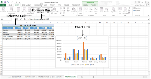
The chart title changes to the text contained in the linked cell.
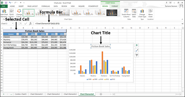
When you change the text in the linked cell, the chart title will change.
Data Labels
Data labels make a chart easier to understand because they show the details about a data series or its individual data points.
Consider the Pie chart as shown in the image below.
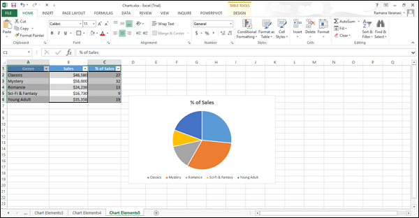
From the chart, we understand that both the classics and the mystery contribute more percentage to the total sales. However, we cannot make out the percentage contribution of each.
Now, let us add data Labels to the Pie chart.
Step 1 − Click on the Chart.
Step 2 − Click the Chart Elements icon.
Step 3 − Select Data Labels from the chart elements list. The data labels appear in each of the pie slices.
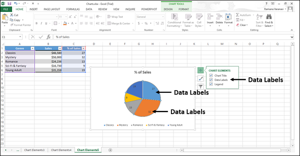
From the data labels on the chart, we can easily read that Mystery contributed to 32% and Classics contributed to 27% of the total sales.
You can change the location of the data labels within the chart, to make them more readable.
Step 4 − Click the ![]() icon to see the options available for data labels.
icon to see the options available for data labels.
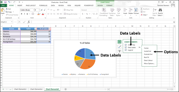
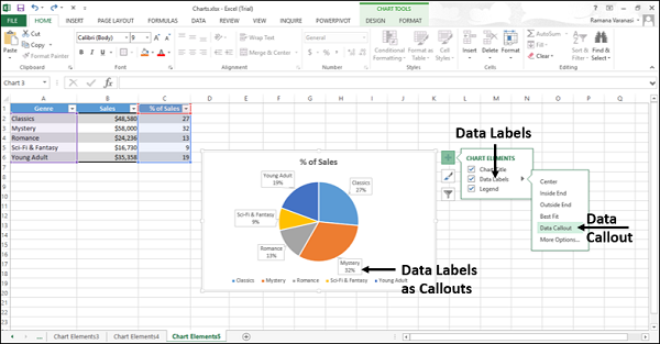
Step 5 − Point on each of the options to see how the data labels will be located on your chart. For example, point to data callout.
The data labels are placed outside the pie slices in a callout.
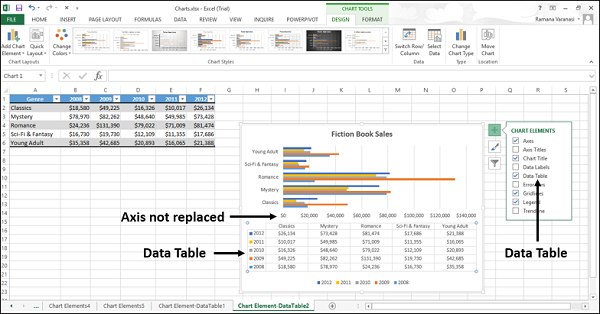
Data Table
Data Tables can be displayed in line, area, column, and bar charts. Follow the steps to insert a data table in your chart.
Step 1 − Click on the chart.
Step 2 − Click the Chart Elements icon.
Step 3 − From the list, select Data Table. The data table appears below the chart. The horizontal axis is replaced by the header row of the data table.
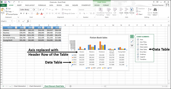
In bar charts, the data table does not replace an axis of the chart but is aligned to the chart.
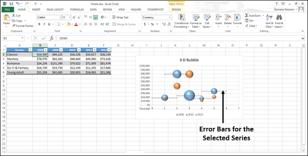
Error Bars
Error bars graphically express the potential error amounts relative to each data marker in a data series. For example, you can show 5% positive and negative potential error amounts in the results of a scientific experiment.
You can add Error bars to a data series in 2-D area, bar, column, line, x y (scatter), and bubble charts.
To add Error bars, follow the steps given below −
Step 1 − Click on the Chart.
Step 2 − Click the Chart Elements icon.
Step 3 − From the list, select Error bars. Click the ![]() icon to see the options available for Error bars.
icon to see the options available for Error bars.
Step 4 − Click More Options… from the list displayed. A small window to add series will open.
Step 5 − Select the series. Click OK.
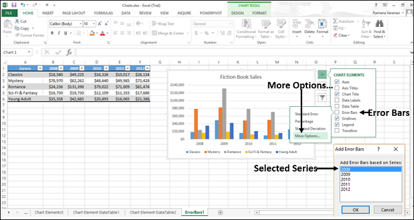
The Error bars will appear for the selected series.
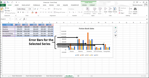
If you change the values on the worksheet associated with the data points in the series, the error bars are adjusted to reflect your changes.
For X Y (Scatter) and Bubble charts, you can display the error bars for the X values, the Y values, or both.
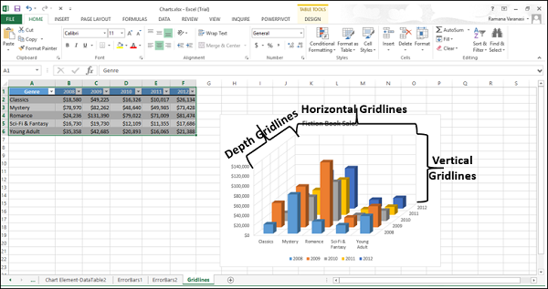
Gridlines
In a chart that displays the axes, to make the data easier to read, you can display the horizontal and the vertical chart gridlines.
Gridlines extend from any horizontal and vertical axes across the plot area of the chart.
You can also display the depth gridlines in 3-D charts.
To insert gridlines −
Step 1 − Click on the 3-D column chart.
Step 2 − Click the Chart Elements icon.
Step 3 − From the list, select Error bars. Click the ![]() icon to see the options available for gridlines.
icon to see the options available for gridlines.
Step 4 − Select Primary Major Horizontal, Primary Major Vertical and Depth Major from the list displayed.
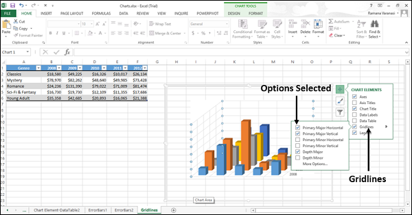
The selected gridlines will be displayed on the chart.
You cannot display gridlines for the chart types that do not display axes, i.e., Pie charts and Doughnut charts.
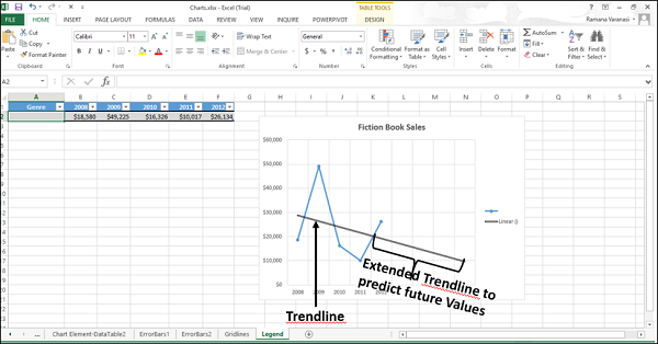
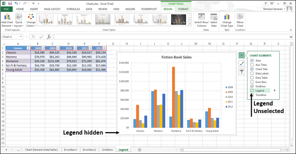
Legend
When you create a chart, the Legend appears by default.
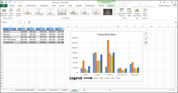
You can hide a Legend by deselecting it from the Chart Elements list.
Trendline
Trendlines are used to graphically display the trends in data and to analyze the problems of prediction. Such analysis is also called regression analysis.
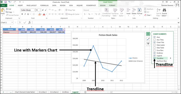
By using regression analysis, you can extend a trendline in a chart beyond the actual data to predict the future values.