- Excel Charts Tutorial
- Excel Charts - Home
- Excel Charts - Introduction
- Excel Charts - Creating Charts
- Excel Charts - Types
- Excel Charts - Column Chart
- Excel Charts - Line Chart
- Excel Charts - Pie Chart
- Excel Charts - Doughnut Chart
- Excel Charts - Bar Chart
- Excel Charts - Area Chart
- Excel Charts - Scatter (X Y) Chart
- Excel Charts - Bubble Chart
- Excel Charts - Stock Chart
- Excel Charts - Surface Chart
- Excel Charts - Radar Chart
- Excel Charts - Combo Chart
- Excel Charts - Chart Elements
- Excel Charts - Chart Styles
- Excel Charts - Chart Filters
- Excel Charts - Fine Tuning
- Excel Charts - Design Tools
- Excel Charts - Quick Formatting
- Excel Charts - Aesthetic Data Labels
- Excel Charts - Format Tools
- Excel Charts - Sparklines
- Excel Charts - PivotCharts
- Excel Charts Useful Resources
- Excel Charts - Quick Guide
- Excel Charts - Useful Resources
- Excel Charts - Discussion
Excel Charts - Combo Chart
Combo charts combine two or more chart types to make the data easy to understand. Shown with a secondary axis, this chart is even easier to read.
You can use Combo charts when
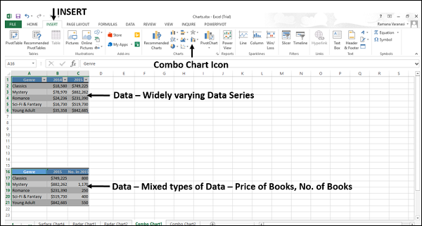
The numbers in your data vary widely from data series to data series, or
You have mixed type of data (for example, price and volume).
You can plot one or more data series on a secondary vertical (Value) axis. The scale of the secondary vertical axis shows the values for the associated data series. Follow the steps to insert a Combo chart in your worksheet.
Step 1 − Arrange the data in columns and rows on the worksheet.
Step 2 − Select the data.
Step 3 − On the INSERT tab, in the Charts group, click the Combo chart icon on the Ribbon
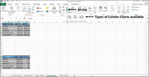
You will see the different types of available Combo charts.
A Combo chart has the following sub-types −
- Clustered Column – Line
- Clustered Column – Line on Secondary Axis
- Stacked Area – Clustered Column
- Custom Combination
Step 4 − Point your mouse on each of the icons. A preview of that chart type will be shown on the worksheet.
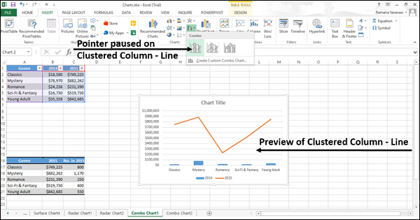
Step 5 − Double-click the chart type that suits your data.
In this chapter, you will understand when each of the Combo chart types is useful.
Clustered Column – Line
Clustered Column–Line chart is used to highlight the different types of information. Clustered Column – Line chart combines a Clustered Column and Line chart, showing some data series as columns and others as lines in the same chart.
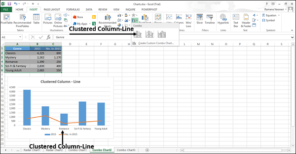
You can use the Clustered Column – Line Chart when you have mixed type of data.
Clustered Column – Line on Secondary Axis
Clustered Column – Line on Secondary Axis charts are used to highlight different types of information. The scale of the secondary vertical axis shows the values for the associated data series.
The Clustered Column – Line on the secondary axis chart combines a clustered column and a line chart, showing some data series as columns and others as lines in the same chart.
A secondary axis works well in a chart that shows a combination of column and line charts.
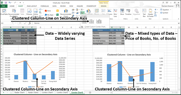
You can use the Clustered Column – Line on Secondary Axis charts when −
- The range of values in the chart varies widely
- You have mixed types of data
Stacked Area – Clustered Column
The Stacked Area − Clustered Column charts are used to highlight the different types of information. The scale of the secondary vertical axis shows the values for the associated data series.
Stacked Area − Clustered Column chart combines a Stacked Area and a Clustered Column in the same chart.
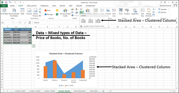
You can use the Stacked Area – Clustered Column charts when you have mixed types of data.
Custom Combo Chart
You can create a Combo chart that is customized by you.
Step 1 − Select the data on your worksheet.
Step 2 − On the INSERT tab, in the Charts group, click the Combo chart icon on the Ribbon
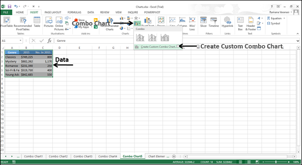
Step 3 − Click Create Custom Combo chart. A ‘Insert Chart’ window appears. In the left pane, Combo chart type is highlighted. For Custom Combination, a dialog box appears.
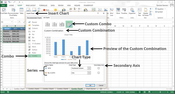
Step 4 − Select a chart type for each of the series.
Step 5 − If you want, you can move the axis of any series to the secondary axis by checking the box.
Step 6 − When you are satisfied with a custom combination, click OK.
Your customized combo chart will be displayed.