- Excel Charts Tutorial
- Excel Charts - Home
- Excel Charts - Introduction
- Excel Charts - Creating Charts
- Excel Charts - Types
- Excel Charts - Column Chart
- Excel Charts - Line Chart
- Excel Charts - Pie Chart
- Excel Charts - Doughnut Chart
- Excel Charts - Bar Chart
- Excel Charts - Area Chart
- Excel Charts - Scatter (X Y) Chart
- Excel Charts - Bubble Chart
- Excel Charts - Stock Chart
- Excel Charts - Surface Chart
- Excel Charts - Radar Chart
- Excel Charts - Combo Chart
- Excel Charts - Chart Elements
- Excel Charts - Chart Styles
- Excel Charts - Chart Filters
- Excel Charts - Fine Tuning
- Excel Charts - Design Tools
- Excel Charts - Quick Formatting
- Excel Charts - Aesthetic Data Labels
- Excel Charts - Format Tools
- Excel Charts - Sparklines
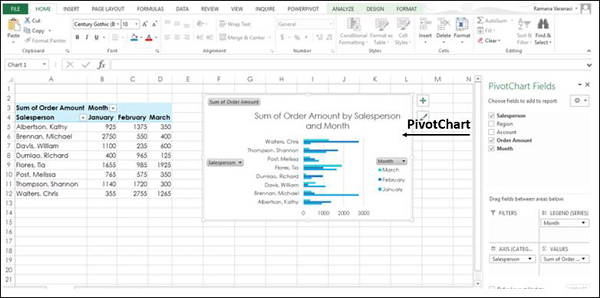
- Excel Charts - PivotCharts
- Excel Charts Useful Resources
- Excel Charts - Quick Guide
- Excel Charts - Useful Resources
- Excel Charts - Discussion
Excel Charts - Quick Guide
Excel Charts - Introduction
In Microsoft Excel, charts are used to make a graphical representation of any set of data. A chart is a visual representation of data, in which the data is represented by symbols such as bars in a bar chart or lines in a line chart.
Charts Group
You can find the Charts group under the INSERT tab on the Ribbon.
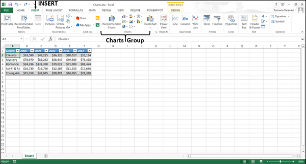
The Charts group on the Ribbon looks as follows −
The Charts group is formatted in such a way that −
Types of charts are displayed.
The subgroups are clubbed together.
It helps you find a chart suitable to your data with the button Recommended Charts.
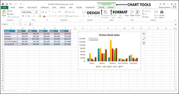
Chart Tools
When you click on a chart, a new tab Chart Tools is displayed on the ribbon. There are two tabs under CHART TOOLS −
- DESIGN
- FORMAT
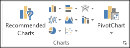
Recommended Charts
The Recommended Charts command on the Insert tab helps you to create a chart that is just right for your data.
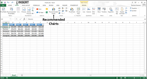
To use Recommended charts −
Step 1 − Select the data.
Step 2 − Click Recommended Charts.
A window displaying the charts that suit your data will be displayed.
Excel Charts - Creating Charts
In this chapter, we will learn to create charts.
Creating Charts with Insert Chart
To create charts using the Insert Chart tab, follow the steps given below.
Step 1 − Select the data.
Step 2 − Click the Insert tab on the Ribbon.
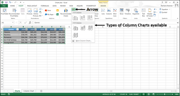
Step 3 − Click the Insert Column Chart on the Ribbon.
The 2-D column, 3-D Column chart options are displayed. Further, More Column Charts… option is also displayed.
Step 4 − Move through the Column Chart options to see the previews.
Step 5 − Click Clustered Column. The chart will be displayed in your worksheet.
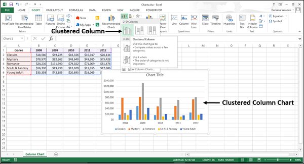
Step 6 − Give a meaningful title to the chart by editing Chart Title.
Creating Charts with Recommended Charts
You can use the Recommended Charts option if −
You want to create a chart quickly.
You are not sure of the chart type that suits your data.
If the chart type you selected is not working with your data.
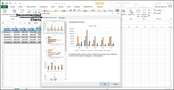
To use the option Recommended Charts, follow the steps given below −
Step 1 − Select the data.
Step 2 − Click the Insert tab on the Ribbon.
Step 3 − Click Recommended Charts.
A window displaying the charts that suit your data will be displayed, under the tab Recommended Charts.
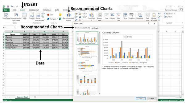
Step 4 − Browse through the Recommended Charts.
Step 5 − Click on a chart type to see the preview on the right side.
Step 6 − Select the chart type you like. Click OK. The chart will be displayed in your worksheet.
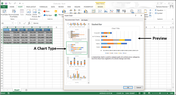
If you do not see a chart you like, click the All Charts tab to see all the available chart types and pick a chart.
Step 7 − Give a meaningful title to the chart by editing Chart Title.
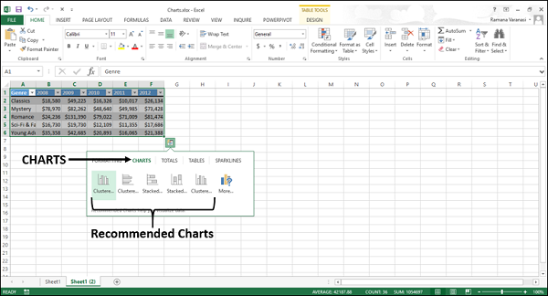
Creating Charts with Quick Analysis
Follow the steps given to create a chart with Quick Analysis.
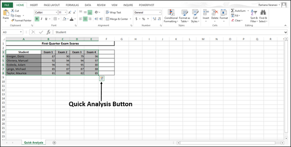
Step 1 − Select the data.
A Quick Analysis button  appears at the bottom right of your selected data.
Step 2 − Click the Quick Analysis icon.
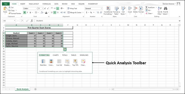
The Quick Analysis toolbar appears with the options FORMATTING, CHARTS, TOTALS, TABLES, SPARKLINES.
Step 3 − Click the CHARTS option.
Recommended Charts for your data will be displayed.
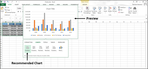
Step 4 − Point the mouse over the Recommended Charts. Previews of the available charts will be shown.
Step 5 − Click More.
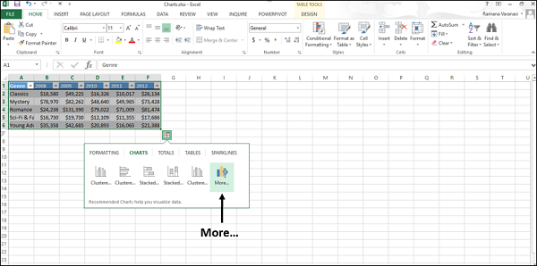
More Recommended Charts will be displayed.
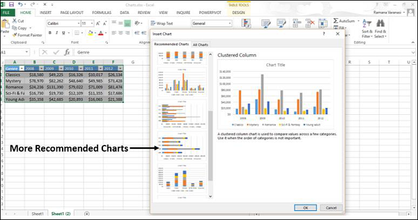
Step 6 − Select the type of chart you like, click OK. The chart will be displayed in your worksheet.
Step 7 − Give a meaningful title to the chart by editing Chart Title.
Excel Charts - Types
Excel provides you different types of charts that suit your purpose. Based on the type of data, you can create a chart. You can also change the chart type later.
Excel offers the following major chart types −
- Column Chart
- Line Chart
- Pie Chart
- Doughnut Chart
- Bar Chart
- Area Chart
- XY (Scatter) Chart
- Bubble Chart
- Stock Chart
- Surface Chart
- Radar Chart
- Combo Chart
Each of these chart types have sub-types. In this chapter, you will have an overview of the different chart types and get to know the sub-types for each chart type.
Column Chart
A Column Chart typically displays the categories along the horizontal (category) axis and values along the vertical (value) axis. To create a column chart, arrange the data in columns or rows on the worksheet.
A column chart has the following sub-types −
- Clustered Column.
- Stacked Column.
- 100% Stacked Column.
- 3-D Clustered Column.
- 3-D Stacked Column.
- 3-D 100% Stacked Column.
- 3-D Column.
Line Chart
Line charts can show continuous data over time on an evenly scaled Axis. Therefore, they are ideal for showing trends in data at equal intervals, such as months, quarters or years.
In a Line chart −
- Category data is distributed evenly along the horizontal axis.
- Value data is distributed evenly along the vertical axis.
To create a Line chart, arrange the data in columns or rows on the worksheet.
A Line chart has the following sub-types −
- Line
- Stacked Line
- 100% Stacked Line
- Line with Markers
- Stacked Line with Markers
- 100% Stacked Line with Markers
- 3-D Line
Pie Chart
Pie charts show the size of items in one data series, proportional to the sum of the items. The data points in a pie chart are shown as a percentage of the whole pie. To create a Pie Chart, arrange the data in one column or row on the worksheet.
A Pie Chart has the following sub-types −
- Pie
- 3-D Pie
- Pie of Pie
- Bar of Pie
Doughnut Chart
A Doughnut chart shows the relationship of parts to a whole. It is similar to a Pie Chart with the only difference that a Doughnut Chart can contain more than one data series, whereas, a Pie Chart can contain only one data series.
A Doughnut Chart contains rings and each ring representing one data series. To create a Doughnut Chart, arrange the data in columns or rows on a worksheet.
Bar Chart
Bar Charts illustrate comparisons among individual items. In a Bar Chart, the categories are organized along the vertical axis and the values are organized along the horizontal axis. To create a Bar Chart, arrange the data in columns or rows on the Worksheet.
A Bar Chart has the following sub-types −
- Clustered Bar
- Stacked Bar
- 100% Stacked Bar
- 3-D Clustered Bar
- 3-D Stacked Bar
- 3-D 100% Stacked Bar
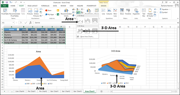
Area Chart
Area Charts can be used to plot the change over time and draw attention to the total value across a trend. By showing the sum of the plotted values, an area chart also shows the relationship of parts to a whole. To create an Area Chart, arrange the data in columns or rows on the worksheet.
An Area Chart has the following sub-types −
- Area
- Stacked Area
- 100% Stacked Area
- 3-D Area
- 3-D Stacked Area
- 3-D 100% Stacked Area
XY (Scatter) Chart
XY (Scatter) charts are typically used for showing and comparing numeric values, like scientific, statistical, and engineering data.
A Scatter chart has two Value Axes −
- Horizontal (x) Value Axis
- Vertical (y) Value Axis
It combines x and y values into single data points and displays them in irregular intervals, or clusters. To create a Scatter chart, arrange the data in columns and rows on the worksheet.
Place the x values in one row or column, and then enter the corresponding y values in the adjacent rows or columns.
Consider using a Scatter chart when −
You want to change the scale of the horizontal axis.
You want to make that axis a logarithmic scale.
Values for horizontal axis are not evenly spaced.
There are many data points on the horizontal axis.
You want to adjust the independent axis scales of a scatter chart to reveal more information about data that includes pairs or grouped sets of values.
You want to show similarities between large sets of data instead of differences between data points.
You want to compare many data points regardless of the time.
The more data that you include in a scatter chart, the better the comparisons you can make.
A Scatter chart has the following sub-types −
Scatter
Scatter with Smooth Lines and Markers
Scatter with Smooth Lines
Scatter with Straight Lines and Markers
Scatter with Straight Lines
Bubble Chart
A Bubble chart is like a Scatter chart with an additional third column to specify the size of the bubbles it shows to represent the data points in the data series.
A Bubble chart has the following sub-types −
- Bubble
- Bubble with 3-D effect
Stock Chart
As the name implies, Stock charts can show fluctuations in stock prices. However, a Stock chart can also be used to show fluctuations in other data, such as daily rainfall or annual temperatures.
To create a Stock chart, arrange the data in columns or rows in a specific order on the worksheet. For example, to create a simple high-low-close Stock chart, arrange your data with High, Low, and Close entered as Column headings, in that order.
A Stock chart has the following sub-types −
- High-Low-Close
- Open-High-Low-Close
- Volume-High-Low-Close
- Volume-Open-High-Low-Close
Surface Chart
A Surface chart is useful when you want to find the optimum combinations between two sets of data. As in a topographic map, colors and patterns indicate areas that are in the same range of values.
To create a Surface chart −
- Ensure that both the categories and the data series are numeric values.
- Arrange the data in columns or rows on the worksheet.
A Surface chart has the following sub-types −
- 3-D Surface
- Wireframe 3-D Surface
- Contour
- Wireframe Contour
Radar Chart
Radar charts compare the aggregate values of several data series. To create a Radar chart, arrange the data in columns or rows on the worksheet.
A Radar chart has the following sub-types −
- Radar
- Radar with Markers
- Filled Radar
Combo Chart
Combo charts combine two or more chart types to make the data easy to understand, especially when the data is widely varied. It is shown with a secondary axis and is even easier to read. To create a Combo chart, arrange the data in columns and rows on the worksheet.
A Combo chart has the following sub-types −
- Clustered Column – Line
- Clustered Column – Line on Secondary Axis
- Stacked Area – Clustered Column
- Custom Combination
Excel Charts - Column Chart
Column Charts are useful to visually compare values across a few categories or for showing data changes over a period of time.
A Column Chart typically displays the categories along the horizontal (category) axis and the values along the vertical (value) axis.
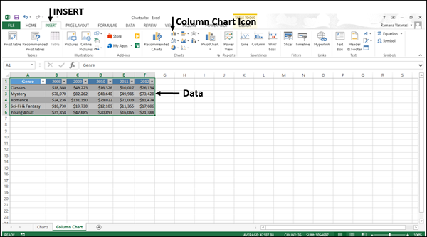
Follow the steps given to insert a column chart.
Step 1 − Arrange the data in columns or rows on the worksheet.
Step 2 − Select the data.
Step 3 − On the INSERT tab, in the Charts group, click the Column chart icon on the Ribbon.
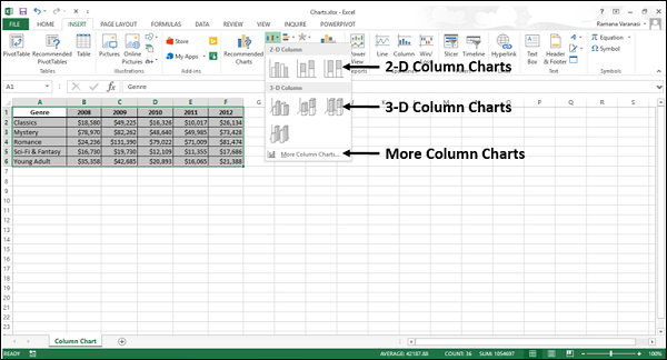
You will see the different options available for Column Charts.
A Column Chart has the following sub-types −
2-D Column Charts
Clustered Column
Stacked Column
100% Stacked Column
3-D Column Charts
3-D Clustered Column
3-D Stacked Column
3-D 100% Stacked Column
3-D Column
Step 4 − Point your mouse on each of the icons. You will see a preview of the chart type.
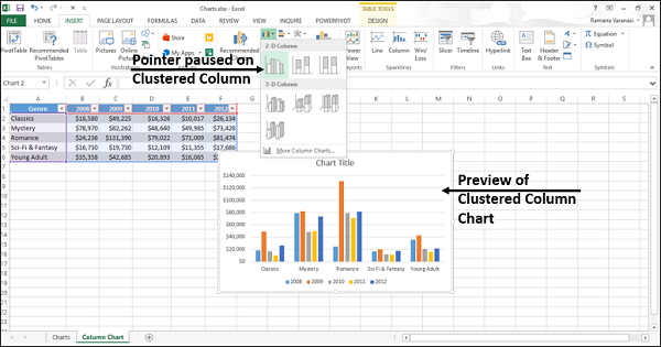
Step 5 − Double-click the chart type that suits your data.
In this chapter, you will understand when each of the column chart types is useful.
Clustered Column and 3-D Clustered Column
These chart types are useful to compare the values across a few categories, when the order of the categories is not important.
Remember that −
A Clustered Column chart shows values in 2-D rectangular columns.
A 3-D Clustered Column chart shows Columns in 3-D perspective, but it does not use a third value axis (depth axis).
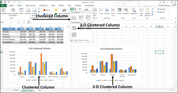
You can use Clustered Column charts when you have multiple data series with categories that represent −
Ranges of values (e.g. item counts).
Specific scale arrangements (e.g. a Likert scale with entries like Strongly agree, Agree, Neutral, Disagree, Strongly disagree).
Names that are not in any specific order (e.g. item names, geographic names, or the names of people).
Stacked Column and 3-D Stacked Column
These charts are useful to −
- Compare parts of a whole
- Show how parts of a whole change over time
- Compare parts of a whole across categories
A Stacked Column chart displays values in 2-D vertical stacked rectangles. A 3-D Stacked Column chart displays the data by using a 3-D perspective, but it does not use a third value axis (depth axis).
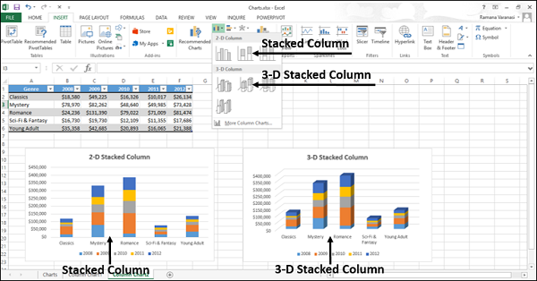
A 100% Stacked bar shows 2-D bars that compare the percentage that each value contributes to a total across the categories.
100% Stacked Column and 3-D 100% Stacked Column
These charts are used to −
Compare the percentages that each value contributes to the total.
Check, how the percentage that each value contributes changes over time.
Compare the percentage that each value contributes across categories.
A 100% Stacked Column chart shows values in 2-D columns that are stacked to represent 100%. A 3-D 100% Stacked Column chart shows the columns using a 3-D perspective, but it does use a third value axis (depth axis).
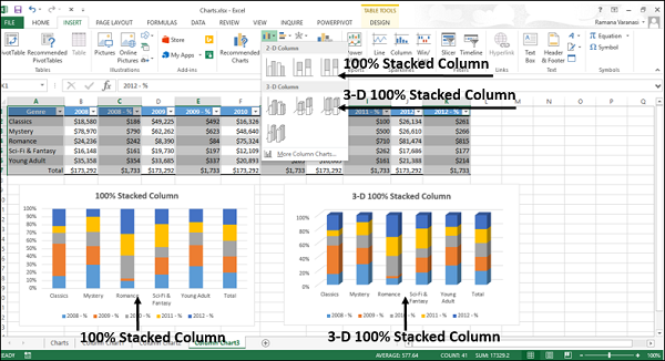
You can use 100% Stacked Column charts when you have three or more data series and you want to emphasize the contributions to the whole, especially if the total is the same for each category.
3-D Column
3-D Column charts use three axes that you can modify (a horizontal axis, a vertical axis, and a depth axis), and they compare data points along the horizontal and the depth axes.
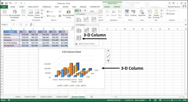
You can use this chart when you want to compare the data across both the categories and the data series.
Excel Charts - Line Chart
Line charts can show continuous data over time on an evenly scaled Axis. Therefore, they are ideal for showing trends in data at equal intervals, such as days, months, quarters or years.
In a Line chart −
Category data is distributed evenly along the horizontal axis.
Value data is distributed evenly along the vertical axis.
Follow the steps given below to insert a Line chart in your worksheet.
Step 1 − Arrange the data in columns or rows on the worksheet.
Step 2 − Select the data.
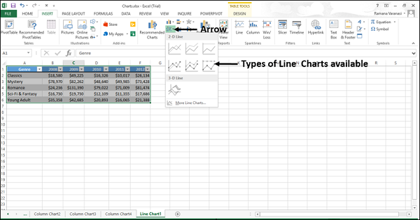
Step 3 − On the INSERT tab, in the Charts group, click the Line chart icon on the Ribbon.
You will see the different Line charts available.
A Line chart has the following sub-types −
2-D Line charts
Line
100% Stacked Line
Line with Markers
Stacked Line with Markers
100% Stacked Line with Markers
3-D Line charts
3-D Line
Step 4 − Point your mouse on each of the icons. A preview of that line type will be shown on the worksheet.
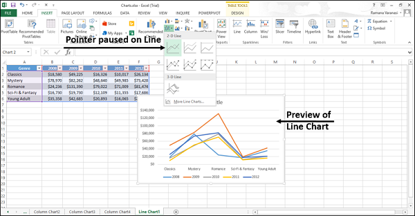
Step 5 − Double-click the chart type that suits your data.
In this chapter, you will understand when each of the line chart types is useful.
Line and Line with Markers
Line charts indicate individual data values. Line charts work best when you have multiple data series in your chart.
Line charts can show trends over −
Time (days, months, quarters or years), or
Evenly spaced Categories.
A Line chart can be with or without markers.
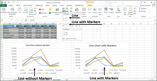
You can use a Line chart without markers when −
The order of categories is important.
There are many categories or if the values are approximate.
You can use a Line chart with Markers when −
The order of categories is important.
There are only a few categories.
Stacked Line and Stacked Line with Markers
Stacked Line charts indicate individual data values. Stacked Line Charts can show the trend of the contribution of each value over −
- Time, or
- Evenly spaced Categories.
Stacked Line charts can be with or without markers.

You can use a stacked line chart without markers when there are many categories or if the values are approximate. You can use a stacked line chart with markers when there are only a few categories.
Reading Stacked Line charts can be difficult as −
They sum the data, which might not be the result you want.
It might not be easy to see that the lines are stacked.
To overcome the difficulties, you can use a Stacked Area chart instead.
100% Stacked Line and 100% Stacked Line with Markers
100% Stacked Line charts indicate individual data values. 100% Stacked Line charts can show the trend of the percentage of each value over −
- Time, or
- Evenly spaced Categories
100% Stacked Line chart can be with or without Markers.
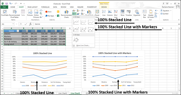
You can use a 100% Stacked Line chart without Markers when there are many categories or if the values are approximate. You can use a 100% Stacked Line chart with markers when there are a few categories.
Reading Stacked Line charts can be difficult. You can use a 100% Stacked Area chart instead.
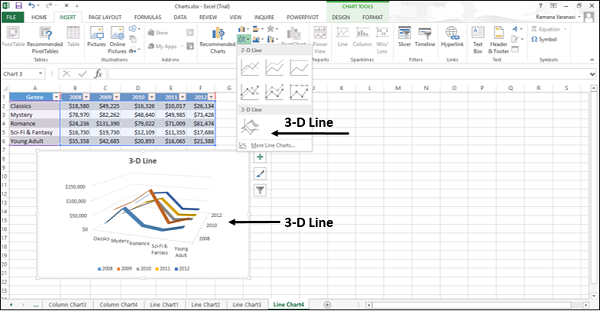
3-D Line
3-D Line charts show each row or column of data as a 3-D Ribbon. 3-D Line charts can show trends over −
- Time (days, months, quarters or years), or
- Categories.
A 3-D Line chart has horizontal, vertical, and depth axes that you can change. The third axis can show some lines in front of others.
Excel Charts - Pie Chart
Pie charts show the size of the items in one data series, proportional to the sum of the items. The data points in a Pie chart are shown as a percentage of the whole Pie.
Follow the steps given below to insert a pie chart in your worksheet.
Step 1 − Arrange the data in columns or rows on the worksheet.
Step 2 − Select the data.
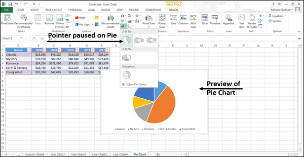
Step 3 − On the INSERT tab, in the Charts group, click the Pie chart icon on the Ribbon.
You will see the different types of Pie chart available.
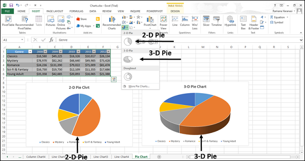
A Pie chart has the following sub-types −
2-D Pie Charts
Pie
Pie of Pie
Bar of Pie
3-D Pie Charts
3-D Pie
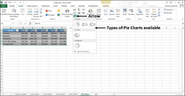
Step 4 − Point your mouse on each of the icons. A preview of that chart type will be displayed on the worksheet.
Consider using a Pie chart when −
You have only one data series.
None of the values in your data are negative.
Almost none of the values in your data are zero values.
You have no more than seven categories, all of which represent parts of the whole pie.
In this chapter, you will understand when each of the pie chart types is useful.
Pie and 3-D Pie
Pie charts show the contribution of each value to a total value in a 2-D or a 3-D format.
You can pull out the slices of a Pie chart manually to emphasize the slices. Follow the steps given below to give the 3-D effect.
Step 1 − Click on a slice that you want to emphasize.
Step 2 − Pull it out of the chart.
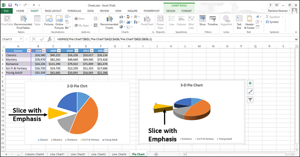
Use these chart types to show a proportion of the whole pie.
Use these chart types when −
Number is equal to 100%.
The chart contains only a few Pie slices.
Pie of Pie and Bar of Pie
Pie of Pie or Bar of Pie charts show Pie charts with smaller values pulled out into a secondary Pie or Stacked Bar chart, which makes them easier to distinguish.
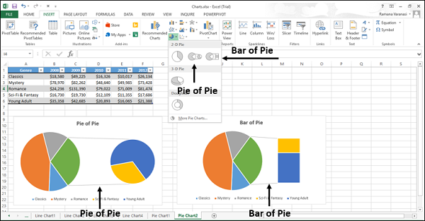
Use these chart types to −
Show proportions of the total value.
Take some values from the first pie and combine them in a
Second Pie, or
Stacked Bar
To make small percentages more readable, highlight the values in the second pie.
Excel Charts - Doughnut Chart
Area charts can be used to plot change over time (years, months and days) or categories and draw attention to the total value across a trend. By showing the sum of the plotted values, an Area chart also shows the relationship of parts to a whole.
You can use Area charts to highlight the magnitude of change over time.
Step 1 − Arrange the data in columns or rows on the worksheet.
Step 2 − Select the data.
Step 3 − On the INSERT tab, in the Charts group, click the Area chart icon on the Ribbon.
You will see the different types of available Area charts.
An Area Chart has the following sub-types −
2-D Area Charts
Area
Stacked Area
100% Stacked Area
3-D Area Charts
3-D Area
3-D Stacked Area
3-D 100% Stacked Area
Step 4 − Point your mouse on each of the icons. A preview of that chart type will be shown on the worksheet.
Step 5 − Double-Click the chart type that suits your data. In this chapter, you will understand when each of the Area Chart Types is useful.
Area and 3-D Area
These chart types are useful to show the trend of values over time or other category data.
An Area chart shows the values in 2-D format. A 3-D Area chart shows values in 3-D format. 3-D Area charts use three axes (horizontal, vertical, and depth) that you can change.
You can use Area charts −
When the category order is important.
To highlight the magnitude of change over time.
As you can see in the screen shot given above, in a non-Stacked Area chart, the data from one series can be hidden behind the data from another series. In such a case, use a line chart or a stacked area chart.
Stacked Area and 3-D Stacked Area
Stacked Area charts are useful to show the trend of the contribution of each value over time or other category data in 2-D format. 3-D Stacked Area charts are also useful for the same but they show areas in 3-D format without using a depth axis.
You can use Stacked Area charts to −
Highlight the magnitude of change over time.
Draw attention to the total value across a trend.
100% Stacked Area and 3-D 100% Stacked Area
100% Stacked Area charts are useful to show the trend of the percentage that each value contributes over time or other category data. 100% 3-D Stacked Area charts are also useful for the same, but they show areas in 3-D format without using a depth axis.
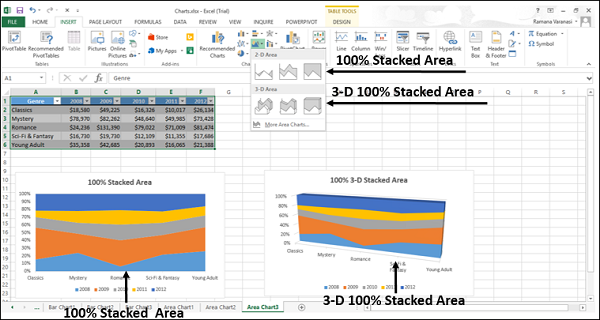
You can use 100% Stacked Area charts to −
Draw attention to the total value across a trend.
Highlight the magnitude of change to the percentage that each value contributes over time.
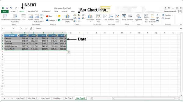
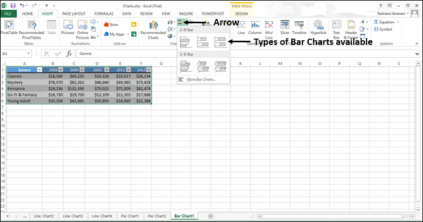
Excel Charts - Bar Chart
Bar charts illustrate the comparisons among individual items. A Bar chart typically displays categories along the vertical (category) axis and values along the horizontal (value) axis.
Follow the steps given below to use a Bar chart.
Step 1 − Arrange the data in columns or rows on the worksheet.
Step 2 − Select the data.
Step 3 − On the INSERT tab, in the Charts group, click the Bar chart icon on the Ribbon.
You will see the different types of bar charts available.
A bar chart has the following sub-types −
2-D Bar Charts
Clustered Bar
Stacked Bar
100% Stacked Bar
3-D Bar Charts
3-D Clustered Bar
3-D Stacked Bar
3-D 100% Stacked Bar
Step 4 − Point the mouse on each of the icons. A preview of that chart type will be shown on the worksheet.
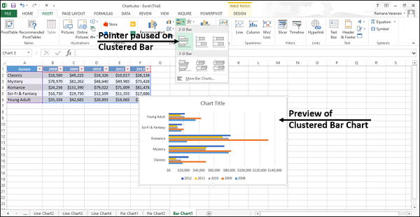
Step 5 − Double-click the chart type that suits your data.
In this chapter, you will understand when each of the Bar chart types is useful.
Clustered Bar and 3-D Clustered Bar
These chart types are useful to compare values across a few categories. A Clustered Bar chart shows bars in 2-D format. A 3-D Clustered bar chart shows bars in 3-D perspective, but it does not use a third value axis (depth axis).
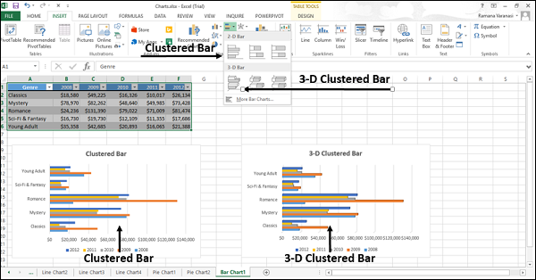
You can use Clustered Bar charts when −
- The chart shows duration.
- The category text is long.
Stacked Bar and 3-D Stacked Bar
These charts are useful to compare the parts of a whole across various categories and show the change in parts of a whole unit with respect to time.
A Stacked Bar chart displays values in 2-D horizontal stacked rectangles. A 3-D Stacked Bar chart displays the data by using a 3-D perspective, but it does not use a third value axis (depth axis).
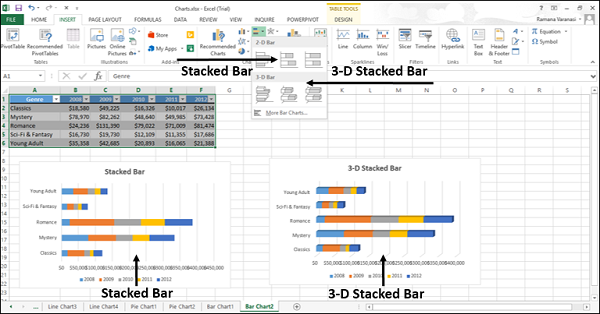
You can use Stacked Bar charts when the category text is long.
100% Stacked Bar and 3-D 100% Stacked Bar
These charts are useful to compare the percentage that each value contributes to the total unit and show the change in percentage that each value contributes with respect to time.
A 100% Stacked bar chart displays Values in 2-D horizontal stacked rectangles. A 3-D 100% Stacked bar chart displays the data by using a 3-D perspective, but it does not use a third value axis (depth axis).
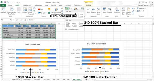
You can use 100% Stacked bar charts when the category text is long.
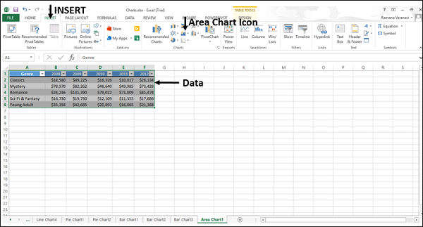
Excel Charts - Area Chart
Area charts can be used to plot change over time (years, months and days) or categories and draw attention to the total value across a trend. By showing the sum of the plotted values, an Area chart also shows the relationship of parts to a whole.
You can use Area charts to highlight the magnitude of change over time.
Step 1 − Arrange the data in columns or rows on the worksheet.
Step 2 − Select the data.
Step 3 − On the INSERT tab, in the Charts group, click the Area chart icon on the Ribbon.
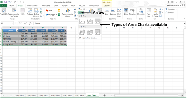
You will see the different types of available Area charts.
An Area Chart has the following sub-types −
2-D Area Charts
Area
Stacked Area
100% Stacked Area
3-D Area Charts
3-D Area
3-D Stacked Area
3-D 100% Stacked Area
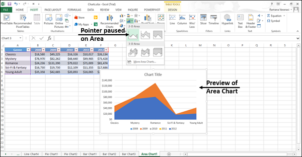
Step 4 − Point your mouse on each of the icons. A preview of that chart type will be shown on the worksheet.
Step 5 − Double-Click the chart type that suits your data. In this chapter, you will understand when each of the Area Chart Types is useful.
Area and 3-D Area
These chart types are useful to show the trend of values over time or other category data.
An Area chart shows the values in 2-D format. A 3-D Area chart shows values in 3-D format. 3-D Area charts use three axes (horizontal, vertical, and depth) that you can change.
You can use Area charts −
When the category order is important.
To highlight the magnitude of change over time.
As you can see in the screen shot given above, in a non-Stacked Area chart, the data from one series can be hidden behind the data from another series. In such a case, use a line chart or a stacked area chart.
Stacked Area and 3-D Stacked Area
Stacked Area charts are useful to show the trend of the contribution of each value over time or other category data in 2-D format. 3-D Stacked Area charts are also useful for the same but they show areas in 3-D format without using a depth axis.
You can use Stacked Area charts to −
Highlight the magnitude of change over time.
Draw attention to the total value across a trend.
100% Stacked Area and 3-D 100% Stacked Area
100% Stacked Area charts are useful to show the trend of the percentage that each value contributes over time or other category data. 100% 3-D Stacked Area charts are also useful for the same, but they show areas in 3-D format without using a depth axis.
You can use 100% Stacked Area charts to −
Draw attention to the total value across a trend.
Highlight the magnitude of change to the percentage that each value contributes over time.
Excel Charts - Scatter (X Y) Chart
Scatter (X Y) charts are typically used for showing and comparing numeric values, like scientific, statistical, and engineering data.
A Scatter Chart has two value axes −
- Horizontal (x) value axis
- Vertical (y) value axis
It combines x and y values into single data points and shows them in irregular intervals, or clusters.
Consider using a Scatter chart when −
You want to change the scale of the horizontal axis.
You want to make that axis a logarithmic scale.
Values for horizontal axis are not evenly spaced.
There are many data points on the horizontal axis.
You want to adjust the independent axis scales of a scatter chart to reveal more information about the data that includes pairs or grouped sets of values.
You want to show similarities between large sets of data instead of the differences between the data points.
You want to compare many data points regardless of the time.
The more data that you include in a Scatter chart, the better the comparisons.
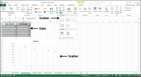
Follow the steps given below to insert a Scatter chart in your worksheet.
Step 1 − Arrange the data in columns or rows on the worksheet.
Step 2 − Place the x values in one row or column, and then enter the corresponding y values in the adjacent rows or columns.
Step 3 − Select the data.
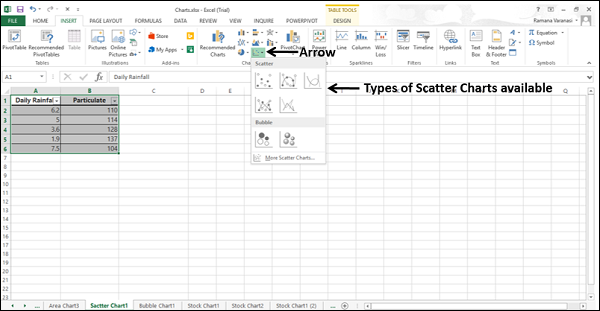
Step 4 − On the INSERT tab, in the Charts group, click the Scatter chart icon on the Ribbon.
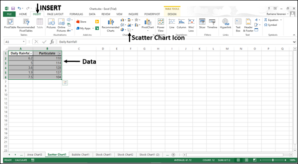
You will see the different types of available Scatter charts.
A Scatter chart has the following sub-types −
Scatter
Scatter with Smooth Lines and Markers
Scatter with Smooth Lines
Scatter with Straight Lines and Markers
Scatter with Straight Lines
Step 5 − Point your mouse on each of the icons. A preview of that chart type will be shown on the worksheet.
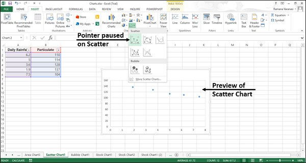
Step 6 − Double-click the chart type that suits your data.
In this chapter, you will understand when each of the Scatter chart is useful.
Scatter Chart
Scatter charts are useful to compare at least two sets of values or pairs of data. Scatter charts show relationships between sets of values.
Use Scatter charts when the data represents separate measurements.
Types of Scatter Charts
The following section explains the different options available to display a Scatter chart.
Scatter with smooth lines and markers and scatter with smooth lines.
Scatter with Smooth Lines and Markers and Scatter with Smooth Lines display a smooth curve that connects the data points. Scatter with Smooth Lines and Markers and Scatter with Smooth Lines are useful to compare at least two sets of values or pairs of data.
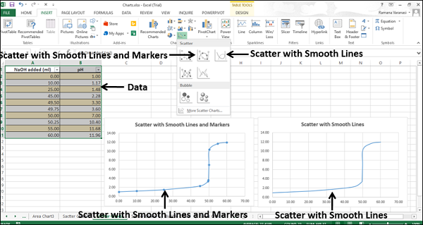
Use Scatter with Smooth Lines and Markers and Scatter with Smooth Lines charts when the data represents a set of x, y pairs based on a formula.
Use Scatter with Smooth Lines and Markers when there are a few data points.
Use Scatter with Smooth Lines when there are many data points.
Scatter with Straight Lines and Markers and Scatter with Straight Lines
Scatter with Straight Lines and Markers and Scatter with Straight Lines connects the data points with straight lines. Scatter with Straight Lines and Markers and Scatter with Straight Lines are useful to compare at least two sets of values or pairs of data.
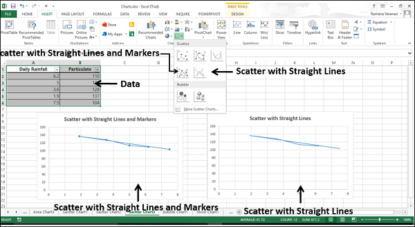
Use Scatter with Straight Lines and Markers and Scatter with Straight Lines charts when the data represents separate measurements.
Use Scatter with Straight Lines and Markers when there are a few data points.
Use Scatter with Straight Lines when there are many data points.
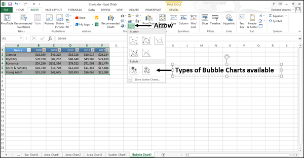
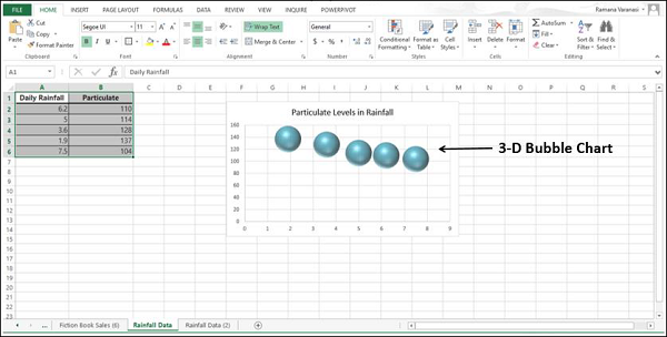
Excel Charts - Bubble Chart
A Bubble chart is like a Scatter chart with an additional third column to specify the size of the bubbles it shows to represent the data points in the data series.
Step 1 − Place the X-Values in a row or column and then place the corresponding Y-Values in the adjacent rows or columns on the worksheet.
Step 2 − Select the data.
Step 3 − On the INSERT tab, in the Charts group, click the Scatter (X, Y) chart or Bubble chart icon on the Ribbon.
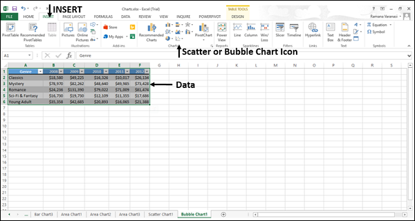
You will see the different types of available Bubble charts.
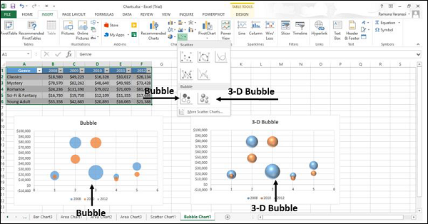
A Bubble chart has the following sub-types −
- Bubble
- 3-D Bubble
Step 4 − Point your mouse on each of the icons. A preview of that chart type will be shown on the worksheet.
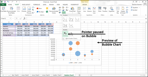
Step 5 − Double-click the chart type that suits your data.
In this chapter, you will understand when the Bubble Chart is useful.
Bubble and 3-D Bubble
Bubble and 3-D Bubble charts are useful to compare three sets of values and show relationships between the sets of values. The third value specifies the size of the bubble.
A Bubble chart shows the data in 2-D format. 3-D Bubble chart shows the data in 3-D format without using a depth axis
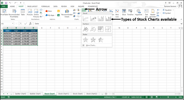
Excel Charts - Stock Chart
Stock charts, as the name indicates are useful to show fluctuations in stock prices. However, these charts are useful to show fluctuations in other data also, such as daily rainfall or annual temperatures.
If you use a Stock chart to display the fluctuation of stock prices, you can also incorporate the trading volume.
For Stock charts, the data needs to be in a specific order. For example, to create a simple high-low-close Stock chart, arrange your data with high, low, and close entered as column headings, in that order.
Follow the steps given below to insert a Stock chart in your worksheet.
Step 1 − Arrange the data in columns or rows on the worksheet.
Step 2 − Select the data.
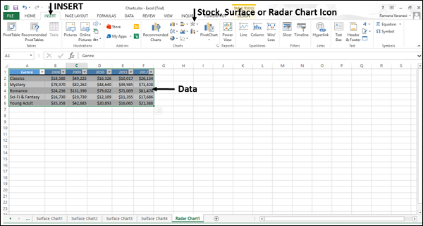
Step 3 − On the INSERT tab, in the Charts group, click the Stock, Surface or Radar chart icon on the Ribbon.
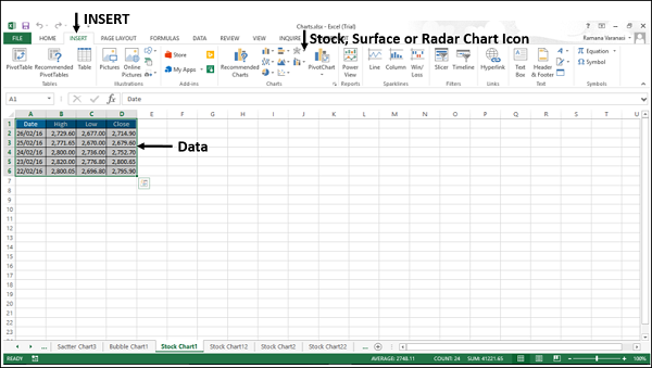
You will see the different types of available Stock charts.
A Stock chart has the following sub-types −
- High-Low-Close
- Open-High-Low-Close
- Volume-High-Low-Close
- Volume-Open-High-Low-Close
In this chapter, you will understand when each of the Stock chart types is useful.
High-Low-Close
The High-Low-Close Stock chart is often used to illustrate the stock prices. It requires three series of values in the following order- High, Low, and then Close.
To create this chart, arrange the data in the Order - High, Low, and Close.
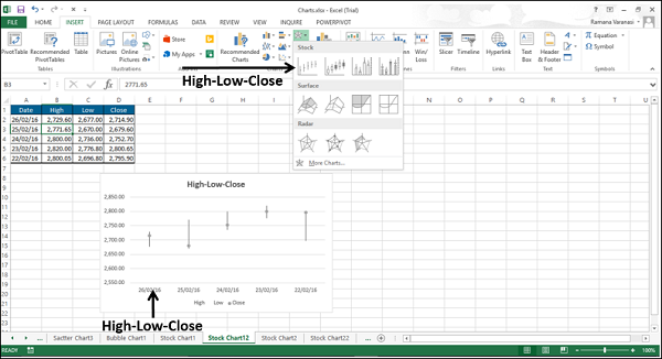
You can use the High-Low-Close Stock chart to show the trend of stocks over a period of time.
Open-High-Low-Close
The Open-High-Low-Close Stock chart is also used to illustrate the stock prices. It requires four series of values in the following order: Open, High, Low, and then Close.
To create this chart, arrange the data in the order - Open, High, Low, and Close.
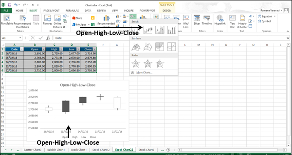
You can use the Open-High-Low-Close Stock chart to show the trend of STOCKS over a period of time.
Volume-High-Low-Close
The Volume-High-Low-Close Stock chart is also used to illustrate the stock prices. It requires four series of values in the following order: Volume, High, Low, and then Close.
To create this chart, arrange the data in the order − Volume, High, Low, and Close.
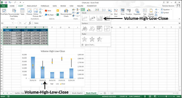
You can use the Volume-High-Low-Close Stock Chart to show the trend of stocks over a period of time.
Volume-Open-High-Low-Close
The Volume-Open-High-Low-Close Stock chart is also used to illustrate the stock prices. It requires five series of values in the following order: Volume, Open, High, Low, and then Close.
To create this chart, arrange the data in the order - Volume, Open, High, Low, and Close.
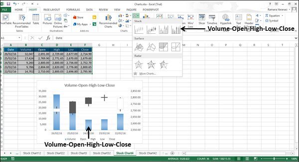
You can use the Volume-Open-High-Low-Close Stock chart to show the trend of stocks over a period of time.
Excel Charts - Surface Chart
Surface charts are useful when you want to find the optimum combinations between two sets of data. As in a topographic map, the colors and patterns indicate the areas that are in the same range of values.
To create a Surface chart, ensure that both the categories and the data series are numeric values.
Step 1 − Arrange the data in columns or rows on the worksheet.
Step 2 − Select the data.
Step 3 − On the INSERT tab, in the Charts group, click the Stock, Surface or Radar Chart icon on the Ribbon.
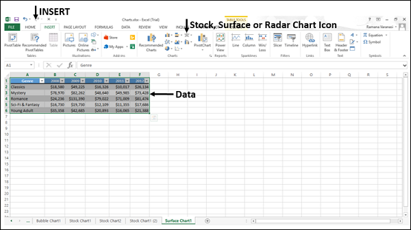
You will see the different types of available Surface charts.
A Surface chart has the following sub-types −
- 3-D Surface
- Wireframe 3-D Surface
- Contour
- Wireframe Contour
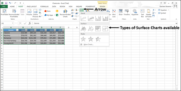
Step 4 − Point your mouse on each of the icons. A preview of that chart type will be shown on the worksheet.
Step 5 − Double-click the chart type that suits your data.
In this chapter, you will understand when each of the Surface chart types is useful.
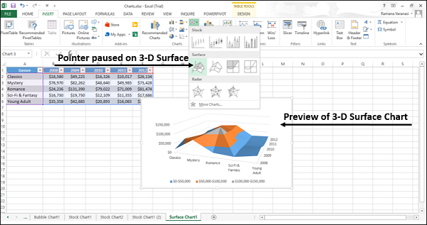
3-D Surface
3-D Surface chart shows a 3-D view of the data, which can be imagined as a rubber sheet stretched over a 3-D Column chart. It is typically used to show relationships between large amounts of data that may otherwise be difficult to see.
Color bands in a Surface chart −
Do not represent the data series
Indicate the difference between the values
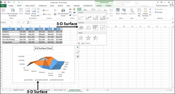
You can use a 3-D Surface chart −
When the categories and the series are both numeric values.
To show the trends in values across two dimensions in a continuous curve.
Wireframe 3-D Surface
A Wireframe 3-D Surface chart is a 3-D Surface chart shown without color on the surface. This chart shows only the lines. A Wireframe 3-D Surface chart is not easy to read, but it can plot large data sets much faster than a 3-D Surface chart.
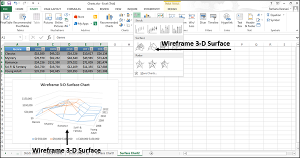
You can use a Wireframe 3-D Surface chart −
To show the trends in values across two dimensions in a continuous curve.
When the categories and the series are both numeric values.
When the data curves behind itself.
Contour
Contour charts are Surface charts viewed from above, similar to the 2-D topographic maps.
In a Contour chart,
The color bands represent specific ranges of the values.
The lines connect the interpolated points of equal value.
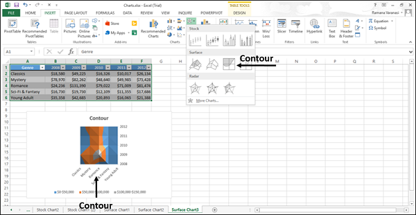
Use Contour chart −
To show the 2-D top view of a 3-D surface chart.
To represent the ranges of the values using color.
When both the categories and the series are numeric.
Wireframe Contour
Wireframe Contour charts are also Surface charts viewed from above. A Wireframe chart shows only the lines without the color bands on the surface. Wireframe Contour charts are not easy to read. You can use a 3-D Surface chart instead.
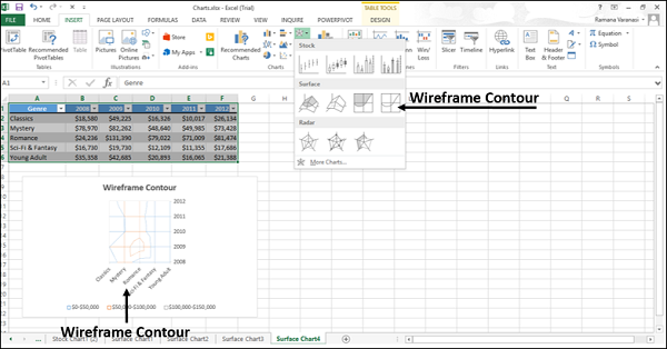
Use Wireframe Contour chart
To show the 2-D top view of a 3-D Surface chart only with lines.
Both the categories and the series are numeric.
Consider using a Contour chart instead, because the colors add detail to this chart type.
Excel Charts - Radar Chart
Radar charts compare the aggregate values of several data series.
To insert a Radar chart in your worksheet, follow the steps given below.
Step 1 − Arrange the data in columns or rows on the worksheet.
Step 2 − Select the data.
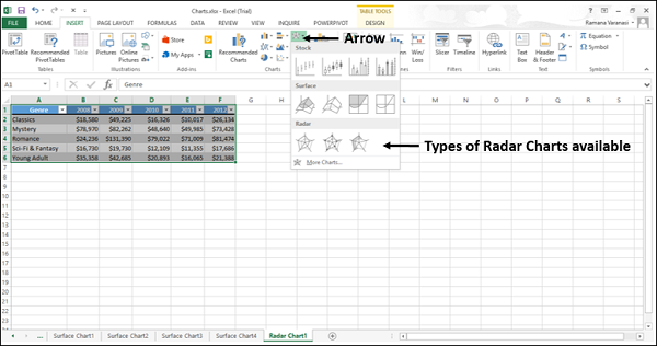
Step 3 − On the INSERT tab, in the Charts group, click the Stock, Surface or Radar Chart icon on the Ribbon.
You will see the different types of available Radar charts.
A Radar chart has the following sub-types −
- Radar
- Radar with Markers
- Filled Radar
Step 4 − Point your mouse on each of the icons. A preview of that chart type will be shown on the worksheet.
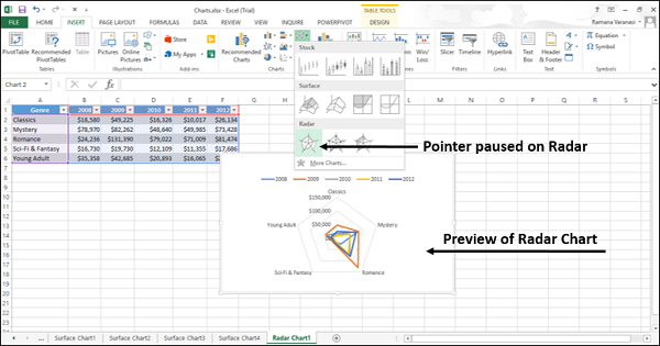
Step 5 − Double-click the chart type that suits your data.
In this chapter, you will understand when each of the Radar chart types is useful.
Radar and Radar with Markers
Radar and Radar with Markers show values relative to a center point. Radar with Markers shows with the markers for the individual points and Radar shows without the markers for the individual points.
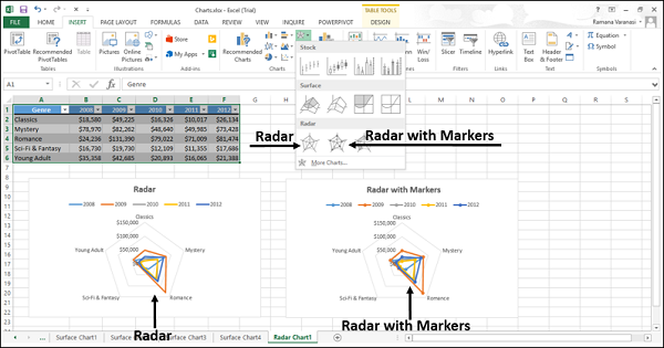
You can use the Radar and Radar with Marker charts when the categories are not directly comparable.
Filled Radar
In a Filled Radar chart, the area covered by a data series is filled with a color. As in Radar chart, Filled Radar chart shows values relative to a center point.
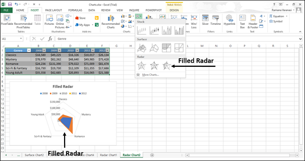
You can use Filled Radar charts when the categories are not directly comparable.
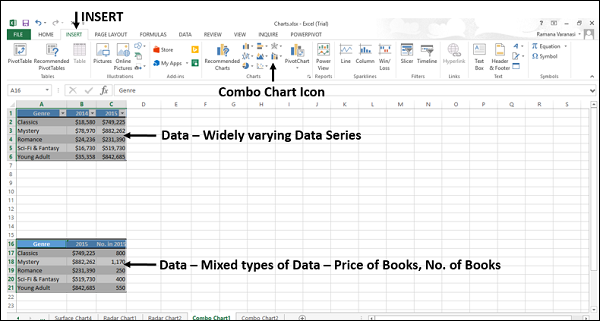
Excel Charts - Combo Chart
Combo charts combine two or more chart types to make the data easy to understand. Shown with a secondary axis, this chart is even easier to read.
You can use Combo charts when
The numbers in your data vary widely from data series to data series, or
You have mixed type of data (for example, price and volume).
You can plot one or more data series on a secondary vertical (Value) axis. The scale of the secondary vertical axis shows the values for the associated data series. Follow the steps to insert a Combo chart in your worksheet.
Step 1 − Arrange the data in columns and rows on the worksheet.
Step 2 − Select the data.
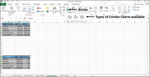
Step 3 − On the INSERT tab, in the Charts group, click the Combo chart icon on the Ribbon
You will see the different types of available Combo charts.
A Combo chart has the following sub-types −
- Clustered Column – Line
- Clustered Column – Line on Secondary Axis
- Stacked Area – Clustered Column
- Custom Combination
Step 4 − Point your mouse on each of the icons. A preview of that chart type will be shown on the worksheet.
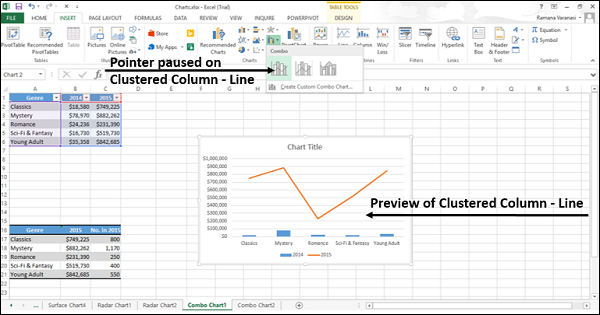
Step 5 − Double-click the chart type that suits your data.
In this chapter, you will understand when each of the Combo chart types is useful.
Clustered Column – Line
Clustered Column–Line chart is used to highlight the different types of information. Clustered Column – Line chart combines a Clustered Column and Line chart, showing some data series as columns and others as lines in the same chart.
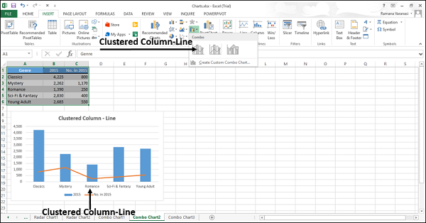
You can use the Clustered Column – Line Chart when you have mixed type of data.
Clustered Column – Line on Secondary Axis
Clustered Column – Line on Secondary Axis charts are used to highlight different types of information. The scale of the secondary vertical axis shows the values for the associated data series.
The Clustered Column – Line on the secondary axis chart combines a clustered column and a line chart, showing some data series as columns and others as lines in the same chart.
A secondary axis works well in a chart that shows a combination of column and line charts.
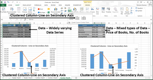
You can use the Clustered Column – Line on Secondary Axis charts when −
- The range of values in the chart varies widely
- You have mixed types of data
Stacked Area – Clustered Column
The Stacked Area − Clustered Column charts are used to highlight the different types of information. The scale of the secondary vertical axis shows the values for the associated data series.
Stacked Area − Clustered Column chart combines a Stacked Area and a Clustered Column in the same chart.
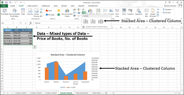
You can use the Stacked Area – Clustered Column charts when you have mixed types of data.
Custom Combo Chart
You can create a Combo chart that is customized by you.
Step 1 − Select the data on your worksheet.
Step 2 − On the INSERT tab, in the Charts group, click the Combo chart icon on the Ribbon
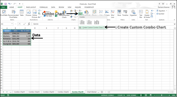
Step 3 − Click Create Custom Combo chart. A ‘Insert Chart’ window appears. In the left pane, Combo chart type is highlighted. For Custom Combination, a dialog box appears.
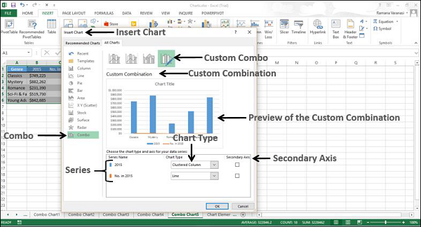
Step 4 − Select a chart type for each of the series.
Step 5 − If you want, you can move the axis of any series to the secondary axis by checking the box.
Step 6 − When you are satisfied with a custom combination, click OK.
Your customized combo chart will be displayed.
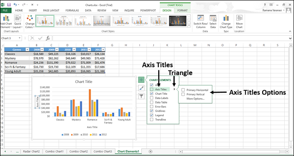
Excel Charts - Chart Elements
Chart elements give more descriptions to your charts, thus making your data more meaningful and visually appealing. In this chapter, you will learn about the chart elements.
Follow the steps given below to insert the chart elements in your graph.
Step 1 − Click the chart. Three buttons appear at the upper-right corner of the chart. They are −
 Chart Elements
 Chart Styles and Colors, and
 Chart Filters
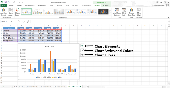
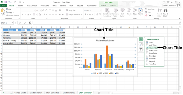
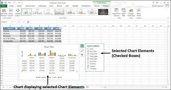
Step 2 − Click the Chart Elements icon. A list of available elements will be displayed.
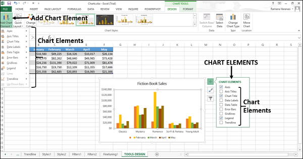
The following chart elements are available −
- Axes
- Axis titles
- Chart titles
- Data labels
- Data table
- Error bars
- Gridlines
- Legend
- Trendline
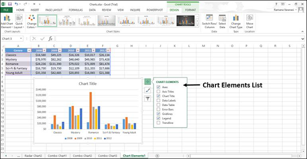
You can add, remove or change these chart elements.
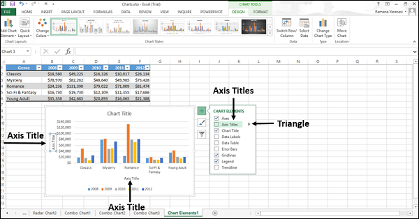
Step 3 − Point on each of these chart elements to see a preview of how they are displayed. For example, select Axis Titles. The Axis Titles of both, the horizontal and the vertical axes appear and are highlighted.
A ![]() appears next to Axis Titles in the chart elements list.
appears next to Axis Titles in the chart elements list.
Step 4 − Click ![]() to see the options for Axis Titles.
to see the options for Axis Titles.
Step 5 − Select/deselect the chart elements, which you want in your chart to be displayed, from the list.
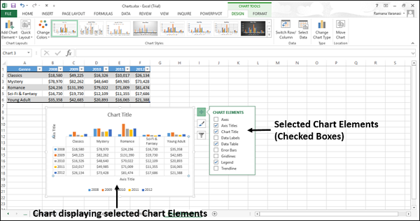
In this chapter, you will understand the different chart elements and their usage.
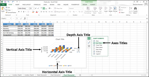
Axes
Charts typically have two axes that are used to measure and categorize the data −
- A vertical axis (also known as value axis or y axis), and
- A horizontal axis (also known as category axis or x axis)
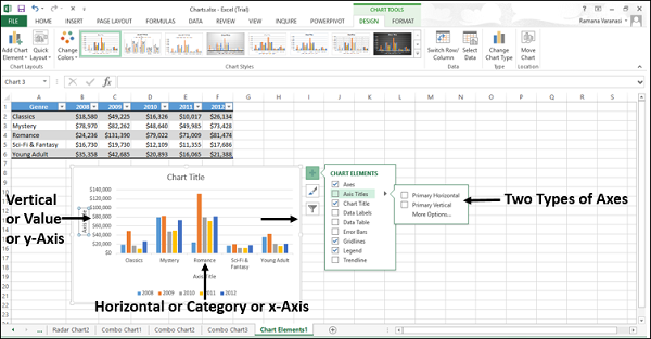
3-D Column charts have a third axis, the depth axis (also known as the series axis or the z axis), so that the data can be plotted along the depth of a chart.
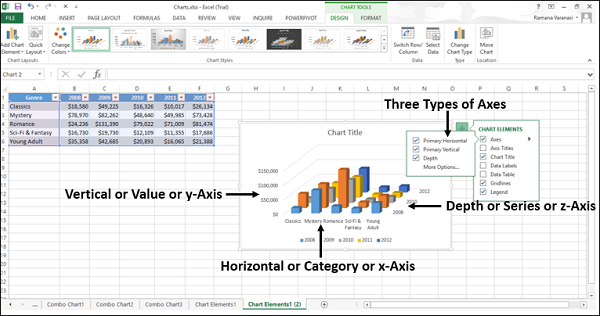
Radar charts do not have horizontal (Category) axes. Pie and Doughnut charts do not have any axes.
Not all chart types display axes the same way.
x y (Scatter) charts and Bubble charts show numeric values on both the horizontal axis and the vertical axes.
Column, Line, and Area charts, show numeric values on the vertical (value) axis only and show textual groupings (or categories) on the horizontal axis. The depth (series) axis is another form of category axis.
Axis Titles
Axis titles give the understanding of the data of what the chart is all about.
You can add axis titles to any horizontal, vertical, or the depth axes in the chart.
You cannot add axis titles to charts that do not have axes (Pie or Doughnut charts).
To add Axis Titles,
Step 1 − Click on the chart.
Step 2 − Click the Chart Elements icon.
Step 3 − From the list, select Axes Titles. Axes titles appear for horizontal, vertical and depth axes.
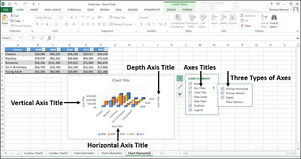
Step 4 − Click the Axis Title on the chart and modify the axes titles to give meaningful names to the data they represent.
You can link the axes titles to the cells containing text on the worksheet. When the text on the worksheet changes, the axes titles also change accordingly.
Step 1 − On the chart, click any axis title box.
Step 2 − On the worksheet, in the formula bar, type an equal-to sign (=). Select the worksheet cell that contains the text that you want to use for the axis title. Press Enter.
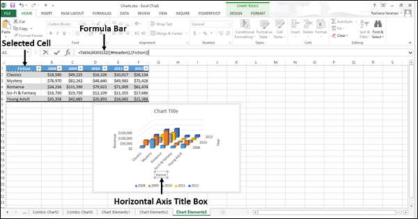
The axis title changes to the text contained in the linked cell.
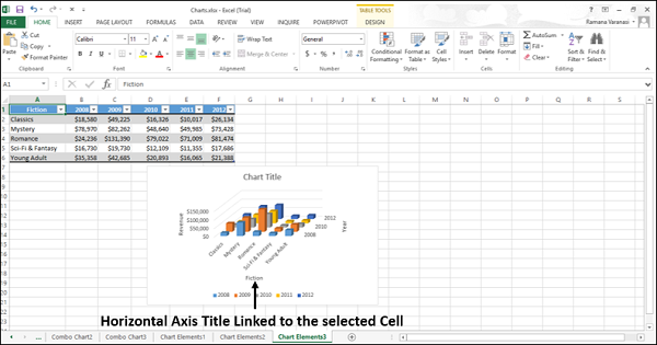
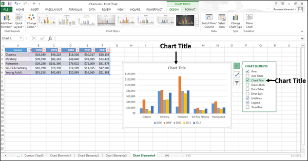
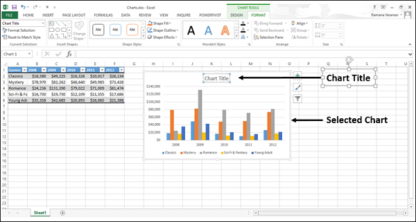
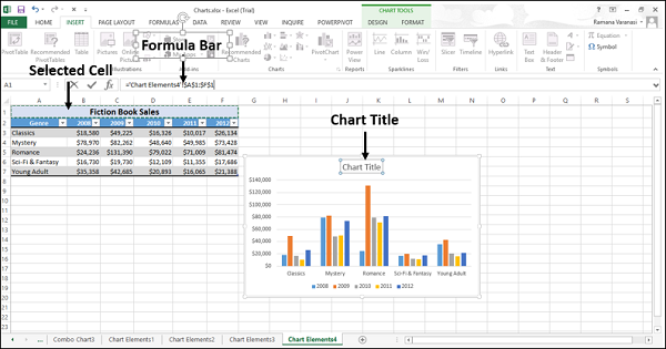
Chart Title
When you create a chart, a Chart Title box appears above the chart.
To add a chart title −
Step 1 − Click on the chart.
Step 2 − Click the Chart Elements icon.
Step 3 − From the list, select Chart Title. A Chart Title box appears above the graph chart.
Step 4 − Select Chart Title and type the title you want.
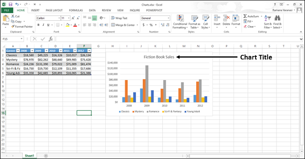
You can link the chart title to the cells containing text on the worksheet. When the text on the worksheet changes, the chart title also changes accordingly.
To link the chart title to a cell follow the steps given below.
Step 1 − On the chart, click the chart title box.
Step 2 − On the worksheet, in the formula bar, type an equal-to sign (=). Select the worksheet cell that contains the text that you want to use as the chart title. Press Enter.
The chart title changes to the text contained in the linked cell.
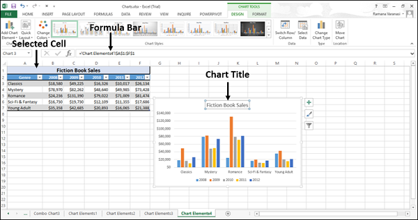
When you change the text in the linked cell, the chart title will change.
Data Labels
Data labels make a chart easier to understand because they show the details about a data series or its individual data points.
Consider the Pie chart as shown in the image below.
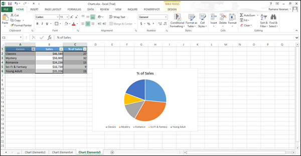
From the chart, we understand that both the classics and the mystery contribute more percentage to the total sales. However, we cannot make out the percentage contribution of each.
Now, let us add data Labels to the Pie chart.
Step 1 − Click on the Chart.
Step 2 − Click the Chart Elements icon.
Step 3 − Select Data Labels from the chart elements list. The data labels appear in each of the pie slices.
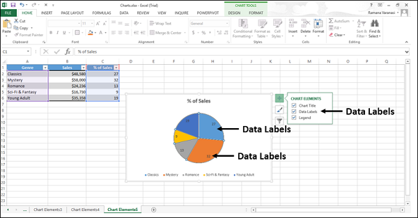
From the data labels on the chart, we can easily read that Mystery contributed to 32% and Classics contributed to 27% of the total sales.
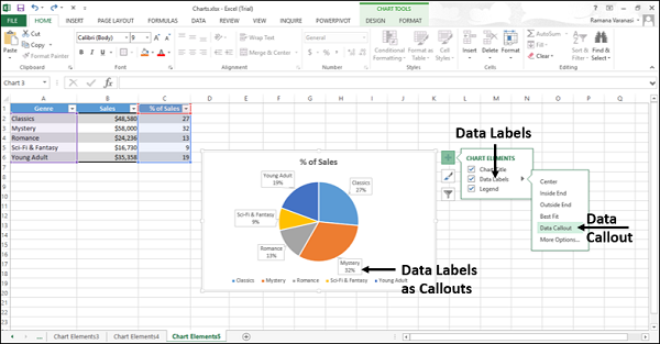
You can change the location of the data labels within the chart, to make them more readable.
Step 4 − Click the ![]() icon to see the options available for data labels.
icon to see the options available for data labels.
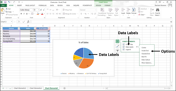
Step 5 − Point on each of the options to see how the data labels will be located on your chart. For example, point to data callout.
The data labels are placed outside the pie slices in a callout.
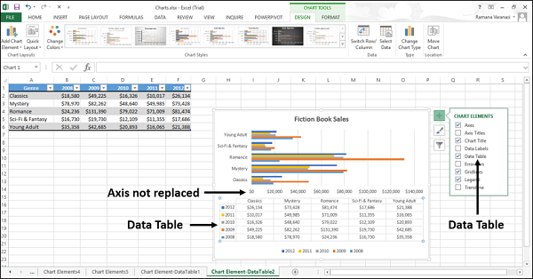
Data Table
Data Tables can be displayed in line, area, column, and bar charts. Follow the steps to insert a data table in your chart.
Step 1 − Click on the chart.
Step 2 − Click the Chart Elements icon.
Step 3 − From the list, select Data Table. The data table appears below the chart. The horizontal axis is replaced by the header row of the data table.
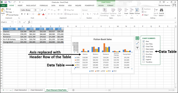
In bar charts, the data table does not replace an axis of the chart but is aligned to the chart.
Error Bars
Error bars graphically express the potential error amounts relative to each data marker in a data series. For example, you can show 5% positive and negative potential error amounts in the results of a scientific experiment.
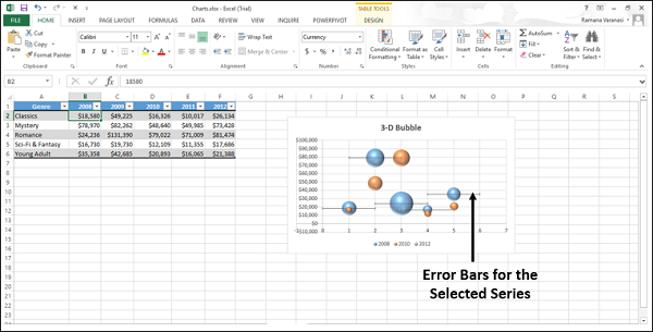
You can add Error bars to a data series in 2-D area, bar, column, line, x y (scatter), and bubble charts.
To add Error bars, follow the steps given below −
Step 1 − Click on the Chart.
Step 2 − Click the Chart Elements icon.
Step 3 − From the list, select Error bars. Click the ![]() icon to see the options available for Error bars.
icon to see the options available for Error bars.
Step 4 − Click More Options… from the list displayed. A small window to add series will open.
Step 5 − Select the series. Click OK.
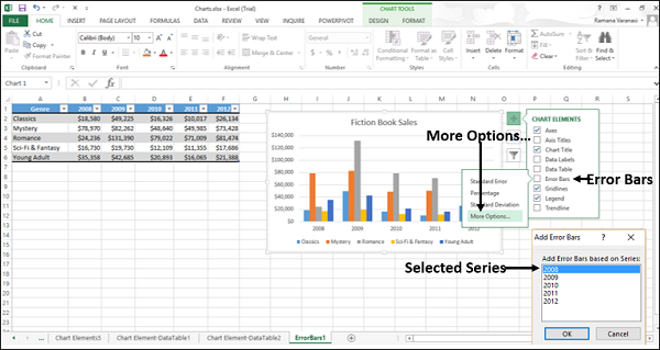
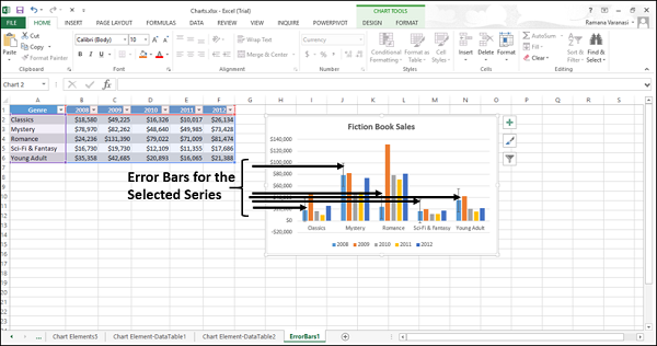
The Error bars will appear for the selected series.
If you change the values on the worksheet associated with the data points in the series, the error bars are adjusted to reflect your changes.
For X Y (Scatter) and Bubble charts, you can display the error bars for the X values, the Y values, or both.
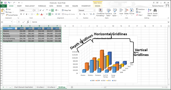
Gridlines
In a chart that displays the axes, to make the data easier to read, you can display the horizontal and the vertical chart gridlines.
Gridlines extend from any horizontal and vertical axes across the plot area of the chart.
You can also display the depth gridlines in 3-D charts.
To insert gridlines −
Step 1 − Click on the 3-D column chart.
Step 2 − Click the Chart Elements icon.
Step 3 − From the list, select Error bars. Click the ![]() icon to see the options available for gridlines.
icon to see the options available for gridlines.
Step 4 − Select Primary Major Horizontal, Primary Major Vertical and Depth Major from the list displayed.
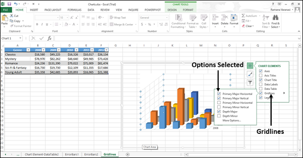
The selected gridlines will be displayed on the chart.
You cannot display gridlines for the chart types that do not display axes, i.e., Pie charts and Doughnut charts.
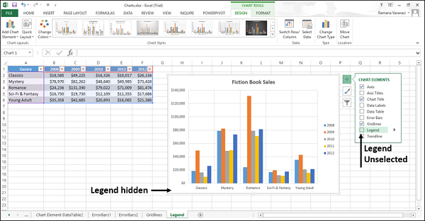
Legend
When you create a chart, the Legend appears by default.
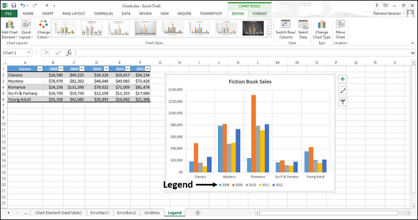
You can hide a Legend by deselecting it from the Chart Elements list.
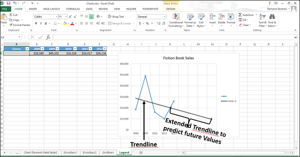
Trendline
Trendlines are used to graphically display the trends in data and to analyze the problems of prediction. Such analysis is also called regression analysis.
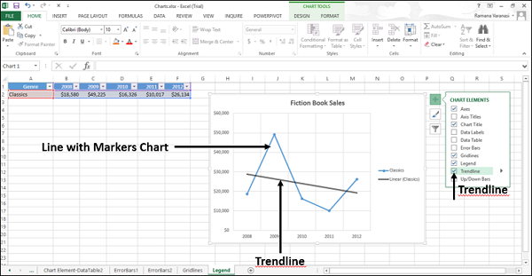
By using regression analysis, you can extend a trendline in a chart beyond the actual data to predict the future values.
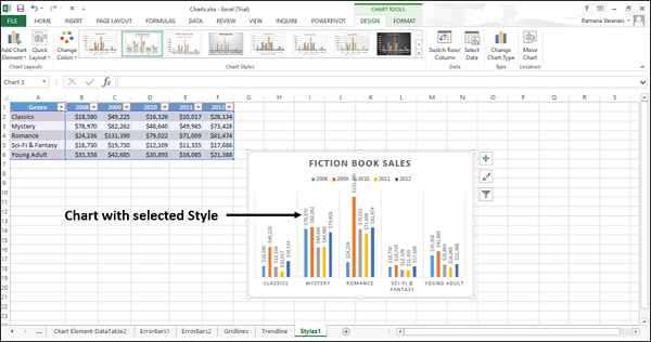
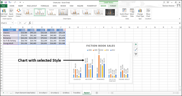
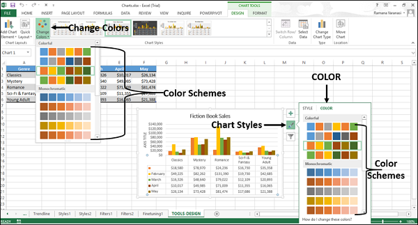
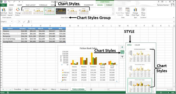
Excel Charts - Chart Styles
You can use Chart Styles to customize the look of the chart. You can set a style and color scheme for your chart with the help of this tool.
Follow the steps given below to add style and color to your chart.
Step 1 − Click on the chart. Three buttons appear at the upper-right corner of the chart.
Step 2 − Click the Chart Styles icon. STYLE and COLOR will be displayed.
Style
You can use STYLE to fine tune the look and style of your chart.
Step 1 − Click STYLE. Different style options will be displayed.
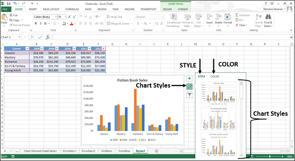
Step 2 − Scroll down the options. Point to any of the options to see the preview of your chart with the currently selected style.
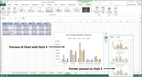
Step 3 − Choose the style option you want. The chart will be displayed with the selected style.
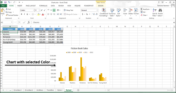
Color
You can use the COLOR options to select the color scheme for your chart.
Step 1 − Click COLOR. Different color scheme will be displayed.
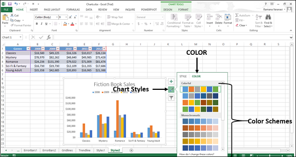
Step 2 − Scroll down the options. Point on any of the options to see the preview of your chart with the currently selected color scheme.
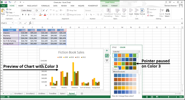
Step 3 − Choose the color option you want. The chart will be displayed with the selected color.
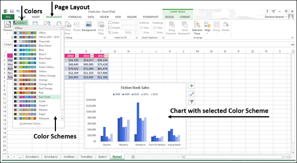
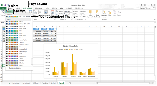
You can change the color schemes through the Page Layout tab also.
Step 1 − On the Page Layout tab, in the Themes group, click the Colors button on the Ribbon.
Step 2 − Select any color scheme of your choice from the list.
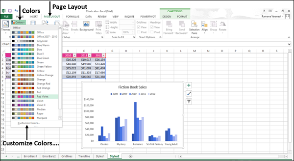
You can also customize the colors and have your own color scheme.
Step 1 − Click the option Customize Colors…
A new window Create New Theme Colors appears. Let us take an example.
Step 2 − Click the drop-down arrow to see more options.
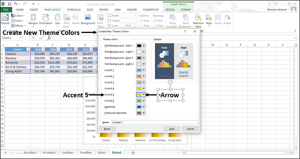
A small window - Theme Colors appear.
Step 3 − Click Orange Accent 2 as shown in the following screen shot.
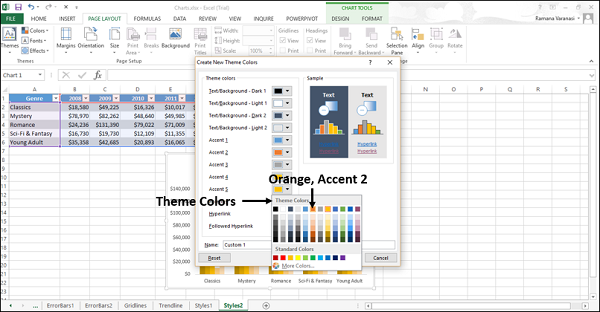
Step 4 − Give a name to your color scheme. Click Save.
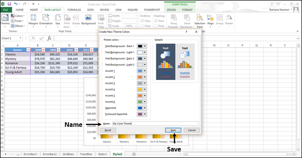
Your customized theme appears under Custom in the Colors menu, on the Page Layout tab on the ribbon.
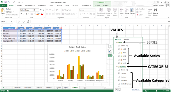
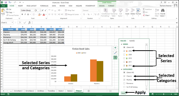
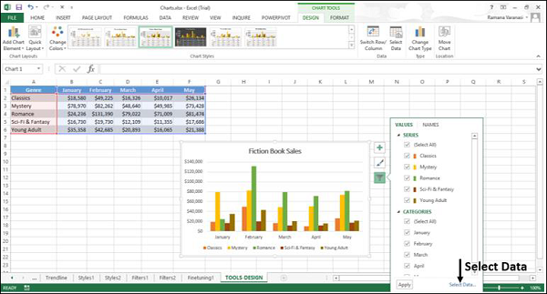
Excel Charts - Chart Filters
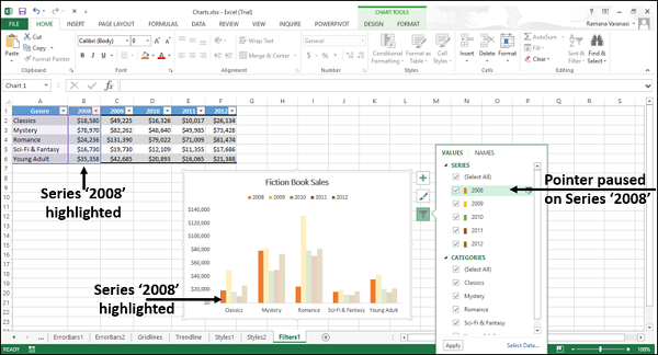
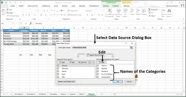
You can use Chart Filters to edit the data points (values) and names that are visible on the displayed chart, dynamically.
Step 1 − Click on the chart.
Step 2 − Click the Chart Filters icon that appears at the upper-right corner of the chart. Two tabs – VALUES and NAMES appear in a new window.
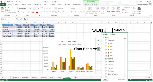
Values
Values are the series and the categories in the data.
Click the Values tab. The available SERIES and CATEGORIES in your data appear.
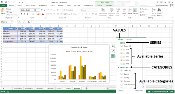
Values – Series
Step 1 − Point on any of the available series. That particular series will be highlighted on the chart. In addition, the data corresponding to that series will be highlighted in the excel table.
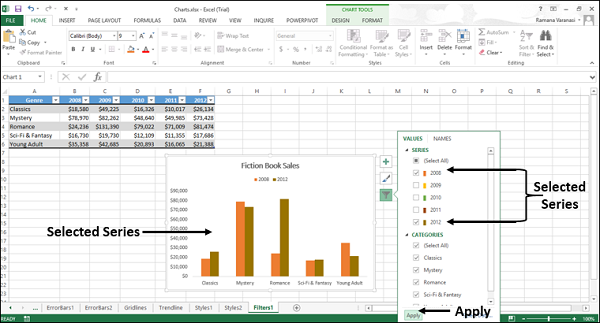
Step 2 − Select the series you want to display and deselect the rest of the series. Click Apply. Only the selected series will be displayed on the chart.
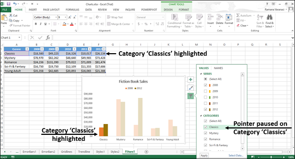
Values – Categories
Step 1 − Point to any of the available categories. That particular category will be highlighted on the chart. In addition, the data corresponding to that category will be highlighted in the excel table.
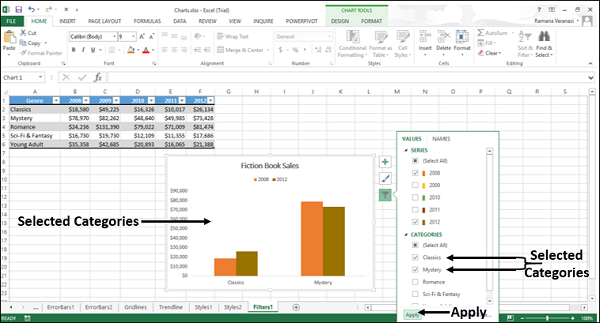
Step 2 − Select the category you want to display deselect the rest of the categories. Click Apply. Only the selected categories will be displayed on the chart.
Names
NAMES represent the names of the series in the chart. By default, names are taken from the excel table.
You can change the names of the series in the chart using the names tab in the chart filters. Click the NAMES tab in the Chart Filters. The names of the series and the names of the categories in the chart will be displayed.
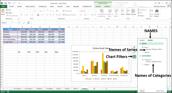
You can change the names of the series and categories with select data button, in the lower right corner of the chart filters box.
Names – Series
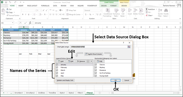
Step 1 − Click the Select Data button. The Select Data Source Dialog Box appears. The names of the series are at the left side of the dialog box.
To change the names of the series,
Step 2 − Click the Edit button above the series names.
The Edit Series dialog box appears. You can also see the cell reference of the name of the first series.
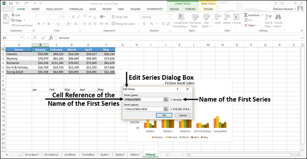
Step 3 − Change the cell reference of the name of the first series. Click OK.
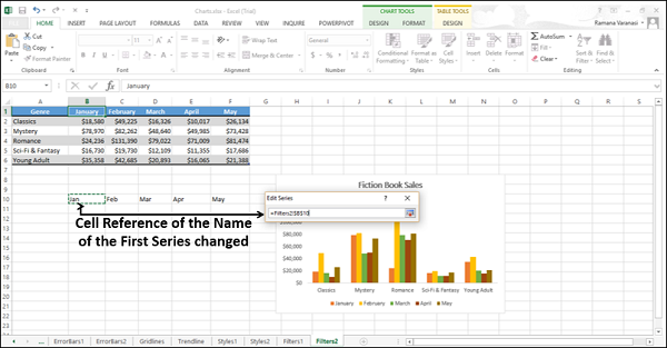
You can see that the name of the first series has changed.
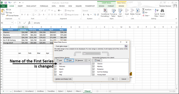
Step 4 − Repeat the steps 2 and 3 for the names of the rest of the series.
Note that the names have changed only in the chart. They have not changed in the Excel table.
Names – Categories
To change the names of the categories, you need to follow the same steps as for series, by selecting the edit button above the categories names in the select data source dialog-box.
Excel Charts - Fine Tuning
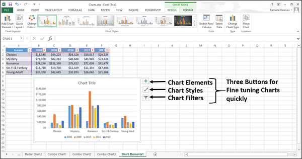
To fine tune the charts quickly, use the three buttons that appear at the upper-right corner of the chart.
The three buttons through which you can fine-tune your chart quickly are −
- Chart Elements − To add chart elements like axis titles or data labels.
- Chart Styles − To customize the look of the chart.
- Chart Filters − To change the data that is shown on the chart.
Step 1 − Click on the chart. Three buttons appear at the upper-right corner of the chart.
Select / Deselect Chart Elements
Step 1 − Click on the chart.
Step 2 − Click Chart Elements. From the list of chart elements, point to each chart element to see how they are displayed on the chart.
Step 3 − Select/deselect chart elements. Only the selected chart elements will be displayed on the chart.
Format Style
You can use Chart Styles to set a style for your chart.
Step 1 − Click on the Chart.
Step 2 − Click the Chart Styles icon. STYLE and COLOR will be displayed. You can use STYLE to fine-tune the look and style of your chart.
Step 3 − Click on STYLE. Different Style options will be displayed.

Step 4 − Scroll down the options. Point at any of the options to see the preview of your chart with the currently selected style.
Step 5 − Choose the style option you want. The chart will be displayed with selected Style.
Format Color
You can use color in chart styles to select the color scheme for your chart.
Step 1 − Click on the Chart.
Step 2 − Click the Chart Styles icon. STYLE and COLOR tabs are displayed.
Step 3 − Click the COLOR tab. Different color scheme options are displayed.

Step 4 − Scroll down the options. Point to any of the options to see the preview of your chart with the currently selected color scheme.
Step 5 − Choose the color option you want. The chart will be displayed with selected color.
Chart Filters
You can use the chart filters to edit the data points (values) and names that are visible on the chart being displayed, dynamically.
Step 1 − Click on the Chart.
Step 2 − Click the Chart Filters icon at the upper-right corner of the chart.
Two tabs – VALUES and NAMES appear in a new window.
Values are the series and the categories in the data.
Step 3 − Click the values. The available series and categories in your data appear.
Step 4 − Select / deselect series and categories. The chart changes dynamically, displaying only the selected series and categories.
Step 5 − After the final selection of series and categories, click Apply. The chart will be displayed with the selected data.
Excel Charts - Design Tools
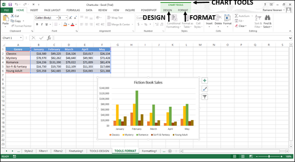
Chart tools comprise of two tabs DESIGN and FORMAT.
Step 1 − When you click on a chart, CHART TOOLS comprising of DESIGN and FORMAT tabs appear on the Ribbon.
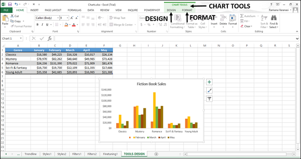
Step 2 − Click the DESIGN tab on the Ribbon. The Ribbon changes to the DESIGN commands.
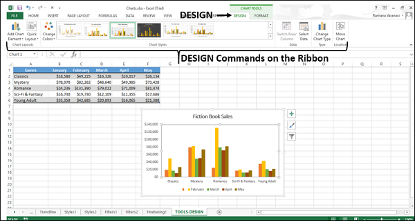
The Ribbon contains the following Design commands −
Chart layouts group
Add chart element
Quick layout
Chart styles group
Change colors
Chart styles
Data group
Switch row/column
Select data
Type group
Change chart type
Location group
Move chart
In this chapter, you will understand the design commands on the Ribbon.
Add Chart Element
Add Chart Element is the same as chart elements.
Step 1 − Click Add Chart Element. The chart elements appear in the drop-down list. These are same as those in the chart elements list.
Refer to the chapter – Chart Elements in this tutorial.
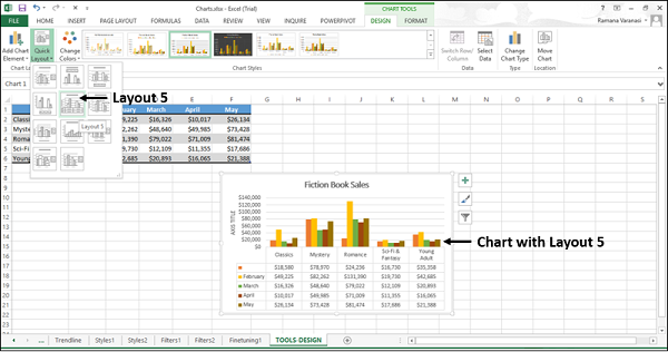
Quick Layout
You can use Quick Layout to change the overall layout of the chart quickly by choosing one of the predefined layout options.
Step 1 − On the Ribbon, click Quick Layout. Different predefined layout options will be displayed.
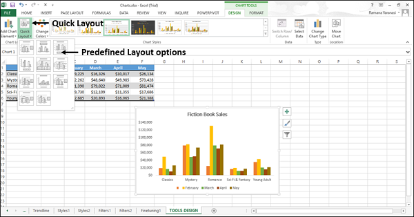
Step 2 − Move the pointer across the predefined layout options. The chart layout changes dynamically to the particular option.
Step 3 − Select the layout you want. The chart will be displayed with the chosen layout.
Change Colors
The functions of Change Colors are the same as Chart Styles → COLOR.
Step 1 − On the Ribbon, click Change Colors. The color schemes appear in the drop-down list. These are the same as that appear in Change Styles → COLOR.
Refer to the chapter – Chart Styles in this tutorial.
Chart Styles
The Chart Styles command is the same as Chart Styles → STYLE.
Refer to the chapter – Chart Styles in this tutorial.
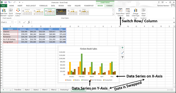
Switch Row/Column
You can use Switch Row/Column to change the data being displayed on X-axis to be displayed on Y-axis and vice versa.
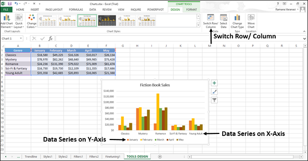
Click Switch Row / Column. The data will be swapped between X-axis and Y-axis on the chart.
Select Data
You can use Select Data to change the data range included in the chart.
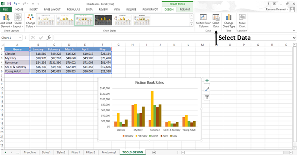
Step 1 − Click Select Data. A Select Data Source window appears.
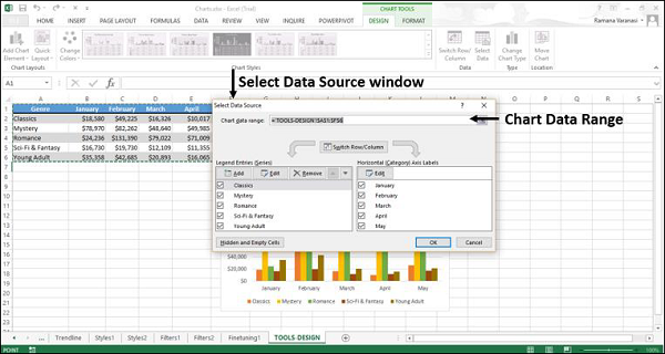
This window is the same as that appears with Chart Styles → Select data.
Step 2 − Select the chart data range in the select data source window.
Step 3 − Select the data that you want to display on your chart form the Excel worksheet.
Change Chart Type
You can use the Change Chart Type button to change your chart to a different chart type.
Step 1 − Click Change Chart Type. A Change Chart Type window appears.
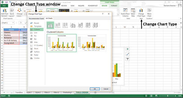
Step 2 − Select the chart type you want.
Your chart will be displayed with the chart type you want.
Move Chart
You can use Move Chart to move the chart to another worksheet in the workbook.
Step 1 − Click the Move Chart command button. A Move Chart window appears.
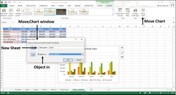
Step 2 − Select New Sheet. Type the name of the new sheet.
The chart moves from the existing sheet to the new sheet.
Excel Charts - Quick Formatting
You can format charts quickly using the Format pane. It is quite handy and provides advanced formatting options.
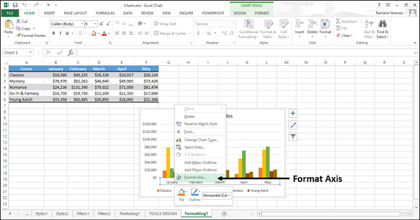
To Format any chart element,
Step 1 − Click on the chart.
Step 2 − Right-click chart element.
Step 3 − Click Format <Chart Element> from the drop-down list.
The Format pane appears with options that are tailored for the selected chart element.
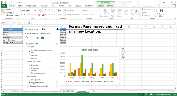
Format Pane
The Format pane by default appears on the right-side of the chart.
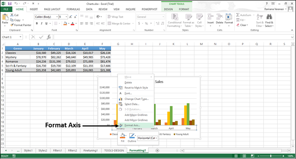
Step 1 − Click on the chart.
Step 2 − Right-click the horizontal axis. A drop-down list appears.
Step 3 − Click Format Axis. The Format pane for formatting axis appears. The format pane contains the task pane options.
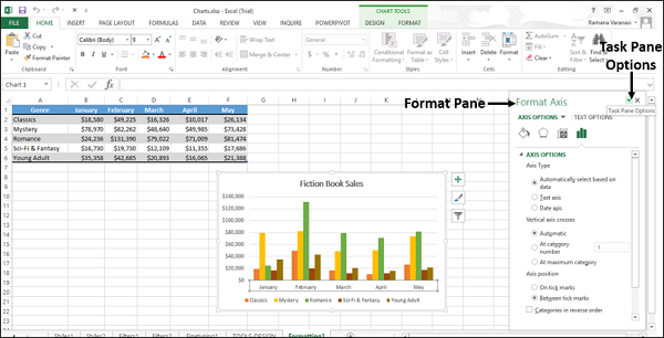
Step 4 − Click the ![]() Task Pane Options icon.
Task Pane Options icon.
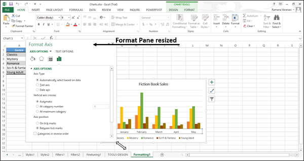
The task pane options – Move, Size or Close appear in the drop-down. You can move, resize or close the format pane using these options.
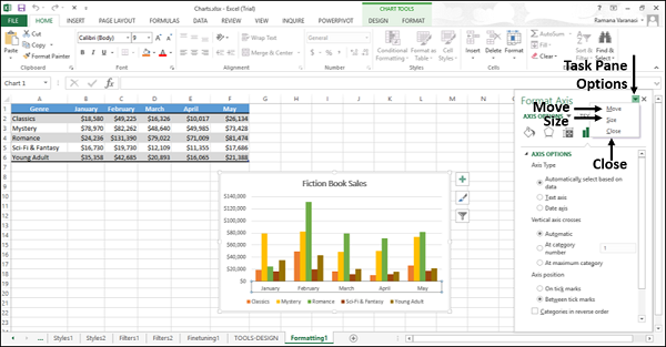
Step 5 − Click Move. The mouse pointer changes to  holding which you can move the Format Pane. Drag the format pane to the location you want.
Step 6 − Click the Size option from the task pane options to resize the format window. The pointer changes to an arrow, which appears at the right-bottom corner of the format pane.
Step 7 − Click Close from the task pane options.
The Format Pane closes.
Format Axis
To format axis quickly follow the steps given below.
Step 1 − Right-click the chart axis and then click Format Axis.
The Format Axis pane appears.
In the Format Axis pane, you will see two tabs −
- AXIS OPTIONS
- TEXT OPTIONS
By default, Axis Options are highlighted. The icons below these options on the pane are to format the appearance of the axes.
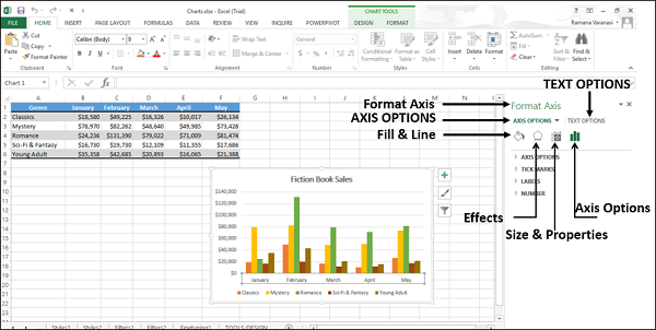
Step 2 − Click Axis Options. The various available options for formatting axis will appear.
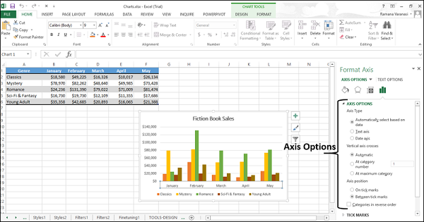
Step 3 − Select the required Axis Options. You can edit the display of the axes through these options.
Format Chart Title
To format the chart title, follow the steps given below.
Step 1 − Right-click the chart title and then click Format Chart Title.
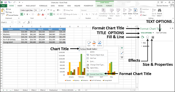
Step 2 − Select the required Title Options.
You can edit the display of the chart title through these options.
Format Chart Area
To format the chart area, follow the steps given below.
Step 1 − Right-click the chart area and then click Format Chart Area.
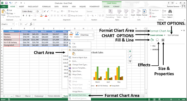
Step 2 − Select the required Chart Options.
You can edit the display of your chart through these options.
Format Plot Area
To format the plot area, follow the steps given below.
Step 1 − Right-click the plot area and then click Format Plot Area.
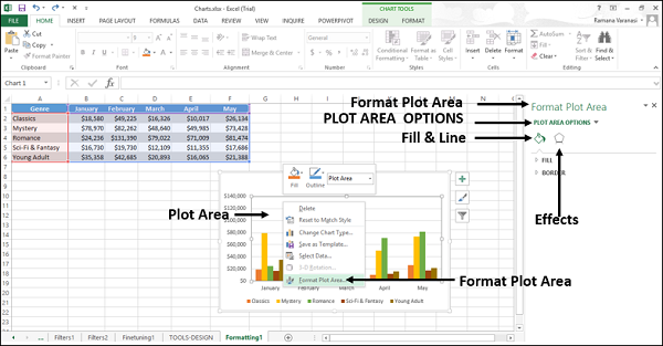
Step 2 − Select the required Plot Area Options.
You can edit the display of the plot area where your chart is plotted through these options.
Format Data Series
To format the data series −
Step 1 − Right-click any of the data series of your chart and then click Format Data Series.
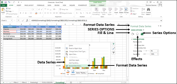
Step 2 − Select the required Series Options.
You can edit the display of the series through these options.
Format Data Labels
To format data labels quickly, follow the steps −
Step 1 − Right-click a data label. The data labels of the entire series are selected. Click Format Data Labels.
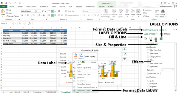
Step 2 − Select the required Label Options.
You can edit the display of the data labels of the selected series through these options.
Format Data Point
To format the data point in your line chart −
Step 1 − Click the data point that you want to format. The data points of the entire series are selected.
Step 2 − Click the data point again. Now, only that particular data point is selected.
Step 3 − Right-click that particular selected data point and then click Format Data Point.
The Format Pane – Format Data Point appears.
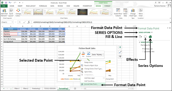
Step 4 − Select the required Series Options. You can edit the display of the data points through these options.
Format Legend
To format Legend −
Step 1 − Right-click legend and then click Format Legend.
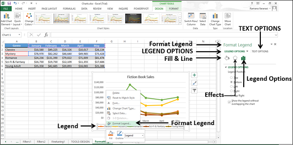
Step 2 − Select the required Legend Options. You can edit the display of the legends through these options.
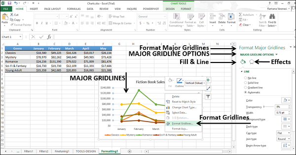
Format Major Gridlines
Format major gridlines of your chart by following the steps given below −
Step 1 − Right-click the major gridlines and then click Format Gridlines.
Excel Charts - Aesthetic Data Labels
You can have aesthetic and meaningful data labels. You can −
Include rich and refreshable text from data points or any other text in your data labels.
Enhance them with formatting and additional freeform text.
Display them in just about any shape.
Data labels stay in place, even when you switch to a different type of chart. You can also connect the data labels to their data points with leader lines on all charts.
Here, we will use a Bubble chart to see the formatting of data labels.
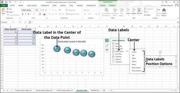
Data Label Positions
To place the data labels in the chart, follow the steps given below.
Step 1 − Click the chart and then click chart elements.
Step 2 − Select Data Labels. Click ![]() to see the options available for placing the data labels.
to see the options available for placing the data labels.
Step 3 − Click Center to place the data labels at the center of the bubbles.
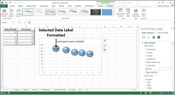
Format a Single Data Label
To format a single data label −
Step 1 − Click twice any data label you want to format.
Step 2 − Right-click that data label and then click Format Data Label. Alternatively, you can also click More Options in data labels options to display on the Format Data Label task pane.

There are many formatting options for data labels in the format data labels task pane.

Step 3 − Format the data label choosing the options you want. Make sure that only one data label is selected while formatting.
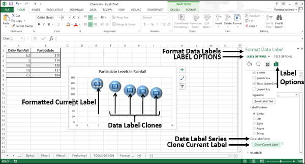
Clone Current Label
To clone the data label created, follow the steps given −
Step 1 − In the Format Data Labels pane, click the Label Options icon.
Step 2 − Under Data Label Series, click Clone Current Label. This will enable you to apply your custom data label formatting quickly to the other data points in the series.
Data Labels with Effects
You can opt for many things to change the look and feel of the data label like changing the Fill Color of the data label for emphasis etc. To format the data labels −
Step 1 − Right-click a data label and then click Format Data Label. The Format Pane - Format Data Label appears.
Step 2 − Click the Fill & Line icon. The options for Fill and Line appear below it.
Step 3 − Under FILL, Click Solid Fill and choose the color. You can also choose the other options such as Gradient Fill, Pattern & Texture Fill and so on.
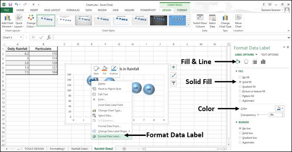
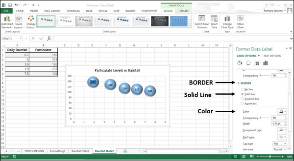
Step 4 − Under BORDER, click Solid Line and choose color.
Step 5 − Click the TEXT OPTIONS tab.
Step 6 − Click Solid Fill under the TEXT FILL option.
Step 7 − Choose a color that is compatible to your data label color.
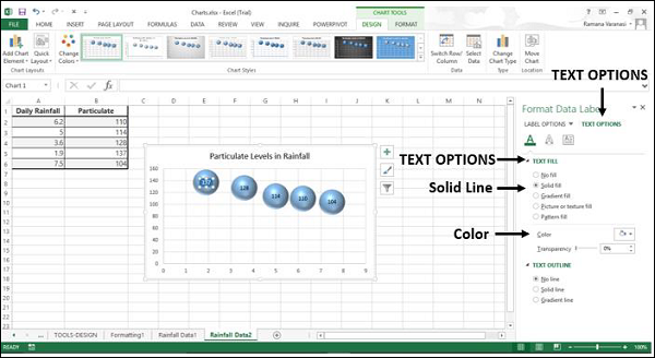
You can give your data Label a 3-D look with the Effects option.
Step 8 − Click Effects and choose the required effects.
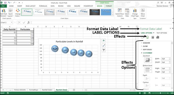
Under Label Options, click Clone Current Label. All the data labels in the series get formatted with the look and feel of the initially chosen data label.

Shape of a Data Label
You can personalize your chart by changing the shapes of your data label.
Step 1 − Right-click the data Label you want to change.
Step 2 − Click Change Data Label Shape in the drop-down List. Various data label shapes appear.
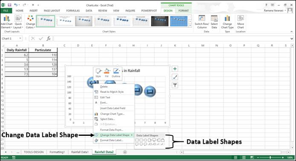
Step 3 − Choose the shape you want. The data labels will appear with the chosen shape.
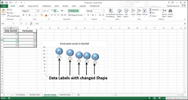
You can observe that the data labels are not completely visible. To make them visible, resize the data labels.
Resize a Data Label
To resize a data label −
Step 1 − Click on any data label.
Step 2 − Drag the border to the size you want. Alternatively, you can click on Size & Properties icon in Format data Labels task pane and then choose the size options.
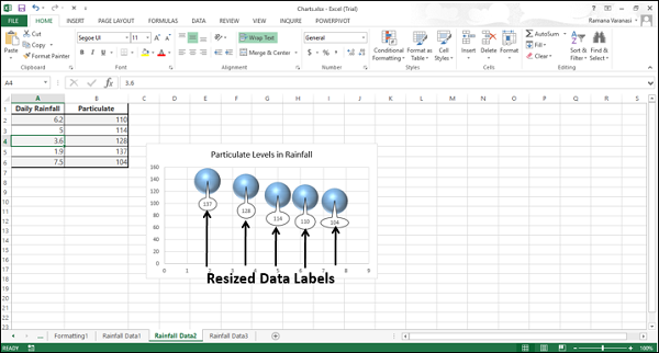
As you can see, the chart with the resized data labels, the data labels in a series can have varying sizes.
Add a Field to a Data Label
You can add a field to a data label. The corresponding field can contain explanatory text or a calculated value.
Step 1 − Place the explanatory text in a cell.
Step 2 − Click the data label, to which you want add the field. All the data labels in the series are selected.
Step 3 − Click again the data label, to which you want add the field. Now, only that particular data label is selected.
Step 4 − Right click the data label. In the drop-down list, click Insert Data Label Field.
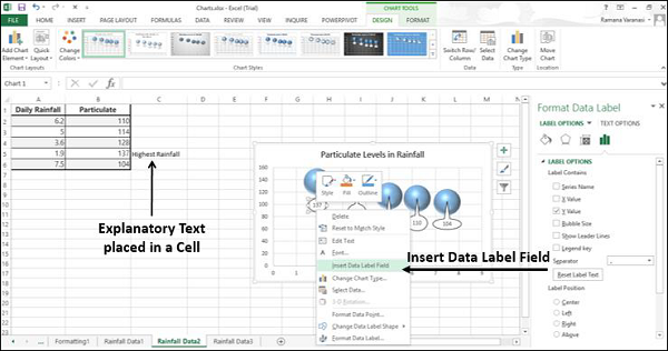
Various field options appear as shown in the image given below.
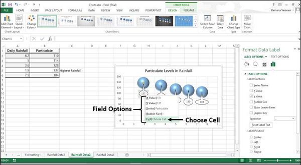
Step 5 − Click Choose Cell. A Data Label Reference window appears.
Step 6 − Select reference of the cell with the explanatory text and click OK.
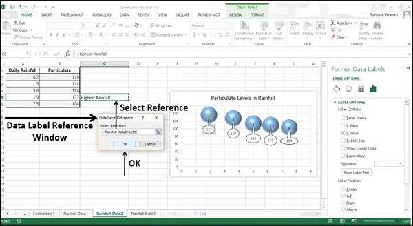
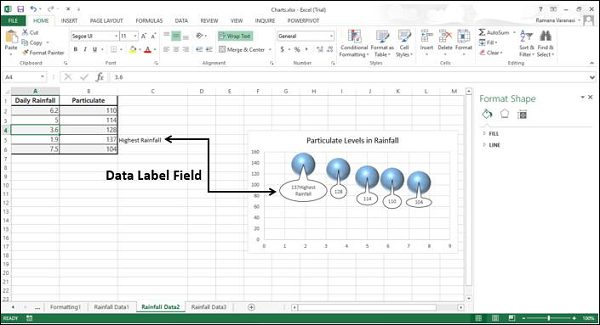
The explanatory text appears in the data label.
Step 7 − Resize the data Label to view the entire text.
Connecting Data Labels to Data Points
A Leader line is a line that connects a data label and its associated data point. It is helpful when you have placed a data label away from a data point.
All chart types with data labels have this functionality from Excel 2013 onwards. In earlier versions of Excel, only Pie charts had this functionality.
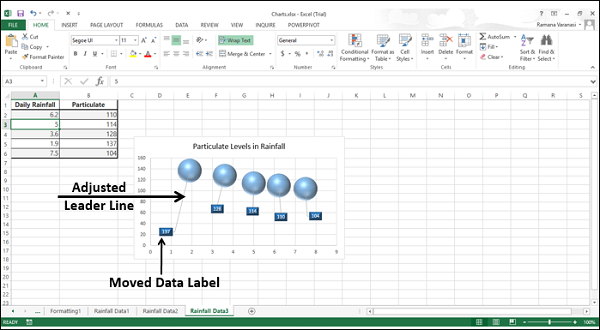
Step 1 − Click the data label.
Step 2 − Drag it after you see a four headed arrow. The Leader line appears.
Step 3 − Repeat Step 1 and 2 for all the data labels in the series. You can see the Leader lines appear for all the data labels.
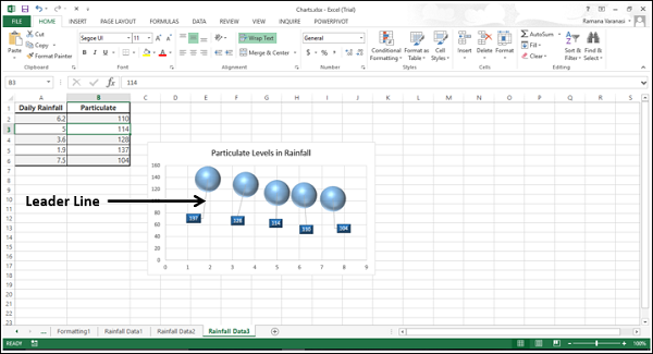
Step 4 − Move the data label. The Leader line automatically adjusts and follows it.
Format Leader Lines
You can format the Leader lines so that they are displayed the way you want in your chart.
Step 1 − Right click the Leader line you want to format and then click Format leader lines.
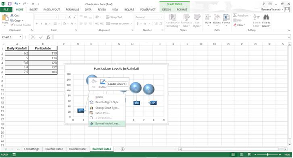
The Format pane - Format Leader Lines appears.
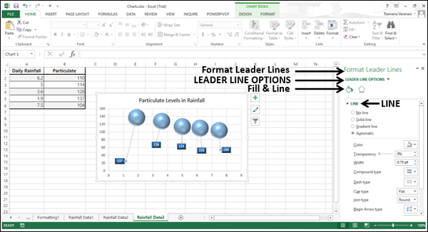
Step 2 − Click the Fill & Line icon.
Step 3 − Under the Line option, choose the options to display the leader line in a manner you want. The leader lines will be formatted as per your choices.
Excel Charts - Format Tools
The CHART TOOLS menu comprises of two tabs DESIGN and FORMAT.
When you click on a chart, a new tab CHART TOOLS comprising of DESIGN and FORMAT tabs appear on the Ribbon.
Click the FORMAT tab on the Ribbon. The Ribbon changes to the FORMAT commands.
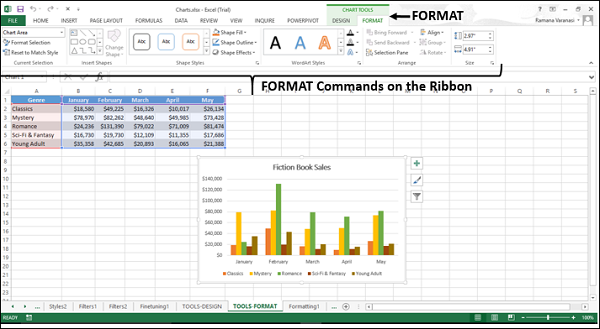
The Ribbon contains the following format commands −
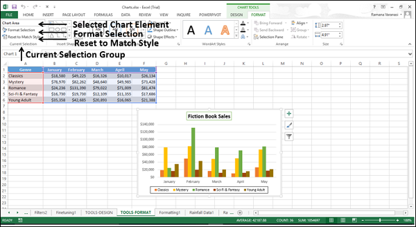
Current Selection Group
Chart Element Selection Box
Format Selection
Reset to Match Style
Insert Shapes Group
Different Shapes to Insert
Change Shape
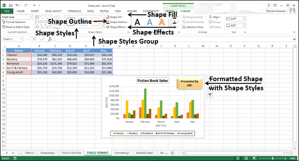
Shape Styles Group
Shape Styles
Shape Fill
Shape Outline
Shape Effects
WordArt Styles
WordArt Styles
Text Fill
Text Outline
Text Effects
Arrange Group
Bring Forward
Send Backward
Selection Pane
Align
Group
Rotate
Size Group
Shape Height
Shape Width
Current Selection Group
You can format chart elements using the Current Selection Group commands.
For formatting your charts through the Ribbon, follow the given steps.
Step 1 − Select the chart element you want to format. It appears in the box provided at the top of the group.
Step 2 − Click Format Selection. The Format pane appears for the selected chart element.
Step 3 − Format the selected chart element using the options in the format pane.
Refer chapter − Formatting Charts Quickly in this Tutorial.
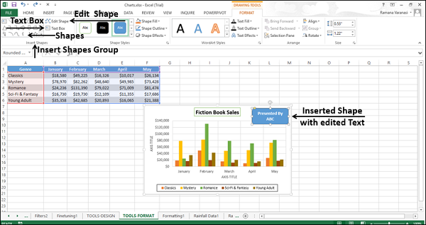
Insert Shapes Group
You can insert different shapes in your chart selecting the shapes. After you insert a shape, you can add text to it, with Edit Text.
You can edit shape with −
- Change Shape
- Edit Points
Shape Styles Group
You can change the style of the shape, choosing the given styles −
- You can choose a Shape Fill Color.
- You can Format Shape Outline.
- You can add Visual Effects to the Shape.
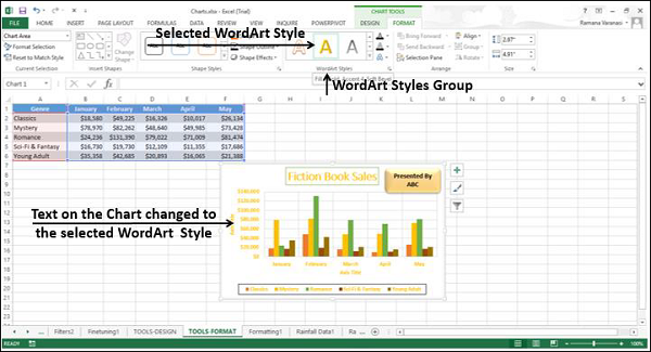
WordArt Styles Group
You can use the word art to change the way your chart is displayed. The available options are −
Fill the text with a color with the Text Fill command.
Customize the Text Outline.
Add visual effects to the text with Text Effects.
Arrange Group
The Arrange Group commands are used to select the objects on your chart, change the order or visibility of the selected objects.
To see the objects that are present on your chart, click the selection pane command. The selection pane appears listing the objects available on your chart.
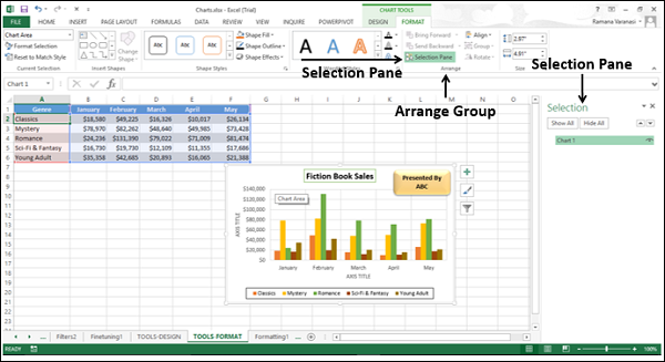
Select the objects and then you can do the following with the selected objects −
- Bring Forward
- Send Backward
- Selection Pane
- Align
- Group
- Rotate
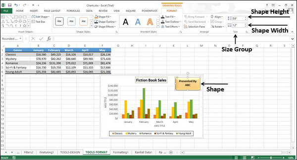
Size Group
The Size Group commands are used to change the width or the height of the shape or picture on the chart. You can use the shape height box and shape width box to change the height and weight respectively of a shape or picture.
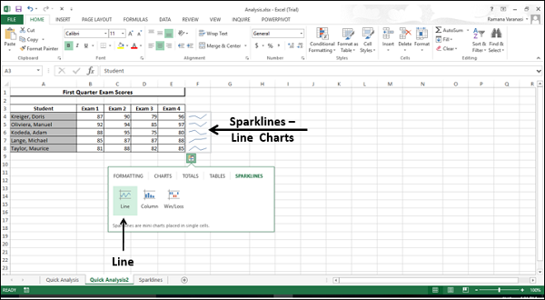
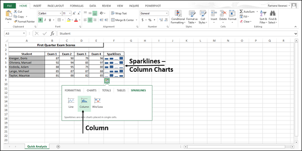
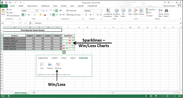
Excel Charts - Sparklines
Sparklines are tiny charts placed in single cells, each representing a row of data in your selection. They provide a quick way to see trends.
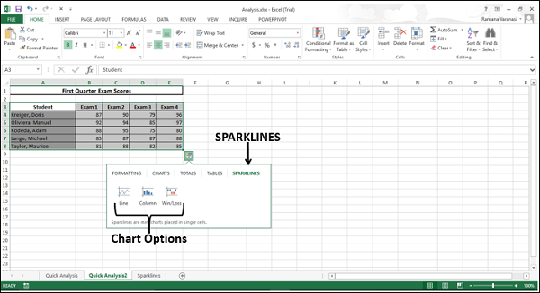
Sparklines have the following types −
- Line Sparkline
- Column Sparkline
- Win/Loss Sparkline
In this chapter, you will understand the different types of Sparklines and the way to add them to your data. You can add Sparklines through the Quick Analysis tool or through the INSERT tab on the Ribbon.
Sparklines with Quick Analysis
With Quick Analysis Tool, you can show the Sparklines alongside your data in the Excel data table.
Follow the steps given below.
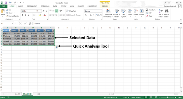
Step 1 − Select the data for which you want to add Sparklines. Keep an empty column to the right side of the data for the Sparklines.
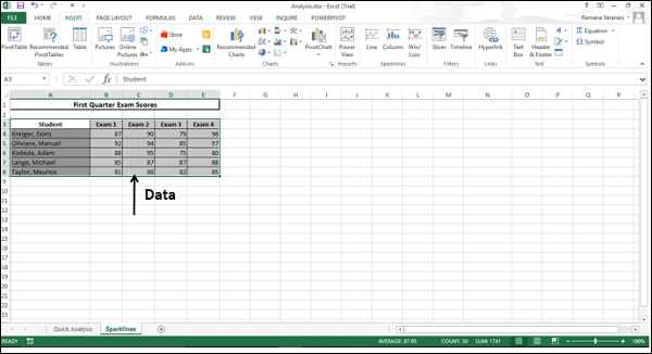
The Quick Analysis icon appears at the bottom right of your selected data.
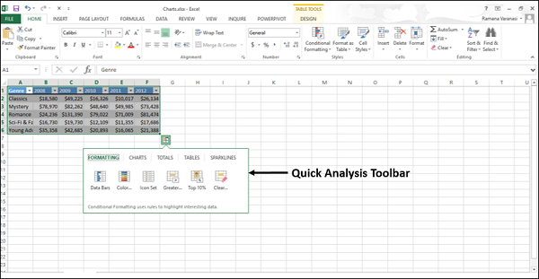
Step 2 − Click the Quick Analysis button that appears (or press CRTL+Q). The Quick Analysis Toolbar appears with the following options
- FORMATTING
- CHARTS
- TOTALS
- TABLES
- SPARKLINES
Step 3 − Click SPARKLINES. The chart options displayed are based on the data and may vary.
Line Sparkline – with Quick Analysis Toolbar
Step 4 − Click the Line button. A line chart for each row is displayed.
Column Sparkline – with Quick Analysis Toolbar
Step 5 − Click the Column button. A column chart for each row is displayed.
Win/Loss Sparkline – with Quick Analysis Toolbar
Step 6 − Click the Win/Loss button. A win/loss chart for each row is displayed.
Sparklines with INSERT tab
When you add Sparklines with INSERT tab on the Ribbon, you can show the Sparklines either alongside your data in the Excel data table as you had seen with Quick Analysis tool or in any location that you can choose on the worksheet.
Follow the steps given to add Sparklines through the Insert tab.
Step 1 − Click the INSERT tab on the Ribbon. The Sparklines group appears on the Ribbon, with three tabs −
- Line
- Column
- Win/Loss
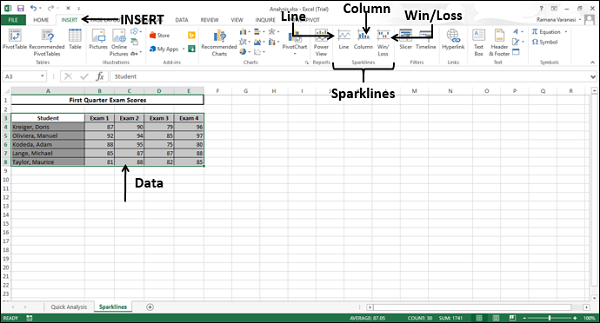
Line Sparkline through INSERT tab on Ribbon
Step 2 − Click the Line option. A Create Sparklines window appears. It will have placeholders for the data range and the location range.
Step 3 − Select Data Range or type the data range in the box.
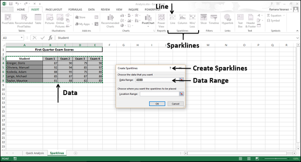
Step 4 − Select the Location range where you want the Sparklines to be placed.
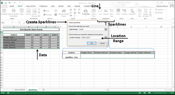
Step 5 − Click OK.
A line chart for each row of the selected data is displayed at the selected location.
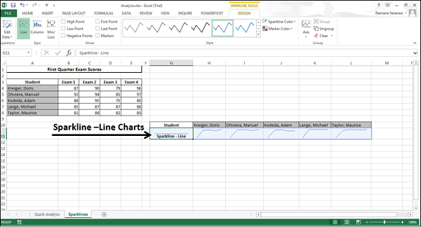
Column Sparkline – with INSERT tab on Ribbon
Step 1 − Click the INSERT tab on the Ribbon.
Step 2 − Click the Column button in the Sparklines group on the Ribbon.
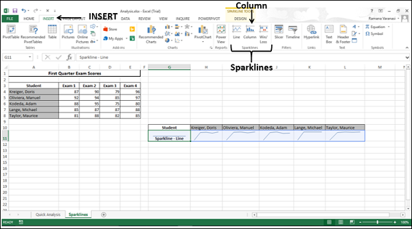
A Create Sparklines window appears, with placeholders for data range and location range.
Step 3 − Select the data range.
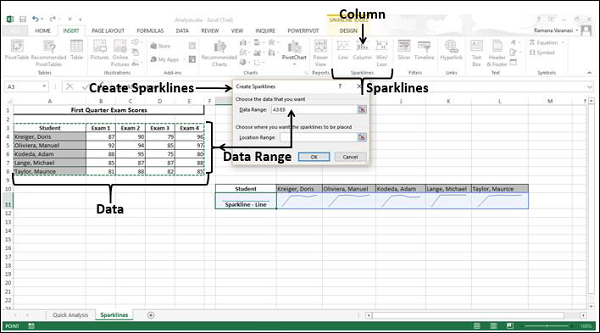
Step 4 − Select the location range where you want the Sparklines to be placed.
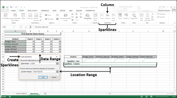
Step 5 − Click OK.
A column chart for each row of the selected data is displayed at the selected location.
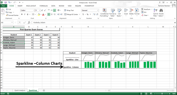
Win/Loss Sparkline – with INSERT tab on Ribbon
Step 1 − Click the INSERT tab on the Ribbon.
Step 2 − Click the Win/Loss button in the Sparklines group on the Ribbon.
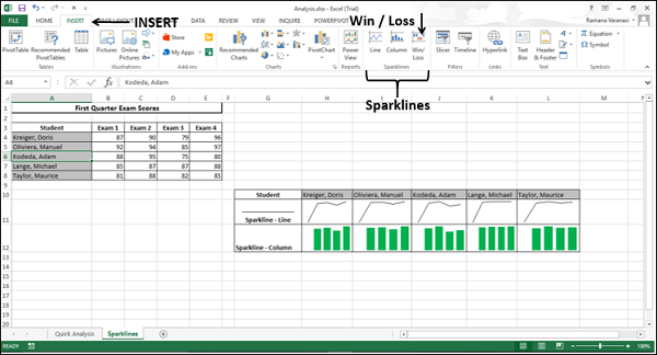
A Create Sparklines window appears, with placeholders for data range and location range.
Step 3 − Select the data range.
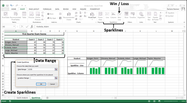
Step 4 − Select the Location Range where you want the Sparklines to be placed.
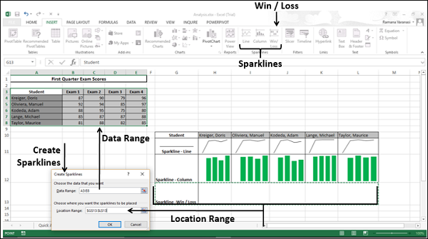
Step 5 − Click OK.
A Win/Loss chart for each row of the selected data is displayed at the selected location.
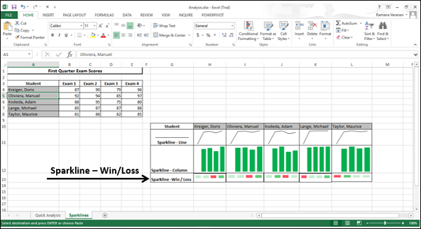
Excel Charts - PivotCharts
Pivot charts are used to graphically summarize the data and explore complicated data.
A Pivot chart shows the data series, categories, and chart axes the same way a standard chart does. Additionally, it also gives you interactive filtering controls right on the chart so that you can quickly analyze a subset of your data.
Pivot charts are useful when you have the data in a huge Pivot table or a lot of complex worksheet data that includes text and numbers. A Pivot chart can help you make sense of this data.
You can create a Pivot chart in the following ways −
From a Pivot table
From a data table as a standalone without Pivot table
From a data table as a standalone without Pivot table with recommended charts
Creating a PivotChart from a PivotTable
To create a Pivot chart from a Pivot table −
Step 1 − Click the Pivot table. The Ribbon shows the Pivot table tools – ANALYZE and DESIGN on the Ribbon.
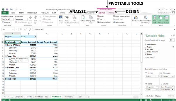
Step 2 − Click the ANALYZE tab. The Ribbon converts to the options available in ANALYZE tab.
Step 3 − Click PivotChart. An Insert Chart window appears.
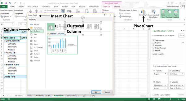
Step 4 − Click Column and then Clustered Column. Click OK. You can see the Pivot chart.
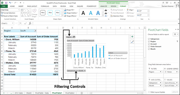
To summarize the data as you want, you can click any interactive control and then pick the sort or filtering options you want.
Step 5 − Click Region Filter Control. A search box appears with the list of all the regions.
Step 6 − Click Select Multiple Items. Check Boxes appear for the list of all the regions.
Step 7 − Select the East and South check boxes. Click OK.
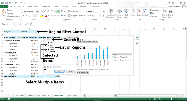
Step 8 − Click the Chart Elements icon.
Step 9 − Click Bottom from the options under the Legend option.
Step 10 − Now click the Month Filter control and select January. Click OK.
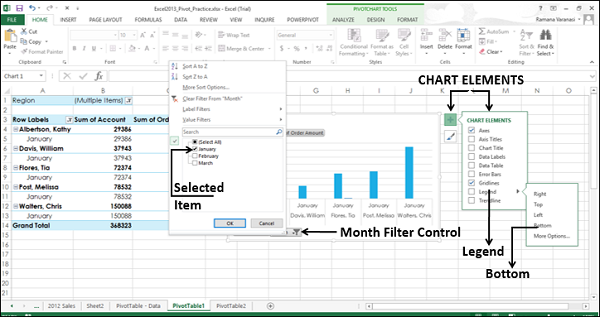
The Pivot chart is displayed with the filtered data.
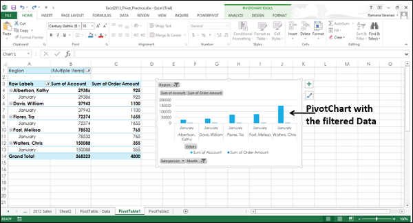
As in the case of normal charts, you can use the chart elements and the chart filters that appear at the right-top corner of the pivot chart to format the pivot chart to make it more presentable.
You have already seen how we changed the position of legend in the above given steps. Now, we will use chart styles to make the Pivot chart much more presentable.
Step 1 − Click the Chart Styles icon.
Step 2 − Under the STYLE option, choose Style 2.
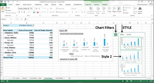
Style 2 has data labels above the columns that makes the Pivot chart more readable.
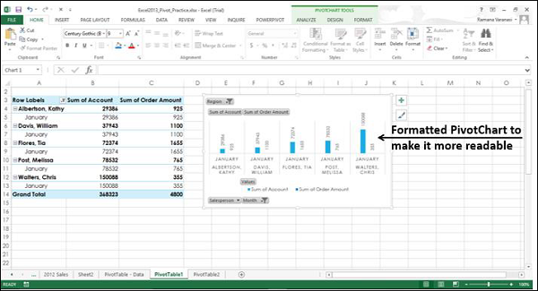
Creating a PivotChart from the Data Table as a Standalone PivotChart
You can create a Pivot chart without creating a Pivot table first.
Step 1 − Select the data table.
Step 2 − On the Insert tab, in the Charts group, click PivotChart on the Ribbon.
A Create PivotChart window appears.
Step 3 − Select the Table/Range
Step 4 − Select the location where you want the Pivot chart to be placed. You can choose a cell on the existing worksheet itself or on a new worksheet. Click OK.
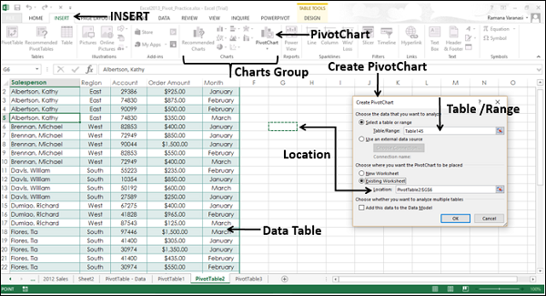
An empty Pivot chart and an empty Pivot table appear along with the Pivot chart field list to build the Pivot chart.
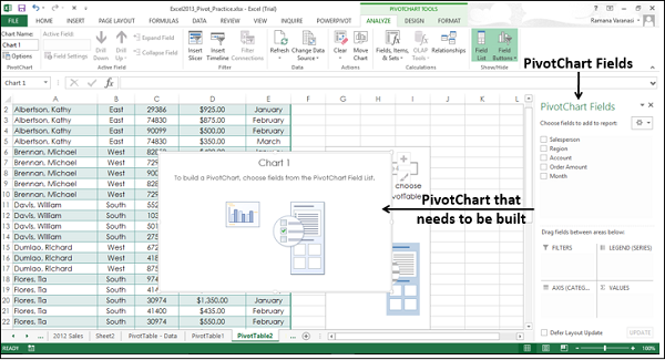
Step 5 − Choose the fields to be added to the Pivot chart.
Step 6 − Arrange the fields by dragging them into FILTERS, LEGEND (SERIES), AXIS (CATEGORIES) and VALUES.
Step 7 − Use the Filter Controls on the Pivot chart to select the data to be placed on the Pivot chart. Excel will automatically create a coupled Pivot table.
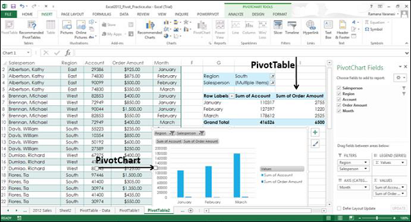
Recommended Pivot Charts
You can create a Pivot chart that is recommended for your data without first creating a Pivot table. Just as in the case of normal charts, Excel provides Recommended Pivot charts so that to quickly decide on the type of PivotChart that suits your data.
Step 1 − Select the data table.
Step 2 − On the Insert tab, in the Charts group, click Recommended Charts.
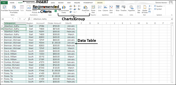
An Insert Chart window appears with two tabs Recommended charts and All charts.
Step 3 − Click the Recommended Charts tab.
Charts with the PivotChart icon ![]() in the top right corner are Pivot charts.
in the top right corner are Pivot charts.
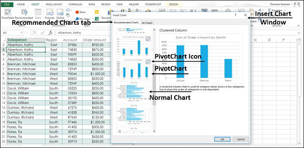
Step 4 − Click a Pivot chart. The preview appears on the right side.
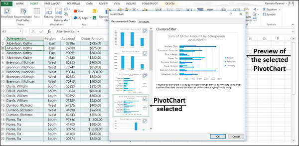
Step 5 − Click OK once you find the Pivot chart you want.
Your standalone Pivot chart for your data is displayed. Excel will automatically create a coupled Pivot table.