- SAP Analytics Cloud - Home
- SAP Analytics Cloud - Introduction
- SAP Analytics Cloud - Registration (Trial)
- SAP Analytics Cloud - System Requirements
- SAP Analytics Cloud - User Interface
- SAP Analytics Cloud - Export Options
- SAP Analytics Cloud - Creating First Story
- SAP Analytics Cloud - Exploring Data (Charts)
- SAP Analytics Cloud - Using Filters
- SAP Analytics Cloud - Styling Template
- SAP Analytics Cloud - Using Sharing Option
- SAP Analytics Cloud - Bookmarks
- SAP Analytics Cloud - Role Configuration
- Customizing Home Screen
- SAP Analytics Cloud - Designer
- SAP Analytics Cloud - Application
- SAP Analytics Cloud - User Roles
- SAP Analytics Cloud - Assigning Roles
- SAP Analytics Cloud - Creating Teams
- SAP Analytics Cloud - Admin for Support
- SAP Analytics Cloud - Adding Comments
- SAP Analytics Cloud - Digital Boardroom
- SAP Analytics Cloud - Support
- SAP Analytics Cloud Resources
- SAP Analytics Cloud - Quick Guide
- SAP Analytics Cloud - Useful Resources
- SAP Analytics Cloud - Discussion
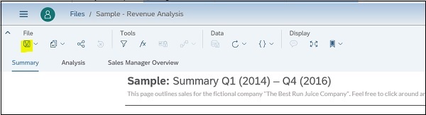
SAP Analytics Cloud - Creating First Story
Stories are main part of SAP Analytics to explore data and to find deep insight using charts and tables. You can share the stories with your colleagues, can also add comment on the findings. Stories has two main parts −
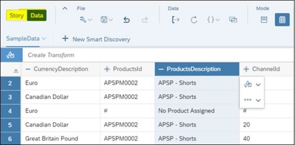
Data View
With use of data view, you can see real time data coming from source system and visualizations change accordingly.
Story View
With Story View, you can design beautiful, interactive dashboards for yourself or others. You can create new pages and add items such as charts, tables, and other graphics that visualize your data. Items on a page, such as a bar chart, are arranged as tiles that you can move around, resize, and style to your liking.
You can switch between Data and Story view. Whichever view of a story you are using, the key to the underlying data lies in the measures and dimensions defined in the model of your data. Measures represent quantities that provide meaning to your data. For example, sales revenue, salary, or number of employees. Dimensions represent categories that provide perspective on your data. Example: Product Category, date, or region.
To start with, you have to start with importing the data. From your computer, drag your file over to the Home screen in SAP Analytics Cloud. Release it on the Prepare Model option when the pop-up appears.
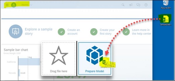
You can use - I'm Feeling Lucky automatically maps the column data to measures or dimensions, and dives right into the Data Exploration model. You can always change this model.
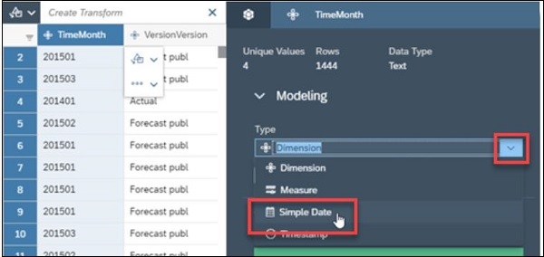
After the data is loaded into a model, you'll see the Data Manipulation view in your newly created story. Your column data has automatically been mapped to measures and dimensions. You can also select option - Enable date drill down checkbox to create date hierarchy. This allows you to view your data in a time-series chart.
You can save changes by selecting save button to generate the model in the story with your data.