- Ngx-Bootstrap - Home
- Ngx-Bootstrap - Overview
- Ngx-Bootstrap - Environment Setup
- Ngx-Bootstrap - Accordion
- Ngx-Bootstrap - Alerts
- Ngx-Bootstrap - Buttons
- Ngx-Bootstrap - Carousel
- Ngx-Bootstrap - Collapse
- Ngx-Bootstrap - DatePicker
- Ngx-Bootstrap - Dropdowns
- Ngx-Bootstrap - Modals
- Ngx-Bootstrap - Pagination
- Ngx-Bootstrap - Popover
- Ngx-Bootstrap - Progressbar
- Ngx-Bootstrap - Rating
- Ngx-Bootstrap - Sortable
- Ngx-Bootstrap - Tabs
- Ngx-Bootstrap - Timepicker
- Ngx-Bootstrap - Tooltip
- Ngx-Bootstrap - Typeahead
- Ngx-Bootstrap Useful Resources
- Ngx-Bootstrap - Quick Guide
- Ngx-Bootstrap - Useful Resources
- Ngx-Bootstrap - Discussion
Ngx-Bootstrap - Typeahead
ngx-bootstrap Typeahead directive provides a easy to use and highly configurable, easy to use Typeahead component.
TypeaheadDirective
selector
[typeahead]
Inputs
adaptivePosition − boolean, sets use adaptive position.
container − string, A selector specifying the element the typeahead should be appended to.
dropup − boolean, This attribute indicates that the dropdown should be opened upwards, default:false.
isAnimated − boolean, turn on/off animation, default:false.
optionsListTemplate − TemplateRef<TypeaheadOptionListContext>, used to specify a custom options list template. Template variables: matches, itemTemplate, query.
typeahead − Typeahead, options source, can be Array of strings, objects or an Observable for external matching process.
typeaheadAsync − boolean, should be used only in case of typeahead attribute is Observable of array. If true - loading of options will be async, otherwise - sync. true make sense if options array is large.
typeaheadGroupField − string, when options source is an array of objects, the name of field that contains the group value, matches are grouped by this field when set.
typeaheadHideResultsOnBlur − boolean, used to hide result on blur.
typeaheadIsFirstItemActive − boolean, makes active first item in a list. Default:true.
typeaheadItemTemplate − TemplateRef<TypeaheadOptionItemContext>, used to specify a custom item template. Template variables exposed are called item and index.
typeaheadLatinize − boolean, match latin symbols. If true the word sper would match super and vice versa.Default: true.
typeaheadMinLength − number, minimal no of characters that needs to be entered before typeahead kicks-in. When set to 0, typeahead shows on focus with full list of options (limited as normal by typeaheadOptionsLimit)
typeaheadMultipleSearch − boolean, Can be used to conduct a search of multiple items and have suggestion not for the whole value of the input but for the value that comes after a delimiter provided via typeaheadMultipleSearchDelimiters attribute. This option can only be used together with typeaheadSingleWords option if typeaheadWordDelimiters and typeaheadPhraseDelimiters are different from typeaheadMultipleSearchDelimiters to avoid conflict in determining when to delimit multiple searches and when a single word.
typeaheadMultipleSearchDelimiters − string, should be used only in case typeaheadMultipleSearch attribute is true. Sets the multiple search delimiter to know when to start a new search. Defaults to comma. If space needs to be used, then explicitly set typeaheadWordDelimiters to something else than space because space is used by default OR set typeaheadSingleWords attribute to false if you don't need to use it together with multiple search.
typeaheadOptionField − string, when options source is an array of objects, the name of field that contains the options value, we use array item as option in case of this field is missing. Supports nested properties and methods.
typeaheadOptionsInScrollableView − number, Default value: 5,specifies number of options to show in scroll view
typeaheadOptionsLimit − number, maximum length of options items list. The default value is 20.
typeaheadOrderBy − TypeaheadOrder, Used to specify a custom order of matches. When options source is an array of objects a field for sorting has to be set up. In case of options source is an array of string, a field for sorting is absent. The ordering direction could be changed to ascending or descending.
typeaheadPhraseDelimiters − string, should be used only in case typeaheadSingleWords attribute is true. Sets the word delimiter to match exact phrase. Defaults to simple and double quotes.
typeaheadScrollable − boolean, Default value: false, specifies if typeahead is scrollable
typeaheadSelectFirstItem − boolean, Default value: true, fired when an options list was opened and the user clicked Tab If a value equal true, it will be chosen first or active item in the list If value equal false, it will be chosen an active item in the list or nothing
typeaheadSingleWords − boolean, Default value: true, Can be use to search words by inserting a single white space between each characters for example 'C a l i f o r n i a' will match 'California'.
typeaheadWaitMs − number, minimal wait time after last character typed before typeahead kicks-in
typeaheadWordDelimiters − string, should be used only in case typeaheadSingleWords attribute is true. Sets the word delimiter to break words. Defaults to space.
Outputs
typeaheadLoading − fired when 'busy' state of this component was changed, fired on async mode only, returns boolean.
typeaheadNoResults − fired on every key event and returns true in case of matches are not detected.
typeaheadOnBlur − fired when blur event occurs. returns the active item.
typeaheadOnSelect − fired when option was selected, return object with data of this option.
Example
As we're going to use a Typeahead, We've to update app.module.ts used in ngx-bootstrap Timepicker chapter to use TypeaheadModule.
Update app.module.ts to use the TypeaheadModule.
app.module.ts
import { BrowserModule } from '@angular/platform-browser';
import { NgModule } from '@angular/core';
import { BrowserAnimationsModule } from '@angular/platform-browser/animations';
import { AppComponent } from './app.component';
import { TestComponent } from './test/test.component';
import { AccordionModule } from 'ngx-bootstrap/accordion';
import { AlertModule,AlertConfig } from 'ngx-bootstrap/alert';
import { ButtonsModule } from 'ngx-bootstrap/buttons';
import { FormsModule } from '@angular/forms';
import { CarouselModule } from 'ngx-bootstrap/carousel';
import { CollapseModule } from 'ngx-bootstrap/collapse';
import { BsDatepickerModule, BsDatepickerConfig } from 'ngx-bootstrap/datepicker';
import { BsDropdownModule,BsDropdownConfig } from 'ngx-bootstrap/dropdown';
import { PaginationModule,PaginationConfig } from 'ngx-bootstrap/pagination';
import { PopoverModule, PopoverConfig } from 'ngx-bootstrap/popover';
import { ProgressbarModule,ProgressbarConfig } from 'ngx-bootstrap/progressbar';
import { RatingModule, RatingConfig } from 'ngx-bootstrap/rating';
import { SortableModule, DraggableItemService } from 'ngx-bootstrap/sortable';
import { TabsModule, TabsetConfig } from 'ngx-bootstrap/tabs';
import { TimepickerModule } from 'ngx-bootstrap/timepicker';
import { TypeaheadModule } from 'ngx-bootstrap/typeahead';

@NgModule({
   declarations: [
      AppComponent,
      TestComponent
   ],
   imports: [
      BrowserAnimationsModule,
      BrowserModule,
      AccordionModule,
      AlertModule,
      ButtonsModule,
      FormsModule,
      CarouselModule,
      CollapseModule,
      BsDatepickerModule.forRoot(),
      BsDropdownModule,
      ModalModule,
      PaginationModule,
      PopoverModule,
      ProgressbarModule,
      RatingModule,
      SortableModule,
      TabsModule,
      TimepickerModule.forRoot(),
      TypeaheadModule.forRoot()
   ],
   providers: [AlertConfig,
      BsDatepickerConfig,
      BsDropdownConfig,
      BsModalService,
      PaginationConfig,
      ProgressbarConfig,
      RatingConfig,
      DraggableItemService,
      TabsetConfig],
   bootstrap: [AppComponent]
})
export class AppModule { }
Update test.component.html to use the timepicker component.
test.component.html
<input [(ngModel)]="selectedState"
   [typeahead]="states"
   class="form-control">
<pre class="card card-block card-header mb-3">Model: {{selectedState | json}}</pre>
Update test.component.ts for corresponding variables and methods.
test.component.ts
import { Component, OnInit } from '@angular/core';

@Component({
   selector: 'app-test',
   templateUrl: './test.component.html',
   styleUrls: ['./test.component.css']
})
export class TestComponent implements OnInit {
   selectedState: string;
   states: string[] = ['Alabama','Alaska','Arizona','Arkansas','California','Colorado',
   'Connecticut','Delaware','Florida','Georgia','Hawaii','Idaho','Illinois',
   'Indiana','Iowa','Kansas','Kentucky','Louisiana','Maine',
   'Maryland','Massachusetts','Michigan','Minnesota','Mississippi',
   'Missouri','Montana','Nebraska','Nevada','New Hampshire','New Jersey',
   'New Mexico','New York','North Dakota','North Carolina','Ohio',
   'Oklahoma','Oregon','Pennsylvania','Rhode Island','South Carolina',
   'South Dakota','Tennessee','Texas','Utah','Vermont',
   'Virginia','Washington','West Virginia','Wisconsin','Wyoming'];
   constructor() {}
   ngOnInit(): void {
   }
}
Build and Serve
Run the following command to start the angular server.
ng serve
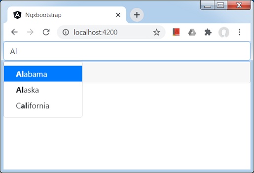
Once server is up and running. Open http://localhost:4200. Click on Open modal button and verify the following output.