- Ngx-Bootstrap - Home
- Ngx-Bootstrap - Overview
- Ngx-Bootstrap - Environment Setup
- Ngx-Bootstrap - Accordion
- Ngx-Bootstrap - Alerts
- Ngx-Bootstrap - Buttons
- Ngx-Bootstrap - Carousel
- Ngx-Bootstrap - Collapse
- Ngx-Bootstrap - DatePicker
- Ngx-Bootstrap - Dropdowns
- Ngx-Bootstrap - Modals
- Ngx-Bootstrap - Pagination
- Ngx-Bootstrap - Popover
- Ngx-Bootstrap - Progressbar
- Ngx-Bootstrap - Rating
- Ngx-Bootstrap - Sortable
- Ngx-Bootstrap - Tabs
- Ngx-Bootstrap - Timepicker
- Ngx-Bootstrap - Tooltip
- Ngx-Bootstrap - Typeahead
- Ngx-Bootstrap Useful Resources
- Ngx-Bootstrap - Quick Guide
- Ngx-Bootstrap - Useful Resources
- Ngx-Bootstrap - Discussion
Ngx-Bootstrap - Collapse
ngx-bootstrap Collapse directive helps to show/hide a container content.
CollapseDirective
selector
[collapse]
Inputs
collapse − boolean, A flag indicating visibility of content (shown or hidden)
display − string
isAnimated − boolean, turn on/off animation. default: false
Outputs
collapsed − This event fires as soon as content collapses
collapses − This event fires when collapsing is started
expanded − This event fires as soon as content becomes visible
expands − This event fires when expansion is started
Methods
toggle() − allows to manually toggle content visibility
hide − allows to manually hide content
show − allows to manually show collapsed content
Example
As we're going to use collapse, We've to update app.module.ts used in ngx-bootstrap Carousel chapter to use CollapseModule.
Update app.module.ts to use the CollapseModule.
app.module.ts
import { BrowserModule } from '@angular/platform-browser';
import { NgModule } from '@angular/core';
import { BrowserAnimationsModule } from '@angular/platform-browser/animations';
import { AppComponent } from './app.component';
import { TestComponent } from './test/test.component';
import { AccordionModule } from 'ngx-bootstrap/accordion';
import { AlertModule,AlertConfig } from 'ngx-bootstrap/alert';
import { ButtonsModule } from 'ngx-bootstrap/buttons';
import { FormsModule } from '@angular/forms';
import { CarouselModule } from 'ngx-bootstrap/carousel';
import { CollapseModule } from 'ngx-bootstrap/collapse';

@NgModule({
   declarations: [
      AppComponent,
      TestComponent
   ],
   imports: [
      BrowserAnimationsModule,
      BrowserModule,
      AccordionModule,
      AlertModule,
      ButtonsModule,
      FormsModule,
      CarouselModule,
      CollapseModule
   ],
   providers: [AlertConfig],
   bootstrap: [AppComponent]
})
export class AppModule { }
Update test.component.html to use the Collapse.
test.component.html
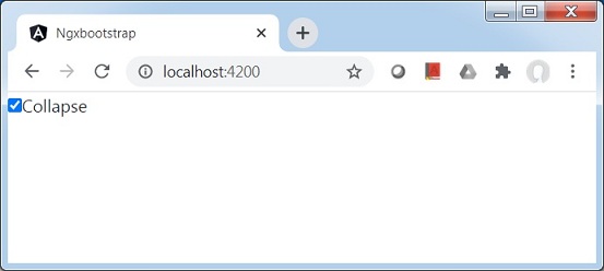
<div>
   <div class="checkbox">
      <label><input type="checkbox" [(ngModel)]="isCollapsed">Collapse</label>
   </div>
</div>
<div [collapse]="isCollapsed" [isAnimated]="true">
   <div class="well well-lg card card-block card-header">Welcome to Tutorialspoint.</div>
</div>
Update test.component.ts for corresponding variables and methods.
test.component.ts
import { Component, OnInit } from '@angular/core';

@Component({
   selector: 'app-test',
   templateUrl: './test.component.html',
   styleUrls: ['./test.component.css']
})
export class TestComponent implements OnInit {
   isCollapsed: boolean = false;
   constructor() { }

   ngOnInit(): void {
   }
}
Build and Serve
Run the following command to start the angular server.
ng serve
Once server is up and running. Open http://localhost:4200 and verify the following output.
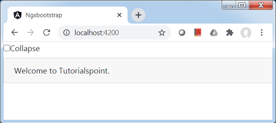
Check the collapse check box and then content will be collapsed.