- Ngx-Bootstrap - Home
- Ngx-Bootstrap - Overview
- Ngx-Bootstrap - Environment Setup
- Ngx-Bootstrap - Accordion
- Ngx-Bootstrap - Alerts
- Ngx-Bootstrap - Buttons
- Ngx-Bootstrap - Carousel
- Ngx-Bootstrap - Collapse
- Ngx-Bootstrap - DatePicker
- Ngx-Bootstrap - Dropdowns
- Ngx-Bootstrap - Modals
- Ngx-Bootstrap - Pagination
- Ngx-Bootstrap - Popover
- Ngx-Bootstrap - Progressbar
- Ngx-Bootstrap - Rating
- Ngx-Bootstrap - Sortable
- Ngx-Bootstrap - Tabs
- Ngx-Bootstrap - Timepicker
- Ngx-Bootstrap - Tooltip
- Ngx-Bootstrap - Typeahead
- Ngx-Bootstrap Useful Resources
- Ngx-Bootstrap - Quick Guide
- Ngx-Bootstrap - Useful Resources
- Ngx-Bootstrap - Discussion
Ngx-Bootstrap - Tabs
ngx-bootstrap tabs component provides a easy to use and highly configurable Tab component.
TabsetComponent
selector
tabset
Inputs
justified − boolean, if true tabs fill the container and have a consistent width.
type − string, navigation context class: 'tabs' or 'pills'.
vertical − if true tabs will be placed vertically.
TabDirective
selector
tab, [tab]
Inputs
active − boolean, tab active state toggle.
customClass − string, if set, will be added to the tab's class attribute. Multiple classes are supported.
disabled − boolean, if true tab can not be activated.
heading − string, tab header text.
id − string, tab id. The same id with suffix '-link' will be added to the corresponding
- element.
removable − boolean, if true tab can be removable, additional button will appear.
Outputs
deselect − fired when tab became inactive, $event:Tab equals to deselected instance of Tab component.
removed − fired before tab will be removed, $event:Tab equals to instance of removed tab.
selectTab − fired when tab became active, $event:Tab equals to selected instance of Tab component.
Example
As we're going to use a Tab, We've to update app.module.ts used in ngx-bootstrap Sortable chapter to use TabsModule and TabsetConfig.
Update app.module.ts to use the TabsModule and TabsetConfig.
app.module.ts
import { BrowserModule } from '@angular/platform-browser';
import { NgModule } from '@angular/core';
import { BrowserAnimationsModule } from '@angular/platform-browser/animations';
import { AppComponent } from './app.component';
import { TestComponent } from './test/test.component';
import { AccordionModule } from 'ngx-bootstrap/accordion';
import { AlertModule,AlertConfig } from 'ngx-bootstrap/alert';
import { ButtonsModule } from 'ngx-bootstrap/buttons';
import { FormsModule } from '@angular/forms';
import { CarouselModule } from 'ngx-bootstrap/carousel';
import { CollapseModule } from 'ngx-bootstrap/collapse';
import { BsDatepickerModule, BsDatepickerConfig } from 'ngx-bootstrap/datepicker';
import { BsDropdownModule,BsDropdownConfig } from 'ngx-bootstrap/dropdown';
import { PaginationModule,PaginationConfig } from 'ngx-bootstrap/pagination';
import { PopoverModule, PopoverConfig } from 'ngx-bootstrap/popover';
import { ProgressbarModule,ProgressbarConfig } from 'ngx-bootstrap/progressbar';
import { RatingModule, RatingConfig } from 'ngx-bootstrap/rating';
import { SortableModule, DraggableItemService } from 'ngx-bootstrap/sortable';
import { TabsModule, TabsetConfig } from 'ngx-bootstrap/tabs';

@NgModule({
   declarations: [
      AppComponent,
      TestComponent
   ],
   imports: [
      BrowserAnimationsModule,
      BrowserModule,
      AccordionModule,
      AlertModule,
      ButtonsModule,
      FormsModule,
      CarouselModule,
      CollapseModule,
      BsDatepickerModule.forRoot(),
      BsDropdownModule,
      ModalModule,
      PaginationModule,
      PopoverModule,
      ProgressbarModule,
      RatingModule,
      SortableModule,
      TabsModule
   ],
   providers: [AlertConfig,
      BsDatepickerConfig,
      BsDropdownConfig,
      BsModalService,
      PaginationConfig,
      ProgressbarConfig,
      RatingConfig,
      DraggableItemService,
      TabsetConfig],
   bootstrap: [AppComponent]
})
export class AppModule { }
Update test.component.html to use the tabs component.
test.component.html
<tabset>
   <tab heading="Home">Home</tab>
   <tab *ngFor="let tabz of tabs"
      [heading]="tabz.title"
      [active]="tabz.active"
      (selectTab)="tabz.active = true"
      [disabled]="tabz.disabled">
      {{tabz?.content}}
   </tab>
</tabset>
Update test.component.ts for corresponding variables and methods.
test.component.ts
import { Component, OnInit } from '@angular/core';

@Component({
   selector: 'app-test',
   templateUrl: './test.component.html',
   styleUrls: ['./test.component.css']
})
export class TestComponent implements OnInit {
   tabs = [
      { title: 'First', content: 'First Tab Content' },
      { title: 'Second', content: 'Second Tab Content', active: true },
      { title: 'Third', content: 'Third Tab Content', removable: true },
      { title: 'Four', content: 'Fourth Tab Content', disabled: true }
   ];
   constructor() {}
   ngOnInit(): void {
   }
}
Build and Serve
Run the following command to start the angular server.
ng serve
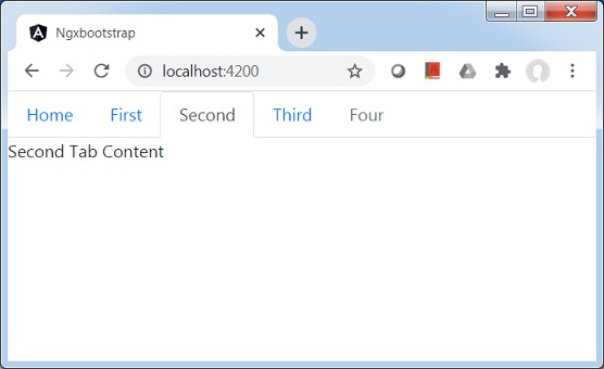
Once server is up and running. Open http://localhost:4200. Click on Open modal button and verify the following output.