- Ngx-Bootstrap - Home
- Ngx-Bootstrap - Overview
- Ngx-Bootstrap - Environment Setup
- Ngx-Bootstrap - Accordion
- Ngx-Bootstrap - Alerts
- Ngx-Bootstrap - Buttons
- Ngx-Bootstrap - Carousel
- Ngx-Bootstrap - Collapse
- Ngx-Bootstrap - DatePicker
- Ngx-Bootstrap - Dropdowns
- Ngx-Bootstrap - Modals
- Ngx-Bootstrap - Pagination
- Ngx-Bootstrap - Popover
- Ngx-Bootstrap - Progressbar
- Ngx-Bootstrap - Rating
- Ngx-Bootstrap - Sortable
- Ngx-Bootstrap - Tabs
- Ngx-Bootstrap - Timepicker
- Ngx-Bootstrap - Tooltip
- Ngx-Bootstrap - Typeahead
- Ngx-Bootstrap Useful Resources
- Ngx-Bootstrap - Quick Guide
- Ngx-Bootstrap - Useful Resources
- Ngx-Bootstrap - Discussion
Ngx-Bootstrap - Alerts
Alerts provides contextual messages for typical user actions like info, error with available and flexible alert messages.
AlertComponent
Displays collapsible content panels for presenting information in a limited amount of space.
selector
alert,bs-alert
Inputs
dismissible − boolean, If set, displays an inline "Close" button, default: false
dismissOnTimeout − string | number, Number in milliseconds, after which alert will be closed
isOpen − boolean, Is alert visible, default: true
type − string, alert type. Provides one of four bootstrap supported contextual classes: success, info, warning and danger, default: warning
Outputs
onClose − This event fires immediately after close instance method is called, $event is an instance of Alert component.
onClosed − This event fires when alert closed, $event is an instance of Alert component
AlertConfig
Properties
dismissible − boolean, is alerts are dismissible by default, default: false
dismissOnTimeout − number, default time before alert will dismiss, default: undefined
type − string, default alert type, default: warning
Example
As we're going to use alerts, We've to update app.module.ts used in ngx-bootstrap Accordion chapter to use AlertModule and AlertConfig.
Update app.module.ts to use the AlertModule and AlertConfig.
app.module.ts
import { BrowserModule } from '@angular/platform-browser';
import { NgModule } from '@angular/core';
import { BrowserAnimationsModule } from '@angular/platform-browser/animations';
import { AppComponent } from './app.component';
import { TestComponent } from './test/test.component';
import { AccordionModule } from 'ngx-bootstrap/accordion';
import { AlertModule, AlertConfig } from 'ngx-bootstrap/alert';
@NgModule({
   declarations: [
      AppComponent,
      TestComponent
   ],
   imports: [
      BrowserAnimationsModule,
      BrowserModule,
      AccordionModule,
      AlertModule
   ],
   providers: [AlertConfig],
   bootstrap: [AppComponent]
})
export class AppModule { }
Update test.component.html to use the alerts.
test.component.html
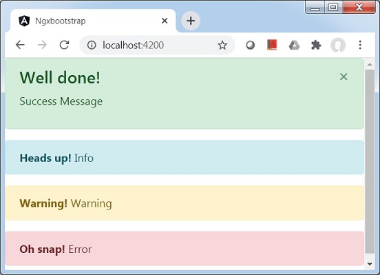
<alert type="success"
   [dismissible]="dismissible"
   [isOpen]="open"
   (onClosed)="log($event)"
   [dismissOnTimeout]="timeout">
   <h4 class="alert-heading">Well done!</h4>
   <p>Success Message</p>
</alert>
<alert type="info">
   <strong>Heads up!</strong> Info
</alert>
<alert type="warning">
   <strong>Warning!</strong> Warning
</alert>
<alert type="danger">
   <strong>Oh snap!</strong> Error
</alert>
Update test.component.ts for corresponding variables and methods.
test.component.ts
import { Component, OnInit } from '@angular/core';
@Component({
   selector: 'app-test',
   templateUrl: './test.component.html',
   styleUrls: ['./test.component.css']
})
export class TestComponent implements OnInit {
   open: boolean = true;
   dismissible: boolean = true;
   timeout: number = 10000;
   constructor() { }

   ngOnInit(): void {
   }
   log(alert){
      console.log('alert message closed');
   }
}
Build and Serve
Run the following command to start the angular server.
ng serve
Once server is up and running. Open http://localhost:4200 and verify the following output.