- Ngx-Bootstrap - Home
- Ngx-Bootstrap - Overview
- Ngx-Bootstrap - Environment Setup
- Ngx-Bootstrap - Accordion
- Ngx-Bootstrap - Alerts
- Ngx-Bootstrap - Buttons
- Ngx-Bootstrap - Carousel
- Ngx-Bootstrap - Collapse
- Ngx-Bootstrap - DatePicker
- Ngx-Bootstrap - Dropdowns
- Ngx-Bootstrap - Modals
- Ngx-Bootstrap - Pagination
- Ngx-Bootstrap - Popover
- Ngx-Bootstrap - Progressbar
- Ngx-Bootstrap - Rating
- Ngx-Bootstrap - Sortable
- Ngx-Bootstrap - Tabs
- Ngx-Bootstrap - Timepicker
- Ngx-Bootstrap - Tooltip
- Ngx-Bootstrap - Typeahead
- Ngx-Bootstrap Useful Resources
- Ngx-Bootstrap - Quick Guide
- Ngx-Bootstrap - Useful Resources
- Ngx-Bootstrap - Discussion
Ngx-Bootstrap - TimePicker
ngx-bootstrap timepicker component provides a easy to use and highly configurable Time Picker component.
TimepickerComponent
selector
timepicker
Inputs
arrowkeys − boolean, if true the values of hours and minutes can be changed using the up/down arrow keys on the keyboard.
disabled − boolean, if true hours and minutes fields will be disabled.
hoursPlaceholder − string, placeholder for hours field in timepicker.
hourStep − number, hours change step.
max − Date, maximum time user can select.
meridians − string[], meridian labels based on locale.
min − Date, minimum time user can select.
minutesPlaceholder − string, placeholder for minutes field in timepicker.
minuteStep − number, hours change step.
mousewheel − boolean, if true scroll inside hours and minutes inputs will change time.
readonlyInput − boolean, if true hours and minutes fields will be readonly.
secondsPlaceholder − string, placeholder for seconds field in timepicker.
secondsStep − number, seconds change step.
showMeridian − boolean, if true meridian button will be shown.
showMinutes − boolean, show minutes in timepicker.
showSeconds − boolean, show seconds in timepicker.
showSpinners − boolean, if true spinner arrows above and below the inputs will be shown.
Outputs
isValid − emits true if value is a valid date.
Example
As we're going to use a TimePicker, We've to update app.module.ts used in ngx-bootstrap Tabs chapter to use TimepickerModule.
Update app.module.ts to use the TimepickerModule.
app.module.ts
import { BrowserModule } from '@angular/platform-browser';
import { NgModule } from '@angular/core';
import { BrowserAnimationsModule } from '@angular/platform-browser/animations';
import { AppComponent } from './app.component';
import { TestComponent } from './test/test.component';
import { AccordionModule } from 'ngx-bootstrap/accordion';
import { AlertModule,AlertConfig } from 'ngx-bootstrap/alert';
import { ButtonsModule } from 'ngx-bootstrap/buttons';
import { FormsModule } from '@angular/forms';
import { CarouselModule } from 'ngx-bootstrap/carousel';
import { CollapseModule } from 'ngx-bootstrap/collapse';
import { BsDatepickerModule, BsDatepickerConfig } from 'ngx-bootstrap/datepicker';
import { BsDropdownModule,BsDropdownConfig } from 'ngx-bootstrap/dropdown';
import { PaginationModule,PaginationConfig } from 'ngx-bootstrap/pagination';
import { PopoverModule, PopoverConfig } from 'ngx-bootstrap/popover';
import { ProgressbarModule,ProgressbarConfig } from 'ngx-bootstrap/progressbar';
import { RatingModule, RatingConfig } from 'ngx-bootstrap/rating';
import { SortableModule, DraggableItemService } from 'ngx-bootstrap/sortable';
import { TabsModule, TabsetConfig } from 'ngx-bootstrap/tabs';
import { TimepickerModule } from 'ngx-bootstrap/timepicker';

@NgModule({
   declarations: [
      AppComponent,
      TestComponent
   ],
   imports: [
      BrowserAnimationsModule,
      BrowserModule,
      AccordionModule,
      AlertModule,
      ButtonsModule,
      FormsModule,
      CarouselModule,
      CollapseModule,
      BsDatepickerModule.forRoot(),
      BsDropdownModule,
      ModalModule,
      PaginationModule,
      PopoverModule,
      ProgressbarModule,
      RatingModule,
      SortableModule,
      TabsModule,
      TimepickerModule.forRoot()
   ],
   providers: [AlertConfig,
      BsDatepickerConfig,
      BsDropdownConfig,
      BsModalService,
      PaginationConfig,
      ProgressbarConfig,
      RatingConfig,
      DraggableItemService,
      TabsetConfig],
   bootstrap: [AppComponent]
})
export class AppModule { }
Update test.component.html to use the timepicker component.
test.component.html
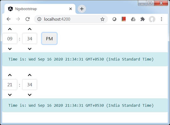
<timepicker [(ngModel)]="time"></timepicker>
<pre class="alert alert-info">Time is: {{time}}</pre>

<timepicker [(ngModel)]="time" [showMeridian]="false"></timepicker>
<pre class="alert alert-info">Time is: {{time}}</pre>
Update test.component.ts for corresponding variables and methods.
test.component.ts
import { Component, OnInit } from '@angular/core';

@Component({
   selector: 'app-test',
   templateUrl: './test.component.html',
   styleUrls: ['./test.component.css']
})
export class TestComponent implements OnInit {
   time: Date = new Date();
   constructor() {}
   ngOnInit(): void {
   }
}
Build and Serve
Run the following command to start the angular server.
ng serve
Once server is up and running. Open http://localhost:4200. Click on Open modal button and verify the following output.