- Ngx-Bootstrap - Home
- Ngx-Bootstrap - Overview
- Ngx-Bootstrap - Environment Setup
- Ngx-Bootstrap - Accordion
- Ngx-Bootstrap - Alerts
- Ngx-Bootstrap - Buttons
- Ngx-Bootstrap - Carousel
- Ngx-Bootstrap - Collapse
- Ngx-Bootstrap - DatePicker
- Ngx-Bootstrap - Dropdowns
- Ngx-Bootstrap - Modals
- Ngx-Bootstrap - Pagination
- Ngx-Bootstrap - Popover
- Ngx-Bootstrap - Progressbar
- Ngx-Bootstrap - Rating
- Ngx-Bootstrap - Sortable
- Ngx-Bootstrap - Tabs
- Ngx-Bootstrap - Timepicker
- Ngx-Bootstrap - Tooltip
- Ngx-Bootstrap - Typeahead
- Ngx-Bootstrap Useful Resources
- Ngx-Bootstrap - Quick Guide
- Ngx-Bootstrap - Useful Resources
- Ngx-Bootstrap - Discussion
Ngx-Bootstrap - Buttons
ngx-bootstrap buttons have two specific directives which makes a group of buttons to behave as checkbox or radio buttons or hybrid where a radio button can be unchecked.
ButtonCheckboxDirective
Add checkbox functionality to any element.
selector
[btnCheckbox]
Inputs
btnCheckboxFalse − boolean, Falsy value, will be set to ngModel, default: false
btnCheckboxTrue − boolean, Truthy value, will be set to ngModel, default: true
ButtonRadioDirective
Create radio buttons or groups of buttons. A value of a selected button is bound to a variable specified via ngModel.
selector
[btnRadio]
Inputs
btnRadio − string, Radio button value, will be set to ngModel
disabled − boolean, If true - radio button is disabled
uncheckable − boolean, If true - radio button can be unchecked
value − string, Current value of radio component or group
ButtonRadioGroupDirective
A group of radio buttons. A value of a selected button is bound to a variable specified via ngModel.
selector
[btnRadioGroup]
Example
As we're going to use buttons, We've to update app.module.ts used in ngx-bootstrap Alerts chapter to use ButtonsModule. We're also adding support for input controls using FormModule.
Update app.module.ts to use the AlertModule and AlertConfig.
app.module.ts
import { BrowserModule } from '@angular/platform-browser';
import { NgModule } from '@angular/core';
import { BrowserAnimationsModule } from '@angular/platform-browser/animations';
import { AppComponent } from './app.component';
import { TestComponent } from './test/test.component';
import { AccordionModule } from 'ngx-bootstrap/accordion';
import { AlertModule,AlertConfig } from 'ngx-bootstrap/alert';
import { ButtonsModule } from 'ngx-bootstrap/buttons';
import { FormsModule } from '@angular/forms';
@NgModule({
   declarations: [
      AppComponent,
      TestComponent
   ],
   imports: [
      BrowserAnimationsModule,
      BrowserModule,
      AccordionModule,
      AlertModule,
      ButtonsModule,
      FormsModule
   ],
   providers: [AlertConfig],
   bootstrap: [AppComponent]
})
export class AppModule { }
Update test.component.html to use the buttons.
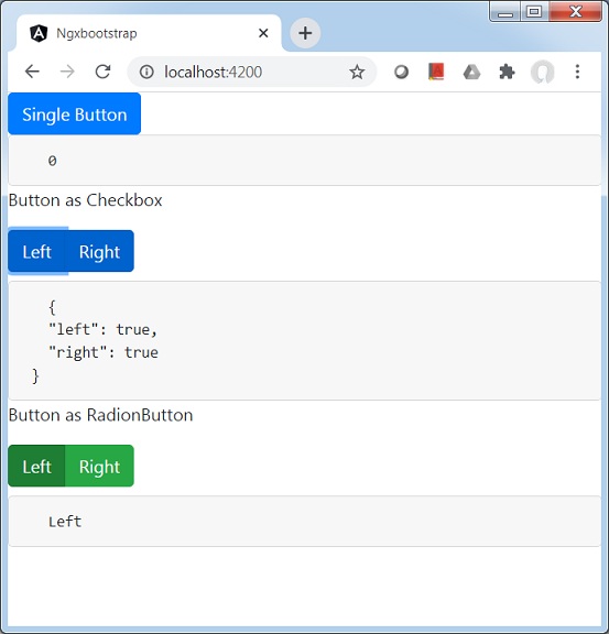
test.component.html
<button type="button" class="btn btn-primary" (click)="clicked()">
   Single Button
</button>
<pre class="card card-block card-header">
   {{clickCounter}}
</pre>
<p>Button as Checkbox</p>
<div class="btn-group">
   <label class="btn btn-primary" [(ngModel)]="checkModel.left"
      btnCheckbox tabindex="0" role="button">Left</label>
   <label class="btn btn-primary" [(ngModel)]="checkModel.right"
      btnCheckbox tabindex="0" role="button">Right</label>
</div>
<pre class="card card-block card-header">
   {{checkModel | json}}
</pre>
<p>Button as RadionButton</p>
<div class="form-inline">
   <div class="btn-group" btnRadioGroup [(ngModel)]="radioModel">
      <label class="btn btn-success" btnRadio="Left">Left</label>
      <label class="btn btn-success" btnRadio="Right">Right</label>
   </div>
</div>
<pre class="card card-block card-header">
   {{radioModel}}
</pre>
Update test.component.ts for corresponding variables and methods.
test.component.ts
import { Component, OnInit } from '@angular/core';
@Component({
   selector: 'app-test',
   templateUrl: './test.component.html',
   styleUrls: ['./test.component.css']
})
export class TestComponent implements OnInit {
   checkModel = { left: false, right: false };
   radioModel = 'Left';
   clickCounter = 0;
   constructor() { }

   ngOnInit(): void {
   }
   clicked(): void {
      this.clickCounter++;
   }
}
Build and Serve
Run the following command to start the angular server.
ng serve
Once server is up and running. Open http://localhost:4200 and verify the following output.