- Ngx-Bootstrap - Home
- Ngx-Bootstrap - Overview
- Ngx-Bootstrap - Environment Setup
- Ngx-Bootstrap - Accordion
- Ngx-Bootstrap - Alerts
- Ngx-Bootstrap - Buttons
- Ngx-Bootstrap - Carousel
- Ngx-Bootstrap - Collapse
- Ngx-Bootstrap - DatePicker
- Ngx-Bootstrap - Dropdowns
- Ngx-Bootstrap - Modals
- Ngx-Bootstrap - Pagination
- Ngx-Bootstrap - Popover
- Ngx-Bootstrap - Progressbar
- Ngx-Bootstrap - Rating
- Ngx-Bootstrap - Sortable
- Ngx-Bootstrap - Tabs
- Ngx-Bootstrap - Timepicker
- Ngx-Bootstrap - Tooltip
- Ngx-Bootstrap - Typeahead
- Ngx-Bootstrap Useful Resources
- Ngx-Bootstrap - Quick Guide
- Ngx-Bootstrap - Useful Resources
- Ngx-Bootstrap - Discussion
Ngx-Bootstrap - DatePicker
ngx-bootstrap DatePicker component is highly configurable and customizable as per our need. It provides various options to select date or date range.
BsDatepickerDirective
selector
[bsDatepicker]
Inputs
bsConfig − Partial<BsDatepickerConfig>, Config object for datepicker
bsValue − Date, Initial value of datepicker
container − string, A selector specifying the element the datepicker should be appended to. default: body
dateCustomClasses − DatepickerDateCustomClasses[], Date custom classes
datesDisabled − Date[], Disable specific dates
datesEnabled − Date[], Enable specific dates
dateTooltipTexts − DatepickerDateTooltipText[], Date tooltip text
daysDisabled − number[], Disable Certain days in the week
isDisabled − boolean, Indicates whether datepicker's content is enabled or not
isOpen − boolean, Returns whether or not the datepicker is currently being shown
maxDate − boolean, Maximum date which is available for selection
minDate − boolean, Minimum date which is available for selection
minMode − BsDatepickerViewMode, Minimum view mode : day, month, or year
outsideClick − boolean, Close datepicker on outside click, default: true
outsideEsc − boolean, Close datepicker on escape click, default: true
placement − "top" | "bottom" | "left" | "right", Placement of a datepicker. Accepts: "top", "bottom", "left", "right", default: bottom
triggers − string, Specifies events that should trigger. Supports a space separated list of event names., default: click
Outputs
bsValueChange − Emits when datepicker value has been changed
onHidden − Emits an event when the datepicker is hidden
onShown − Emits an event when the datepicker is shown
Methods
show() − Opens an element's datepicker. This is considered a 'manual' triggering of the datepicker.
hide() − Closes an element's datepicker. This is considered a 'manual' triggering of the datepicker.
toggle() − Toggles an element's datepicker. This is considered a 'manual' triggering of the datepicker.
setConfig() − Set config for datepicker
BsDaterangepickerDirective
selector
[bsDaterangepicker]
Inputs
bsConfig − Partial<BsDaterangepickerConfig>, Config object for daterangepicker
bsValue − Date, Initial value of daterangepicker
container − string, A selector specifying the element the daterangepicker should be appended to. default: body
dateCustomClasses − DatepickerDateCustomClasses[], Date custom classes
datesDisabled − Date[], Disable specific dates
datesEnabled − Date[], Enable specific dates
dateTooltipTexts − DatepickerDateTooltipText[], Date tooltip text
daysDisabled − number[], Disable Certain days in the week
isDisabled − boolean, Indicates whether daterangepicker's content is enabled or not
isOpen − boolean, Returns whether or not the daterangepicker is currently being shown
maxDate − boolean, Maximum date which is available for selection
minDate − boolean, Minimum date which is available for selection
minMode − BsDatepickerViewMode, Minimum view mode : day, month, or year
outsideClick − boolean, Close daterangepicker on outside click, default: true
outsideEsc − boolean, Close daterangepicker on escape click, default: true
placement − "top" | "bottom" | "left" | "right", Placement of a daterangepicker. Accepts: "top", "bottom", "left", "right", default: bottom
triggers − string, Specifies events that should trigger. Supports a space separated list of event names., default: click
Outputs
bsValueChange − Emits when daterangepicker value has been changed
onHidden − Emits an event when the daterangepicker is hidden
onShown − Emits an event when the daterangepicker is shown
Methods
show() − Opens an element's datepicker. This is considered a 'manual' triggering of the datepicker.
hide() − Closes an element's datepicker. This is considered a 'manual' triggering of the datepicker.
toggle() − Toggles an element's datepicker. This is considered a 'manual' triggering of the datepicker.
setConfig() − Set config for datepicker
Example
As we're going to use DatePicker and DateRangePicker, We've to update app.module.ts used in ngx-bootstrap Collapse chapter to use BsDatepickerModule and BsDatepickerConfig.
Update app.module.ts to use the BsDatepickerModule and BsDatepickerConfig.
app.module.ts
import { BrowserModule } from '@angular/platform-browser';
import { NgModule } from '@angular/core';
import { BrowserAnimationsModule } from '@angular/platform-browser/animations';
import { AppComponent } from './app.component';
import { TestComponent } from './test/test.component';
import { AccordionModule } from 'ngx-bootstrap/accordion';
import { AlertModule,AlertConfig } from 'ngx-bootstrap/alert';
import { ButtonsModule } from 'ngx-bootstrap/buttons';
import { FormsModule } from '@angular/forms';
import { CarouselModule } from 'ngx-bootstrap/carousel';
import { CollapseModule } from 'ngx-bootstrap/collapse';
import { BsDatepickerModule, BsDatepickerConfig } from 'ngx-bootstrap/datepicker';

@NgModule({
   declarations: [
      AppComponent,
      TestComponent
   ],
   imports: [
      BrowserAnimationsModule,
      BrowserModule,
      AccordionModule,
      AlertModule,
      ButtonsModule,
      FormsModule,
      CarouselModule,
      CollapseModule,
      BsDatepickerModule.forRoot()
   ],
   providers: [AlertConfig, BsDatepickerConfig],
   bootstrap: [AppComponent]
})
export class AppModule { }
Update index.html to use the bs-datepicker.css.
app.module.ts
<!doctype html>
<html lang="en">
   <head>
      <meta charset="utf-8">
      <title>Ngxbootstrap</title>
      <base href="/">
      <meta name="viewport" content="width=device-width, initial-scale=1">
      <link rel="icon" type="image/x-icon" href="favicon.ico">
      <link href="https://maxcdn.bootstrapcdn.com/bootstrap/4.0.0/css/bootstrap.min.css" rel="stylesheet">
      <link href="https://unpkg.com/ngx-bootstrap/datepicker/bs-datepicker.css" rel="stylesheet" >
   </head>
   <body>
      <app-root></app-root>
   </body>
</html>
Update test.component.html to use the datepickers.
test.component.html
<div class="row">
   <div class="col-xs-12 col-12 col-md-4 form-group">
      <input type="text"
         placeholder="Datepicker"
         class="form-control"
         bsDatepicker
         [bsValue]="bsValue"
         [minDate]="minDate"
         [maxDate]="maxDate"
         [daysDisabled]="[6,0]"
         [datesDisabled]="disabledDates"
         [bsConfig]="{ isAnimated: true, dateInputFormat: 'YYYY-MM-DD' }">
   </div>
   <div class="col-xs-12 col-12 col-md-4 form-group">
      <input type="text"
         placeholder="Daterangepicker"
         class="form-control"
         bsDaterangepicker
         [(ngModel)]="bsRangeValue"
         [datesEnabled]="enabledDates"
         [bsConfig]="{ isAnimated: true }">
   </div>
</div>
Update test.component.ts for corresponding variables and methods.
test.component.ts
import { Component, OnInit } from '@angular/core';

@Component({
   selector: 'app-test',
   templateUrl: './test.component.html',
   styleUrls: ['./test.component.css']
})
export class TestComponent implements OnInit {

   bsValue = new Date();
   bsRangeValue: Date[];
   maxDate = new Date();
   minDate = new Date();

   constructor() {
      this.minDate.setDate(this.minDate.getDate() - 1);
      this.maxDate.setDate(this.maxDate.getDate() + 7);
      this.bsRangeValue = [this.bsValue, this.maxDate];
   }

   ngOnInit(): void {
   }
}
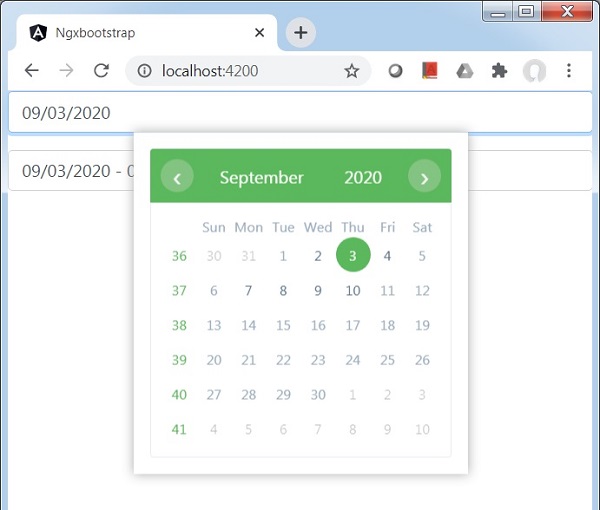
Build and Serve
Run the following command to start the angular server.
ng serve
Once server is up and running. Open http://localhost:4200 and verify the following output.