- Ngx-Bootstrap - Home
- Ngx-Bootstrap - Overview
- Ngx-Bootstrap - Environment Setup
- Ngx-Bootstrap - Accordion
- Ngx-Bootstrap - Alerts
- Ngx-Bootstrap - Buttons
- Ngx-Bootstrap - Carousel
- Ngx-Bootstrap - Collapse
- Ngx-Bootstrap - DatePicker
- Ngx-Bootstrap - Dropdowns
- Ngx-Bootstrap - Modals
- Ngx-Bootstrap - Pagination
- Ngx-Bootstrap - Popover
- Ngx-Bootstrap - Progressbar
- Ngx-Bootstrap - Rating
- Ngx-Bootstrap - Sortable
- Ngx-Bootstrap - Tabs
- Ngx-Bootstrap - Timepicker
- Ngx-Bootstrap - Tooltip
- Ngx-Bootstrap - Typeahead
- Ngx-Bootstrap Useful Resources
- Ngx-Bootstrap - Quick Guide
- Ngx-Bootstrap - Useful Resources
- Ngx-Bootstrap - Discussion
Ngx-Bootstrap - Popover
ngx-bootstrap popover component provides a small overlay component to provide small information about a component.
PopoverDirective
selector
popover
Inputs
adaptivePosition − boolean, sets disable adaptive position.
container − string, A selector specifying the element the popover should be appended to.
containerClass − string, Css class for popover container
delay − number, Delay before showing the tooltip
isOpen − boolean, Returns whether or not the popover is currently being shown
outsideClick − boolean, Close popover on outside click, default: false
placement − "top" | "bottom" | "left" | "right" | "auto" | "top left" | "top right" | "right top" | "right bottom" | "bottom right" | "bottom left" | "left bottom" | "left top", Placement of a popover. Accepts: "top", "bottom", "left", "right".
popover − string | TemplateRef<any>, Content to be displayed as popover.
popoverContext − any, Context to be used if popover is a template.
popoverTitle − string, Title of a popover.
triggers − string, Specifies events that should trigger. Supports a space separated list of event names.
Outputs
onHidden − Emits an event when the popover is hidden.
onShown − Emits an event when the popover is shown.
Methods
setAriaDescribedBy() − Set attribute aria-describedBy for element directive and set id for the popover.
show() − Opens an element's popover. This is considered a "manual" triggering of the popover.
hide() − Closes an element's popover. This is considered a "manual" triggering of the popover.
toggle() − Toggles an element's popover. This is considered a "manual" triggering of the popover.
Example
As we're going to use a popover, We've to update app.module.ts used in ngx-bootstrap Pagination chapter to use PopoverModule and PopoverConfig.
Update app.module.ts to use the PopoverModule and PopoverConfig.
app.module.ts
import { BrowserModule } from '@angular/platform-browser';
import { NgModule } from '@angular/core';
import { BrowserAnimationsModule } from '@angular/platform-browser/animations';
import { AppComponent } from './app.component';
import { TestComponent } from './test/test.component';
import { AccordionModule } from 'ngx-bootstrap/accordion';
import { AlertModule,AlertConfig } from 'ngx-bootstrap/alert';
import { ButtonsModule } from 'ngx-bootstrap/buttons';
import { FormsModule } from '@angular/forms';
import { CarouselModule } from 'ngx-bootstrap/carousel';
import { CollapseModule } from 'ngx-bootstrap/collapse';
import { BsDatepickerModule, BsDatepickerConfig } from 'ngx-bootstrap/datepicker';
import { BsDropdownModule,BsDropdownConfig } from 'ngx-bootstrap/dropdown';
import { PaginationModule,PaginationConfig } from 'ngx-bootstrap/pagination';
import { PopoverModule, PopoverConfig } from 'ngx-bootstrap/popover';

@NgModule({
   declarations: [
      AppComponent,
      TestComponent
   ],
   imports: [
      BrowserAnimationsModule,
      BrowserModule,
      AccordionModule,
      AlertModule,
      ButtonsModule,
      FormsModule,
      CarouselModule,
      CollapseModule,
      BsDatepickerModule.forRoot(),
      BsDropdownModule,
      ModalModule,
      PaginationModule,
      PopoverModule
   ],
   providers: [AlertConfig,
      BsDatepickerConfig,
      BsDropdownConfig,
      BsModalService,
      PaginationConfig],
   bootstrap: [AppComponent]
})
export class AppModule { }
Update test.component.html to use the modal.
test.component.html
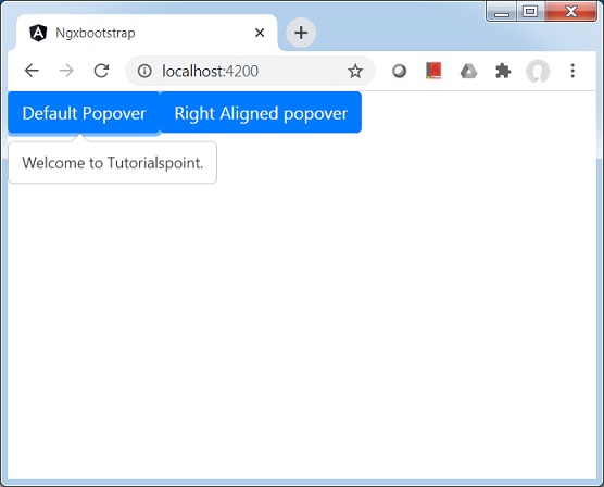
<button type="button" class="btn btn-default btn-primary"
   popover="Welcome to Tutorialspoint." [outsideClick]="true">
   Default Popover
</button>
<button type="button" class="btn btn-default btn-primary"
   popover="Welcome to Tutorialspoint."
   popoverTitle="Tutorialspoint"
   [outsideClick]="true"
   placement="right">
   Right Aligned popover
</button>
Update test.component.ts for corresponding variables and methods.
test.component.ts
import { Component, OnInit } from '@angular/core';
import { BsModalService } from 'ngx-bootstrap/modal';
import { PageChangedEvent } from 'ngx-bootstrap/pagination';

@Component({
   selector: 'app-test',
   templateUrl: './test.component.html',
   styleUrls: ['./test.component.css']
})
export class TestComponent implements OnInit {
   constructor() {}
   ngOnInit(): void {
   }
}
Build and Serve
Run the following command to start the angular server.
ng serve
Once server is up and running. Open http://localhost:4200. Click on Open modal button and verify the following output.