- Ngx-Bootstrap - Home
- Ngx-Bootstrap - Overview
- Ngx-Bootstrap - Environment Setup
- Ngx-Bootstrap - Accordion
- Ngx-Bootstrap - Alerts
- Ngx-Bootstrap - Buttons
- Ngx-Bootstrap - Carousel
- Ngx-Bootstrap - Collapse
- Ngx-Bootstrap - DatePicker
- Ngx-Bootstrap - Dropdowns
- Ngx-Bootstrap - Modals
- Ngx-Bootstrap - Pagination
- Ngx-Bootstrap - Popover
- Ngx-Bootstrap - Progressbar
- Ngx-Bootstrap - Rating
- Ngx-Bootstrap - Sortable
- Ngx-Bootstrap - Tabs
- Ngx-Bootstrap - Timepicker
- Ngx-Bootstrap - Tooltip
- Ngx-Bootstrap - Typeahead
- Ngx-Bootstrap Useful Resources
- Ngx-Bootstrap - Quick Guide
- Ngx-Bootstrap - Useful Resources
- Ngx-Bootstrap - Discussion
Ngx-Bootstrap - Rating
ngx-bootstrap rating component provides a configurable rating component, a star bar by default.
RatingComponent
selector
rating
Inputs
customTemplate − TemplateRef<any>, custom template for icons.
max − number, no. of icons, default: 5.
readonly − boolean, if true will not react on any user events.
titles − string[], array of icons titles, default: ([1, 2, 3, 4, 5])
Outputs
onHover − fired when icon selected, $event:number equals to selected rating.
onLeave − fired when icon selected, $event:number equals to previous rating value.
Example
As we're going to use a rating, We've to update app.module.ts used in ngx-bootstrap ProgressBar chapter to use RatingModule, RatingConfig.
Update app.module.ts to use the RatingModule and RatingConfig.
app.module.ts
import { BrowserModule } from '@angular/platform-browser';
import { NgModule } from '@angular/core';
import { BrowserAnimationsModule } from '@angular/platform-browser/animations';
import { AppComponent } from './app.component';
import { TestComponent } from './test/test.component';
import { AccordionModule } from 'ngx-bootstrap/accordion';
import { AlertModule,AlertConfig } from 'ngx-bootstrap/alert';
import { ButtonsModule } from 'ngx-bootstrap/buttons';
import { FormsModule } from '@angular/forms';
import { CarouselModule } from 'ngx-bootstrap/carousel';
import { CollapseModule } from 'ngx-bootstrap/collapse';
import { BsDatepickerModule, BsDatepickerConfig } from 'ngx-bootstrap/datepicker';
import { BsDropdownModule,BsDropdownConfig } from 'ngx-bootstrap/dropdown';
import { PaginationModule,PaginationConfig } from 'ngx-bootstrap/pagination';
import { PopoverModule, PopoverConfig } from 'ngx-bootstrap/popover';
import { ProgressbarModule,ProgressbarConfig } from 'ngx-bootstrap/progressbar';
import { RatingModule, RatingConfig } from 'ngx-bootstrap/rating';

@NgModule({
   declarations: [
      AppComponent,
      TestComponent
   ],
   imports: [
      BrowserAnimationsModule,
      BrowserModule,
      AccordionModule,
      AlertModule,
      ButtonsModule,
      FormsModule,
      CarouselModule,
      CollapseModule,
      BsDatepickerModule.forRoot(),
      BsDropdownModule,
      ModalModule,
      PaginationModule,
      PopoverModule,
      ProgressbarModule,
      RatingModule
   ],
   providers: [AlertConfig,
      BsDatepickerConfig,
      BsDropdownConfig,
      BsModalService,
      PaginationConfig,
      ProgressbarConfig,
      RatingConfig],
   bootstrap: [AppComponent]
})
export class AppModule { }
Update test.component.html to use the rating.
test.component.html
<rating [(ngModel)]="value"
   [max]="max"
   [readonly]="false"
   [titles]="['one','two','three','four']"></rating>
Update test.component.ts for corresponding variables and methods.
test.component.ts
import { Component, OnInit } from '@angular/core';

@Component({
   selector: 'app-test',
   templateUrl: './test.component.html',
   styleUrls: ['./test.component.css']
})
export class TestComponent implements OnInit {
   max: number = 10;
   value: number = 5;
   constructor() {}
   ngOnInit(): void {
   }
}
Build and Serve
Run the following command to start the angular server.
ng serve
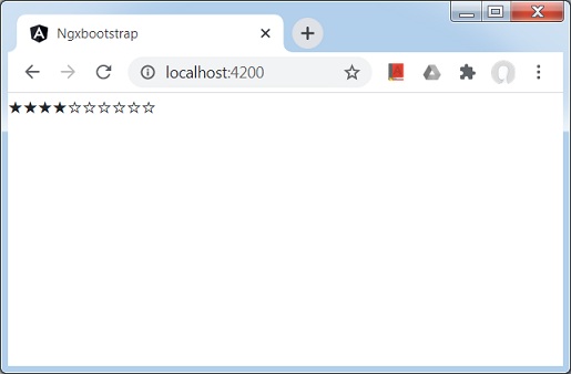
Once server is up and running. Open http://localhost:4200. Click on Open modal button and verify the following output.