- Ngx-Bootstrap - Home
- Ngx-Bootstrap - Overview
- Ngx-Bootstrap - Environment Setup
- Ngx-Bootstrap - Accordion
- Ngx-Bootstrap - Alerts
- Ngx-Bootstrap - Buttons
- Ngx-Bootstrap - Carousel
- Ngx-Bootstrap - Collapse
- Ngx-Bootstrap - DatePicker
- Ngx-Bootstrap - Dropdowns
- Ngx-Bootstrap - Modals
- Ngx-Bootstrap - Pagination
- Ngx-Bootstrap - Popover
- Ngx-Bootstrap - Progressbar
- Ngx-Bootstrap - Rating
- Ngx-Bootstrap - Sortable
- Ngx-Bootstrap - Tabs
- Ngx-Bootstrap - Timepicker
- Ngx-Bootstrap - Tooltip
- Ngx-Bootstrap - Typeahead
- Ngx-Bootstrap Useful Resources
- Ngx-Bootstrap - Quick Guide
- Ngx-Bootstrap - Useful Resources
- Ngx-Bootstrap - Discussion
Ngx-Bootstrap - Dropdowns
ngx-bootstrap dropdown component is toggleable and provides contextual overlay to display list of links etc. With dropdown directives we can make dropdowns interactive.
BsDropdownDirective
selector
[bsDropdown],[dropdown]
Inputs
autoClose − boolean, Indicates that dropdown will be closed on item or document click, and after pressing ESC
container − string, A selector specifying the element the popover should be appended to.
dropup − boolean, This attribute indicates that the dropdown should be opened upwards.
insideClick − boolean, This attribute indicates that the dropdown shouldn't close on inside click when autoClose is set to true.
isAnimated − boolean, Indicates that dropdown will be animated
isDisabled − boolean, Disables dropdown toggle and hides dropdown menu if opened
isOpen − boolean, Returns whether or not the popover is currently being shown
placement − string, Placement of a popover. Accepts: "top", "bottom", "left", "right"
triggers − string, Specifies events that should trigger. Supports a space separated list of event names.
Outputs
isOpenChange − Emits an event when isOpen change
onHidden − Emits an event when the popover is hidden
onShown − Emits an event when the popover is shown
Methods
show() − Opens an element's popover. This is considered a 'manual' triggering of the popover.
hide() − Closes an element's popover. This is considered a 'manual' triggering of the popover.
toggle() − Toggles an element's popover. This is considered a 'manual' triggering of the popover.
setConfig() − Set config for popover
Example
As we're going to use dropdowns, We've to update app.module.ts used in ngx-bootstrap DatePicker chapter to use BsDropdownModule and BsDropdownConfig.
Update app.module.ts to use the BsDropdownModule and BsDropdownConfig.
app.module.ts
import { BrowserModule } from '@angular/platform-browser';
import { NgModule } from '@angular/core';
import { BrowserAnimationsModule } from '@angular/platform-browser/animations';
import { AppComponent } from './app.component';
import { TestComponent } from './test/test.component';
import { AccordionModule } from 'ngx-bootstrap/accordion';
import { AlertModule,AlertConfig } from 'ngx-bootstrap/alert';
import { ButtonsModule } from 'ngx-bootstrap/buttons';
import { FormsModule } from '@angular/forms';
import { CarouselModule } from 'ngx-bootstrap/carousel';
import { CollapseModule } from 'ngx-bootstrap/collapse';
import { BsDatepickerModule, BsDatepickerConfig } from 'ngx-bootstrap/datepicker';
import { BsDropdownModule,BsDropdownConfig } from 'ngx-bootstrap/dropdown';

@NgModule({
   declarations: [
      AppComponent,
      TestComponent
   ],
   imports: [
      BrowserAnimationsModule,
      BrowserModule,
      AccordionModule,
      AlertModule,
      ButtonsModule,
      FormsModule,
      CarouselModule,
      CollapseModule,
      BsDatepickerModule.forRoot(),
      BsDropdownModule
   ],
   providers: [AlertConfig, BsDatepickerConfig, BsDropdownConfig],
   bootstrap: [AppComponent]
})
export class AppModule { }
Update test.component.html to use the dropdowns.
test.component.html
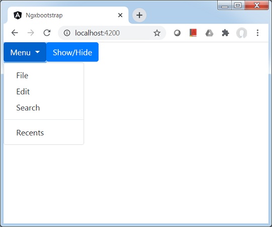
<div class="btn-group" dropdown #dropdown="bs-dropdown" [autoClose]="false">
   <button id="button-basic" dropdownToggle type="button"
      class="btn btn-primary dropdown-toggle"
      aria-controls="dropdown-basic">
      Menu <span class="caret"></span>
   </button>
   <ul id="dropdown-basic" *dropdownMenu class="dropdown-menu"
      role="menu" aria-labelledby="button-basic">
      <li role="menuitem"><a class="dropdown-item" href="#">File</a></li>
      <li role="menuitem"><a class="dropdown-item" href="#">Edit</a></li>
      <li role="menuitem"><a class="dropdown-item" href="#">Search</a></li>
      <li class="divider dropdown-divider"></li>
      <li role="menuitem"><a class="dropdown-item" href="#">Recents</a>
      </li>
   </ul>
</div>
<button type="button" class="btn btn-primary"
   (click)="dropdown.isOpen = !dropdown.isOpen">Show/Hide
</button>
Update test.component.ts for corresponding variables and methods.
test.component.ts
import { Component, OnInit } from '@angular/core';

@Component({
   selector: 'app-test',
   templateUrl: './test.component.html',
   styleUrls: ['./test.component.css']
})
export class TestComponent implements OnInit {
   constructor() {}

   ngOnInit(): void {}
}
Build and Serve
Run the following command to start the angular server.
ng serve
Once server is up and running. Open http://localhost:4200 and verify the following output.