- Ngx-Bootstrap - Home
- Ngx-Bootstrap - Overview
- Ngx-Bootstrap - Environment Setup
- Ngx-Bootstrap - Accordion
- Ngx-Bootstrap - Alerts
- Ngx-Bootstrap - Buttons
- Ngx-Bootstrap - Carousel
- Ngx-Bootstrap - Collapse
- Ngx-Bootstrap - DatePicker
- Ngx-Bootstrap - Dropdowns
- Ngx-Bootstrap - Modals
- Ngx-Bootstrap - Pagination
- Ngx-Bootstrap - Popover
- Ngx-Bootstrap - Progressbar
- Ngx-Bootstrap - Rating
- Ngx-Bootstrap - Sortable
- Ngx-Bootstrap - Tabs
- Ngx-Bootstrap - Timepicker
- Ngx-Bootstrap - Tooltip
- Ngx-Bootstrap - Typeahead
- Ngx-Bootstrap Useful Resources
- Ngx-Bootstrap - Quick Guide
- Ngx-Bootstrap - Useful Resources
- Ngx-Bootstrap - Discussion
Ngx-Bootstrap - Modals
ngx-bootstrap modal component is a flexible and highly configurable dialog prompt and provides multiple defaults and can be used with minimum code.
ModalDirective
selector
[bsModal]
Inputs
config − ModalOptions, allows to set modal configuration via element property
Outputs
onHidden − This event is fired when the modal has finished being hidden from the user (will wait for CSS transitions to complete).
onHide − This event is fired immediately when the hide instance method has been called.
onShow − This event fires immediately when the show instance method is called.
onShown − This event is fired when the modal has been made visible to the user (will wait for CSS transitions to complete).
Methods
show() − Allows to manually open modal.
hide() − Allows to manually close modal.
toggle() − Allows to manually toggle modal visibility.
showElement() − Show dialog.
focusOtherModal() − Events tricks.
Example
As we're going to use a modal, We've to update app.module.ts used in ngx-bootstrap Dropdowns chapter to use ModalModule and BsModalService.
Update app.module.ts to use the ModalModule and BsModalService.
app.module.ts
import { BrowserModule } from '@angular/platform-browser';
import { NgModule } from '@angular/core';
import { BrowserAnimationsModule } from '@angular/platform-browser/animations';
import { AppComponent } from './app.component';
import { TestComponent } from './test/test.component';
import { AccordionModule } from 'ngx-bootstrap/accordion';
import { AlertModule,AlertConfig } from 'ngx-bootstrap/alert';
import { ButtonsModule } from 'ngx-bootstrap/buttons';
import { FormsModule } from '@angular/forms';
import { CarouselModule } from 'ngx-bootstrap/carousel';
import { CollapseModule } from 'ngx-bootstrap/collapse';
import { BsDatepickerModule, BsDatepickerConfig } from 'ngx-bootstrap/datepicker';
import { BsDropdownModule,BsDropdownConfig } from 'ngx-bootstrap/dropdown';
import { ModalModule, BsModalService } from 'ngx-bootstrap/modal';

@NgModule({
   declarations: [
      AppComponent,
      TestComponent
   ],
   imports: [
      BrowserAnimationsModule,
      BrowserModule,
      AccordionModule,
      AlertModule,
      ButtonsModule,
      FormsModule,
      CarouselModule,
      CollapseModule,
      BsDatepickerModule.forRoot(),
      BsDropdownModule,
      ModalModule
   ],
   providers: [AlertConfig, BsDatepickerConfig, BsDropdownConfig,BsModalService],
   bootstrap: [AppComponent]
})
export class AppModule { }
Update test.component.html to use the modal.
test.component.html
<button type="button" class="btn btn-primary" (click)="openModal(template)">Open modal</button>
<ng-template #template>
<div class="modal-header">
<h4 class="modal-title pull-left">Modal</h4>
<button type="button" class="close pull-right" aria-label="Close" (click)="modalRef.hide()">
<span aria-hidden="true">×</span>
</button>
</div>
<div class="modal-body">
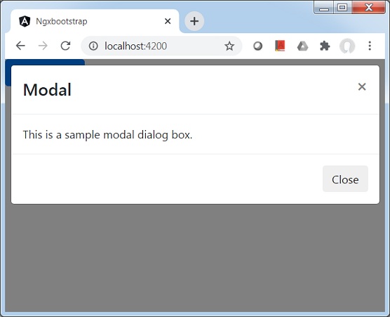
This is a sample modal dialog box.
</div>
<div class="modal-footer">
<button type="button" class="btn btn-default" (click)="modalRef.hide()">Close</button>
</div>
</ng-template>
Update test.component.ts for corresponding variables and methods.
test.component.ts
import { Component, OnInit, TemplateRef } from '@angular/core';
import { BsModalRef, BsModalService } from 'ngx-bootstrap/modal';

@Component({
   selector: 'app-test',
   templateUrl: './test.component.html',
   styleUrls: ['./test.component.css']
})
export class TestComponent implements OnInit {

   modalRef: BsModalRef;
   constructor(private modalService: BsModalService) {}

   openModal(template: TemplateRef<any>) {
      this.modalRef = this.modalService.show(template);
   }

   ngOnInit(): void {
   }
}
Build and Serve
Run the following command to start the angular server.
ng serve
Once server is up and running. Open http://localhost:4200. Click on Open modal button and verify the following output.