- Ionic - Colors
- Ionic - Content
- Ionic - Header
- Ionic - Footer
- Ionic - Buttons
- Ionic - Lists
- Ionic - Cards
- Ionic - Forms
- Ionic - Toggle
- Ionic - Checkbox
- Ionic - Radio Button
- Ionic - Range
- Ionic - Select
- Ionic - Tabs
- Ionic - Grid
- Ionic - Icons
- Ionic - Padding
- Ionic Javascript Components
- Ionic - JS Action Sheet
- Ionic - JS Backdrop
- Ionic - JS Content
- Ionic - JS Forms
- Ionic - JS Events
- Ionic - JS Header
- Ionic - JS Footer
- Ionic - JS Keyboard
- Ionic - JS List
- Ionic - JS Loading
- Ionic - JS Modal
- Ionic - JS Navigation
- Ionic - JS Popover
- Ionic - JS Popup
- Ionic - JS Scroll
- Ionic - JS Side Menu
- Ionic - JS Slide Box
- Ionic - JS Tabs
- Ionic Advanced Concepts
- Ionic - Cordova Integration
- Ionic - AdMob
- Ionic - Camera
- Ionic - Facebook
- Ionic - In App Browser
- Ionic - Native Audio
- Ionic - Geolocation
- Ionic - Media
- Ionic - Splash Screen
- Ionic Useful Resources
- Ionic - Quick Guide
- Ionic - Useful Resources
- Ionic - Discussion
Ionic - Toggle
Sometimes there are two options available for the users. The most efficient way to handle this situation is through toggle forms. Ionic gives us classes for toggle elements that are animated and easy to implement.
Using Toggle
Toggle can be implemented using two Ionic classes. First, we need to create a label for the same reason we explained in the previous chapter and assign a toggle class to it.
Inside our label will be created . You will notice two more ionic classes used in the following example. The track class will add background styling to our checkbox and color animation when the toggle is tapped. The handle class is used to add a circle button to it.
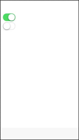
The following example shows two toggle forms. The first one is checked, the second one is not.
<label class = "toggle">
   <input type = "checkbox" />
   <div class = "track">
      <div class = "handle"></div>
   </div>
</label>

<br>

<label class = "toggle">
   <input type = "checkbox" />
   <div class = "track">
      <div class = "handle"></div>
   </div>
</label>
The above code will produce the following screen −
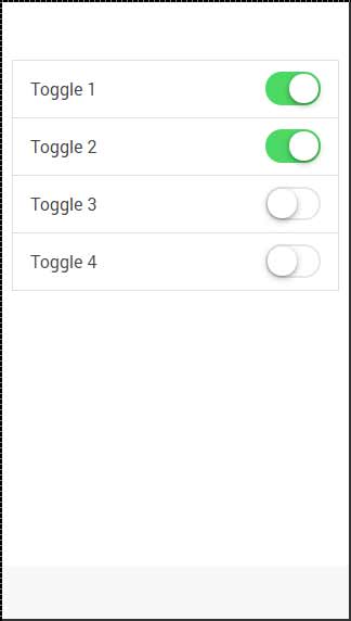
Multiple Toggles
Most of the time when you want to add more than one element of the same kind in Ionic, the best way is to use list items. The class that is used for multiple toggles is the item-toggle. The next example shows how to create a list for toggles. The first one and the second one are checked.
<ul class = "list">
   <li class = "item item-toggle">
      Toggle 1
      <label class = "toggle">
         <input type = "checkbox" />
         <div class = "track">
            <div class = "handle"></div>
         </div>
      </label>
   </li>

   <li class = "item item-toggle">
      Toggle 2
      <label class = "toggle">
         <input type = "checkbox" />
         <div class = "track">
            <div class = "handle"></div>
         </div>
      </label>
   </li>

   <li class = "item item-toggle">
      Toggle 3
      <label class = "toggle">
         <input type = "checkbox" />
         <div class = "track">
            <div class = "handle"></div>
         </div>
      </label>
   </li>

   <li class = "item item-toggle">
      Toggle 4
      <label class = "toggle">
         <input type = "checkbox" />
         <div class = "track">
            <div class = "handle"></div>
         </div>
      </label>
   </li>
</ul>
The above code will produce the following screen −
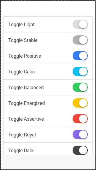
Styling Toggle
All the Ionic color classes can be applied to the toggle element. The Prefix will be the toggle. We will apply this to the label element. The following example shows all the colors that are applied.
<ul class = "list">
   <li class = "item item-toggle">
      Toggle Light
      <label class = "toggle  toggle-light">
         <input type = "checkbox" />
         <div class = "track">
            <div class = "handle"></div>
         </div>
      </label>
   </li>

   <li class = "item item-toggle">
      Toggle Stable
      <label class = "toggle toggle-stable">
         <input type = "checkbox" />
         <div class = "track">
            <div class = "handle"></div>
         </div>
      </label>
   </li>

   <li class = "item item-toggle">
      Toggle Positive
      <label class = "toggle toggle-positive">
         <input type = "checkbox" />
         <div class = "track">
            <div class = "handle"></div>
         </div>
      </label>
   </li>

   <li class = "item item-toggle">
      Toggle Calm
      <label class = "toggle toggle-calm">
         <input type = "checkbox" />
         <div class = "track">
            <div class = "handle"></div>
         </div>
      </label>
   </li>

   <li class = "item item-toggle">
      Toggle Balanced
      <label class = "toggle toggle-balanced">
         <input type = "checkbox" />
         <div class = "track">
            <div class = "handle"></div>
         </div>
      </label>
   </li>

   <li class = "item item-toggle">
      Toggle Energized
      <label class = "toggle toggle-energized">
         <input type = "checkbox" />
         <div class = "track">
            <div class = "handle"></div>
         </div>
      </label>
   </li>

   <li class = "item item-toggle">
      Toggle Assertive
      <label class = "toggle toggle-assertive">
         <input type = "checkbox" />
         <div class = "track">
            <div class = "handle"></div>
         </div>
      </label>
   </li>

   <li class = "item item-toggle">
      Toggle Royal
      <label class = "toggle  toggle-royal">
         <input type = "checkbox" />
         <div class = "track">
            <div class = "handle"></div>
         </div>
      </label>
   </li>

   <li class = "item item-toggle">
      Toggle Dark
      <label class = "toggle toggle-dark">
         <input type = "checkbox" />
         <div class = "track">
            <div class = "handle"></div>
         </div>
      </label>
   </li>
</ul>
The above code will produce the following screen −