- Ionic - Colors
- Ionic - Content
- Ionic - Header
- Ionic - Footer
- Ionic - Buttons
- Ionic - Lists
- Ionic - Cards
- Ionic - Forms
- Ionic - Toggle
- Ionic - Checkbox
- Ionic - Radio Button
- Ionic - Range
- Ionic - Select
- Ionic - Tabs
- Ionic - Grid
- Ionic - Icons
- Ionic - Padding
- Ionic Javascript Components
- Ionic - JS Action Sheet
- Ionic - JS Backdrop
- Ionic - JS Content
- Ionic - JS Forms
- Ionic - JS Events
- Ionic - JS Header
- Ionic - JS Footer
- Ionic - JS Keyboard
- Ionic - JS List
- Ionic - JS Loading
- Ionic - JS Modal
- Ionic - JS Navigation
- Ionic - JS Popover
- Ionic - JS Popup
- Ionic - JS Scroll
- Ionic - JS Side Menu
- Ionic - JS Slide Box
- Ionic - JS Tabs
- Ionic Advanced Concepts
- Ionic - Cordova Integration
- Ionic - AdMob
- Ionic - Camera
- Ionic - Facebook
- Ionic - In App Browser
- Ionic - Native Audio
- Ionic - Geolocation
- Ionic - Media
- Ionic - Splash Screen
- Ionic Useful Resources
- Ionic - Quick Guide
- Ionic - Useful Resources
- Ionic - Discussion
Selected Reading
Ionic - JavaScript Slide Box
A Slide box contains pages that can be changed by swiping the content screen.
Using Slide Box
The usage of the slide box is simple. You just need to add ion-slide-box as a container and ion-slide with box class inside that container. We will add height and border to our boxes for better visibility.
HTML Code
<ion-slide-box>

   <ion-slide>
      <div class = "box box1">
         <h1>Box 1</h1>
      </div>
   </ion-slide>

   <ion-slide>
      <div class = "box box2">
         <h1>Box 2</h1>
      </div>
   </ion-slide>

   <ion-slide>
      <div class = "box box3">
         <h1>Box 3</h1>
      </div>
   </ion-slide>

</ion-slide-box>

.box1, box2, box3 {
   height: 300px;
   border: 2px solid blue;
}
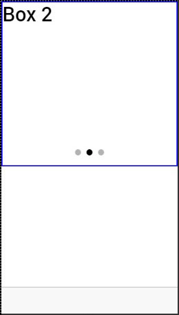
The Output will look as shown in the following screenshot −
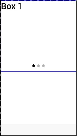
We can change the box by dragging the content to the right. We can also drag to the left to show the previous box.
A few attributes that can be used for controlling slide box behavior are mentioned in the following table.
Delegate Methods
| Attribute | Type | Details |
|---|---|---|
| does-continue | Boolean | Should slide box loop when first or last box is reached. |
| auto-play | Boolean | Should slide box automatically slide. |
| slide-interval | number | Time value between auto slide changes in milliseconds. Default value is 4000. |
| show-pager | Boolean | Should pager be visible. |
| pager-click | expression | Called when a pager is tapped (if pager is visible). $index is used to match with different slides. |
| on-slide-changed | expression | Called when slide is changed. $index is used to match with different slides. |
| active-slide | expression | Used as a model to bind the current slide index to. |
| delegate-handle | string | Used for slide box identification with $ionicSlideBoxDelegate. |
Slide Box Delegate
The $ionicSlideBoxDelegate is a service used for controlling all slide boxes. We need to inject it to the controller.
Controller Code
.controller('MyCtrl', function($scope, $ionicSlideBoxDelegate) {
   $scope.nextSlide = function() {
      $ionicSlideBoxDelegate.next();
   }
})
HTML Code
<button class = "button button-icon icon ion-navicon" ng-click = "nextSlide()"></button>
The following table shows $ionicSlideBoxDelegate methods.
Delegate Methods
| Method | Parameters | Type | Details |
|---|---|---|---|
| slide(parameter1, parameter2) | to, speed | number, number | Parameter to represents the index to slide to. speed determines how fast is the change in milliseconds. |
| enableSlide(parameter1) | shouldEnable | boolean | Used for enambling or disabling sliding. |
| previous(parameter1) | speed | number | The value in miliseconds the change should take. |
| stop() | / | / | Used to stop the sliding. |
| start() | / | / | Used to start the sliding. |
| currentIndex() | / | number | Returns index of the curent slide. |
| slidesCount() | / | number | Returns total number of the slides. |
| $getByHandle(parameter1) | handle | string | Used to connect methods to the particular slide box with the same handle. $ionicSlideBoxDelegate. $getByHandle('my-handle').start(); |

Advertisements