- Ionic - Colors
- Ionic - Content
- Ionic - Header
- Ionic - Footer
- Ionic - Buttons
- Ionic - Lists
- Ionic - Cards
- Ionic - Forms
- Ionic - Toggle
- Ionic - Checkbox
- Ionic - Radio Button
- Ionic - Range
- Ionic - Select
- Ionic - Tabs
- Ionic - Grid
- Ionic - Icons
- Ionic - Padding
- Ionic Javascript Components
- Ionic - JS Action Sheet
- Ionic - JS Backdrop
- Ionic - JS Content
- Ionic - JS Forms
- Ionic - JS Events
- Ionic - JS Header
- Ionic - JS Footer
- Ionic - JS Keyboard
- Ionic - JS List
- Ionic - JS Loading
- Ionic - JS Modal
- Ionic - JS Navigation
- Ionic - JS Popover
- Ionic - JS Popup
- Ionic - JS Scroll
- Ionic - JS Side Menu
- Ionic - JS Slide Box
- Ionic - JS Tabs
- Ionic Advanced Concepts
- Ionic - Cordova Integration
- Ionic - AdMob
- Ionic - Camera
- Ionic - Facebook
- Ionic - In App Browser
- Ionic - Native Audio
- Ionic - Geolocation
- Ionic - Media
- Ionic - Splash Screen
- Ionic Useful Resources
- Ionic - Quick Guide
- Ionic - Useful Resources
- Ionic - Discussion
Ionic - Grid
Working with the Ionic Grid System is straightforward. There are two main classes row for working with rows and col for columns.
You can choose as many columns or rows you want. All of them will adjust its size to accommodate the available space, although you can change this behavior to suit your needs.
NOTE − All examples in this tutorial will have borders applied to our grid to be able to display it in a way that is easy to understand.
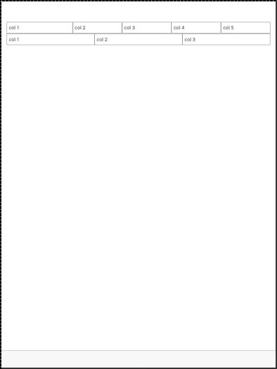
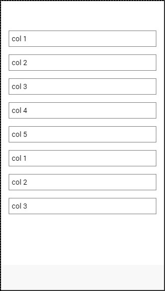
Simple Grid
The following example shows how to use the col and the row classes. We will create two rows. The first row will have five columns and the second one will have only three. Notice how the width of the columns is different in the first and second row.
<div class = "row">
   <div class = "col">col 1</div>
   <div class = "col">col 2</div>
   <div class = "col">col 3</div>
   <div class = "col">col 4</div>
   <div class = "col">col 5</div>
</div>

<div class = "row">
   <div class = "col">col 1</div>
   <div class = "col">col 2</div>
   <div class = "col">col 3</div>
</div>
The above code will produce the following screen −
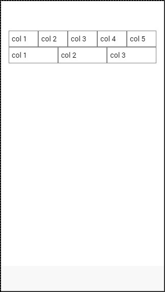
Column Sizes
Sometimes you do not want to leave the column sizes automatically assigned. If this is the case, you can choose the col prefix followed by a number that will represent a percentage of the row width. This will apply only to the column with a specific size applied. The other columns will adjust to the available space that is left.
In the following example, the first column will use 50 percent of the full width and the others will adjust accordingly.
<div class = "row">
   <div class = "col col-50">col 1</div>
   <div class = "col">col 2</div>
   <div class = "col">col 3</div>
   <div class = "col">col 4</div>
   <div class = "col">col 5</div>
</div>

<div class = "row">
   <div class = "col col-50">col 1</div>
   <div class = "col">col 2</div>
   <div class = "col">col 3</div>
</div>
The above code will produce following screen −
The following table shows the available percentage options that Ionic grid system provides −
Column Percentage Classnames
| Class Name | Percentage Used |
|---|---|
| col-10 | 10% |
| col-20 | 20% |
| col-25 | 25% |
| col-33 | 33.3333% |
| col-50 | 50% |
| col-67 | 66.6666% |
| col-75 | 75% |
| col-80 | 80% |
| col-90 | 90% |
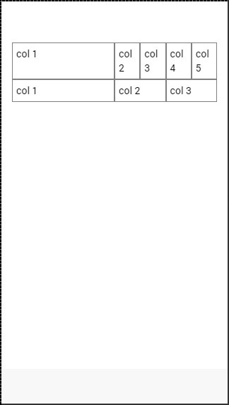
Horizontal and Vertical Positioning
The columns can be offset from the left. It works the same for the specific size of the columns. This time the prefix will be col-offset and then we will use the same percentage numbers showed in the table above. The following example shows how can we offset the second column of both the rows by 25 percent.
<div class = "row">
   <div class = "col">col 1</div>
   <div class = "col col-offset-25">col 2</div>
   <div class = "col">col 3</div>
   <div class = "col">col 4</div>
   <div class = "col">col 5</div>
</div>

<div class = "row">
   <div class = "col">col 1</div>
   <div class = "col col-offset-25">col 2</div>
   <div class = "col">col 3</div>
</div>
The above code will produce the following screen −
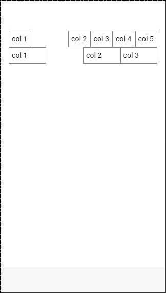
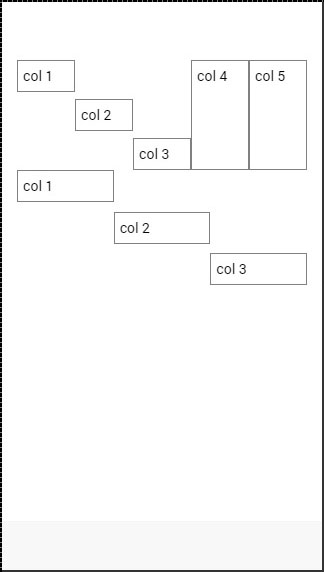
You can also vertically align the columns inside a row. There are three classes, which can be used, namely top, center and the bottom class with the col prefix. The following code shows how to place vertically the first three columns of both rows.
NOTE − In the example that follows we added .col {height: 120px} to our CSS to show you the vertical placing of the columns.
<div class = "row">
   <div class = "col col-top">col 1</div>
   <div class = "col col-center">col 2</div>
   <div class = "col col-bottom">col 3</div>
   <div class = "col">col 4</div>
   <div class = "col">col 5</div>
</div>

<div class = "row">
   <div class = "col col-top">col 1</div>
   <div class = "col col-center">col 2</div>
   <div class = "col col-bottom">col 3</div>
</div>
The above code will produce the following screen −
Responsive Grid
The Ionic Grid can also be used for a responsive layout. There are three classes available. The responsive-sm class will collapse columns into a single row when the viewport is smaller than a landscape phone. The responsive-md class will be applied when viewport is smaller than a portrait tablet. The responsive-lg class will be applied when viewport is smaller than a landscape tablet.
The first image after the following example shows how the responsive-sm class looks on a Mobile device and the second one shows how the same responsive grid looks differently on a Tablet device.
<div class = "row responsive-sm">
   <div class = "col col-25">col 1</div>
   <div class = "col">col 2</div>
   <div class = "col">col 3</div>
   <div class = "col">col 4</div>
   <div class = "col">col 5</div>
</div>

<div class = "row responsive-sm">
   <div class = "col">col 1</div>
   <div class = "col">col 2</div>
   <div class = "col">col 3</div>
</div>
Mobile Grid View
Tablet Grid View