- Ionic - Colors
- Ionic - Content
- Ionic - Header
- Ionic - Footer
- Ionic - Buttons
- Ionic - Lists
- Ionic - Cards
- Ionic - Forms
- Ionic - Toggle
- Ionic - Checkbox
- Ionic - Radio Button
- Ionic - Range
- Ionic - Select
- Ionic - Tabs
- Ionic - Grid
- Ionic - Icons
- Ionic - Padding
- Ionic Javascript Components
- Ionic - JS Action Sheet
- Ionic - JS Backdrop
- Ionic - JS Content
- Ionic - JS Forms
- Ionic - JS Events
- Ionic - JS Header
- Ionic - JS Footer
- Ionic - JS Keyboard
- Ionic - JS List
- Ionic - JS Loading
- Ionic - JS Modal
- Ionic - JS Navigation
- Ionic - JS Popover
- Ionic - JS Popup
- Ionic - JS Scroll
- Ionic - JS Side Menu
- Ionic - JS Slide Box
- Ionic - JS Tabs
- Ionic Advanced Concepts
- Ionic - Cordova Integration
- Ionic - AdMob
- Ionic - Camera
- Ionic - Facebook
- Ionic - In App Browser
- Ionic - Native Audio
- Ionic - Geolocation
- Ionic - Media
- Ionic - Splash Screen
- Ionic Useful Resources
- Ionic - Quick Guide
- Ionic - Useful Resources
- Ionic - Discussion
Ionic - Quick Guide
Ionic - Overview
Ionic is a front-end HTML framework built on top of AngularJS and Cordova. As per their official document, the definition of this Ionic Open Source Framework is as follows −
Ionic is an HTML5 Mobile App Development Framework targeted at building hybrid mobile apps. Think of Ionic as the front-end UI framework that handles all the look and feel and UI interactions your app needs to be compelling. Kind of like "Bootstrap for Native", but with the support for a broad range of common native mobile components, slick animations and a beautiful design.
Ionic Framework Features
Following are the most important features of Ionic −
AngularJS − Ionic is using AngularJS MVC architecture for building rich single page applications optimized for mobile devices.
CSS components − With the native look and feel, these components offer almost all elements that a mobile application needs. The components default styling can be easily overridden to accommodate your own designs.
JavaScript components − These components are extending CSS components with JavaScript functionalities to cover all mobile elements that cannot be done only with HTML and CSS.
Cordova Plugins − Apache Cordova plugins offer API needed for using native device functions with JavaScript code.
Ionic CLI − This is NodeJS utility powered with commands for starting, building, running and emulating Ionic applications.
Ionic View − Very useful platform for uploading, sharing and testing your application on native devices.
Licence − Ionic is released under MIT license.
Ionic Framework Advantages
Following are some of the most commonly known Ionic Framework Advantages −
Ionic is used for Hybrid App Development. This means that you can package your applications for IOS, Android, Windows Phone and Firefox OS, which can save you a lot of working time.
Starting your app is very easy since Ionic provides useful pre-generated app setup with simple layouts.
The apps are built in a very clean and modular way, so it is very maintainable and easy to update.
Ionic Developers Team have a very good relationship with the Google Developers Team and they are working together to improve the framework. The updates are coming out regularly and Ionic support group is always willing to help when needed.
Ionic Framework Limitations
Following are some of the most important Ionic Framework Limitations −
Testing can be tricky since the browser does not always give you the right information about the phone environment. There are so many different devices as well as platforms and you usually need to cover most of them.
It can be hard to combine different native functionalities. There will be many instances where you would run into plugin compatibility issues, which leads to build errors that are hard to debug.
Hybrid apps tend to be slower than the native ones. However, since the mobile technologies are improving fast this will not be an issue in the future.
In the next chapter, we will understand the environment setup of the Ionic Open Source Framework.
Ionic - Environment Setup
This chapter will show you how to start with Ionic Framework. The following table contains the list of components needed to start with Ionic.
| Sr.No. | Software & Description |
|---|---|
| 1 | NodeJS This is the base platform needed to create Mobile Apps using Ionic. You can find detail on the NodeJS installation in our NodeJS Environment Setup. Make sure you also install npm while installing NodeJS. |
| 2 | Android SDK If you are going to work on a Windows platform and are developing your apps for the Android platform, then you should have Android SDK setup on your machine. The following link has detailed information on the Android Environment Setup. |
| 3 | XCode If you are going to work on the Mac platform and are developing your apps for the iOS platform, then you should have XCode setup on your machine. The following link has detailed information on the iOS Environment Setup. |
| 4 | cordova and Ionic These are the main SDKs which is needed to start working with Ionic. This chapter explains how to setup Ionic in simple step assuming you already have the required setup as explained in the table above. |
Installing Cordova and Ionic
We will use the Windows command prompt for this tutorial. The same steps can be applied to the OSX terminal. Open your command window to install Cordova and Ionic −
C:\Users\Username> npm install -g cordova ionic
Creating Apps
While creating apps in Ionic, you can choose from the following three options to start with −
- Tabs App
- Blank App
- Side menu app
In your command window, open the folder where you want to create the app and try one of the options mentioned below.
Tabs App
If you want to use the Ionic tabs template, the app will be built with the tab menu, header and a couple of useful screens and functionalities. This is the default Ionic template. Open your command window and choose where you want to create your app.
C:\Users\Username> cd Desktop
This command will change the working directory. The app will be created on the Desktop.
C:\Users\Username\Desktop> ionic start myApp tabs
Ionic Start command will create a folder named myApp and setup Ionic files and folders.
C:\Users\Username\Desktop> cd myApp
Now, we want to access the myApp folder that we just created. This is our root folder.
Let us now add the Cordova project for the Android Platform and install the basic Cordova plugins as well. The following code allows us to run the app on the Android emulator or a device.
C:\Users\Username\Desktop\myApp> ionic platform add android
The next step is to build the app. If you have building errors after running the following command, you probably did not install the Android SDK and its dependencies.
C:\Users\Username\Desktop\myApp> ionic build android
The last step of the installation process is to run your app, which will start the mobile device, if connected, or the default emulator, if there is no device connected. Android Default Emulator is slow, so I suggest you to install Genymotion or some other popular Android Emulator.
C:\Users\Username\Desktop\myApp> ionic run android
This will produce below result, which is an Ionic Tabs App.
Blank App
If you want to start from the scratch, you can install the Ionic blank template. We will use the same steps that have been explained above with the addition of ionic start myApp blank instead of ionic start myApp tabs as follows.
C:\Users\Username\Desktop> ionic start myApp blank
The Ionic Start command will create a folder named myApp and setup the Ionic files and folders.
C:\Users\Username\Desktop> cd myApp
Let us add the Cordova project for the Android Platform and install the basic Cordova plugins as explained above.
C:\Users\Username\Desktop\myApp>ionic platform add android
The next step is to build our app −
C:\Users\Username\Desktop\myApp> ionic build android
Finally, we will start the App as with the following code −
C:\Users\Username\Desktop\myApp> ionic run android
This will produce the following result, which is a Ionic Blank App.
Side Menu App
The third template that you can use is the Side Menu Template. The steps are the same as the previous two templates; we will just add sidemenu when starting our app as shown in the code below.
C:\Users\Username\Desktop> ionic start myApp sidemenu
The Ionic Start command will create a folder named myApp and setup the Ionic files and folders.
C:\Users\Username\Desktop> cd myApp
Let us add the Cordova project for the Android Platform and install the basic Cordova plugins with the code given below.
C:\Users\Username\Desktop\myApp> ionic platform add android
The next step is to build our app with the following code.
C:\Users\Username\Desktop\myApp> ionic build android
Finally, we will start the App with the code given below.
C:\Users\Username\Desktop\myApp> ionic run android
This will produce the following result, which is an Ionic Side Menu App.
Test App in Browser
Since we are working with the JavaScript, you can serve your app on any web browser. This will speed up your building process, but you should always test your app on native emulators and devices. Type the following code to serve your app on the web browser.
C:\Users\Username\Desktop\myApp> ionic serve
The above command will open your app in the web browser. Google Chrome provides the device mode functionality for mobile development testing. Press F12 to access the developer console.
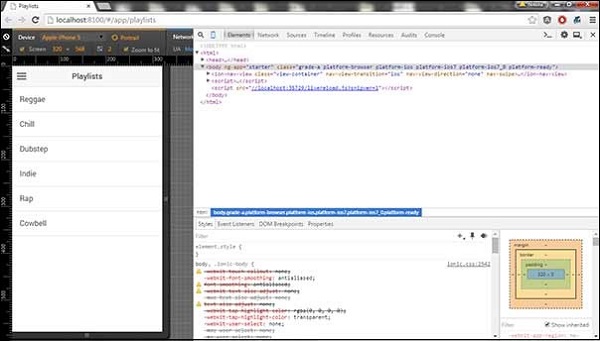
The top left corner of the console window click has the "Toggle Device Mode" icon. The next step will be to click "Dock to Right" icon in the top right corner. Once the page is refreshed, you should be ready for testing on the web browser.
Project Folder Structure
Ionic creates the following directory structure for all type of apps. This is important for any Ionic developer to understand the purpose of every directory and the files mentioned below −
Let us have a quick understanding of all the folders and files available in the project folder structure shown in the image above.
Hooks − Hooks are scripts that can be triggered during the build process. They are usually used for the Cordova commands customization and for building automated processes. We will not use this folder during this tutorial.
Platforms − This is the folder where Android and IOS projects are created. You might encounter some platform specific problems during development that will require these files, but you should leave them intact most of the time.
Plugins − This folder contains Cordova plugins. When you initially create an Ionic app, some of the plugins will be installed. We will show you how to install Cordova plugins in our subsequent chapters.
Resources − This folder is used for adding resources like icon and splash screen to your project.
Scss − Since Ionic core is built with Sass, this is the folder where your Sass file is located. For simplifying the process, we will not use Sass for this tutorial. Our styling will be done using CSS.
www − www is the main working folder for Ionic developers. They spend most of their time here. Ionic gives us their default folder structure inside 'www', but the developers can always change it to accommodate their own needs. When this folder is opened, you will find the following sub-folders −
The css folder, where you will write your CSS styling.
The img folder for storing images.
The js folder that contains the apps main configuration file (app.js) and AngularJS components (controllers, services, directives). All your JavaScript code will be inside these folders.
The libs folder, where your libraries will be placed.
The templates folder for your HTML files.
Index.html as a starting point to your app.
Other Files − Since this is a beginners tutorial, we will just mention some of the other important files and their purposes as well.
.bowerrc is the bower configuration file.
.editorconfig is the editor configuration file.
.gitignore is used to instruct which part of the app should be ignored when you want to push your app to the Git repository.
bower.json will contain the bower components and dependencies, if you choose to use the bower package manager.
gulpfile.js is used for creating automated tasks using the gulp task manager.
config.xml is the Cordova configuration file.
package.json contains the information about the apps, their dependencies and plugins that are installed using the NPM package manager.
In the next chapter, we will discuss the different colors available in Ionic open source framework.
Ionic - Colors
Before we start with actual elements available in the Ionic framework, let us have a little understanding on how Ionic makes use of colors for different elements.
Ionic Color Classes
Ionic framework gives us a set of nine predefined color classes. You can use these colors or you can override it with your own styling.
The following table shows the default set of nine colors provided by Ionic. We will use these colors for styling different Ionic elements in this tutorial. For now, you can check all the colors as shown below −
| Class | Description | Result |
|---|---|---|
| light | To be used for white color | |
| stable | To be used for light grey color | |
| positive | To be used for blue color | |
| calm | To be used for light blue color | |
| balanced | To be used for green color | |
| energized | To be used for yellow color | |
| assertive | To be used for red color | |
| royal | To be used for violet color | |
| dark | To be used for black color |
Ionic Color Usage
Ionic makes use of different classes for each element. For example, a header element will have bar class and a button will have a button class. To simplify the usage, we use different colors by prefixing element class in a color name.
For example, to create a blue color header, we will use a bar-calm as follows −
<div class = "bar bar-header bar-calm">
   ...
</div>
Similarly, to create a grey color button, we will use button-stable class as follows.
<div class = "button button-stable">
   ...
</div>
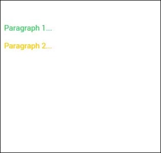
You can also use Ionic color class like any other CSS class. We will now style two paragraphs with a balanced (green) and an energized (yellow) color.
<p class = "balanced">Paragraph 1...</p>
<p class = "energized">Paragraph 2...</p>
The above code will produce the following screen −
We will discuss in detail in the subsequent chapters, when we create different elements using different classes.
Customizing Colors with CSS
When you want to change some of the Ionic default colors using CSS, you can do it by editing the lib/css/ionic.css file. In some cases, this approach is not very productive because every element (header, button, footer...) uses its own classes for styling.
Therefore, if you want to change the color of the "light" class to orange, you would need to search through all the elements that use this class and change it. This is useful when you want to change the color of a single element, but not very practical for changing color of all elements because it would use too much time.
Customizing colors using SASS
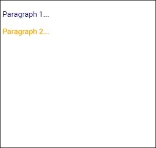
SASS (which is the short form of Syntactically Awesome Style Sheet) provides an easier way to change the color for all the elements at once. If you want to use SASS, open your project in the command window and type −
C:\Users\Username\Desktop\tutorialApp> ionic setup sass
This will set up SASS for your project. Now you can the change default colors by opening the scss/ionic.app.scss file and then typing in the following code before this line @import "www/lib/ionic/scss/ionic";
We will change the balanced color to dark blue and the energized color to orange. The two paragraphs that we used above are now dark blue and orange.
$balanced: #000066 !default;
$energized: #FFA500 !default;
Now, if you use the following example −
<p class = "balanced">Paragraph 1...</p>
<p class = "energized">Paragraph 2...</p>
The above code will produce the following screen −
All the Ionic elements that are using these classes will change to dark blue and orange. Take into consideration that you do not need to use Ionic default color classes. You can always style elements the way you want.
Important Note
The www/css/style.css file will be removed from the header of the index.html after you install SASS. You will need to link it manually if you still want to use it. Open index.html and then add the following code inside the header.
<link href = "css/style.css" rel = "stylesheet">
Ionic - Content
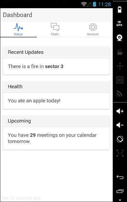
Almost every mobile app contains some fundamental elements. Usually those elements include a header and a footer that will cover the top and the bottom part of the screen. All the other elements will be placed between these two. Ionic provides ion-content element that serves as a container that will wrap all the other elements that we want to create.
This container has some unique characteristics, but since this is a JavaScript based component which we will cover in the later part of this tutorial.
<div class = "bar bar-header">
   <h1 class = "title">Header</h1>
</div>

<div class = "list">
   <label class = "item item-input">
      <input type = "text" placeholder = "Placeholder 1" />
   </label>

   <label class = "item item-input">
      <input type = "text" placeholder = "Placeholder 2" />
   </label>
</div>

<div class = "bar bar-footer">
   <h1 class = "title">Footer</h1>
</div>
Ionic - Header
The Ionic header bar is located on top of the screen. It can contain title, icons, buttons or some other elements on top of it. There are predefined classes of headers that you can use. You can check all of it in this tutorial.
Adding Header
The main class for all the bars you might use in your app is bar. This class will always be applied to all the bars in your app. All bar subclasses will use the prefix bar.
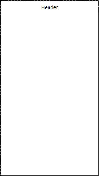
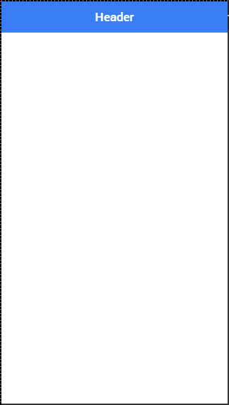
If you want to create a header, you need to add bar-header after your main bar class. Open your www/index.html file and add the header class inside your body tag. We are adding a header to the index.html body because we want it to be available on every screen in the app.
Since bar-header class has default (white) styling applied, we will add the title on top of it, so you can differentiate it from the rest of your screen.
<div class = "bar bar-header">
   <h1 class = "title">Header</h1>
</div>
The above code will produce the following screen −
Header Colors
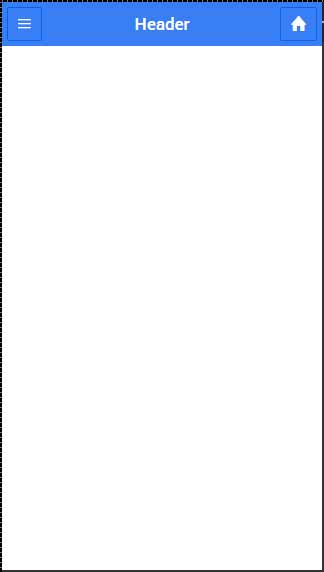
If you want to style your header, you just need to add the appropriate color class to it. When you style your elements, you need to add your main element class as prefix to your color class. Since we are styling the header bar, the prefix class will be bar and the color class that we want to use in this example is positive (blue).
<div class = "bar bar-header bar-positive">
   <h1 class = "title">Header</h1>
</div>
The above code will produce the following screen −
You can use any of the following nine classes to give a color of your choice to your app header −
| Color Class | Description | Result |
|---|---|---|
| bar-light | To be used for white color | |
| bar-stable | To be used for light grey color | |
| bar-positive | To be used for blue color | |
| bar-calm | To be used for light blue color | |
| bar-balanced | To be used for green color | |
| bar-energized | To be used for yellow color | |
| bar-assertive | To be used for red color | |
| bar-royal | To be used for violet color | |
| bar-dark | To be used for black color |
Header Elements
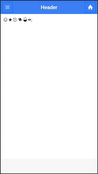
We can add other elements inside the header. The following code is an example to add a menu button and a home button inside a header. We will also add icons on top of our header buttons.
<div class = "bar bar-header bar-positive">
   <button class = "button icon ion-navicon"></button>
   <h1 class = "title">Header Buttons</h1>
   <button class = "button icon ion-home"></button>
</div>
The above code will produce the following screen −
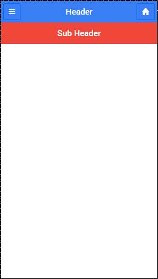
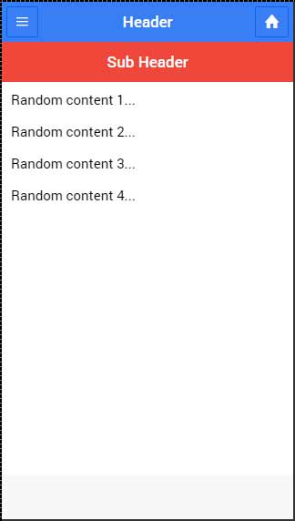
Sub Header
You can create a sub header that will be located just below the header bar. The following example will show how to add a header and a sub header to your app. Here, we have styled the sub header with an "assertive" (red) color class.
<div class = "bar bar-header bar-positive">
   <button class = "button icon ion-navicon"></button>
   <h1 class = "title">Header Buttons</h1>
   <button class = "button icon ion-home"></button>
</div>

<div class = "bar bar-subheader bar-assertive">
   <h2 class = "title">Sub Header</h2>
</div>
The above code will produce the following screen −
When your route is changed to any of the app screens, you will notice that the header and the sub header are covering some content as shown in the screenshot below.
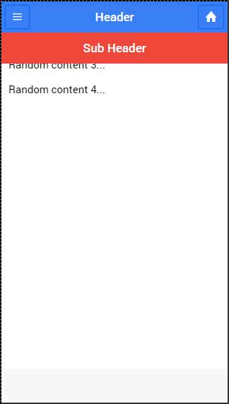
To fix this you need to add a has-header or a has-subheader class to the ion-content tags of your screens. Open one of your HTML files from www/templates and add the has-subheader class to the ion-content. If you only use header in your app, you will need to add the has-header class instead.
<ion-content class = "padding has-subheader">
The above code will produce the following screen −
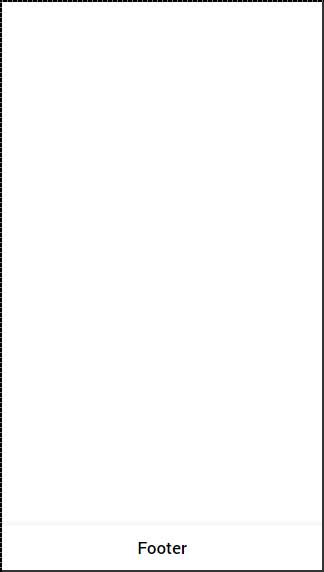
Ionic - Footer
Ionic footer is placed at the bottom of the app screen. Working with footers is almost the same as working with headers.
Adding Footer
The main class for Ionic footers is bar (the same as header). When you want to add footer to your screens, you need to add bar-footer class to your element after the main bar class. Since we want to use our footer on every screen in the app, we will add it to the body of the index.html file. We will also add title for our footer.
<div class = "bar bar-footer">
   <h1 class = "title">Footer</h1>
</div>
The above code will produce the following screen −
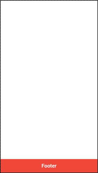
Footer Colors
If you want to style your footer, you just need to add the appropriate color class to it. When you style your elements, you need to add your main element class as a prefix to your color class. Since we are styling a footer bar, the prefix class will be a bar and the color class that we want to use in this example is assertive (red).
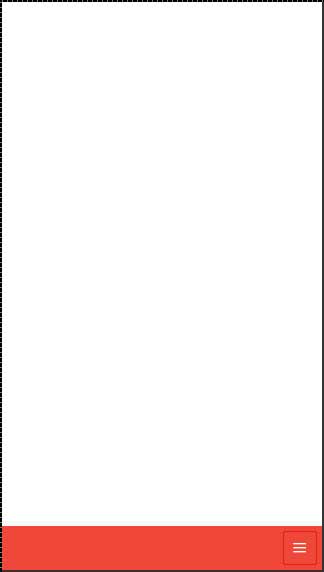
<div class = "bar bar-footer bar-assertive">
   <h1 class = "title">Footer</h1>
</div>
The above code will produce the following screen −
You can use any of the following nine classes to give a color of your choice to your app footer −
| Color Class | Description | Result |
|---|---|---|
| bar-light | To be used for white color | |
| bar-stable | To be used for light grey color | |
| bar-positive | To be used for blue color | |
| bar-calm | To be used for light blue color | |
| bar-balanced | To be used for green color | |
| bar-energized | To be used for yellow color | |
| bar-assertive | To be used for red color | |
| bar-royal | To be used for violet color | |
| bar-dark | To be used for black color |
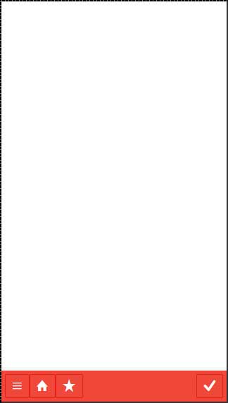
Footer Elements
Footers can contain elements inside it. Most of the time you will need to add buttons with icons inside a footer.
The first button added will always be in the left corner. The last one will be placed on the right. The buttons in between will be grouped next to the first one on the left side of your footer. In following example, you can also notice that we use the icon class to add icons on top of the buttons.
<div class = "bar bar-footer bar-assertive">
   <button class = "button icon ion-navicon"></button>
   <button class = "button icon ion-home"></button>
   <button class = "button icon ion-star"></button>
   <button class = "button icon ion-checkmark-round"></button>
</div>
The above code will produce the following screen −
If you want to move your button to the right you can add pull-right class.
<div class = "bar bar-footer bar-assertive">
   <button class = "button icon ion-navicon pull-right"></button>
</div>
The above code will produce the following screen −
Ionic - Buttons
There are several types of buttons in the Ionic Framework and these buttons are subtly animated, which further enhances the user experience when using the app. The main class for all the button types is button. This class will always be applied to our buttons, and we will use it as a prefix when working with sub classes.
Block Buttons
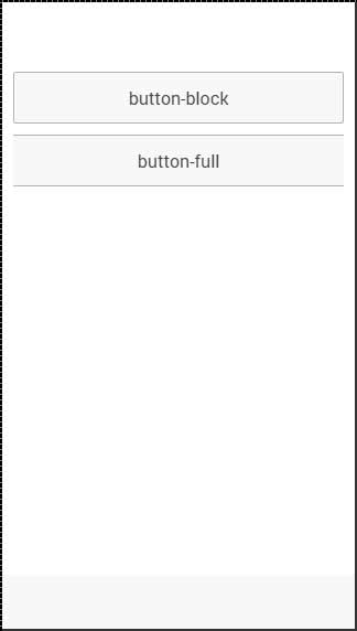
Block buttons will always have 100% width of their parent container. They will also have a small padding applied. You will use button-block class for adding block buttons. If you want to remove padding but keep the full width, you can use the button-full class.
Following is an example to show the usage of both classes −
<button class = "button button-block">
   button-block
</button>

<button class = "button button-full">
   button-full
</button>
The above code will produce the following screen −
Button Size
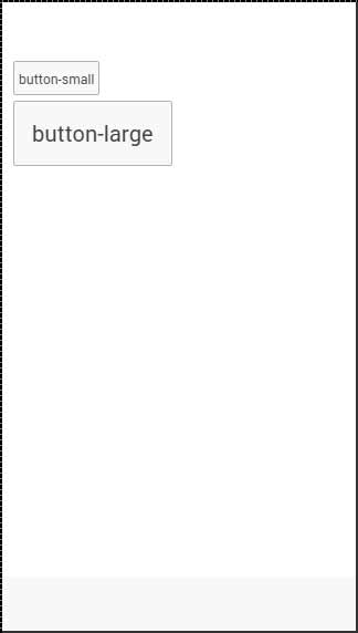
There are two Ionic classes for changing the button size −
button-small and
button-large.
Following is an example to show their usage −
<button class = "button button-small">
   button-small
</button>

<button class = "button button-large">
   button-large
</button>
The above code will produce the following screen −
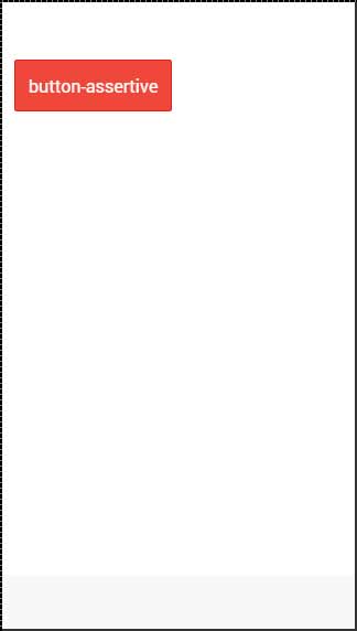
Button Colors
If you want to style your button, you just need to add appropriate color class to it. When you style your elements, you need to add your main element class as a prefix to your color class. Since we are styling the footer bar, the prefix class will be a bar and the color class that we want to use in this example is assertive (red).
<button class = "button button-assertive">
   button-assertive
</button>
The above code will produce the following screen −
You can use any of the following nine classes to give a color of your choice to your app buttons −
| Color Class | Description | Result |
|---|---|---|
| button-light | To be used for white color | |
| button-stable | To be used for light grey color | |
| button-positive | To be used for blue color | |
| button-calm | To be used for light blue color | |
| button-balanced | To be used for green color | |
| button-energized | To be used for yellow color | |
| button-assertive | To be used for red color | |
| button-royal | To be used for violet color | |
| button-dark | To be used for black color |
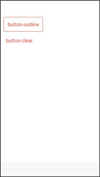
Button Outline
If you want your buttons transparent, you can apply button-outline class. Buttons with this class will have an outline border and a transparent background.
To remove the border from the button, you can use the button-clear class. The following example shows how to use these two classes.
<button class = "button button-assertive button-outline">
   button-outline
</button>

<button class = "button button-assertive button-clear">
   button-clear
</button>
The above code will produce the following screen −
Adding Icons
When you want to add Icons to your buttons, the best way is to use the icon class. You can place the icon on one side of the button by using the icon-left or the icon-right. You will usually want to move your icon to one side when you have some text on top of your button as explained below.
<button class = "button icon ion-home">
</button>

<button class = "button icon icon-left ion-home">
   Home
</button>

<button class = "button icon icon-right ion-home">
   Home
</button>
The above code will produce the following screen −
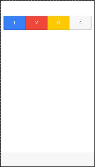
Button Bar
If you want to group a couple of buttons together, you can use the button-bar class. The buttons will have equal size by default.
<div class = "button-bar">
   <a class = "button button-positive">1</a>
   <a class = "button button-assertive">2</a>
   <a class = "button button-energized">3</a>
   <a class = "button">4</a>
</div>
The above code will produce the following screen −
Ionic - Lists
Lists are one of the most popular elements of any web or mobile application. They are usually used for displaying various information. They can be combined with other HTML elements to create different menus, tabs or to break the monotony of pure text files. Ionic framework offers different list types to make their usage easy.
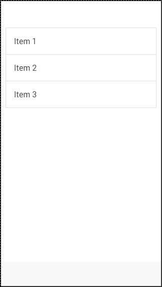
Creating Ionic List
Every list is created with two elements. When you want to create a basic list your <ul> tag needs to have the list class assigned, and your <li> tag will use the item class. Another interesting thing is that you do not even need to use <ul>, <ol> and <li> tags for your lists. You can use any other elements, but the important thing is to add list and item classes appropriately.
<div class = "list">
   <div class = "item">Item 1</div>
   <div class = "item">Item 2</div>
   <div class = "item">Item 3</div>
</div>
The above code will produce the following screen −
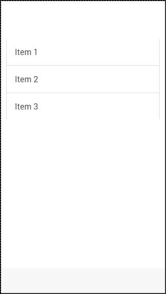
Inset List
When you need a list to fill your own container, you can add the list-insets after your list class. This will add some margin to it and it will adjust the list size to your container.
<div class = "list list-inset">
   <div class = "item">Item 1</div>
   <div class = "item">Item 2</div>
   <div class = "item">Item 3</div>
</div>
The above code will produce the following screen −
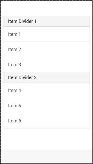
Item Dividers
Dividers are used for organizing some elements into logical groups. Ionic gives us item-divider class for this. Again, like with all the other Ionic elements, we just need to add the item-divider class after the item class. Item dividers are useful as a list header, since they have stronger styling than the other list items by default.
<div class = "list">
   <div class = "item item-divider">Item Divider 1</div>
   <div class = "item">Item 1</div>
   <div class = "item">Item 2</div>
   <div class = "item">Item 3</div>

   <div class = "item item-divider">Item Divider 2</div>
   <div class = "item">Item 4</div>
   <div class = "item">Item 5</div>
   <div class = "item">Item 6</div>
</div>
The above code will produce the following screen −
Adding Icons
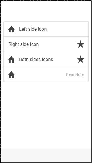
We already showed you how to add icons to your buttons. When adding icons to the list items, you need to choose what side you want to place them. There are item-icon-left and item-icon-right classes for this. You can also combine those two classes, if you want to have your Icons on both the sides. Finally, there is the item-note class to add a text note to your item.
<div class = "list">
   <div class = "item item-icon-left">
      <i class = "icon ion-home"></i>
      Left side Icon
   </div>

   <div class = "item item-icon-right">
      <i class = "icon ion-star"></i>
      Right side Icon
   </div>

   <div class = "item item-icon-left item-icon-right">
      <i class = "icon ion-home"></i>
      <i class = "icon ion-star"></i>
      Both sides Icons
   </div>

   <div class = "item item-icon-left">
      <i class = "icon ion-home"></i>
      <span class = "text-note">Text note</span>
   </div>
</div>
The above code will produce the following screen −
Adding Avatars and Thumbnails
Avatars and thumbnails are similar. The main difference is that avatars are smaller than thumbnails. These thumbnails are covering most of the full height of the list item, while avatars are medium sized circle images. The classes that are used are item-avatar and item-thumbnail. You can also choose which side you want to place your avatars and thumbnails as shown in the thumbnail code example below.
<div class = "list">
   <div class = "item item-avatar">
      <img src = "my-image.png">
      <h3>Avatar</h3>
   </div>

   <div class = "item item-thumbnail-left">
      <img src = "my-image.png">
      <h3>Thumbnail</h3>
   </div>
</div>
The above code will produce the following screen −
Ionic - Cards
Since mobile devices have smaller screen size, cards are one of the best elements for displaying information that will feel user friendly. In the previous chapter, we have discussed how to inset lists. Cards are very similar to inset lists, but they offer some additional shadowing that can influence the performance for larger lists.
Adding Cards
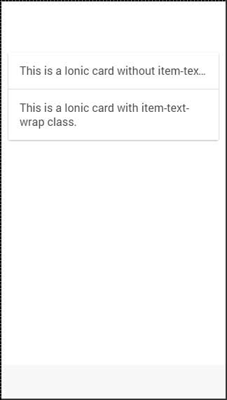
A default card can be created by adding a card class to your element. Cards are usually formed as lists with the item class. One of the most useful class is the item-text-wrap. This will help when you have too much text, so you want to wrap it inside your card. The first card in the following example does not have the item-text-wrap class assigned, but the second one is using it.
<div class = "card">
   <div class = "item">
      This is a Ionic card without item-text-wrap class.
   </div>

   <div class = "item item-text-wrap">
      This is a Ionic card with item-text-wrap class.
   </div>
</div>
The above code will produce the following screen −
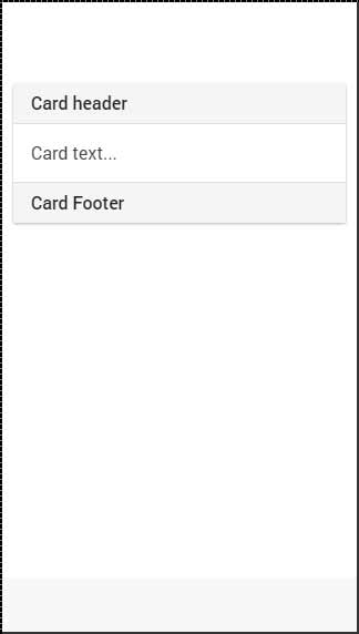
Card Header and Footer
In the previous chapter, we have already discussed how to use the item-divider class for grouping lists. This class can be very useful when working with cards to create card headers. The same class can be used for footers as shown in the following code −
<div class = "card list">
   <div class = "item item-divider">
      Card header
   </div>

   <div class = "item item-text-wrap">
      Card text...
   </div>

   <div class = "item item-divider">
      Card Footer
   </div>
</div>
The above code will produce the following screen −
Complete Card
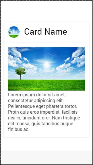
You can add any element on top of your card. In following example, we will show you how to use the full-image class together with the item-body to get a good-looking windowed image inside your card.
<div class = "card">
   <div class = "item item-avatar">
      <img src = "my-image.png">
      <h2>Card Name</h2>
   </div>

   <div class = "item item-body">
      <img class = "full-image" src = "my-image.png">
      Lorem ipsum dolor sit amet, consectetur adipiscing elit. Pellentesque eget
      pharetra tortor. Proin quis eros imperdiet, facilisis nisi in, tincidunt orci.
      Nam tristique elit massa, quis faucibus augue finibus ac.
   </div>
</div>
The above code will produce the following screen −
Ionic - Forms
Ionic forms are mostly used for interaction with users and collecting needed info. This chapter will cover various text input forms and in our subsequent chapters, we will explain how to use other form elements using the Ionic framework.
Using Input Form
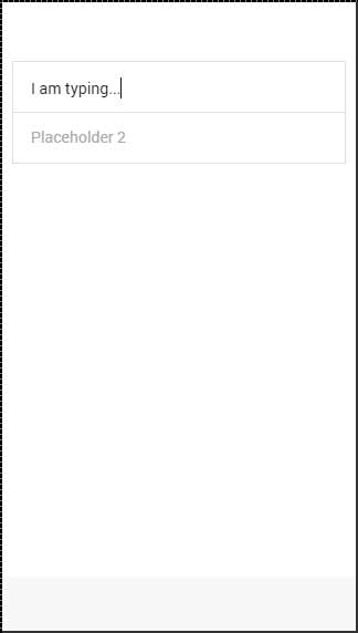
The best way to use forms is to use list and item as your main classes. Your app will usually consist more than one-form element, so it makes sense to organize it as a list. In the following example, you can notice that the item element is a label tag.
You can use any other element, but a label will provide the ability to tap on any part of the element to focus your text input. You can set a placeholder that will look different from the input text and it will be hidden as soon as you start typing. You can see this in the example below.
<div class = "list">
   <label class = "item item-input">
      <input type = "text" placeholder = "Placeholder 1" />
   </label>

   <label class = "item item-input">
      <input type = "text" placeholder = "Placeholder 2" />
   </label>
</div>
The above code will produce the following screen −
Ionic Labels
Ionic offers some other options for your label. You can use the input-label class, if you want your placeholder to be on the left side when you type the text.
<div class = "list">
   <label class = "item item-input">
      <input type = "text" placeholder = "Placeholder 1" />
   </label>

   <label class = "item item-input">
      <input type = "text" placeholder = "Placeholder 2" />
   </label>
</div>
The above code will produce the following screen −
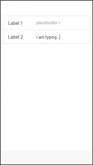
Stacked Label
Stacked label is the other option that allows moving your label on top or the bottom of the input. To achieve this, we will add the item-stacked-label class to our label element and we need to create a new element and assign the input-label class to it. If we want it to be on top, we just need to add this element before the input tag. This is shown in the following example.
Notice that the span tag is before the input tag. If we changed their places, it would appear below it on the screen.
<div class = "list">
   <label class = "item item-input item-stacked-label">
      <span class = "input-label">Label 1</span>
      <input type = "text" placeholder = "Placeholder 1" />
   </label>

   <label class = "item item-input item-stacked-label">
      <span class = "input-label">Label 2</span>
      <input type = "text" placeholder = "Placeholder 2" />
   </label>
</div>
The above code will produce the following screen −
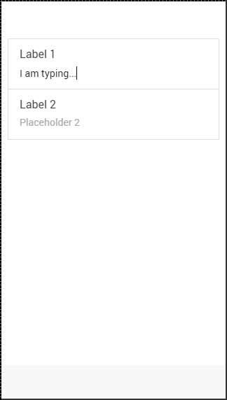
Floating Label
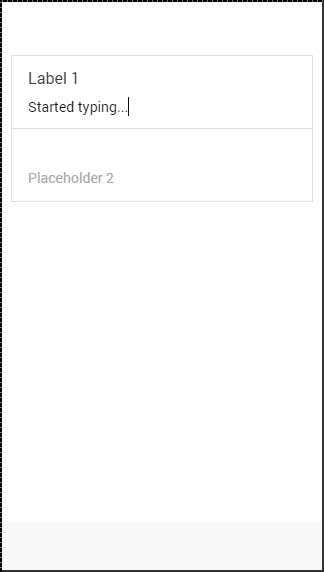
Floating labels are the third option we can use. These labels will be hidden before we start typing. As soon the typing starts, they will appear on top of the element with nice floating animation. We can use floating labels the same way as we used stacked labels. The only difference is that this time we will use item-floating-label class.
<div class = "list">
   <label class = "item item-input item-floating-label">
      <span class = "input-label"t>Label 1</span>
      <input type = "text" placeholder = "Placeholder 1" />
   </label>

   <label class = "item item-input item-floating-label">
      <span class = "input-label">Label 2</span>
      <input type = "text" placeholder = "Placeholder 2" />
   </label>
</div>
The above code will produce the following screen −
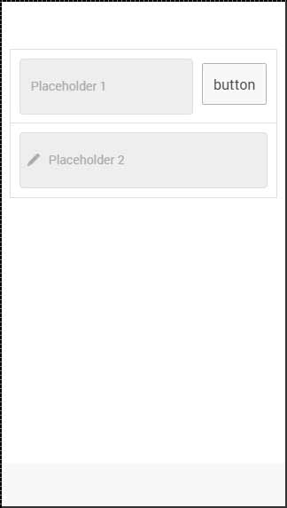
Inset inputs
In our last chapter, we discussed how to inset Ionic elements. You can also inset an input by adding the item-input-inset class to your item and the item-input-wrapper to your label. A Wrapper will add additional styling to your label.
If you add some other elements next to your label, the label size will adjust to accommodate the new element. You can also add elements inside your label (usually icons).
The following example shows two inset inputs. The first one has a button next to the label, and the second one has an icon inside it. We used the placeholder-icon class to make the icon with the same color as the placeholder text. Without it, the icon would use the color of the label.
<div class = "list">
   <div class = "item item-input-inset">
      <label class = "item item-input-wrapper">
         <input type = "text" placeholder = "Placeholder 1" />
      </label>
      <button class = "button">button</button>
   </div>

   <div class = "item item-input-inset">
      <label class = "item item-input-wrapper">
         <i class = "icon ion-edit placeholder-icon"></i>
         <input type = "text" placeholder = "Placeholder 2" />
      </label>
   </div>
</div>
The above code will produce the following screen −
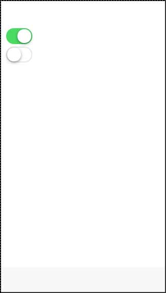
Ionic - Toggle
Sometimes there are two options available for the users. The most efficient way to handle this situation is through toggle forms. Ionic gives us classes for toggle elements that are animated and easy to implement.
Using Toggle
Toggle can be implemented using two Ionic classes. First, we need to create a label for the same reason we explained in the previous chapter and assign a toggle class to it.
Inside our label will be created . You will notice two more ionic classes used in the following example. The track class will add background styling to our checkbox and color animation when the toggle is tapped. The handle class is used to add a circle button to it.
The following example shows two toggle forms. The first one is checked, the second one is not.
<label class = "toggle">
   <input type = "checkbox" />
   <div class = "track">
      <div class = "handle"></div>
   </div>
</label>

<br>

<label class = "toggle">
   <input type = "checkbox" />
   <div class = "track">
      <div class = "handle"></div>
   </div>
</label>
The above code will produce the following screen −
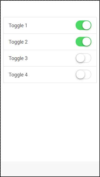
Multiple Toggles
Most of the time when you want to add more than one element of the same kind in Ionic, the best way is to use list items. The class that is used for multiple toggles is the item-toggle. The next example shows how to create a list for toggles. The first one and the second one are checked.
<ul class = "list">
   <li class = "item item-toggle">
      Toggle 1
      <label class = "toggle">
         <input type = "checkbox" />
         <div class = "track">
            <div class = "handle"></div>
         </div>
      </label>
   </li>

   <li class = "item item-toggle">
      Toggle 2
      <label class = "toggle">
         <input type = "checkbox" />
         <div class = "track">
            <div class = "handle"></div>
         </div>
      </label>
   </li>

   <li class = "item item-toggle">
      Toggle 3
      <label class = "toggle">
         <input type = "checkbox" />
         <div class = "track">
            <div class = "handle"></div>
         </div>
      </label>
   </li>

   <li class = "item item-toggle">
      Toggle 4
      <label class = "toggle">
         <input type = "checkbox" />
         <div class = "track">
            <div class = "handle"></div>
         </div>
      </label>
   </li>
</ul>
The above code will produce the following screen −
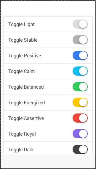
Styling Toggle
All the Ionic color classes can be applied to the toggle element. The Prefix will be the toggle. We will apply this to the label element. The following example shows all the colors that are applied.
<ul class = "list">
   <li class = "item item-toggle">
      Toggle Light
      <label class = "toggle  toggle-light">
         <input type = "checkbox" />
         <div class = "track">
            <div class = "handle"></div>
         </div>
      </label>
   </li>

   <li class = "item item-toggle">
      Toggle Stable
      <label class = "toggle toggle-stable">
         <input type = "checkbox" />
         <div class = "track">
            <div class = "handle"></div>
         </div>
      </label>
   </li>

   <li class = "item item-toggle">
      Toggle Positive
      <label class = "toggle toggle-positive">
         <input type = "checkbox" />
         <div class = "track">
            <div class = "handle"></div>
         </div>
      </label>
   </li>

   <li class = "item item-toggle">
      Toggle Calm
      <label class = "toggle toggle-calm">
         <input type = "checkbox" />
         <div class = "track">
            <div class = "handle"></div>
         </div>
      </label>
   </li>

   <li class = "item item-toggle">
      Toggle Balanced
      <label class = "toggle toggle-balanced">
         <input type = "checkbox" />
         <div class = "track">
            <div class = "handle"></div>
         </div>
      </label>
   </li>

   <li class = "item item-toggle">
      Toggle Energized
      <label class = "toggle toggle-energized">
         <input type = "checkbox" />
         <div class = "track">
            <div class = "handle"></div>
         </div>
      </label>
   </li>

   <li class = "item item-toggle">
      Toggle Assertive
      <label class = "toggle toggle-assertive">
         <input type = "checkbox" />
         <div class = "track">
            <div class = "handle"></div>
         </div>
      </label>
   </li>

   <li class = "item item-toggle">
      Toggle Royal
      <label class = "toggle  toggle-royal">
         <input type = "checkbox" />
         <div class = "track">
            <div class = "handle"></div>
         </div>
      </label>
   </li>

   <li class = "item item-toggle">
      Toggle Dark
      <label class = "toggle toggle-dark">
         <input type = "checkbox" />
         <div class = "track">
            <div class = "handle"></div>
         </div>
      </label>
   </li>
</ul>
The above code will produce the following screen −
Ionic - Checkbox
Ionic checkbox is almost the same as toggle. These two are styled differently but are used for the same purposes.
Adding Checkbox
When creating a checkbox form, you need to add the checkbox class name to both label and the input elements. The following example shows two simple checkboxes, one is checked and the other is not.
<label class = "checkbox">
   <input type = "checkbox">
</label>

<label class = "checkbox">
   <input type = "checkbox">
</label>
The above code will produce the following screen −
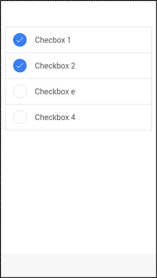
Multiple Checkboxes
As we already showed, the list will be used for multiple elements. Now we will use the item-checkbox class for each list item.
<ul class = "list">
   <li class = "item item-checkbox">
      Checkbox 1
      <label class = "checkbox">
         <input type = "checkbox" />
      </label>
   </li>

   <li class = "item item-checkbox">
      Checkbox 2
      <label class = "checkbox">
         <input type = "checkbox" />
      </label>
   </li>

   <li class = "item item-checkbox">
      Checkbox e
      <label class = "checkbox">
         <input type = "checkbox" />
      </label>
   </li>

   <li class = "item item-checkbox">
      Checkbox 4
      <label class = "checkbox">
         <input type = "checkbox" />
      </label>
   </li>
</ul>
The above code will produce the following screen −
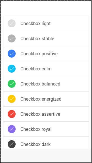
Styling Checkbox
When you want to style a checkbox, you need to apply any Ionic color class with the checkbox prefix. Check the following example to see how it looks like. We will use the list of checkboxes for this example.
<ul class = "list">
   <li class = "item item-checkbox checkbox-light">
      Checkbox 1
      <label class = "checkbox">
         <input type = "checkbox" />
      </label>
   </li>

   <li class = "item item-checkbox checkbox-stable">
      Checkbox 2
      <label class = "checkbox">
         <input type = "checkbox" />
      </label>
   </li>

   <li class = "item item-checkbox  checkbox-positive">
      Checkbox 3
      <label class = "checkbox">
         <input type = "checkbox" />
      </label>
   </li>

   <li class = "item item-checkbox  checkbox-calm">
      Checkbox 4
      <label class = "checkbox">
         <input type = "checkbox" />
      </label>
   </li>

   <li class = "item item-checkbox  checkbox-balanced">
      Checkbox 5
      <label class = "checkbox">
         <input type = "checkbox" />
      </label>
   </li>

   <li class = "item item-checkbox  checkbox-energized">
      Checkbox 6
      <label class = "checkbox">
         <input type = "checkbox" />
      </label>
   </li>

   <li class = "item item-checkbox  checkbox-assertive">
      Checkbox 7
      <label class = "checkbox">
         <input type = "checkbox" />
      </label>
   </li>

   <li class = "item item-checkbox  checkbox-royal">
      Checkbox 8
      <label class = "checkbox">
         <input type = "checkbox" />
      </label>
   </li>

   <li class = "item item-checkbox  checkbox-dark">
      Checkbox 9
      <label class = "checkbox">
         <input type = "checkbox" />
      </label>
   </li>
</ul>
The above code will produce the following screen −
Ionic - Radio Button
Radio buttons are another form of an element, which we will be covering in this chapter. The difference between radio buttons from toggle and checkbox forms is that when using the former, you choose only one radio button from the list. As the latter allows you to choose more than one.
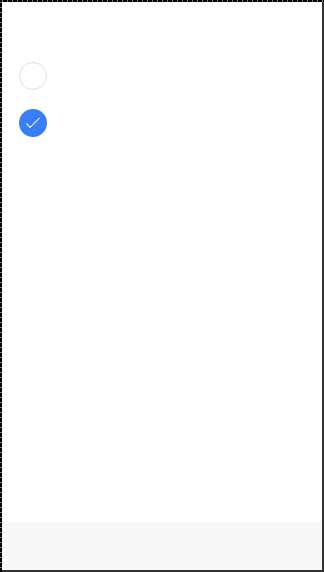
Adding Radio Buttons
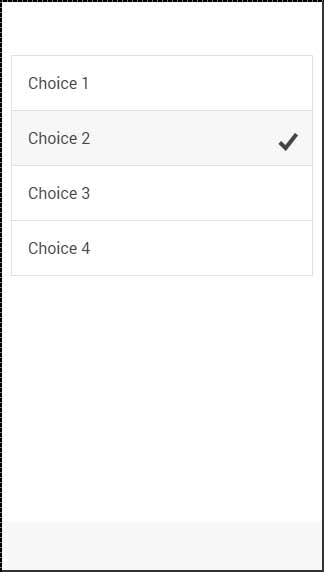
Since there will always be more than one radio button to choose from, the best way is to create a list. We did this whenever we wanted multiple elements. The list item class will be item-radio. Again, we will use label for this as we have used with all the other forms. Input will have the name attribute. This attribute will group all the buttons that you want to use as a possible choice. The item-content class is used to display options clearly. At the end, we will use the radio-icon class to add the checkmark icon that will be used to mark the option that the user chooses.
In the following example, there are four radio buttons and the second one is chosen.
<div class = "list">
   <label class = "item item-radio">
      <input type = "radio" name = "group1" />
      <div class = "item-content">
         Choice 1
      </div>
      <i class = "radio-icon ion-checkmark"></i>
   </label>

   <label class = "item item-radio">
      <input type = "radio" name = "group1" />
      <div class = "item-content">
         Choice 2
      </div>
      <i class = "radio-icon ion-checkmark"></i>
   </label>

   <label class = "item item-radio">
      <input type = "radio" name = "group1" />
      <div class = "item-content">
         Choice 3
      </div>
      <i class = "radio-icon ion-checkmark"></i>
   </label>

   <label class = "item item-radio">
      <input type = "radio" name = "group1" />
      <div class = "item-content">
         Choice 4
      </div>
      <i class = "radio-icon ion-checkmark"></i>
   </label>
</div>
The above code will produce the following screen −
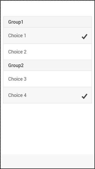
Multiple Radio Button Groups
Sometimes you want to create more than one group. This is what the name attribute is made for; the following example will group the first two and the last two buttons as two option groups.
We will use the item-divider class to separate two groups. Notice that the first group has the name attribute equal to group1 and the second one uses group2.
<div class = "list">
   <div class = " item item-divider">
      Group1
   </div>

   <label class = "item item-radio">
      <input type = "radio" name = "group1" />
      <div class = "item-content">
         Choice 1
      </div>
      <i class = "radio-icon ion-checkmark"></i>
   </label>

   <label class = "item item-radio">
      <input type = "radio" name = "group1" />
      <div class = "item-content">
         Choice 2
      </div>
      <i class = "radio-icon ion-checkmark"></i>
   </label>

   <div class = "item item-divider">
      Group2
   </div>

   <label class = "item item-radio">
      <input type = "radio" name = "group2" />
      <div class = "item-content">
         Choice 3
      </div>
      <i class = "radio-icon ion-checkmark"></i>
   </label>

   <label class = "item item-radio">
      <input type = "radio" name = "group2" />
      <div class = "item-content">
         Choice 4
      </div>
      <i class = "radio-icon ion-checkmark"></i>
   </label>
</div>
The above code will produce the following screen −
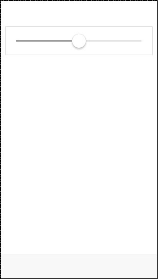
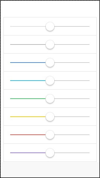
Ionic - Range
Ionic range is used to choose and display the level of something. It will represent the actual value in co-relation to maximal and minimal value. Ionic offers a simple way of working with Range.
Using Range
Range is used as an inside item element. The class that is used is range. We will place this class after the item class. This will prepare a container where the range will be placed. After creating a container, we need to add input and assign the range type to it and the name attribute as well.
<div class = "item range">
   <input type = "range" name = "range1">
</div>
The above code will produce the following screen −
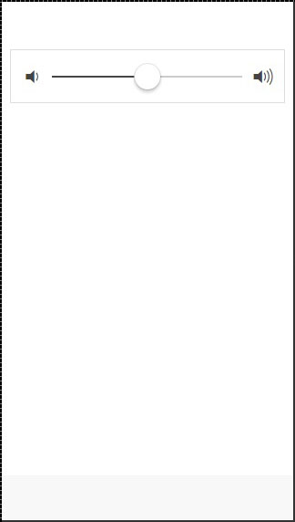
Adding Icons
Range will usually require icons to display the data clearly. We just need to add icons before and after the range input to place them on both sides of the range element.
<div class = "item range">
   <i class = "icon ion-volume-low"></i>
   <input type = "range" name = "volume">
   <i class = "icon ion-volume-high"></i>
</div>
The above code will produce the following screen −
Styling Range
Our next example will show you how to style Range with Ionic colors. The color classes will use a range prefix. We will create a list with nine ranges and style it differently.
<div class = "list">
   <div class = "item range range-light">
      <input type = "range" name = "volume">
   </div>

   <div class = "item range range-stable">
      <input type = "range" name = "volume">
   </div>

   <div class = "item range range-positive">
      <input type = "range" name = "volume">
   </div>

   <div class = "item range range-calm">
      <input type = "range" name = "volume">
   </div>

   <div class = "item range range-balanced">
      <input type = "range" name = "volume">
   </div>

   <div class = "item range range-energized">
      <input type = "range" name = "volume">
   </div>

   <div class = "item range range-assertive">
      <input type = "range" name = "volume">
   </div>

   <div class = "item range range-royal">
      <input type = "range" name = "volume">
   </div>

   <div class = "item range range-dark">
      <input type = "range" name = "volume">
   </div>
</div>
The above code will produce the following screen −
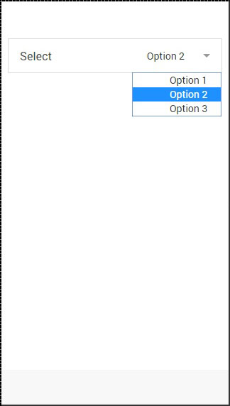
Ionic - Select
Ionic Select will create a simple menu with select options for the user to choose. This Select Menu will look differently on different platforms, since its styling is handled by the browser.
Using Select
First, we will create a label and add the item-input and the item-select classes. The second class will add additional styling to the select form and then we will add the input-label class inside that will be used to add a name to our select element. We will also add select with option inside. This is regular HTML5 select element. The following example is showing Ionic Select with three options.
<label class = "item item-input item-select">
   <div class = "input-label">
      Select
   </div>

   <select>
      <option>Option 1</option>
      <option selected>Option 2</option>
      <option>Option 3</option>
   </select>
</label>
The above code will produce the following screen −
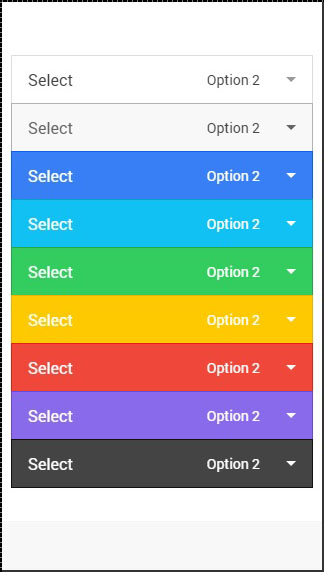
Styling Select
The following example will show you how to apply styling to select. We are creating a list with nine differently styled select elements using Ionic colors. Since we are using list with items, item will be the prefix to the color classes.
<div class = "list">
   <label class = "item item-input item-select item-light">
      <div class = "input-label">
         Select
      </div>

      <select>
         <option>Option 1</option>
         <option selected>Option 2</option>
         <option>Option 3</option>
      </select>
   </label>

   <label class = "item item-input item-select item-stable">
      <div class = "input-label">
         Select
      </div>

      <select>
         <option>Option 1</option>
         <option selected>Option 2</option>
         <option>Option 3</option>
      </select>
   </label>

   <label class = "item item-input item-select item-positive">
      <div class = "input-label">
         Select
      </div>

      <select>
         <option>Option 1</option>
         <option selected>Option 2</option>
         <option>Option 3</option>
      </select>
   </label>

   <label class = "item item-input item-select item-calm">
      <div class = "input-label">
         Select
      </div>

      <select>
         <option>Option 1</option>
         <option selected>Option 2</option>
         <option>Option 3</option>
      </select>
   </label>

   <label class = "item item-input item-select item-balanced">
      <div class = "input-label">
         Select
      </div>

      <select>
         <option>Option 1</option>
         <option selected>Option 2</option>
         <option>Option 3</option>
      </select>
   </label>

   <label class = "item item-input item-select item-energized">
      <div class = "input-label">
         Select
      </div>

      <select>
         <option>Option 1</option>
         <option selected>Option 2</option>
         <option>Option 3</option>
      </select>
   </label>

   <label class = "item item-input item-select item-assertive">
      <div class = "input-label">
         Select
      </div>

      <select>
         <option>Option 1</option>
         <option selected>Option 2</option>
         <option>Option 3</option>
      </select>
   </label>

   <label class = "item item-input item-select item-royal">
      <div class = "input-label">
         Select
      </div>

      <select>
         <option>Option 1</option>
         <option selected>Option 2</option>
         <option>Option 3</option>
      </select>
   </label>

   <label class = "item item-input item-select item-dark">
      <div class = "input-label">
         Select
      </div>

      <select>
         <option>Option 1</option>
         <option selected>Option 2</option>
         <option>Option 3</option>
      </select>
   </label>
</div>
The above code will produce the following screen −
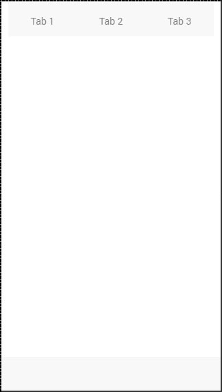
Ionic - Tabs
Ionic tabs are most of the time used for mobile navigation. Styling is optimized for different platforms. This means that on android devices, tabs will be placed at the top of the screen, while on IOS it will be at the bottom. There are different ways of creating tabs. We will understand in detail, how to create tabs in this chapter.
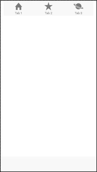
Simple Tabs
Simple Tabs menu can be created with a tabs class. For the inside element that is using this class, we need to add tab-item elements. Since tabs are usually used for navigation, we will use <a> tags for tab items. The following example is showing a menu with four tabs.
<div class = "tabs">
   <a class = "tab-item">
      Tab 1
   </a>

   <a class = "tab-item">
      Tab 2
   </a>

   <a class = "tab-item">
      Tab 3
   </a>
</div>
The above code will produce the following screen −
Adding Icons
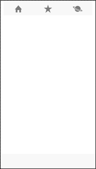
Ionic provides classes for adding icons to tabs. If you want your tabs to have icons without any text, a tabs-icon-only class should be added after the tabs class. Of course, you need to add icons you want to display.
<div class = "tabs tabs-icon-only">
   <a class = "tab-item">
      <i class = "icon ion-home"></i>
   </a>

   <a class = "tab-item">
      <i class = "icon ion-star"></i>
   </a>

   <a class = "tab-item">
      <i class = "icon ion-planet"></i>
   </a>
</div>
The above code will produce the following screen −
You can also add icons and text together. The tabs-icon-top and tabs-icon-left are classes that will place the icon above or on the left side respectively. Implementation is the same as the example given above, we will just add a new class and text that we want to use. The following example shows icons placed above the text.
<div class = "tabs tabs-icon-top">
   <a class = "tab-item">
      <i class = "icon ion-home"></i>
      Tab 1
   </a>

   <a class = "tab-item">
      <i class = "icon ion-star"></i>
      Tab 2
   </a>

   <a class = "tab-item">
      <i class = "icon ion-planet"></i>
      Tab 3
   </a>
</div>
The above code will produce the following screen −
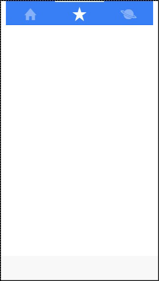
Striped Tabs
Striped Tabs can be created by adding a container around our tabs with the tabs-striped class. This class allows the usage of the tabs-background and the tabs-color prefixes for adding some of the Ionic colors to the tabs menu.
In the following example, we will use the tabs-background-positive (blue) class to style the background of our menu, and the tabs-color-light (white) class to style the tab icons. Notice the difference between the second tab that is active and the other two that are not.
<div class = "tabs-striped tabs-background-positive tabs-color-light">
   <div class = "tabs">
      <a class = "tab-item">
         <i class = "icon ion-home"></i>
      </a>

      <a class = "tab-item active">
         <i class = "icon ion-star"></i>
      </a>

      <a class = "tab-item">
         <i class = "icon ion-planet"></i>
      </a>
   </div>
</div>
The above code will produce the following screen −
Ionic - Grid
Working with the Ionic Grid System is straightforward. There are two main classes row for working with rows and col for columns.
You can choose as many columns or rows you want. All of them will adjust its size to accommodate the available space, although you can change this behavior to suit your needs.
NOTE − All examples in this tutorial will have borders applied to our grid to be able to display it in a way that is easy to understand.
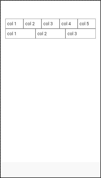
Simple Grid
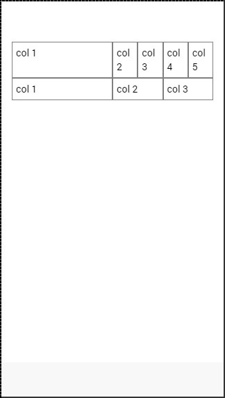
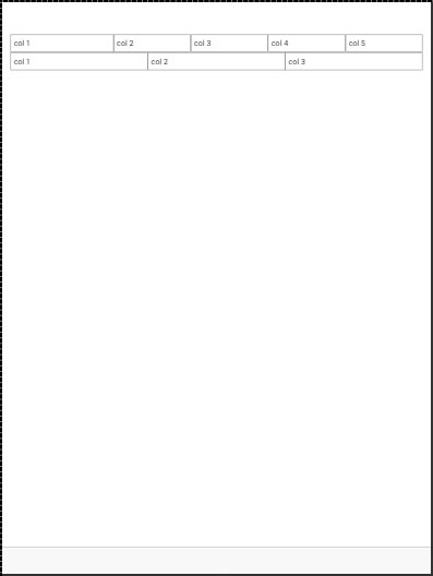
The following example shows how to use the col and the row classes. We will create two rows. The first row will have five columns and the second one will have only three. Notice how the width of the columns is different in the first and second row.
<div class = "row">
   <div class = "col">col 1</div>
   <div class = "col">col 2</div>
   <div class = "col">col 3</div>
   <div class = "col">col 4</div>
   <div class = "col">col 5</div>
</div>

<div class = "row">
   <div class = "col">col 1</div>
   <div class = "col">col 2</div>
   <div class = "col">col 3</div>
</div>
The above code will produce the following screen −
Column Sizes
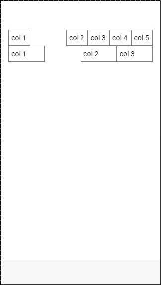
Sometimes you do not want to leave the column sizes automatically assigned. If this is the case, you can choose the col prefix followed by a number that will represent a percentage of the row width. This will apply only to the column with a specific size applied. The other columns will adjust to the available space that is left.
In the following example, the first column will use 50 percent of the full width and the others will adjust accordingly.
<div class = "row">
   <div class = "col col-50">col 1</div>
   <div class = "col">col 2</div>
   <div class = "col">col 3</div>
   <div class = "col">col 4</div>
   <div class = "col">col 5</div>
</div>

<div class = "row">
   <div class = "col col-50">col 1</div>
   <div class = "col">col 2</div>
   <div class = "col">col 3</div>
</div>
The above code will produce following screen −
The following table shows the available percentage options that Ionic grid system provides −
Column Percentage Classnames
| Class Name | Percentage Used |
|---|---|
| col-10 | 10% |
| col-20 | 20% |
| col-25 | 25% |
| col-33 | 33.3333% |
| col-50 | 50% |
| col-67 | 66.6666% |
| col-75 | 75% |
| col-80 | 80% |
| col-90 | 90% |
Horizontal and Vertical Positioning
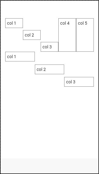
The columns can be offset from the left. It works the same for the specific size of the columns. This time the prefix will be col-offset and then we will use the same percentage numbers showed in the table above. The following example shows how can we offset the second column of both the rows by 25 percent.
<div class = "row">
   <div class = "col">col 1</div>
   <div class = "col col-offset-25">col 2</div>
   <div class = "col">col 3</div>
   <div class = "col">col 4</div>
   <div class = "col">col 5</div>
</div>

<div class = "row">
   <div class = "col">col 1</div>
   <div class = "col col-offset-25">col 2</div>
   <div class = "col">col 3</div>
</div>
The above code will produce the following screen −
You can also vertically align the columns inside a row. There are three classes, which can be used, namely top, center and the bottom class with the col prefix. The following code shows how to place vertically the first three columns of both rows.
NOTE − In the example that follows we added .col {height: 120px} to our CSS to show you the vertical placing of the columns.
<div class = "row">
   <div class = "col col-top">col 1</div>
   <div class = "col col-center">col 2</div>
   <div class = "col col-bottom">col 3</div>
   <div class = "col">col 4</div>
   <div class = "col">col 5</div>
</div>

<div class = "row">
   <div class = "col col-top">col 1</div>
   <div class = "col col-center">col 2</div>
   <div class = "col col-bottom">col 3</div>
</div>
The above code will produce the following screen −
Responsive Grid
The Ionic Grid can also be used for a responsive layout. There are three classes available. The responsive-sm class will collapse columns into a single row when the viewport is smaller than a landscape phone. The responsive-md class will be applied when viewport is smaller than a portrait tablet. The responsive-lg class will be applied when viewport is smaller than a landscape tablet.
The first image after the following example shows how the responsive-sm class looks on a Mobile device and the second one shows how the same responsive grid looks differently on a Tablet device.
<div class = "row responsive-sm">
   <div class = "col col-25">col 1</div>
   <div class = "col">col 2</div>
   <div class = "col">col 3</div>
   <div class = "col">col 4</div>
   <div class = "col">col 5</div>
</div>

<div class = "row responsive-sm">
   <div class = "col">col 1</div>
   <div class = "col">col 2</div>
   <div class = "col">col 3</div>
</div>
Mobile Grid View
Tablet Grid View
Ionic - Icons
There are more than 700 premium icons provided by Ionic. There are also different sets of icons provided for Android and IOS. You can find almost anything you need but you are not bound to use them, if you do not want to. You can use your own custom icons or any other icon set instead. You can check all the Ionic icons here.
How to use Icons?
If you want to use Ionic icons find the icon you need on the page (https://ionicons.com/). When you are adding Ionic elements, you always add the main class first and then you add the subclass you want. The main class for all icons is icon. The Subclass is the name of the icon you want. We will add six icons in our example that is given below −
<i class = "icon icon ion-happy-outline"></i>
<i class = "icon icon ion-star"></i>
<i class = "icon icon ion-compass"></i>
<i class = "icon icon ion-planet"></i>
<i class = "icon icon ion-ios-analytics"></i>
<i class = "icon icon ion-ios-eye"></i>
The above code will produce the following screen −
The size of these icons can be changed with the font-size property in your Ionic CSS file.
.icon {
   font-size: 50px;
}
Once the icon size is setup, the same code will produce the following screenshot as the output −
Default Icons
| Code | Result |
|---|---|
| <i class="icon ion-ionic"></i> | |
| <i class="icon ion-arrow-up-a"></i> | |
| <i class="icon ion-arrow-right-a"></i> | |
| <i class="icon ion-arrow-down-a"></i> | |
| <i class="icon ion-arrow-left-a"></i> | |
| <i class="icon ion-arrow-up-b"></i> | |
| <i class="icon ion-arrow-right-b"></i> | |
| <i class="icon ion-arrow-down-b"></i> | |
| <i class="icon ion-arrow-left-b"></i> | |
| <i class="icon ion-arrow-up-c"></i> | |
| <i class="icon ion-arrow-right-c"></i> | |
| <i class="icon ion-arrow-down-c"></i> | |
| <i class="icon ion-arrow-left-c"></i> | |
| <i class="icon ion-arrow-return-right"></i> | |
| <i class="icon ion-arrow-return-left"></i> | |
| <i class="icon ion-arrow-swap"></i> | |
| <i class="icon ion-arrow-shrink"></i> | |
| <i class="icon ion-arrow-expand"></i> | |
| <i class="icon ion-arrow-move"></i> | |
| <i class="icon ion-arrow-resize"></i> | |
| <i class="icon ion-chevron-up"></i> | |
| <i class="icon ion-chevron-right"></i> | |
| <i class="icon ion-chevron-down"></i> | |
| <i class="icon ion-chevron-left"></i> | |
| <i class="icon ion-navicon-round"></i> | |
| <i class="icon ion-navicon"></i> | |
| <i class="icon ion-drag"></i> | |
| <i class="icon ion-log-in"></i> | |
| <i class="icon ion-log-out"></i> | |
| <i class="icon ion-checkmark-round"></i> | |
| <i class="icon ion-checkmark"></i> | |
| <i class="icon ion-checkmark-circled"></i> | |
| <i class="icon ion-close-round"></i> | |
| <i class="icon ion-close"></i> | |
| <i class="icon ion-close-circled"></i> | |
| <i class="icon ion-plus-round"></i> | |
| <i class="icon ion-plus"></i> | |
| <i class="icon ion-plus-circled"></i> | |
| <i class="icon ion-minus-round"></i> | |
| <i class="icon ion-minus"></i> | |
| <i class="icon ion-minus-circled"></i> | |
| <i class="icon ion-information"></i> | |
| <i class="icon ion-informaticon ion-circled"></i> | |
| <i class="icon ion-help"></i> | |
| <i class="icon ion-help-circled"></i> | |
| <i class="icon ion-backspace-outline"></i> | |
| <i class="icon ion-backspace"></i> | |
| <i class="icon ion-help-buoy"></i> | |
| <i class="icon ion-asterisk"></i> | |
| <i class="icon ion-alert"></i> | |
| <i class="icon ion-alert-circled"></i> | |
| <i class="icon ion-refresh"></i> | |
| <i class="icon ion-loop"></i> | |
| <i class="icon ion-shuffle"></i> | |
| <i class="icon ion-home"></i> | |
| <i class="icon ion-search"></i> | |
| <i class="icon ion-flag"></i> | |
| <i class="icon ion-star"></i> | |
| <i class="icon ion-heart"></i> | |
| <i class="icon ion-heart-broken"></i> | |
| <i class="icon ion-gear-a"></i> | |
| <i class="icon ion-gear-b"></i> | |
| <i class="icon ion-toggle-filled"></i> | |
| <i class="icon ion-toggle"></i> | |
| <i class="icon ion-settings"></i> | |
| <i class="icon ion-wrench"></i> | |
| <i class="icon ion-hammer"></i> | |
| <i class="icon ion-edit"></i> | |
| <i class="icon ion-trash-a"></i> | |
| <i class="icon ion-trash-b"></i> | |
| <i class="icon ion-document"></i> | |
| <i class="icon ion-document-text"></i> | |
| <i class="icon ion-clipboard"></i> | |
| <i class="icon ion-scissors"></i> | |
| <i class="icon ion-funnel"></i> | |
| <i class="icon ion-bookmark"></i> | |
| <i class="icon ion-email"></i> | |
| <i class="icon ion-email-unread"></i> | |
| <i class="icon ion-folder"></i> | |
| <i class="icon ion-filing"></i> | |
| <i class="icon ion-archive"></i> | |
| <i class="icon ion-reply"></i> | |
| <i class="icon ion-reply-all"></i> | |
| <i class="icon ion-forward"></i> | |
| <i class="icon ion-share"></i> | |
| <i class="icon ion-paper-airplane"></i> | |
| <i class="icon ion-link"></i> | |
| <i class="icon ion-paperclip"></i> | |
| <i class="icon ion-compose"></i> | |
| <i class="icon ion-briefcase"></i> | |
| <i class="icon ion-medkit"></i> | |
| <i class="icon ion-at"></i> | |
| <i class="icon ion-pound"></i> | |
| <i class="icon ion-quote"></i> | |
| <i class="icon ion-cloud"></i> | |
| <i class="icon ion-upload"></i> | |
| <i class="icon ion-more"></i> | |
| <i class="icon ion-grid"></i> | |
| <i class="icon ion-calendar"></i> | |
| <i class="icon ion-clock"></i> | |
| <i class="icon ion-compass"></i> | |
| <i class="icon ion-pinpoint"></i> | |
| <i class="icon ion-pin"></i> | |
| <i class="icon ion-navigate"></i> | |
| <i class="icon ion-location"></i> | |
| <i class="icon ion-map"></i> | |
| <i class="icon ion-lock-combination"></i> | |
| <i class="icon ion-locked"></i> | |
| <i class="icon ion-unlocked"></i> | |
| <i class="icon ion-key"></i> | |
| <i class="icon ion-arrow-graph-up-right"></i> | |
| <i class="icon ion-arrow-graph-down-right"></i> | |
| <i class="icon ion-arrow-graph-up-left"></i> | |
| <i class="icon ion-arrow-graph-down-left"></i> | |
| <i class="icon ion-stats-bars"></i> | |
| <i class="icon ion-connecticon ion-bars"></i> | |
| <i class="icon ion-pie-graph"></i> | |
| <i class="icon ion-chatbubble"></i> | |
| <i class="icon ion-chatbubble-working"></i> | |
| <i class="icon ion-chatbubbles"></i> | |
| <i class="icon ion-chatbox"></i> | |
| <i class="icon ion-chatbox-working"></i> | |
| <i class="icon ion-chatboxes"></i> | |
| <i class="icon ion-person"></i> | |
| <i class="icon ion-person-add"></i> | |
| <i class="icon ion-person-stalker"></i> | |
| <i class="icon ion-woman"></i> | |
| <i class="icon ion-man"></i> | |
| <i class="icon ion-female"></i> | |
| <i class="icon ion-male"></i> | |
| <i class="icon ion-transgender"></i> | |
| <i class="icon ion-fork"></i> | |
| <i class="icon ion-knife"></i> | |
| <i class="icon ion-spoon"></i> | |
| <i class="icon ion-soup-can-outline"></i> | |
| <i class="icon ion-soup-can"></i> | |
| <i class="icon ion-beer"></i> | |
| <i class="icon ion-wineglass"></i> | |
| <i class="icon ion-coffee"></i> | |
| <i class="icon ion-icecream"></i> | |
| <i class="icon ion-pizza"></i> | |
| <i class="icon ion-power"></i> | |
| <i class="icon ion-mouse"></i> | |
| <i class="icon ion-battery-full"></i> | |
| <i class="icon ion-battery-half"></i> | |
| <i class="icon ion-battery-low"></i> | |
| <i class="icon ion-battery-empty"></i> | |
| <i class="icon ion-battery-charging"></i> | |
| <i class="icon ion-wifi"></i> | |
| <i class="icon ion-bluetooth"></i> | |
| <i class="icon ion-calculator"></i> | |
| <i class="icon ion-camera"></i> | |
| <i class="icon ion-eye"></i> | |
| <i class="icon ion-eye-disabled"></i> | |
| <i class="icon ion-flash"></i> | |
| <i class="icon ion-flash-off"></i> | |
| <i class="icon ion-qr-scanner"></i> | |
| <i class="icon ion-image"></i> | |
| <i class="icon ion-images"></i> | |
| <i class="icon ion-wand"></i> | |
| <i class="icon ion-contrast"></i> | |
| <i class="icon ion-aperture"></i> | |
| <i class="icon ion-crop"></i> | |
| <i class="icon ion-easel"></i> | |
| <i class="icon ion-paintbrush"></i> | |
| <i class="icon ion-paintbucket"></i> | |
| <i class="icon ion-monitor"></i> | |
| <i class="icon ion-laptop"></i> | |
| <i class="icon ion-ipad"></i> | |
| <i class="icon ion-iphone"></i> | |
| <i class="icon ion-ipod"></i> | |
| <i class="icon ion-printer"></i> | |
| <i class="icon ion-usb"></i> | |
| <i class="icon ion-outlet"></i> | |
| <i class="icon ion-bug"></i> | |
| <i class="icon ion-code"></i> | |
| <i class="icon ion-code-working"></i> | |
| <i class="icon ion-code-download"></i> | |
| <i class="icon ion-fork-repo"></i> | |
| <i class="icon ion-network"></i> | |
| <i class="icon ion-pull-request"></i> | |
| <i class="icon ion-merge"></i> | |
| <i class="icon ion-xbox"></i> | |
| <i class="icon ion-playstation"></i> | |
| <i class="icon ion-steam"></i> | |
| <i class="icon ion-closed-captioning"></i> | |
| <i class="icon ion-videocamera"></i> | |
| <i class="icon ion-film-marker"></i> | |
| <i class="icon ion-disc"></i> | |
| <i class="icon ion-headphone"></i> | |
| <i class="icon ion-music-note"></i> | |
| <i class="icon ion-radio-waves"></i> | |
| <i class="icon ion-speakerphone"></i> | |
| <i class="icon ion-mic-a"></i> | |
| <i class="icon ion-mic-b"></i> | |
| <i class="icon ion-mic-c"></i> | |
| <i class="icon ion-volume-high"></i> | |
| <i class="icon ion-volume-medium"></i> | |
| <i class="icon ion-volume-low"></i> | |
| <i class="icon ion-volume-mute"></i> | |
| <i class="icon ion-levels"></i> | |
| <i class="icon ion-play"></i> | |
| <i class="icon ion-pause"></i> | |
| <i class="icon ion-stop"></i> | |
| <i class="icon ion-record"></i> | |
| <i class="icon ion-skip-forward"></i> | |
| <i class="icon ion-skip-backward"></i> | |
| <i class="icon ion-eject"></i> | |
| <i class="icon ion-bag"></i> | |
| <i class="icon ion-card"></i> | |
| <i class="icon ion-cash"></i> | |
| <i class="icon ion-pricetag"></i> | |
| <i class="icon ion-pricetags"></i> | |
| <i class="icon ion-thumbsup"></i> | |
| <i class="icon ion-thumbsdown"></i> | |
| <i class="icon ion-happy-outline"></i> | |
| <i class="icon ion-happy"></i> | |
| <i class="icon ion-sad-outline"></i> | |
| <i class="icon ion-sad"></i> | |
| <i class="icon ion-bowtie"></i> | |
| <i class="icon ion-tshirt-outline"></i> | |
| <i class="icon ion-tshirt"></i> | |
| <i class="icon ion-trophy"></i> | |
| <i class="icon ion-podium"></i> | |
| <i class="icon ion-ribbon-a"></i> | |
| <i class="icon ion-ribbon-b"></i> | |
| <i class="icon ion-university"></i> | |
| <i class="icon ion-magnet"></i> | |
| <i class="icon ion-beaker"></i> | |
| <i class="icon ion-erlenmeyer-flask"></i> | |
| <i class="icon ion-egg"></i> | |
| <i class="icon ion-earth"></i> | |
| <i class="icon ion-planet"></i> | |
| <i class="icon ion-lightbulb"></i> | |
| <i class="icon ion-cube"></i> | |
| <i class="icon ion-leaf"></i> | |
| <i class="icon ion-waterdrop"></i> | |
| <i class="icon ion-flame"></i> | |
| <i class="icon ion-fireball"></i> | |
| <i class="icon ion-bonfire"></i> | |
| <i class="icon ion-umbrella"></i> | |
| <i class="icon ion-nuclear"></i> | |
| <i class="icon ion-no-smoking"></i> | |
| <i class="icon ion-thermometer"></i> | |
| <i class="icon ion-speedometer"></i> | |
| <i class="icon ion-model-s"></i> | |
| <i class="icon ion-plane"></i> | |
| <i class="icon ion-jet"></i> | |
| <i class="icon ion-load-a"></i> | |
| <i class="icon ion-load-b"></i> | |
| <i class="icon ion-load-c"></i> | |
| <i class="icon ion-load-d"></i> |
iOS Style Icons
| Code | Result |
|---|---|
| <i class="icon ion-ios-ionic-outline"></i> | |
| <i class="icon ion-ios-arrow-back"></i> | |
| <i class="icon ion-ios-arrow-forward"></i> | |
| <i class="icon ion-ios-arrow-up"></i> | |
| <i class="icon ion-ios-arrow-right"></i> | |
| <i class="icon ion-ios-arrow-down"></i> | |
| <i class="icon ion-ios-arrow-left"></i> | |
| <i class="icon ion-ios-arrow-thin-up"></i> | |
| <i class="icon ion-ios-arrow-thin-right"></i> | |
| <i class="icon ion-ios-arrow-thin-down"></i> | |
| <i class="icon ion-ios-arrow-thin-left"></i> | |
| <i class="icon ion-ios-circle-filled"></i> | |
| <i class="icon ion-ios-circle-outline"></i> | |
| <i class="icon ion-ios-checkmark-empty"></i> | |
| <i class="icon ion-ios-checkmark-outline"></i> | |
| <i class="icon ion-ios-checkmark"></i> | |
| <i class="icon ion-ios-plus-empty"></i> | |
| <i class="icon ion-ios-plus-outline"></i> | |
| <i class="icon ion-ios-plus"></i> | |
| <i class="icon ion-ios-close-empty"></i> | |
| <i class="icon ion-ios-close-outline"></i> | |
| <i class="icon ion-ios-close"></i> | |
| <i class="icon ion-ios-minus-empty"></i> | |
| <i class="icon ion-ios-minus-outline"></i> | |
| <i class="icon ion-ios-minus"></i> | |
| <i class="icon ion-ios-informaticon ion-empty"></i> | |
| <i class="icon ion-ios-informaticon ion-outline"></i> | |
| <i class="icon ion-ios-information"></i> | |
| <i class="icon ion-ios-help-empty"></i> | |
| <i class="icon ion-ios-help-outline"></i> | |
| <i class="icon ion-ios-help"></i> | |
| <i class="icon ion-ios-search"></i> | |
| <i class="icon ion-ios-search-strong"></i> | |
| <i class="icon ion-ios-star"></i> | |
| <i class="icon ion-ios-star-half"></i> | |
| <i class="icon ion-ios-star-outline"></i> | |
| <i class="icon ion-ios-heart"></i> | |
| <i class="icon ion-ios-heart-outline"></i> | |
| <i class="icon ion-ios-more"></i> | |
| <i class="icon ion-ios-more-outline"></i> | |
| <i class="icon ion-ios-home"></i> | |
| <i class="icon ion-ios-home-outline"></i> | |
| <i class="icon ion-ios-cloud"></i> | |
| <i class="icon ion-ios-cloud-outline"></i> | |
| <i class="icon ion-ios-cloud-upload"></i> | |
| <i class="icon ion-ios-cloud-upload-outline"></i> | |
| <i class="icon ion-ios-cloud-download"></i> | |
| <i class="icon ion-ios-cloud-download-outline"></i> | |
| <i class="icon ion-ios-upload"></i> | |
| <i class="icon ion-ios-upload-outline"></i> | |
| <i class="icon ion-ios-download"></i> | |
| <i class="icon ion-ios-download-outline"></i> | |
| <i class="icon ion-ios-refresh"></i> | |
| <i class="icon ion-ios-refresh-outline"></i> | |
| <i class="icon ion-ios-refresh-empty"></i> | |
| <i class="icon ion-ios-reload"></i> | |
| <i class="icon ion-ios-loop-strong"></i> | |
| <i class="icon ion-ios-loop"></i> | |
| <i class="icon ion-ios-bookmarks"></i> | |
| <i class="icon ion-ios-bookmarks-outline"></i> | |
| <i class="icon ion-ios-book"></i> | |
| <i class="icon ion-ios-book-outline"></i> | |
| <i class="icon ion-ios-flag"></i> | |
| <i class="icon ion-ios-flag-outline"></i> | |
| <i class="icon ion-ios-glasses"></i> | |
| <i class="icon ion-ios-glasses-outline"></i> | |
| <i class="icon ion-ios-browsers"></i> | |
| <i class="icon ion-ios-browsers-outline"></i> | |
| <i class="icon ion-ios-at"></i> | |
| <i class="icon ion-ios-at-outline"></i> | |
| <i class="icon ion-ios-pricetag"></i> | |
| <i class="icon ion-ios-pricetag-outline"></i> | |
| <i class="icon ion-ios-pricetags"></i> | |
| <i class="icon ion-ios-pricetags-outline"></i> | |
| <i class="icon ion-ios-cart"></i> | |
| <i class="icon ion-ios-cart-outline"></i> | |
| <i class="icon ion-ios-chatboxes"></i> | |
| <i class="icon ion-ios-chatboxes-outline"></i> | |
| <i class="icon ion-ios-chatbubble"></i> | |
| <i class="icon ion-ios-chatbubble-outline"></i> | |
| <i class="icon ion-ios-cog"></i> | |
| <i class="icon ion-ios-cog-outline"></i> | |
| <i class="icon ion-ios-gear"></i> | |
| <i class="icon ion-ios-gear-outline"></i> | |
| <i class="icon ion-ios-settings"></i> | |
| <i class="icon ion-ios-settings-strong"></i> | |
| <i class="icon ion-ios-toggle"></i> | |
| <i class="icon ion-ios-toggle-outline"></i> | |
| <i class="icon ion-ios-analytics"></i> | |
| <i class="icon ion-ios-analytics-outline"></i> | |
| <i class="icon ion-ios-pie"></i> | |
| <i class="icon ion-ios-pie-outline"></i> | |
| <i class="icon ion-ios-pulse"></i> | |
| <i class="icon ion-ios-pulse-strong"></i> | |
| <i class="icon ion-ios-filing"></i> | |
| <i class="icon ion-ios-filing-outline"></i> | |
| <i class="icon ion-ios-box"></i> | |
| <i class="icon ion-ios-box-outline"></i> | |
| <i class="icon ion-ios-compose"></i> | |
| <i class="icon ion-ios-compose-outline"></i> | |
| <i class="icon ion-ios-trash"></i> | |
| <i class="icon ion-ios-trash-outline"></i> | |
| <i class="icon ion-ios-copy"></i> | |
| <i class="icon ion-ios-copy-outline"></i> | |
| <i class="icon ion-ios-email"></i> | |
| <i class="icon ion-ios-email-outline"></i> | |
| <i class="icon ion-ios-undo"></i> | |
| <i class="icon ion-ios-undo-outline"></i> | |
| <i class="icon ion-ios-redo"></i> | |
| <i class="icon ion-ios-redo-outline"></i> | |
| <i class="icon ion-ios-paperplane"></i> | |
| <i class="icon ion-ios-paperplane-outline"></i> | |
| <i class="icon ion-ios-folder"></i> | |
| <i class="icon ion-ios-folder-outline"></i> | |
| <i class="icon ion-ios-paper"></i> | |
| <i class="icon ion-ios-paper-outline"></i> | |
| <i class="icon ion-ios-list"></i> | |
| <i class="icon ion-ios-list-outline"></i> | |
| <i class="icon ion-ios-world"></i> | |
| <i class="icon ion-ios-world-outline"></i> | |
| <i class="icon ion-ios-alarm"></i> | |
| <i class="icon ion-ios-alarm-outline"></i> | |
| <i class="icon ion-ios-speedometer"></i> | |
| <i class="icon ion-ios-speedometer-outline"></i> | |
| <i class="icon ion-ios-stopwatch"></i> | |
| <i class="icon ion-ios-stopwatch-outline"></i> | |
| <i class="icon ion-ios-timer"></i> | |
| <i class="icon ion-ios-timer-outline"></i> | |
| <i class="icon ion-ios-clock"></i> | |
| <i class="icon ion-ios-clock-outline"></i> | |
| <i class="icon ion-ios-time"></i> | |
| <i class="icon ion-ios-time-outline"></i> | |
| <i class="icon ion-ios-calendar"></i> | |
| <i class="icon ion-ios-calendar-outline"></i> | |
| <i class="icon ion-ios-photos"></i> | |
| <i class="icon ion-ios-photos-outline"></i> | |
| <i class="icon ion-ios-albums"></i> | |
| <i class="icon ion-ios-albums-outline"></i> | |
| <i class="icon ion-ios-camera"></i> | |
| <i class="icon ion-ios-camera-outline"></i> | |
| <i class="icon ion-ios-reverse-camera"></i> | |
| <i class="icon ion-ios-reverse-camera-outline"></i> | |
| <i class="icon ion-ios-eye"></i> | |
| <i class="icon ion-ios-eye-outline"></i> | |
| <i class="icon ion-ios-bolt"></i> | |
| <i class="icon ion-ios-bolt-outline"></i> | |
| <i class="icon ion-ios-color-wand"></i> | |
| <i class="icon ion-ios-color-wand-outline"></i> | |
| <i class="icon ion-ios-color-filter"></i> | |
| <i class="icon ion-ios-color-filter-outline"></i> | |
| <i class="icon ion-ios-grid-view"></i> | |
| <i class="icon ion-ios-grid-view-outline"></i> | |
| <i class="icon ion-ios-crop-strong"></i> | |
| <i class="icon ion-ios-crop"></i> | |
| <i class="icon ion-ios-barcode"></i> | |
| <i class="icon ion-ios-barcode-outline"></i> | |
| <i class="icon ion-ios-briefcase"></i> | |
| <i class="icon ion-ios-briefcase-outline"></i> | |
| <i class="icon ion-ios-medkit"></i> | |
| <i class="icon ion-ios-medkit-outline"></i> | |
| <i class="icon ion-ios-medical"></i> | |
| <i class="icon ion-ios-medical-outline"></i> | |
| <i class="icon ion-ios-infinite"></i> | |
| <i class="icon ion-ios-infinite-outline"></i> | |
| <i class="icon ion-ios-calculator"></i> | |
| <i class="icon ion-ios-calculator-outline"></i> | |
| <i class="icon ion-ios-keypad"></i> | |
| <i class="icon ion-ios-keypad-outline"></i> | |
| <i class="icon ion-ios-telephone"></i> | |
| <i class="icon ion-ios-telephone-outline"></i> | |
| <i class="icon ion-ios-drag"></i> | |
| <i class="icon ion-ios-location"></i> | |
| <i class="icon ion-ios-locaticon ion-outline"></i> | |
| <i class="icon ion-ios-navigate"></i> | |
| <i class="icon ion-ios-navigate-outline"></i> | |
| <i class="icon ion-ios-locked"></i> | |
| <i class="icon ion-ios-locked-outline"></i> | |
| <i class="icon ion-ios-unlocked"></i> | |
| <i class="icon ion-ios-unlocked-outline"></i> | |
| <i class="icon ion-ios-monitor"></i> | |
| <i class="icon ion-ios-monitor-outline"></i> | |
| <i class="icon ion-ios-printer"></i> | |
| <i class="icon ion-ios-printer-outline"></i> | |
| <i class="icon ion-ios-game-controller-a"></i> | |
| <i class="icon ion-ios-game-controller-a-outline"></i> | |
| <i class="icon ion-ios-game-controller-b"></i> | |
| <i class="icon ion-ios-game-controller-b-outline"></i> | |
| <i class="icon ion-ios-americanfootball"></i> | |
| <i class="icon ion-ios-americanfootball-outline"></i> | |
| <i class="icon ion-ios-baseball"></i> | |
| <i class="icon ion-ios-baseball-outline"></i> | |
| <i class="icon ion-ios-basketball"></i> | |
| <i class="icon ion-ios-basketball-outline"></i>gt; | |
| <i class="icon ion-ios-tennisball"></i> | |
| <i class="icon ion-ios-tennisball-outline"></i> | |
| <i class="icon ion-ios-football"></i> | |
| <i class="icon ion-ios-football-outline"></i> | |
| <i class="icon ion-ios-body"></i> | |
| <i class="icon ion-ios-body-outline"></i> | |
| <i class="icon ion-ios-person"></i> | |
| <i class="icon ion-ios-person-outline"></i> | |
| <i class="icon ion-ios-personadd"></i> | |
| <i class="icon ion-ios-personadd-outline"></i> | |
| <i class="icon ion-ios-people"></i> | |
| <i class="icon ion-ios-people-outline"></i> | |
| <i class="icon ion-ios-musical-notes"></i> | |
| <i class="icon ion-ios-musical-note"></i> | |
| <i class="icon ion-ios-bell"></i> | |
| <i class="icon ion-ios-bell-outline"></i> | |
| <i class="icon ion-ios-mic"></i> | |
| <i class="icon ion-ios-mic-outline"></i> | |
| <i class="icon ion-ios-mic-off"></i> | |
| <i class="icon ion-ios-volume-high"></i> | |
| <i class="icon ion-ios-volume-low"></i> | |
| <i class="icon ion-ios-play"></i> | |
| <i class="icon ion-ios-play-outline"></i> | |
| <i class="icon ion-ios-pause"></i> | |
| <i class="icon ion-ios-pause-outline"></i> | |
| <i class="icon ion-ios-recording"></i> | |
| <i class="icon ion-ios-recording-outline"></i> | |
| <i class="icon ion-ios-fastforward"></i> | |
| <i class="icon ion-ios-fastforward-outline"></i> | |
| <i class="icon ion-ios-rewind"></i> | |
| <i class="icon ion-ios-rewind-outline"></i> | |
| <i class="icon ion-ios-skipbackward"></i> | |
| <i class="icon ion-ios-skipbackward-outline"></i> | |
| <i class="icon ion-ios-skipforward"></i> | |
| <i class="icon ion-ios-skipforward-outline"></i> | |
| <i class="icon ion-ios-shuffle-strong"></i> | |
| <i class="icon ion-ios-shuffle"></i> | |
| <i class="icon ion-ios-videocam"></i> | |
| <i class="icon ion-ios-videocam-outline"></i> | |
| <i class="icon ion-ios-film"></i> | |
| <i class="icon ion-ios-film-outline"></i> | |
| <i class="icon ion-ios-flask"></i> | |
| <i class="icon ion-ios-flask-outline"></i> | |
| <i class="icon ion-ios-lightbulb"></i> | |
| <i class="icon ion-ios-lightbulb-outline"></i> | |
| <i class="icon ion-ios-wineglass"></i> | |
| <i class="icon ion-ios-wineglass-outline"></i> | |
| <i class="icon ion-ios-pint"></i> | |
| <i class="icon ion-ios-pint-outline"></i> | |
| <i class="icon ion-ios-nutrition"></i> | |
| <i class="icon ion-ios-nutriticon ion-outline"></i> | |
| <i class="icon ion-ios-flower"></i> | |
| <i class="icon ion-ios-flower-outline"></i> | |
| <i class="icon ion-ios-rose"></i> | |
| <i class="icon ion-ios-rose-outline"></i> | |
| <i class="icon ion-ios-paw"></i> | |
| <i class="icon ion-ios-paw-outline"></i> | |
| <i class="icon ion-ios-flame"></i> | |
| <i class="icon ion-ios-flame-outline"></i> | |
| <i class="icon ion-ios-sunny"></i> | |
| <i class="icon ion-ios-sunny-outline"></i> | |
| <i class="icon ion-ios-partlysunny"></i> | |
| <i class="icon ion-ios-partlysunny-outline"></i> | |
| <i class="icon ion-ios-cloudy"></i> | |
| <i class="icon ion-ios-cloudy-outline"></i> | |
| <i class="icon ion-ios-rainy"></i> | |
| <i class="icon ion-ios-rainy-outline"></i> | |
| <i class="icon ion-ios-thunderstorm"></i> | |
| <i class="icon ion-ios-thunderstorm-outline"></i> | |
| <i class="icon ion-ios-snowy"></i> | |
| <i class="icon ion-ios-moon"></i> | |
| <i class="icon ion-ios-moon-outline"></i> | |
| <i class="icon ion-ios-cloudy-night"></i> | |
| <i class="icon ion-ios-cloudy-night-outline"></i> |
Android Style Icons
| Code | Result |
|---|---|
| <i class="icon ion-android-arrow-up"></i> | |
| <i class="icon ion-android-arrow-forward"></i> | |
| <i class="icon ion-android-arrow-down"></i> | |
| <i class="icon ion-android-arrow-back"></i> | |
| <i class="icon ion-android-arrow-dropup"></i> | |
| <i class="icon ion-android-arrow-dropup-circle"></i> | |
| <i class="icon ion-android-arrow-dropright"></i> | |
| <i class="icon ion-android-arrow-dropright-circle"></i> | |
| <i class="icon ion-android-arrow-dropdown"></i> | |
| <i class="icon ion-android-arrow-dropdown-circle"></i> | |
| <i class="icon ion-android-arrow-dropleft"></i> | |
| <i class="icon ion-android-arrow-dropleft-circle"></i> | |
| <i class="icon ion-android-add"></i> | |
| <i class="icon ion-android-add-circle"></i> | |
| <i class="icon ion-android-remove"></i> | |
| <i class="icon ion-android-remove-circle"></i> | |
| <i class="icon ion-android-close"></i> | |
| <i class="icon ion-android-cancel"></i> | |
| <i class="icon ion-android-radio-button-off"></i> | |
| <i class="icon ion-android-radio-button-on"></i> | |
| <i class="icon ion-android-checkmark-circle"></i> | |
| <i class="icon ion-android-checkbox-outline-blank"></i> | |
| <i class="icon ion-android-checkbox-outline"></i> | |
| <i class="icon ion-android-checkbox-blank"></i> | |
| <i class="icon ion-android-checkbox"></i> | |
| <i class="icon ion-android-done"></i> | |
| <i class="icon ion-android-done-all"></i> | |
| <i class="icon ion-android-menu"></i> | |
| <i class="icon ion-android-more-horizontal"></i> | |
| <i class="icon ion-android-more-vertical"></i> | |
| <i class="icon ion-android-refresh"></i> | |
| <i class="icon ion-android-sync"></i> | |
| <i class="icon ion-android-wifi"></i> | |
| <i class="icon ion-android-call"></i> | |
| <i class="icon ion-android-apps"></i> | |
| <i class="icon ion-android-settings"></i> | |
| <i class="icon ion-android-options"></i> | |
| <i class="icon ion-android-funnel"></i> | |
| <i class="icon ion-android-search"></i> | |
| <i class="icon ion-android-home"></i> | |
| <i class="icon ion-android-cloud-outline"></i> | |
| <i class="icon ion-android-cloud"></i> | |
| <i class="icon ion-android-download"></i> | |
| <i class="icon ion-android-upload"></i> | |
| <i class="icon ion-android-cloud-done"></i> | |
| <i class="icon ion-android-cloud-circle"></i> | |
| <i class="icon ion-android-favorite-outline"></i> | |
| <i class="icon ion-android-favorite"></i> | |
| <i class="icon ion-android-star-outline"></i> | |
| <i class="icon ion-android-star-half"></i> | |
| <i class="icon ion-android-star"></i> | |
| <i class="icon ion-android-calendar"></i> | |
| <i class="icon ion-android-alarm-clock"></i> | |
| <i class="icon ion-android-time"></i> | |
| <i class="icon ion-android-stopwatch"></i> | |
| <i class="icon ion-android-watch"></i> | |
| <i class="icon ion-android-locate"></i> | |
| <i class="icon ion-android-navigate"></i> | |
| <i class="icon ion-android-pin"></i> | |
| <i class="icon ion-android-compass"></i> | |
| <i class="icon ion-android-map"></i> | |
| <i class="icon ion-android-walk"></i> | |
| <i class="icon ion-android-bicycle"></i> | |
| <i class="icon ion-android-car"></i> | |
| <i class="icon ion-android-bus"></i> | |
| <i class="icon ion-android-subway"></i> | |
| <i class="icon ion-android-train"></i> | |
| <i class="icon ion-android-boat"></i> | |
| <i class="icon ion-android-plane"></i> | |
| <i class="icon ion-android-restaurant"></i> | |
| <i class="icon ion-android-bar"></i> | |
| <i class="icon ion-android-cart"></i> | |
| <i class="icon ion-android-camera"></i> | |
| <i class="icon ion-android-image"></i> | |
| <i class="icon ion-android-film"></i> | |
| <i class="icon ion-android-color-palette"></i> | |
| <i class="icon ion-android-create"></i> | |
| <i class="icon ion-android-mail"></i> | |
| <i class="icon ion-android-drafts"></i> | |
| <i class="icon ion-android-send"></i> | |
| <i class="icon ion-android-archive"></i> | |
| <i class="icon ion-android-delete"></i> | |
| <i class="icon ion-android-attach"></i> | |
| <i class="icon ion-android-share"></i> | |
| <i class="icon ion-android-share-alt"></i> | |
| <i class="icon ion-android-bookmark"></i> | |
| <i class="icon ion-android-document"></i> | |
| <i class="icon ion-android-clipboard"></i> | |
| <i class="icon ion-android-list"></i> | |
| <i class="icon ion-android-folder-open"></i> | |
| <i class="icon ion-android-folder"></i> | |
| <i class="icon ion-android-print"></i> | |
| <i class="icon ion-android-open"></i> | |
| <i class="icon ion-android-exit"></i> | |
| <i class="icon ion-android-contract"></i> | |
| <i class="icon ion-android-expand"></i> | |
| <i class="icon ion-android-globe"></i> | |
| <i class="icon ion-android-chat"></i> | |
| <i class="icon ion-android-textsms"></i> | |
| <i class="icon ion-android-hangout"></i> | |
| <i class="icon ion-android-happy"></i> | |
| <i class="icon ion-android-sad"></i> | |
| <i class="icon ion-android-person"></i> | |
| <i class="icon ion-android-people"></i> | |
| <i class="icon ion-android-person-add"></i> | |
| <i class="icon ion-android-contact"></i> | |
| <i class="icon ion-android-contacts"></i> | |
| <i class="icon ion-android-playstore"></i> | |
| <i class="icon ion-android-lock"></i> | |
| <i class="icon ion-android-unlock"></i> | |
| <i class="icon ion-android-microphone"></i> | |
| <i class="icon ion-android-microphone-off"></i> | |
| <i class="icon ion-android-notifications-none"></i> | |
| <i class="icon ion-android-notifications"></i> | |
| <i class="icon ion-android-notifications-off"></i> | |
| <i class="icon ion-android-volume-mute"></i> | |
| <i class="icon ion-android-volume-down"></i> | |
| <i class="icon ion-android-volume-up"></i> | |
| <i class="icon ion-android-volume-off"></i> | |
| <i class="icon ion-android-hand"></i> | |
| <i class="icon ion-android-desktop"></i> | |
| <i class="icon ion-android-laptop"></i> | |
| <i class="icon ion-android-phone-portrait"></i> | |
| <i class="icon ion-android-phone-landscape"></i> | |
| <i class="icon ion-android-bulb"></i> | |
| <i class="icon ion-android-sunny"></i> | |
| <i class="icon ion-android-alert"></i> | |
| <i class="icon ion-android-warning"></i> |
Social Icons
| Code | Result |
|---|---|
| <i class="icon ion-social-twitter"></i> | |
| <i class="icon ion-social-twitter-outline"></i> | |
| <i class="icon ion-social-facebook"></i> | |
| <i class="icon ion-social-facebook-outline"></i> | |
| <i class="icon ion-social-googleplus"></i> | |
| <i class="icon ion-social-googleplus-outline"></i> | |
| <i class="icon ion-social-google"></i> | |
| <i class="icon ion-social-google-outline"></i> | |
| <i class="icon ion-social-dribbble"></i> | |
| <i class="icon ion-social-dribbble-outline"></i> | |
| <i class="icon ion-social-octocat"></i> | |
| <i class="icon ion-social-github"></i> | |
| <i class="icon ion-social-github-outline"></i> | |
| <i class="icon ion-social-instagram"></i> | |
| <i class="icon ion-social-instagram-outline"></i> | |
| <i class="icon ion-social-whatsapp"></i> | |
| <i class="icon ion-social-whatsapp-outline"></i> | |
| <i class="icon ion-social-snapchat"></i> | |
| <i class="icon ion-social-snapchat-outline"></i> | |
| <i class="icon ion-social-foursquare"></i> | |
| <i class="icon ion-social-foursquare-outline"></i> | |
| <i class="icon ion-social-pinterest"></i> | |
| <i class="icon ion-social-pinterest-outline"></i> | |
| <i class="icon ion-social-rss"></i> | |
| <i class="icon ion-social-rss-outline"></i> | |
| <i class="icon ion-social-tumblr"></i> | |
| <i class="icon ion-social-tumblr-outline"></i> | |
| <i class="icon ion-social-wordpress"></i> | |
| <i class="icon ion-social-wordpress-outline"></i> | |
| <i class="icon ion-social-reddit"></i> | |
| <i class="icon ion-social-reddit-outline"></i> | |
| <i class="icon ion-social-hackernews"></i> | |
| <i class="icon ion-social-hackernews-outline"></i> | |
| <i class="icon ion-social-designernews"></i> | |
| <i class="icon ion-social-designernews-outline"></i> | |
| <i class="icon ion-social-yahoo"></i> | |
| <i class="icon ion-social-yahoo-outline"></i> | |
| <i class="icon ion-social-buffer"></i> | |
| <i class="icon ion-social-buffer-outline"></i> | |
| <i class="icon ion-social-skype"></i> | |
| <i class="icon ion-social-skype-outline"></i> | |
| <i class="icon ion-social-linkedin"></i> | |
| <i class="icon ion-social-linkedin-outline"></i> | |
| <i class="icon ion-social-vimeo"></i> | |
| <i class="icon ion-social-vimeo-outline"></i> | |
| <i class="icon ion-social-twitch"></i> | |
| <i class="icon ion-social-twitch-outline"></i> | |
| <i class="icon ion-social-youtube"></i> | |
| <i class="icon ion-social-youtube-outline"></i> | |
| <i class="icon ion-social-dropbox"></i> | |
| <i class="icon ion-social-dropbox-outline"></i> | |
| <i class="icon ion-social-apple"></i> | |
| <i class="icon ion-social-apple-outline"></i> | |
| <i class="icon ion-social-android"></i> | |
| <i class="icon ion-social-android-outline"></i> | |
| <i class="icon ion-social-windows"></i> | |
| <i class="icon ion-social-windows-outline"></i> | |
| <i class="icon ion-social-html5"></i> | |
| <i class="icon ion-social-html5-outline"></i> | |
| <i class="icon ion-social-css3"></i> | |
| <i class="icon ion-social-css3-outline"></i> | |
| <i class="icon ion-social-javascript"></i> | |
| <i class="icon ion-social-javascript-outline"></i> | |
| <i class="icon ion-social-angular"></i> | |
| <i class="icon ion-social-angular-outline"></i> | |
| <i class="icon ion-social-nodejs"></i> | |
| <i class="icon ion-social-sass"></i> | |
| <i class="icon ion-social-python"></i> | |
| <i class="icon ion-social-chrome"></i> | |
| <i class="icon ion-social-chrome-outline"></i> | |
| <i class="icon ion-social-codepen"></i> | |
| <i class="icon ion-social-codepen-outline"></i> | |
| <i class="icon ion-social-markdown"></i> | |
| <i class="icon ion-social-tux"></i> | |
| <i class="icon ion-social-freebsd-devil"></i> | |
| <i class="icon ion-social-usd"></i> | |
| <i class="icon ion-social-usd-outline"></i> | |
| <i class="icon ion-social-bitcoin"></i> | |
| <i class="icon ion-social-bitcoin-outline"></i> | |
| <i class="icon ion-social-yen"></i> | |
| <i class="icon ion-social-yen-outline"></i> | |
| <i class="icon ion-social-euro"></i> | |
| <i class="icon ion-social-euro-outline"></i> |
Ionic - Padding
Ionic offers an easy way to add padding to elements. There are couple of classes that can be used and all of them will add 10px between border of element and its content. The following table displays all the available padding classes.
Padding Classes
| Class Name | Class Info |
|---|---|
| padding | Adds padding around every side. |
| padding-vertical | Adds padding to the top and bottom. |
| padding-horizontal | Adds padding to the left and right. |
| padding-top | Adds padding to the top. |
| padding-right | Adds padding to the right. |
| padding-bottom | Adds padding to the bottom. |
| padding-left | Adds padding to the left. |
Using Padding
When you want to apply some padding to your element, you just need to assign one of the classes from the table above. The following example shows two block buttons. The first one is using the padding class and the second one does not. You will notice that the first button is larger, since it has 10px padding applied.
<div class = "button button-block padding">Padding</div>
<div class = "button button-block">No padding</div>
The above code will produce the following screen −
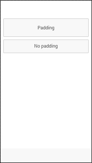
Ionic - Javascript Action Sheet
The Action Sheet is an Ionic service that will trigger a slide up pane on the bottom of the screen, which you can use for various purposes.
Using Action Sheet
In the following example, we will show you how to use the Ionic action sheet. First we will inject $ionicActionSheet service as a dependency to our controller, then we will create $scope.showActionSheet() function, and lastly we will create a button in our HTML template to call the function we created.
Controller Code
.controller('myCtrl', function($scope, $ionicActionSheet) {
   $scope.triggerActionSheet = function() {
      // Show the action sheet
      var showActionSheet = $ionicActionSheet.show({
         buttons: [
            { text: 'Edit 1' },
            { text: 'Edit 2' }
         ],

         destructiveText: 'Delete',
         titleText: 'Action Sheet',
         cancelText: 'Cancel',

         cancel: function() {
            // add cancel code...
         },

         buttonClicked: function(index) {
            if(index === 0) {
               // add edit 1 code
            }

            if(index === 1) {
               // add edit 2 code
            }
         },

         destructiveButtonClicked: function() {
            // add delete code..
         }
      });
   };
})
HTML Code
<button class = "button">Action Sheet Button</button>
Code Explained
When we tap the button, it will trigger the $ionicActionSheet.show function and the Action Sheet will appear. You can create your own functions that will be called when one of the options is taped. The cancel function will close the pane, but you can add some other behavior, which will be called when the cancel option is tapped before the pane is closed.
The buttonClicked function is the place where you can write the code that will be called when one of the edit options is tapped. We can keep track of multiple buttons by using the index parameter. The destructiveButtonCLicked is a function that will be triggered when the delete option is tapped. This option is red by default.
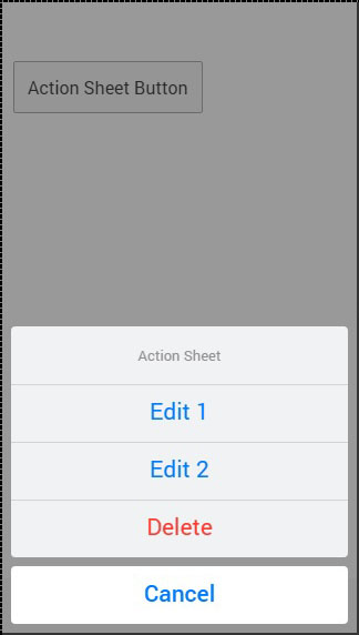
The $ionicActionSheet.show() method has some other useful parameters. You can check all of them in the following table.
Show Method Options
| Properties | Type | Details |
|---|---|---|
| buttons | object | Creates button object with a text field. |
| titleText | string | The title of the action sheet. |
| cancelText | string | The text for cancel button. |
| destructiveText | string | The text for a destructive button. |
| cancel | function | Called when cancel button, backdrop or hardware back button is pressed. |
| buttonClicked | function | Called when one of the buttons is tapped. Index is used for keeping track of which button is tapped. Return true will close the action sheet. |
| destructiveButtonClicked | function | Called when destructive button is clicked. Return true will close the action sheet. |
| cancelOnStateChange | boolean | If true (default) it will cancel the action sheet when navigation state is changed. |
Ionic - Javascript Backdrop
The Ionic Backdrop will overlay the content of the screen when applied. It will appear below other overlays (popup, loading, etc...). There are two methods that can be used for managing backdrop service. The $ionicBackdrop.retain() will apply backdrop over the components, and $ionicBackdrop.release() will remove it.
Using Backdrop
The following example shows how to use backdrop. We are adding $ionicBackdrop as a dependency to the controller, then creating the $scope.showBackdrop() function that will call the retain method immediately. Then, after three seconds, it will call the release method. We are using $timeout for the release method, so we need to add it as a controller dependency too.
.controller('myCtrl', function($scope, $ionicBackdrop, $timeout) {
   $scope.showBackdrop = function() {
      $ionicBackdrop.retain();

      $timeout(function() {
         $ionicBackdrop.release();
      }, 3000);
   };
})
You will notice how the screen is darker in the following image, since the backdrop is applied.
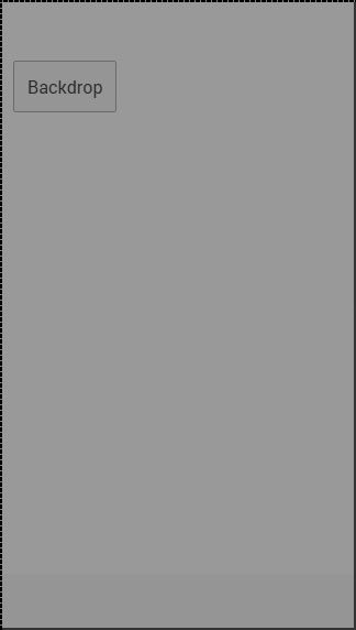
Ionic - Javascript Content
Almost every mobile app contains some fundamental elements. Usually these elements include a header and a footer, which will cover the top and the bottom part of the screen. All the other elements will be placed between these two. Ionic provide ion-content element that serves as a container, which will wrap all the other elements that we want to create.
Let us consider the following example −
<div class = "bar bar-header">
   <h1 class = "title">Header</h1>
</div>

<div class = "list">
   <label class = "item item-input">
      <input type = "text" placeholder = "Placeholder 1" />
   </label>

   <label class = "item item-input">
      <input type = "text" placeholder = "Placeholder 2" />
   </label>
</div>

<div class = "bar bar-footer">
   <h1 class = "title">Footer</h1>
</div>
Ionic - Javascript Forms
In this chapter, we will understand what JavaScript forms are and will learn what a JavaScript checkbox, radio buttons and toggle are.
Using ion-checkbox
Let us see how to use the Ionic JavaScript checkbox. Firstly, we need to create an ion-checkbox element in the HTML file. Inside this, we will assign an ng-model attribute that will be connected to the angular $scope. You will notice that we are using a dot when defining the value of a model even though it would work without it. This will allow us to keep the link between the child and the parent scopes at all times.
This is very important as it helps to avoid some issues that could happen in the future. After we create the element, we will bind its value using angular expressions.
<ion-checkbox ng-model = "checkboxModel.value1">Checkbox 1</ion-checkbox>
<ion-checkbox ng-model = "checkboxModel.value2">Checkbox 2</ion-checkbox>

<p>Checkbox 1 value is: <b>{{checkboxModel.value1}}</b></p>
<p>Checkbox 2 value is: <b>{{checkboxModel.value2}}</b></p>
Next, we need to assign values to our model inside the controller. The values we will use are false, since we want to start with unchecked checkboxes.
$scope.checkboxModel = {
   value1 : false,
   value2 : false
};
The above code will produce the following screen −
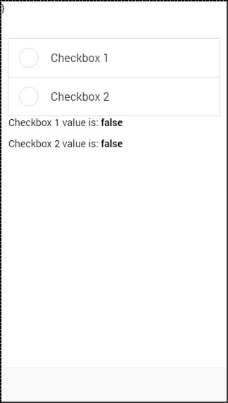
Now, when we tap the checkbox elements, it will automatically change their model value to true as shown in the following screenshot.
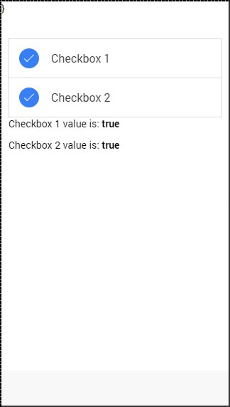
Using ion-radio
To start with, we should create three ion-radio elements in our HTML and assign the ng-model and the ng-value to it. After that, we will display the chosen value with angular expression. We will start by unchecking all the three radioelements, so the value will not be assigned to our screen.
<ion-radio ng-model = "radioModel.value" ng-value = "1">Radio 1</ion-radio>
<ion-radio ng-model = "radioModel.value" ng-value = "2">Radio 2</ion-radio>
<ion-radio ng-model = "radioModel.value" ng-value = "3">Radio 3</ion-radio>

<p>Radio value is: <b>{{radioModel.value}}</b></p>
The above code will produce the following screen −
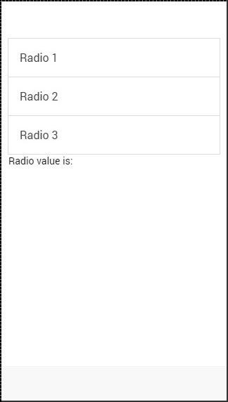
When we tap on the second checkbox element, the value will change accordingly.
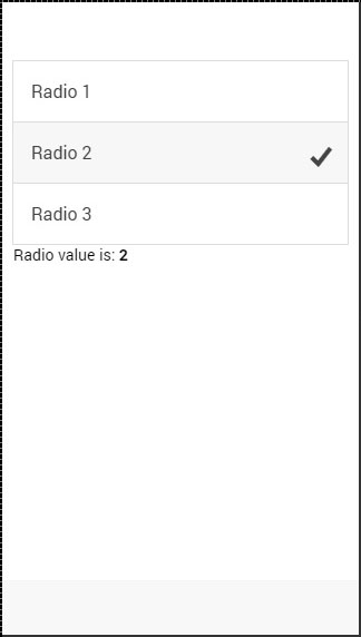
Using ion-toggle
You will notice that toggle is similar to checkbox. We will follow the same steps as we did with our checkbox. In the HTML file, first we will create ion-toggle elements, then assign the ng-model value and then bind expression values of to our view.
<ion-toggle ng-model = "toggleModel.value1">Toggle 1</ion-toggle>
<ion-toggle ng-model = "toggleModel.value2">Toggle 2</ion-toggle>
<ion-toggle ng-model = "toggleModel.value3">Toggle 3</ion-toggle>

<p>Toggle value 1 is: <b>{{toggleModel.value1}}</b></p>
<p>Toggle value 2 is: <b>{{toggleModel.value2}}</b></p>
<p>Toggle value 3 is: <b>{{toggleModel.value3}}</b></p>
Next, we will assign values to $scope.toggleModel in our controller. Since, toggle uses Boolean values, we will assign true to the first element and false to the other two.
$scope.toggleModel = {
   value1 : true,
   value2 : false,
   value3 : false
};
The above code will produce the following screen −
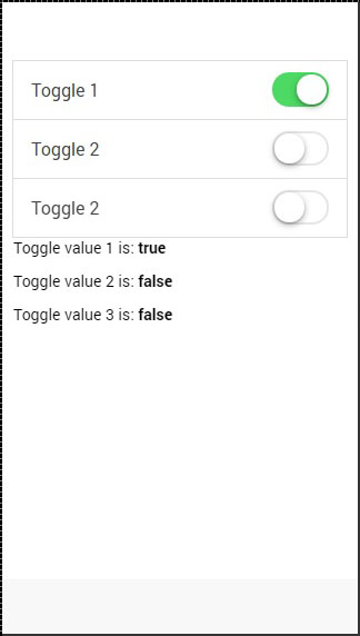
Now we will tap on second and third toggle to show you how the values change from false to true.
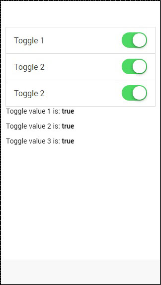
Ionic - Javascript Events
Various Ionic events can be used to add interactivity with users. The following table explains all the Ionic events.
| Event Name | Event Detail |
|---|---|
| on-hold | Called when duration of the touch is more than 500ms. |
| on-tap | Called when duration of the touch is less than 250ms. |
| on-double-tap | Called when there is double tap touch. |
| on-touch | Called immediately when touch begins. |
| on-release | Called when touch ends. |
| on-drag | Called when touch is moved without releasing around the page in any direction. |
| on-drag-up | Called when element is dragged up. |
| on-drag-right | Called when the element is dragged to the right. |
| on-drag-left | Called when the element is dragged to the left. |
| on-drag-down | Called when the element is dragged down. |
| on-swipe | Called when any dragging has high velocity moving in any direction. |
| on-swipe-up | Called when any dragging has high velocity moving up. |
| on-swipe-right | Called when any dragging has high velocity moving to the right. |
| on-swipe-left | Called when any dragging has high velocity moving to the left. |
| on-swipe-down | Called when any dragging has high velocity moving down. |
Using Events
Since all the Ionic events can be used the same way, we will show you how to use the on-touch event and you can just apply the same principles to the other events. To start with, we will create a button and assign an on-touch event, which will call the onTouchFunction().
<button on-touch = "onTouchFunction()" class="button">Test</button>
Then we will create that function in our controller scope.
$scope.onTouchFunction = function() {
   // Do something...
}
Now, when touch event occurs the onTouchFunction() will be called.
Ionic - Javascript Header
This is the Ionic directive, which will add the header bar.
Using JavaScript Header
To create a JavaScript header bar, we need to apply the ion-header-bar directive in the HTML file. Since the default header is white, we will add title, so it will be showed on white background. We will add it to our index.html file.
<ion-header-bar>
   <h1 class = "title">Title!</h1>
</ion-header-bar>
The above code will produce the following screen −
Styling Header
Just like the CSS Header Bar, the JavaScript counterpart can be styled in a similar fashion. To apply color, we need to add a color class with a bar prefix. Therefore, if we want to use a blue header, we will add a bar-positive class. We can also move the title to one side of the screen by adding the align-title attribute. The values for this attribute can be center, left or right.
<ion-header-bar align-title = "left" class = "bar-positive">
   <h1 class = "title">Title!</h1>
</ion-header-bar>
The above code will produce the following screen −
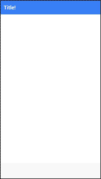
Adding Elements
You will usually want to add some elements to your header. The following example shows how to place a button on the left side and an icon to the right side of the ion-header-bar. You can also add other elements to your header.
<ion-header-bar class = "bar-positive">
   <div class = "buttons">
      <button class = "button">Button</button>
   </div>

   <h1 class = "title">Title!</h1>
   <div class = "buttons">
      <button class = "button icon ion-home"></button>
   </div>
</ion-header-bar>
The above code will produce the following screen −
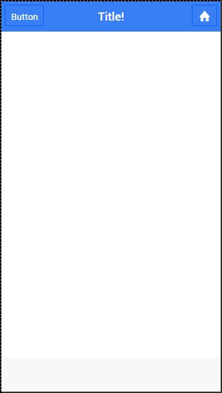
Adding Sub Header
A Sub header is created when a bar-subheader class is added to the ion-header-bar. We will add a bar-assertive class to apply red color to our sub header.
<ion-header-bar class = "bar-positive">
   <div class = "buttons">
      <button class = "button">Button</button>
   </div>

   <h1 class = "title">Title!</h1>
   <div class = "buttons">
      <button class = "button icon ion-home"></button>
   </div>
</ion-header-bar>

<ion-header-bar class = "bar-subheader bar-assertive">
   <h1 class = "title">Subheader</h1>
</ion-header-bar>
The above code will produce the following screen −
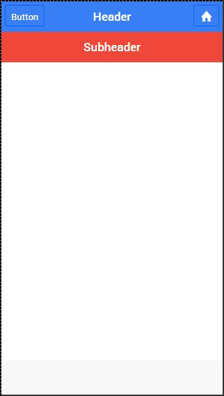
Ionic - Javascript Footer
This directive will add a footer bar at the bottom of the screen.
Using Footer
The Ionic footer can be added by applying an ion-footer-bar class. Working with it is same as working with header. We can add a title and place it on the left, center or right side of the screen by using the align-title attribute. With the prefix bar, we can use the Ionic colors. Let us create a red colored footer with the title in the center.
<ion-footer-bar align-title = "center" class = "bar-assertive">
   <h1 class = "title">Title!</h1>
</ion-footer-bar>
The above code will produce the following screen −
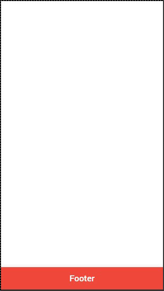
Adding Elements
We can add buttons icons or other elements to the ion-footer-bar and their styling will be applied. Let us add a button and an Icon to our footer.
<ion-footer-bar class = "bar-assertive">
   <div class = "buttons">
      <button class = "button">Button</button>
   </div>

   <h1 class = "title">Footer</h1>

   <div class = "buttons">
      <button class = "button icon ion-home"></button>
   </div>
</ion-footer-bar>
The above code will produce the following screen−
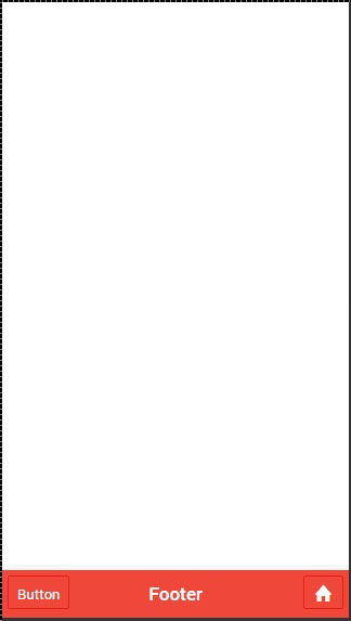
Adding Sub Footer
We showed you how to use a sub header. The same way a sub footer can be created. It will be located above the footer bar. All we need to do is add a bar-subfooter class to our ion-footer-bar element.
In example that follows, we will add the sub-footer above the footer bar, which we previously created.
<ion-footer-bar class = "bar-subfooter bar-positive">
   <h1 class = "title">Sub Footer</h1>
</ion-footer-bar>

<ion-footer-bar class = "bar-assertive">
   <div class = "buttons">
      <button class = "button">Button</button>
   </div>

   <h1 class = "title">Footer</h1>

   <div class = "buttons" ng-click = "doSomething()">
      <button class = "button icon ion-home"></button>
   </div>
</ion-footer-bar>
The above code will produce the following screen −
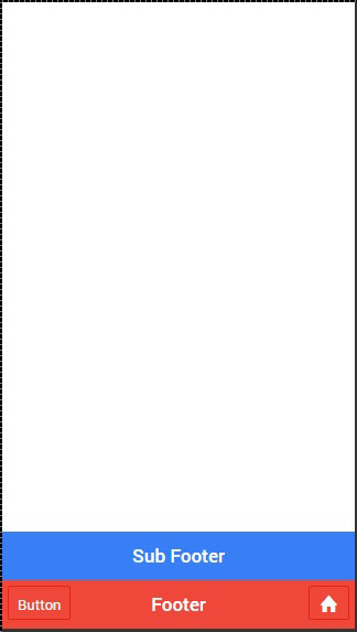
Ionic - Javascript Keyboard
Keyboard is one of the automated features in Ionic. This means that Ionic can recognize when there is a need to open the keyboard.
Using Keyboard
There are some functionalities, which the developers can adjust while working with the Ionic keyboard. When you want to hide some elements while the keyboard is open, you can use the hide-on-keyboard-open class. To show you how this works we created input and button that needs to be hidden when the keyboard is open.
<label class = "item item-input">
   <input type = "text" placeholder = "Input 1">
</label>

<button class = "button button-block hide-on-keyboard-open">
   button
</button>
The above code will produce the following screen −
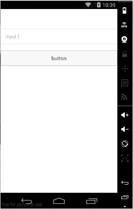
Now, when we tap on the input field, the keyboard will open automatically and the button will become hidden.
A nice feature of Ionic is that it will adjust elements on screen, so the focused element is always visible when the keyboard is open. The following image below shows ten Input forms and the last one is blue.
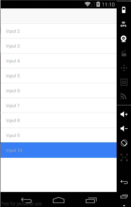
When we tap the blue form, Ionic will adjust our screen, so the blue form is always visible.
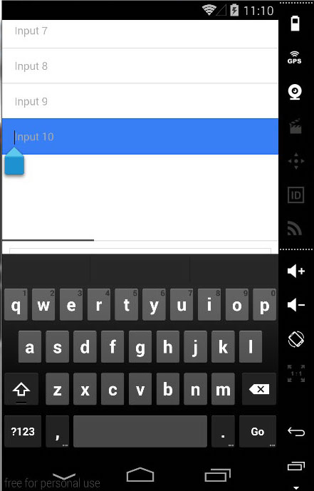
Note − This will work only if the screen is within a directive that has a Scroll View. If you start with one of the Ionic templates, you will notice that all templates use ion-content directive as a container to other screen elements, so the Scroll View is always applied.
Ionic - Javascript List
We already discussed Ionic CSS list elements in the previous chapters. In this chapter, we will show you JavaScript lists. They allow us to use some new features like swipe, drag and remove.
Using List
The directives used for displaying lists and items are ion-list and ion-item as shown below.
<ion-list>
   <ion-item>
      Item 1
   </ion-item>

   <ion-item>
      Item 2
   </ion-item>

   <ion-item>
      Item 3
   </ion-item>
</ion-list>
The above code will produce the following screen −
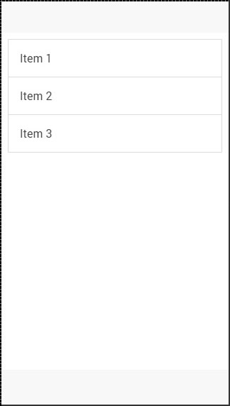
Delete Button
This button can be added by using the ion-delete-button directive. You can use any icon class you want. Since we do not always want to show the delete buttons, because users might accidentally tap it and trigger the delete process, we can add the show-delete attribute to the ion-list and connect it with the ng-model.
In the following example, we will use the ion-toggle as a model. When the toggle is on delete, the buttons will appear on our list items.
<ion-list show-delete = "showDelete1">
   <ion-item>
      <ion-delete-button class = "ion-minus-circled"></ion-delete-button>
      Item 1
   </ion-item>

   <ion-item>
      <ion-delete-button class = "ion-minus-circled"></ion-delete-button>
      Item 2
   </ion-item>
</ion-list>

<ion-toggle ng-model = "showDelete2">
   Show Delete 2
</ion-toggle>
The above code will produce the following screen −
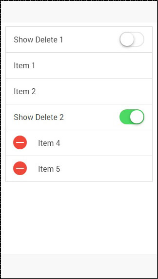
Reorder Button
The Ionic directive for the reorder button is ion-reorder-button. The element we created has an on-reorder attribute that will trigger the function from our controller whenever the user is dragging this element.
<ion-list show-reorder = "true">
   <ion-item ng-repeat = "item in items">
      Item {{item.id}}
      <ion-reorder-button class = "ion-navicon"
         on-reorder = "moveItem(item, $fromIndex, $toIndex)"></ion-reorder-button>
   </ion-item>
</ion-list>

$scope.items = [
   {id: 1},
   {id: 2},
   {id: 3},
   {id: 4}
];

$scope.moveItem = function(item, fromIndex, toIndex) {
   $scope.items.splice(fromIndex, 1);
   $scope.items.splice(toIndex, 0, item);
};
The above code will produce the following screen −
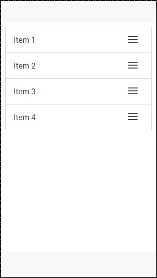
When we click the icon on the right, we can drag the element and move it to some other place in the list.
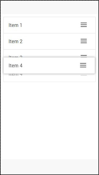
Option Button
The Option button is created using an ion-option-button directive. These buttons are showed when the list item is swiped to the left and we can hide it again by swiping the item element to the right.
You can see in the following example that there are two buttons, which are hidden.
<ion-list>
   <ion-item>
      Item with two buttons...
      <ion-option-button class = "button-positive">Button 1</ion-option-button>
      <ion-option-button class = "button-assertive">Button 2</ion-option-button>
   </ion-item>
</ion-list>
The above code will produce the following screen −
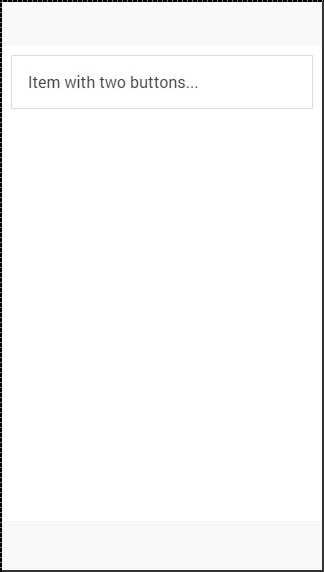
When we swipe the item element to the left, the text will be moved left and buttons will appear on the right side.
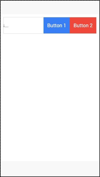
Other Functions
The collection-repeat function is an updated version of the AngularJS ng-repeat directive. It will only render visible elements on the screen and the rest will be updated as you scroll. This is an important performance improvement when you are working with large lists. This directive can be combined with item-width and item-height attributes for further optimization of the list items.
There are some other useful attributes for working with images inside your list. The item-render-buffer function represents number of items that are loaded after visible items. The higher this value, the more items will be preloaded. The force-refresh-images function will fix an issue with source of the images while scrolling. Both of these classes will influence the performance in a negative way.
Ionic - Javascript Loading
Ionic loading will disable any interaction with users when showed and enable it again when it is needed.
Using Loading
Loading is triggered inside the controller. First, we need to inject $ionicLoading in our controller as dependency. After that, we need to call the $ionicLoading.show() method and loading will appear. For disabling it, there is a $ionicLoading.hide() method.
Controller
.controller('myCtrl', function($scope, $ionicLoading) {
   $scope.showLoading = function() {
      $ionicLoading.show({
         template: 'Loading...'
      });
   };

   $scope.hideLoading = function(){
      $ionicLoading.hide();
   };
});
HTML Code
<button class = "button button-block" ng-click = "showLoading()"></button>
When a user taps the button, the loading will appear. You will usually want to hide the loading after some time consuming functionalities are finished.
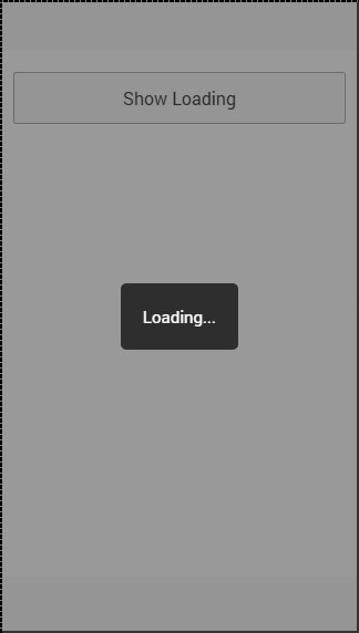
Some other option parameters can be used when working with loading. The explanation is shown in the table below.
Loading option parameters
| Options | Type | Details |
|---|---|---|
| templateUrl | string | Used to load HTML template as loading indicator. |
| scope | object | Used to pass custom scope to loading. Default is the $rootScope. |
| noBackdrop | Boolean | Used to hide the backdrop. |
| hideOnStateChange | Boolean | Used to hide the loading when state is changed. |
| delay | number | Used to delay showing the indicator in milliseconds. |
| duration | number | Used to hide the indicator after some time in milliseconds. Can be used instead of hide() method. |
Loading Config
Ionic config is used to configure options you want to be used in all of the $ionicLoading services throughout the app.
This can be done by using $ionicLoadingConfig. Since constants should be added to the main app module, open your app.js file and add your constant after module declaration.
.constant('$ionicLoadingConfig', {
   template: 'Default Loading Template...'
})
The above code will produce the following screen −
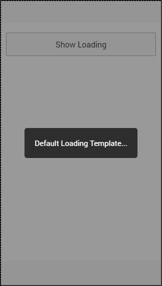
Ionic - Javascript Modal
When Ionic modal is activated, the content pane will appear on top of the regular content. Modal is basically larger popup with more functionalities. Modal will cover entire screen by default but it can be optimized the way you want.
Using Modal
There are a two ways of implementing modal in Ionic. One way is to add separate template and the other is to add it on top of the regular HTML file, inside the script tags. The first thing we need to do is to connect our modal to our controller using angular dependency injection. Then we need to create a modal. We will pass in scope and add animation to our modal.
After that, we will create functions for opening, closing, destroying modal. The last two functions are placed where we can write the code that will be triggered if a modal is hidden or removed. If you do not want to trigger any functionality, when the modal is removed or hidden, you can delete the last two functions.
Controller Code
.controller('MyController', function($scope, $ionicModal) {
   $ionicModal.fromTemplateUrl('my-modal.html', {
      scope: $scope,
      animation: 'slide-in-up'
   }).then(function(modal) {
      $scope.modal = modal;
   });

   $scope.openModal = function() {
      $scope.modal.show();
   };

   $scope.closeModal = function() {
      $scope.modal.hide();
   };

   //Cleanup the modal when we're done with it!
   $scope.$on('$destroy', function() {
      $scope.modal.remove();
   });

   // Execute action on hide modal
   $scope.$on('modal.hidden', function() {
      // Execute action
   });

   // Execute action on remove modal
   $scope.$on('modal.removed', function() {
      // Execute action
   });
});
HTML Code
<script id = "my-modal.html" type = "text/ng-template">
   <ion-modal-view>
      <ion-header-bar>
         <h1 class = "title">Modal Title</h1>
      </ion-header-bar>

      <ion-content>
         <button class = "button icon icon-left ion-ios-close-outline"
            ng-click = "closeModal()">Close Modal</button>
      </ion-content>
   </ion-modal-view>
</script>
The way we showed in the last example is when the script tag is used as a container to our modal inside some existing HTML file.
The second way is to create a new template file inside the templates folder. We will use the same code as in our last example, but we will remove the script tags and we also need to change fromTemplateUrl in controller to connect modal with new created template.
Controller Code
.controller('MyController', function($scope, $ionicModal) {
   $ionicModal.fromTemplateUrl('templates/modal-template.html', {
      scope: $scope,
      animation: 'slide-in-up',
   }).then(function(modal) {
      $scope.modal = modal;
   });

   $scope.openModal = function() {
      $scope.modal.show();
   };

   $scope.closeModal = function() {
      $scope.modal.hide();
   };

   //Cleanup the modal when we're done with it!
   $scope.$on('$destroy', function() {
      $scope.modal.remove();
   });

   // Execute action on hide modal
   $scope.$on('modal.hidden', function() {
      // Execute action
   });

   // Execute action on remove modal
   $scope.$on('modal.removed', function() {
      // Execute action
   });
});
HTML Code
<ion-modal-view>
   <ion-header-bar>
      <h1 class = "title">Modal Title</h1>
   </ion-header-bar>

   <ion-content>
      <button class = "button icon icon-left ion-ios-close-outline"
         ng-click = "closeModal()">Close Modal</button>
   </ion-content>
</ion-modal-view>
The third way of using Ionic modal is by inserting HTML inline. We will use the fromTemplate function instead of the fromTemplateUrl.
Controller Code
.controller('MyController', function($scope, $ionicModal) {
   $scope.modal = $ionicModal.fromTemplate( '<ion-modal-view>' +
      ' <ion-header-bar>' +
         '<h1 class = "title">Modal Title</h1>' +
      '</ion-header-bar>' +

      '<ion-content>'+
         '<button class = "button icon icon-left ion-ios-close-outline"
            ng-click = "closeModal()">Close Modal</button>' +
      '</ion-content>' +

   '</ion-modal-view>', {
      scope: $scope,
      animation: 'slide-in-up'
   })

   $scope.openModal = function() {
      $scope.modal.show();
   };

   $scope.closeModal = function() {
      $scope.modal.hide();
   };

   //Cleanup the modal when we're done with it!
   $scope.$on('$destroy', function() {
      $scope.modal.remove();
   });

   // Execute action on hide modal
   $scope.$on('modal.hidden', function() {
      // Execute action
   });

   // Execute action on remove modal
   $scope.$on('modal.removed', function() {
      // Execute action
   });
});
All three examples will have the same effect. We will create a button to trigger the $ionicModal.show() to open modal.
HTML Code
<button class = "button" ng-click = "openModal()"></button>
When we open modal, it will contain a button that will be used for closing it. We created this button in a HTML template.
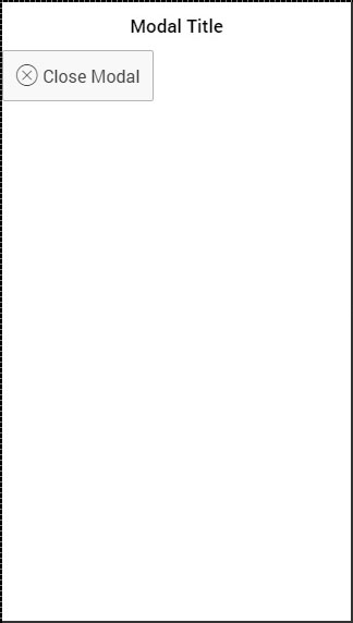
There are also other options for modal optimization. We already showed how to use scope and animation. The following table shows other options.
| Option | Type | Detail |
|---|---|---|
| focusFirstInput | boolean | It will auto focus first input of the modal. |
| backdropClickToClose | boolean | It will enable closing the modal when backdrop is tapped. Default value is true. |
| hardwareBackButtonClose | boolean | It will enable closing the modal when hardware back button is clicked. Default value is true. |
Ionic - Javascript Navigation
Navigation is one of the core components of every app. Ionic is using the AngularJS UI Router for handling the navigation.
Using Navigation
Navigation can be configured in the app.js file. If you are using one of the Ionic templates, you will notice the $stateProvider service injected into the app config. The simplest way of creating states for the app is showed in the following example.
The $stateProvider service will scan the URL, find the corresponding state and load the file, which we defined in app.config.
app.js Code
.config(function($stateProvider) {
   $stateProvider
   .state('index', { url: '/', templateUrl: 'templates/home.html'})
   .state('state1', {url: '/state1', templateUrl: 'templates/state1.html'})
   .state('state2', {url: '/state2', templateUrl: 'templates/state2.html',});
});
The state will be loaded into the ion-nav-view element, which can be placed in the index.html body.
index.html Code
<ion-nav-view></ion-nav-view>
When we created states in the above-mentioned example, we were using the templateUrl, so when the state is loaded, it will search for matching the template file. Now, we will open the templates folder and create a new file state1.html, which will be loaded when the app URL is changed to /state1.
state1.html Code
<ion-view>
   <ion-content>
      This is State 1 !!!
   </ion-content>
</ion-view>
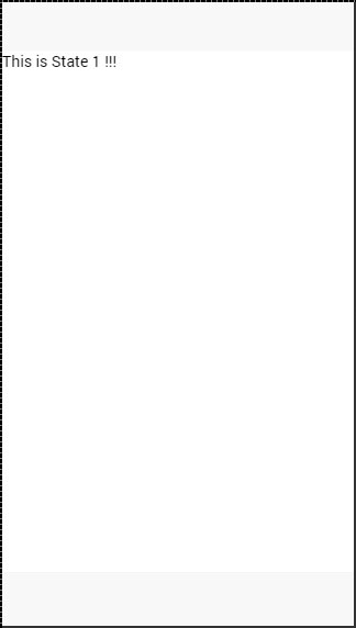
Creating Navigation Menu
You can add a navigation bar to your app in the index.html body by adding the ion-nav-bar element. Inside the navigation bar, we will add the ion-nav-back-button with an icon. This will be used for returning to the previous state. The button will appear automatically when the state is changed. We will assign the goBack() function, which will use the $ionicHistory service for handling this functionality. Therefore, when the user leaves the home state and goes to state1, the back button will appear which can be taped, if the user wants to return to the home state.
index.html Code
<ion-nav-bar class = "bar-positive">
   <ion-nav-back-button class = "button-clear" ng-click = "goBack()">
      <i class = "icon ion-arrow-left-c"></i> Back
   </ion-nav-back-button>
</ion-nav-bar>
Controller Code
.MyCtrl($scope, $ionicHistory) {
   $scope.goBack = function() {
      $ionicHistory.goBack();
   };
}
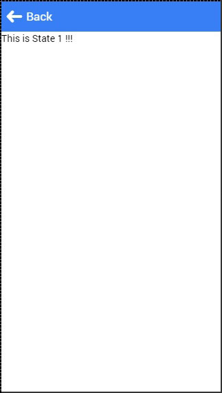
Adding Navigation Elements
Buttons can be added to the navigation bar using the ion-nav-buttons. This element should be placed inside the ion-nav-bar or the ion-view. We can assign the side attribute with four option values. The primary and secondary values will place buttons according to the platform that is used. Sometimes you want the buttons on one side no matter if it is IOS or Android. If that is the case, you can use the left or the right attributes instead.
We can also add the ion-nav-title to the navigation bar. All the code will be placed in the index.html body, so it can be used everywhere.
<ion-nav-bar class = "bar-positive">
   <ion-nav-title>
      Title
   </ion-nav-title>

   <ion-nav-buttons side = "primary">
      <button class = "button">
         Button 1
      </button>
   </ion-nav-buttons>
</ion-nav-bar>
It will produce the following screen −
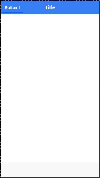
Other Navigation Attributes
The following table shows a few other functionalities, which can be used with Ionic navigation.
Navigation Attributes
| Attribute | Options | Detail |
|---|---|---|
| nav-transition | none, iOS, Android | Used to set animation that should be applied when transition occurs. |
| nav-direction | forward, back, enter, exit, swap | Used to set the direction of the animation when transition occurs. |
| hardwareBackButtonClose | Boolean | It will enable closing the modal when hardware back button is clicked. Default value is true. |
Caching
Ionic has the ability for caching up to ten views to improve performance. It also offers a way to handle caching manually. Since only backward views are cached and the forward ones are loading each time the users visit them, we can easily set to cache forward views by using following the code.
$ionicCinfigProvider.views.forwardCache(true);
We can also set how many states should be cached. If we want three views to be cached, we can use the following code.
$ionicConfigProvider.views.maxCache(3);
Caching can be disabled inside $stateProvider or by setting attribute to ion-view. Both examples are below.
$stateProvider.state('state1', {
   cache: false,
   url : '/state1',
   templateUrl: 'templates/state1.html'
})

<ion-view cache-view = "false"></ion-view>
Controlling the Navigation Bar
We can control the behavior of the navigation bar by using the $ionicNavBarDelegate service. This service needs to be injected to our controller.
HTML Code
<ion-nav-bar>
   <button ng-click = "setNavTitle('title')">
      Set title to banana!
   </button>
</ion-nav-bar>
Controller Code
$scope.setNavTitle = function(title) {
   $ionicNavBarDelegate.title(title);
}
The $ionicNavBarDelegate service has other useful methods. Some of these methods are listed in the following table.
Methods for $ionicNavBarDelegate
| Method | Parameter | Type | Detail |
|---|---|---|---|
| align(parameter) | center, left, right | string | Used to align the title. |
| showBackButton(parameter) | show | Boolean | Used to show or hide the back button. |
| title(parameter) | title | string | Used to show the new title. |
Tracking History
You can track the history of the previous, current and the forward views by using the $ionicHistory service. The following table shows all the methods of this service.
Methods for $ionicHistory
| Method | Parameter | Type | Detail |
|---|---|---|---|
| viewHistory | / | object | Returns the app view history data. |
| currentView() | / | object | Returns the current view. |
| title(parameter) | title | string | Returns the ID of the view which is parent of the current view. |
| currentTitle(parameter) | val | string | Returns the title of the current view. It can be updated by setting new val value. |
| backView() | / | string | Returns the last back view. |
| backTitle() | / | string | Returns the title of last back view. |
| forwardView() | / | object | Returns the last forward view. |
| currentStateName() | / | string | Returns the current state name. |
| goBack() | backCount | number | Used to set how many views to go back. Number should be negative. If it is positive or zero it will have no effect. |
| clearHistory() | / | / | Used to clear entire view history. |
| clearCache() | / | promise | Used to clear all cached views. |
| nextViewOptions() | / | object | Sets the options of the next view. You can look the following example for more info. |
The nextViewOptions() method has the following three options available.
disableAnimate is used for disabling animation of the next view change.
disableBack will set the back view to null.
historyRoot will set the next view as the root view.
$ionicHistory.nextViewOptions({
   disableAnimate: true,
   disableBack: true
});
Ionic - Javascript Popover
This is a view that will appear above the regular view.
Using Popover
A Popover can be created by using ion-popover-view element. This element should be added to the HTML template and the $ionicPopover service needs to be injected into the controller.
There are three ways of adding popover. The first one is the fromTemplate method, which allows using the inline template. The second and the third way of adding popover is to use the fromTemplateUrl method.
Let us understand the fromtemplate method as explained below.
Controller Code for Fromtemplate Method
.controller('DashCtrl', function($scope, $ionicLoading, $ionicPopover) {
   // .fromTemplate() method
   var template = '<ion-popover-view>' + '<ion-header-bar>' +
      '<h1 class = "title">Popover Title</h1>' +
      '</ion-header-bar>'+ '<ion-content>' +
      'Popover Content!' + '</ion-content>' + '</ion-popover-view>';

   $scope.popover = $ionicPopover.fromTemplate(template, {
      scope: $scope
   });

   $scope.openPopover = function($event) {
      $scope.popover.show($event);
   };

   $scope.closePopover = function() {
      $scope.popover.hide();
   };

   //Cleanup the popover when we're done with it!
   $scope.$on('$destroy', function() {
      $scope.popover.remove();
   });

   // Execute action on hide popover
   $scope.$on('popover.hidden', function() {
      // Execute action
   });

   // Execute action on remove popover
   $scope.$on('popover.removed', function() {
      // Execute action
   });
})
As discussed above, the second and the third way of adding popover is to use fromTemplateUrl method. The controller code will be the same for both ways except the fromTemplateUrl value.
If the HTML is added to an existing template, the URL will be the popover.html. If we want to place the HTML into the templates folder, then the URL will change to templates/popover.html.
Both examples have been explained below.
Controller Code for the fromTemplateUrl
.controller('MyCtrl', function($scope, $ionicPopover) {

   $ionicPopover.fromTemplateUrl('popover.html', {
      scope: $scope
   }).then(function(popover) {
      $scope.popover = popover;
   });

   $scope.openPopover = function($event) {
      $scope.popover.show($event);
   };

   $scope.closePopover = function() {
      $scope.popover.hide();
   };

   //Cleanup the popover when we're done with it!
   $scope.$on('$destroy', function() {
      $scope.popover.remove();
   });

   // Execute action on hide popover
   $scope.$on('popover.hidden', function() {
      // Execute action
   });

   // Execute action on remove popover
   $scope.$on('popover.removed', function() {
      // Execute action
   });
})
Now, we will add the script with template to the HTML file, which we are using for calling the popover function.
HTML code from the Existing HTML file
<script id = "popover.html" type = "text/ng-template">
   <ion-popover-view>

      <ion-header-bar>
         <h1 class = "title">Popover Title</h1>
      </ion-header-bar>

      <ion-content>
         Popover Content!
      </ion-content>

   </ion-popover-view>
</script>
If we want to create an HTML as a separate file, we can create a new HTML file in the templates folder and use the same code as we used in the above-mentioned example without the script tags.
The newly created HTML file is as follows.
<ion-popover-view>
   <ion-header-bar>
      <h1 class = "title">Popover Title</h1>
   </ion-header-bar>

   <ion-content>
      Popover Content!
   </ion-content>
</ion-popover-view>
The last thing we need is to create a button that will be clicked to show the popover.
<button class = "button" ng-click = "openPopover($event)">Add Popover</button>
Whatever way we choose from above examples, the output will always be the same.
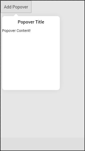
The following table shows the $ionicPopover methods that can be used.
| Method | Option | Type | Detail |
|---|---|---|---|
| initialize(options) | scope, focusFirst, backdropClickToClose, hardwareBackButtonClose | object, boolean, boolean, boolean | Scope is used to pass custom scope to popover. Default is the $rootScope. focusFirstInput is used to auto focus the first input of the popover. backdropClickToClose is used to close popover when clicking the backdrop. hardwareBackButtonClose is used to close popover when hardware back button is pressed. |
| show($event) | $event | promise | Resolved when popover is finished showing. |
| hide() | / | promise | Resolved when popover is finished hiding. |
| remove() | / | promise | Resolved when popover is finished removing. |
| isShown() | / | Boolean | Returns true if popover is shown or false if it is not. |
Ionic - JavaScript Popup
This service is used for creating a popup window on top of the regular view, which will be used for interaction with the users. There are four types of popups namely − show, confirm, alert and prompt.
Using Show Popup
This popup is the most complex of all. To trigger popups, we need to inject the $ionicPopup service to our controller and then just add a method that will trigger the popup we want to use, in this case $ionicPopup.show(). The onTap(e) function can be used for adding e.preventDefault() method, which will keep the popup open, if there is no change applied to the input. When the popup is closed, the promised object will be resolved.
Controller Code
.controller('MyCtrl', function($scope, $ionicPopup) {
   // When button is clicked, the popup will be shown...
   $scope.showPopup = function() {
      $scope.data = {}

      // Custom popup
      var myPopup = $ionicPopup.show({
         template: '<input type = "text" ng-model = "data.model">',
         title: 'Title',
         subTitle: 'Subtitle',
         scope: $scope,

         buttons: [
            { text: 'Cancel' }, {
               text: '<b>Save</b>',
               type: 'button-positive',
               onTap: function(e) {

                  if (!$scope.data.model) {
                     //don't allow the user to close unless he enters model...
                     e.preventDefault();
                  } else {
                     return $scope.data.model;
                  }
               }
            }
         ]
      });

      myPopup.then(function(res) {
         console.log('Tapped!', res);
      });
   };
})
HTML Code
<button class = "button" ng-click = "showPopup()">Add Popup Show</button>
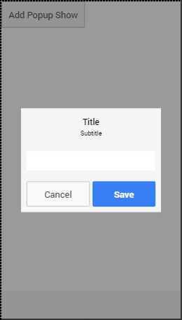
You probably noticed in the above-mentioned example some new options were used. The following table will explain all of those options and their use case.
Show Popup Options
| Option | Type | Details |
|---|---|---|
| template | string | Inline HTML template of the popup. |
| templateUrl | string | URL of the HTML template. |
| title | string | The title of the popup. |
| subTitle | string | The subtitle of the popup. |
| cssClass | string | The CSS class name of the popup. |
| scope | Scope | A scope of the popup. |
| buttons | Array[Object] | Buttons that will be placed in footer of the popup. They can use their own properties and methods. text is displayed on top of the button, type is the Ionic class used for the button, onTap is function that will be triggered when the button is tapped. Returning a value will cause the promise to resolve with the given value. |
Using Confirm Popup
A Confirm Popup is the simpler version of Ionic popup. It contains Cancel and OK buttons that users can press to trigger the corresponding functionality. It returns the promised object that is resolved when one of the buttons are pressed.
Controller Code
.controller('MyCtrl', function($scope, $ionicPopup) {
   // When button is clicked, the popup will be shown...
   $scope.showConfirm = function() {
	   var confirmPopup = $ionicPopup.confirm({
         title: 'Title',
         template: 'Are you sure?'
      });

      confirmPopup.then(function(res) {
         if(res) {
            console.log('Sure!');
         } else {
            console.log('Not sure!');
         }
      });
	};
})
HTML Code
<button class = "button" ng-click = "showConfirm()">Add Popup Confirm</button>
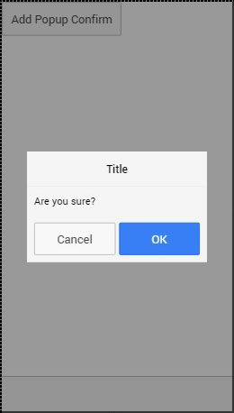
The following table explains the options that can be used for this popup.
Confirm Popup Options
| Option | Type | Details |
|---|---|---|
| template | string | Inline HTML template of the popup. |
| templateUrl | string | URL of the HTML template. |
| title | string | The title of the popup. |
| subTitle | string | The subtitle of the popup. |
| cssClass | string | The CSS class name of the popup. |
| cancelText | string | The text for the Cancel button. |
| cancelType | string | The Ionic button type of the Cancel button. |
| okText | string | The text for the OK button. |
| okType | string | The Ionic button type of the OK button. |
Using Alert Popup
An Alert is a simple popup that is used for displaying the alert information to the user. It has only one button that is used to close the popup and resolve the popups promised object.
Controller Code
.controller('MyCtrl', function($scope, $ionicPopup) {
   $scope.showAlert = function() {
      var alertPopup = $ionicPopup.alert({
         title: 'Title',
         template: 'Alert message'
      });

      alertPopup.then(function(res) {
         // Custom functionality....
      });
   };
})
HTML Code
<button class = "button" ng-click = "showAlert()">Add Popup Alert</button>
It will produce the following screen −
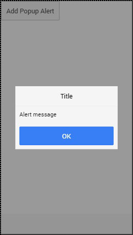
The following table shows the options that can be used for an alert popup.
Alert Popup Options
| Option | Type | Details |
|---|---|---|
| template | string | Inline HTML template of the popup. |
| templateUrl | string | URL of the HTML template. |
| title | string | The title of the popup. |
| subTitle | string | The subtitle of the popup. |
| cssClass | string | The CSS class name of the popup. |
| okText | string | The text for the OK button. |
| okType | string | The Ionic button type of the OK button. |
Using Prompt Popup
The last Ionic popup that can be created using Ionic is prompt. It has an OK button that resolves promise with value from the input and Cancel button that resolves with undefined value.
Controller Code
.controller('MyCtrl', function($scope, $ionicPopup) {
   $scope.showPrompt = function() {
      var promptPopup = $ionicPopup.prompt({
         title: 'Title',
         template: 'Template text',
         inputType: 'text',
         inputPlaceholder: 'Placeholder'
      });

      promptPopup.then(function(res) {
         console.log(res);
      });
   };
})
HTML Code
<button class = "button" ng-click = "showPrompt()">Add Popup Prompt</button>
It will produce the following screen −
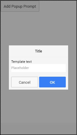
The following table shows options that can be used for a prompt popup.
Prompt Popup Options
| Option | Type | Details |
|---|---|---|
| template | string | Inline HTML template of the popup. |
| templateUrl | string | URL of the HTML template. |
| title | string | The title of the popup. |
| subTitle | string | The subtitle of the popup. |
| cssClass | string | The CSS class name of the popup. |
| inputType | string | The type for the input. |
| inputPlaceholder | string | A placeholder for the input. |
| cancelText | string | The text for the Cancel button. |
| cancelType | string | The Ionic button type of the Cancel button. |
| okText | string | The text for the OK button. |
| okType | string | The Ionic button type of the OK button. |
Ionic - JavaScript Scroll
The element used for scrolling manipulation in ionic apps is called as the ion-scroll.
Using Scroll
The following code snippets will create scrollable containers and adjust scrolling patterns. First, we will create our HTML element and add properties to it. We will add → direction = "xy" to allow scrolling to every side. We will also set the width and the height for the scroll element.
HTML Code
<ion-scroll zooming = "true" direction = "xy" style = "width: 320px; height: 500px">
   <div class = "scroll-container"></div>
</ion-scroll>
Next, we will add the image of our world map to div element, which we created inside the ion-scroll and set its width and height.
CSS Code
.scroll-container {
   width: 2600px;
   height: 1000px;
   background: url('../img/world-map.png') no-repeat
}
When we run our app, we can scroll the map in every direction. The following example shows the North America part of the map.

We can scroll this map to any part that we want. Let us scroll it to show Asia.

There are other attributes, which can be applied to the ion-scroll. You can check them in the following table.
Scroll Attributes
| Attribute | Type | Details |
|---|---|---|
| direction | string | Possible directions of the scroll. Default value is y |
| delegate-handle | string | Used for scroll identification with $ionicScrollDelegate. |
| locking | boolean | Used to lock scrolling in one direction at a time. Default value is true. |
| paging | boolean | Used to determine if the paging will be used with scroll. |
| on-refresh | expression | Called on pull-to-refresh. |
| on-scroll | expression | Called when scrolling. |
| scrollbar-x | boolean | Should horizontal scroll bar be shown. Default value is true. |
| scrollbar-y | string | Should vertical scroll bar be shown. Default value is true. |
| zooming | boolean | Used to apply pinch-to-zoom. |
| min-zoom | integer | Minimal zoom value. |
| max-zoom | integer | Maximal zoom value. |
| scrollbar-x | boolean | Used to enable bouncing. Default value on IOS is true, on Android false. |
Infinite Scroll
An Infinite scroll is used to trigger some behavior when scrolling passes the bottom of the page. The following example shows how this works. In our controller, we created a function for adding items to the list. These items will be added when a scroll passes 10% of the last element loaded. This will continue until we hit 30 loaded elements. Every time loading is finished, on-infinite will broadcast scroll.infiniteScrollComplete event.
HTML Code
<ion-list>
   <ion-item ng-repeat = "item in items" item = "item">Item {{ item.id }}</ion-item>
</ion-list>

<ion-infinite-scroll ng-if = "!noMoreItemsAvailable" on-infinite = "loadMore()"
   distance = "10%"></ion-infinite-scroll>
Controller Code
.controller('MyCtrl', function($scope) {
   $scope.items = [];
   $scope.noMoreItemsAvailable = false;

   $scope.loadMore = function() {
      $scope.items.push({ id: $scope.items.length});

      if ($scope.items.length == 30) {
         $scope.noMoreItemsAvailable = true;
      }

      $scope.$broadcast('scroll.infiniteScrollComplete');
   };
})
Other attributes can also be used with ion-infinite-scroll. Some of them are listed in the table below.
Scroll Attributes
| Attribute | Type | Details |
|---|---|---|
| on-infinite | expression | What should be called when scrolled to the bottom. |
| distance | string | The distance from the bottom needed to trigger on-infinite expression. |
| spinner | string | What spinner should be shown while loading |
| immediate-check | Boolean | Should on-infinite be called when screen is loaded |
Scroll Delegate
Ionic offers delegate for full control of the scroll elements. It can be used by injecting a $ionicScrollDelegate service to the controller, and then use the methods it provides.
The following example shows a scrollable list of 20 objects.
HTML Code
<div class = "list">
   <div class = "item">Item 1</div>
   <div class = "item">Item 2</div>
   <div class = "item">Item 3</div>
   <div class = "item">Item 4</div>
   <div class = "item">Item 5</div>
   <div class = "item">Item 6</div>
   <div class = "item">Item 7</div>
   <div class = "item">Item 8</div>
   <div class = "item">Item 9</div>
   <div class = "item">Item 10</div>
   <div class = "item">Item 11</div>
   <div class = "item">Item 12</div>
   <div class = "item">Item 13</div>
   <div class = "item">Item 14</div>
   <div class = "item">Item 15</div>
   <div class = "item">Item 16</div>
   <div class = "item">Item 17</div>
   <div class = "item">Item 18</div>
   <div class = "item">Item 19</div>
   <div class = "item">Item 20</div>
</div>

<button class = "button" ng-click = "scrollTop()">Scroll to Top!</button>
Controller Code
.controller('DashCtrl', function($scope, $ionicScrollDelegate) {

   $scope.scrollTop = function() {
      $ionicScrollDelegate.scrollTop();
   };
})
The above code will produce the following screen −
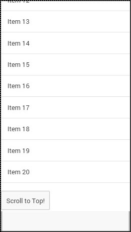
When we tap the button, the scroll will be moved to the top.
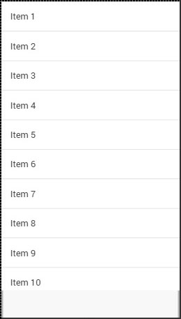
Now, we will go through all of the $ionicScrollDelegate methods.
Delegate Methods
| Method | Parameters | Type | Details |
|---|---|---|---|
| scrollTop(parameter) | shouldAnimate | boolean | Should scroll be animated. |
| scrollBottom(parameter) | shouldAnimate | boolean | Should scroll be animated. |
| scrollTo(parameter1, parameter2, parameter3) | left, top, shouldAnimate | number, number, integer | First two parameters determine value of the x, and y-axis offset. |
| scrollBy(parameter1, parameter2, parameter3) | left, top, shouldAnimate | number, number, integer | First two parameters determine value of the x, and y-axis offset. |
| zoomTo(parameter1, parameter2, parameter3, parameter4) | level, animate, originLeft, originTop | number, boolean, number, number | level is used to determine level to zoom to. originLeft and originRight coordinates where the zooming should happen. |
| zoomBy(parameter1, parameter2, parameter3, parameter4) | factor, animate, originLeft, originTop | number, boolean, number, number | factor is used to determine factor to zoom by. originLeft and originRight coordinates where the zooming should happen. |
| getScrollPosition() | / | / | Returns object with two number as properties: left and right. These numbers represent the distance the user has scrolled from the left and from the top respectively. |
| anchorScroll(parameter1) | shouldAnimate | boolean | It will scroll to the element with the same id as the window.loaction.hash. If this element does not exist, it will scroll to the top. |
| freezeScroll(parameter1) | shouldFreeze | boolean | Used to disable scrolling for particular scroll. |
| freezeAllScrolls(parameter1) | shouldFreeze | boolean | Used to disable scrolling for all the scrolls in the app. |
| getScrollViews() | / | object | Returns the scrollView object. |
| $getByHandle(parameter1) | handle | string | Used to connect methods to the particular scroll view with the same handle. $ionicScrollDelegate. $getByHandle('my-handle').scrollTop(); |
Ionic - JavaScript Side Menu
Side menu is one of the most used Ionic components. The Side menu can be opened by swiping to the left or right or by triggering the button created for that purpose.
Using Side Menu
The first element that we need is ion-side-menus. This element is used for connecting the side menu with all the screens that will use it. The ion-side-menu-content element is where the content will be placed and the ion-side-menu element is the place where we can put a side directive. We will add the side menu to the index.html and place the ion-nav-view inside the side menu content. This way the side menu can be used throughout entire app.
index.html
<ion-side-menus>

   <ion-side-menu>side = "left">
      <h1>SIde Menu</h1>
   </ion-side-menu>

   <ion-side-menu-content>
      <ion-nav-view>
      </ion-nav-view>
   </ion-side-menu-content>

</ion-side-menus>
Now, we will create button with menu-toggle = "left" directive. This button will usually be placed in the apps header bar, but we will add it in our template file for better understanding.
When the button is tapped or when we swipe to the right, the side menu will open. You could also set the menu-close directive, if you would like to have one button only for closing side menu, but we will use the toggle button for this.
HTML Template
<button menu-toggle = "left" class = "button button-icon icon ion-navicon"></button>
The above code will produce the following screen −
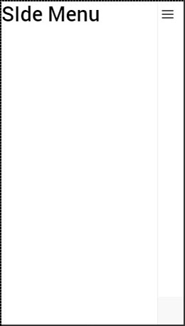
You can add some additional attributes to the ion-side-menus element. The enable-menu-with-back-views can be set to false to disable side menu, when the back button is showed. This will also hide the menu-toggle button from the header. The other attribute is delegate-handle, which will be used for the connection with $ionicSideMenuDelegate.
The ion-side-menu-content element can use its own attribute. When the drag-content attribute is set to false, it will disable the ability to open the side menu by swiping the content screen. The edge-drag-threshold attribute has a default value of 25. This means that swiping is allowed only 25 pixels from the left and right edge of the screen. We can change this number value or we can set it to false to enable swiping on the entire screen or true to disable it.
The ion-side-menu can use the side attribute that we showed in the example above. It will determine whether the menu should appear from the left or the right side. The is-enabled attribute with a false value will disable the side menu, and the width attribute value is a number that represents how wide the side menu should be. The default value is 275.
Side Menu Delegate
The $ionicSideMenuDelegate is a service used for controlling all the side menus in the app. We will show you how to use it, and then we will go through all the options available. Like all the Ionic services, we need to add it as a dependency to our controller and then use it inside the controllers scope. Now, when we click the button, all of the side menus will open.
Controller Code
.controller('MyCtrl', function($scope, $ionicSideMenuDelegate) {
   $scope.toggleLeftSideMenu = function() {
      $ionicSideMenuDelegate.toggleLeft();
   };
})
HTML Code
<button class = "button button-icon icon ion-navicon" ng-click = "toggleLeft()"></button>
The following table shows the $ionicScrollDelegate methods.
Delegate Methods
| Method | Parameters | Type | Details |
|---|---|---|---|
| toggleLeft(parameter) | isOpen | Boolean | Used for opening or closing side menu. |
| toggleRight(parameter) | isOpen | Boolean | Used for opening or closing side menu. |
| getOpenRatio() | / | / | Returns ratio of open part over menu width. If half of the menu is open from the left, the ration will be 0.5. If side menu is closed, it will return 0. If half of the menu is open from the right side, it will return -0.5. |
| isOpen() | / | Boolean | Returns true if side menu is open, false if it is closed. |
| isOpenLeft() | / | Boolean | Returns true if left side menu is open, false if it is closed. |
| isOpenRight() | / | Boolean | Returns true if right side menu is open, false if it is closed. |
| getScrollPosition() | / | / | Returns object with two number as properties: left and right. These numbers represent the distance the user has scrolled from the left and from the top respectively. |
| canDragContent(parameter1) | canDrag | Boolean | Whether the content can be dragged to open side menu. |
| edgeDragThreshold(parameter1) | value | Boolean|number | If the value is true, the side menu can be opened by dragging 25px from the edges of the screen. If it is false, dragging is disabled. We can set any number that will represent pixel value from the left and right edge of the screen. |
| $getByHandle(parameter1) | handle | string | Used to connect methods to the particular side menu view with the same handle. $ionicSideMenuDelegate. $getByHandle('my-handle').toggleLeft(); |
Ionic - JavaScript Slide Box
A Slide box contains pages that can be changed by swiping the content screen.
Using Slide Box
The usage of the slide box is simple. You just need to add ion-slide-box as a container and ion-slide with box class inside that container. We will add height and border to our boxes for better visibility.
HTML Code
<ion-slide-box>

   <ion-slide>
      <div class = "box box1">
         <h1>Box 1</h1>
      </div>
   </ion-slide>

   <ion-slide>
      <div class = "box box2">
         <h1>Box 2</h1>
      </div>
   </ion-slide>

   <ion-slide>
      <div class = "box box3">
         <h1>Box 3</h1>
      </div>
   </ion-slide>

</ion-slide-box>

.box1, box2, box3 {
   height: 300px;
   border: 2px solid blue;
}
The Output will look as shown in the following screenshot −
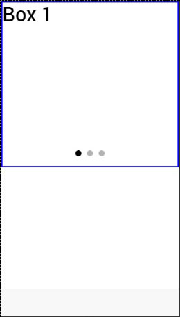
We can change the box by dragging the content to the right. We can also drag to the left to show the previous box.
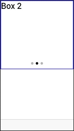
A few attributes that can be used for controlling slide box behavior are mentioned in the following table.
Delegate Methods
| Attribute | Type | Details |
|---|---|---|
| does-continue | Boolean | Should slide box loop when first or last box is reached. |
| auto-play | Boolean | Should slide box automatically slide. |
| slide-interval | number | Time value between auto slide changes in milliseconds. Default value is 4000. |
| show-pager | Boolean | Should pager be visible. |
| pager-click | expression | Called when a pager is tapped (if pager is visible). $index is used to match with different slides. |
| on-slide-changed | expression | Called when slide is changed. $index is used to match with different slides. |
| active-slide | expression | Used as a model to bind the current slide index to. |
| delegate-handle | string | Used for slide box identification with $ionicSlideBoxDelegate. |
Slide Box Delegate
The $ionicSlideBoxDelegate is a service used for controlling all slide boxes. We need to inject it to the controller.
Controller Code
.controller('MyCtrl', function($scope, $ionicSlideBoxDelegate) {
   $scope.nextSlide = function() {
      $ionicSlideBoxDelegate.next();
   }
})
HTML Code
<button class = "button button-icon icon ion-navicon" ng-click = "nextSlide()"></button>
The following table shows $ionicSlideBoxDelegate methods.
Delegate Methods
| Method | Parameters | Type | Details |
|---|---|---|---|
| slide(parameter1, parameter2) | to, speed | number, number | Parameter to represents the index to slide to. speed determines how fast is the change in milliseconds. |
| enableSlide(parameter1) | shouldEnable | boolean | Used for enambling or disabling sliding. |
| previous(parameter1) | speed | number | The value in miliseconds the change should take. |
| stop() | / | / | Used to stop the sliding. |
| start() | / | / | Used to start the sliding. |
| currentIndex() | / | number | Returns index of the curent slide. |
| slidesCount() | / | number | Returns total number of the slides. |
| $getByHandle(parameter1) | handle | string | Used to connect methods to the particular slide box with the same handle. $ionicSlideBoxDelegate. $getByHandle('my-handle').start(); |
Ionic - Javascript Tabs
Tabs are a useful pattern for any navigation type or selecting different pages inside your app. The same tabs will appear at the top of the screen for Android devices and at the bottom for IOS devices.
Using Tabs
Tabs can be added to the app by using ion-tabs as a container element and ion-tab as a content element. We will add it to the index.html, but you can add it to any HTML file inside your app. Just be sure not to add it inside the ion-content to avoid CSS issues that comes with it.
index.html Code
<ion-tabs class = "tabs-icon-only">

   <ion-tab title = "Home" icon-on = "ion-ios-filing"
      icon-off = "ion-ios-filing-outline"></ion-tab>

   <ion-tab title = "About" icon-on = "ion-ios-home"
      icon-off = "ion-ios-home-outline"></ion-tab>

   <ion-tab title = "Settings" icon-on = "ion-ios-star"
      icon-off = "ion-ios-star-outline"></ion-tab>

</ion-tabs>
The output will look as shown in the following screenshot.
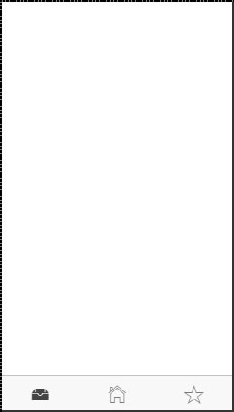
There is API available for ion-tab elements. You can add it as attributes as showed in example above where we used title, icon-on and icon-off. The last two are used to differentiate selected tab from the rest of it. If you look at the image above, you can see that first tab is selected. You can check the rest of the attributes in the following table.
Tab Attributes
| Attribute | Type | Details |
|---|---|---|
| title | string | The title of the tab. |
| href | string | The link used for tab navigation. |
| icon | string | The icon of the tab. |
| icon-on | string | The icon of the tab when selected. |
| icon-off | string | The icon of the tab when not selected. |
| badge | expression | The badge for the tab. |
| badge-style | expression | The badge style for the tab. |
| on-select | expression | Called when tab is selected |
| on-deselect | expression | Called when tab is deselected |
| hidden | expression | Used to hide the tab. |
| disabled | expression | Used to disable the tab. |
Tabs also have its own delegate service for easier control of all the tabs inside the app. It can be injected in the controller and has several methods, which are shown in the following table.
Delegate Methods
| Method | Parameters | Type | Details |
|---|---|---|---|
| selectedIndex() | / | number | Returns the index of the selected tab. |
| $getByHandle(parameter1) | handle | string | Used to connect methods to the particular tab view with the same handle. Handle can be added to ion-tabs by using delegate-handle = "my-handle" attribute. $ionicTabsDelegate.$getByHandle('my-handle').selectedIndex(); |
Ionic - Cordova Integration
Cordova offers ngCordova, which is set of wrappers specifically designed to work with AngularJS.
Installing ngCordova
When you the start Ionic app, you will notice that it is using bower. It can be used for managing ngCordova plugins. If you have bower installed skip this step, if you do not have it, then you can install it in the command prompt window.
C:\Users\Username\Desktop\MyApp> npm install -g bower
Now we need to install ngCordova. Open your app in the command prompt window. The following example is used for the app that is located on the desktop and is named MyApp.
C:\Users\Username\Desktop\MyApp> bower install ngCordova
Next, we need to include ngCordova to our app. Open index.html file and add the following scripts. It is important to add these scripts before cordova.js and after ionic scripts.
<script src = "lib/ngCordova/dist/ng-cordova.js"></script>
Now, we need to inject ngCordova as angular dependency. Open your app.js file and add the ngCordova to angular module. If you have used one of the Ionic template apps, you will notice that there is injected ionic, controllers and services. In that case, you will just add ngCordova at the end of the array.
angular.module('myApp', ['ngCordova'])
You can always check the plugins that are already installed by typing the following command.
C:\Users\Username\Desktop\MyApp> cordova plugins ls
Now, we can use the Cordova plugins. You can check all the other plugins here.
Ionic - Cordova AdMob
The Cordova AdMob plugin is used for integrating ads natively. We will use the admobpro plugin in this chapter, since the admob is deprecated.
Using AdMob
To be able to use ads in your app, you need to sign up to admob and create a banner. When you do this, you will get an Ad Publisher ID. Since these steps are not a part of the Ionic framework, we will not explain it here. You can follow the steps by Google support team here.
You will also need to have android or iOS platform installed, since the cordova plugins work only on native platforms. We have already discussed how to do this in our environment setup chapter.
The AdMob plugin can be installed in the command prompt window.
C:\Users\Username\Desktop\MyApp> cordova plugin add cordova-plugin-admobpro
Now that we have installed the plugin, we need to check if the device is ready before we are able to use it. This is why we need to add the following code in the $ionicPlatform.ready function inside the app.js.
if( ionic.Platform.isAndroid() )  {
   admobid = { // for Android
      banner: 'ca-app-pub-xxx/xxx' // Change this to your Ad Unit Id for banner...
   };

   if(AdMob)
      AdMob.createBanner( {
         adId:admobid.banner,
         position:AdMob.AD_POSITION.BOTTOM_CENTER,
         autoShow:true
      } );
}
The output will look as shown in the following screenshot.
The same code can be applied for iOS or a Windows Phone. You will only use a different id for these platforms. Instead of a banner, you can use interstitial ads that will cover entire screen.
AdMob Methods
The following table shows methods that can be used with admob.
| Method | Parameters | Details |
|---|---|---|
| createBanner(parameter1, parameter2, parameter3) | adId/options, success, fail | Used for creating the banner. |
| removeBanner() | / | Used for removing the banner. |
| showBanner(parameter1) | position | Used for showing the banner. |
| showBannerAtXY(parameter1, parameter2) | x, y | Used for showing the banner at specified location. |
| hideBanner(); | / | Used for hiding the banner. |
| prepareInterstitial(parameter1, parameter2, parameter3) | adId/options, success, fail | Used for preparing interstitial. |
| showInterstitial(); | / | Used for showing interstitial. |
| setOptions(parameter1, parameter2, parameter3) | options, success, fail | Used for setting the default value for other methods. |
AdMob Events
The following table shows the events that can be used with admob.
| Event | Details |
|---|---|
| onAdLoaded | Called when the ad is loaded. |
| onAdFailLoad | Called when the ad is failed to load. |
| onAdPresent | Called when the ad will be showed on screen. |
| onAdDismiss | Called when the ad is dismissed. |
| onAdLeaveApp | Called when the user leaves the app by clicking the ad. |
You can handle these events by following the example below.
document.addEventListener('onAdLoaded', function(e){
   // Handle the event...
});
Ionic - Cordova Camera
The Cordova camera plugin uses the native camera for taking pictures or getting images from the image gallery.
Using Camera
Open your project root folder in command prompt, then download and install the Cordova camera plugin with the following command.
C:\Users\Username\Desktop\MyApp> cordova plugin add org.apache.cordova.camera
Now, we will create a service for using a camera plugin. We will use the AngularJS factory and promise object $q that needs to be injected to the factory.
services.js Code
.factory('Camera', function($q) {
   return {
      getPicture: function(options) {
         var q = $q.defer();

         navigator.camera.getPicture(function(result) {
            q.resolve(result);
         }, function(err) {
            q.reject(err);
         }, options);

         return q.promise;
      }
   }
});
To use this service in the app, we need to inject it to a controller as a dependency. Cordova camera API provides the getPicture method, which is used for taking photos using a native camera.
The native camera settings can be additionally customized by passing the options parameter to the takePicture function. Copy the above-mentioned code sample to your controller to trigger this behavior. It will open the camera application and return a success callback function with the image data or error callback function with an error message. We will also need two buttons that will call the functions we are about to create and we need to show the image on the screen.
HTML Code
<button class = "button" ng-click = "takePicture()">Take Picture</button>
<button class = "button" ng-click = "getPicture()">Open Gallery</button>
<img ng-src = "{{user.picture}}">
Controller Code
.controller('MyCtrl', function($scope, Camera) {
   $scope.takePicture = function (options) {
      var options = {
         quality : 75,
         targetWidth: 200,
         targetHeight: 200,
         sourceType: 1
      };

      Camera.getPicture(options).then(function(imageData) {
         $scope.picture = imageData;;
      }, function(err) {
         console.log(err);
      });
   };
})
The output will look as shown in the following screenshot.
If you want to use images from your gallery, the only thing you need to change is the sourceType method from your options parameter. This change will open a dialog popup instead of camera and allow you to choose the image you want from the device.
You can see the following code, where the sourceType option is changed to 0. Now, when you tap the second button, it will open the file menu from the device.
Controller Code
.controller('MyCtrl', function($scope, Camera) {
   $scope.getPicture = function (options) {
	   var options = {
         quality : 75,
         targetWidth: 200,
         targetHeight: 200,
         sourceType: 0
      };

      Camera.getPicture(options).then(function(imageData) {
         $scope.picture = imageData;;
      }, function(err) {
         console.log(err);
      });
   };
})
The output will look as shown in the following screenshot.
When you save the image you took, it will appear on the screen. You can style it the way you want.
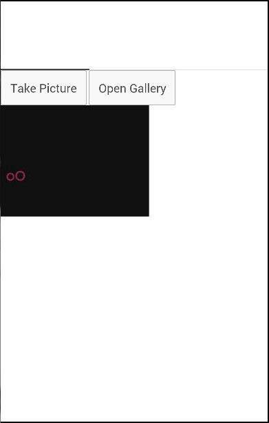
Several other options can be used as well, some of which are given in the following table.
| Parameter | Type | Details |
|---|---|---|
| quality | Number | The quality of the image, range 0-100 |
| destinationType | Number | Format of the image. |
| sourceType | Number | Used for setting the source of the picture. |
| allowEdit | boolean | Used for allowing editing of the image. |
| encodingType | Number | Value 0 will set JPEG, and value 1 will set PNG. |
| targetWidth | Number | Used for scaling image width. |
| targetHeight | Number | Used for scaling image height. |
| mediaType | string | Used for setting the media type. |
| cameraDirection | Number | Value 0 will set the back camera, and value 1 will set the front camera. |
| popoverOptions | string | IOS-only options that specify popover location in iPad. |
| saveToPhotoAlbum | boolean | Used for saving image to photo album. |
| correctOrientation | boolean | Used for correcting orientation of the captured images. |
Ionic - Cordova Facebook
This plugin is used for connecting to Facebook API. Before you start integrating Facebook, you need to create a Facebook app here. You will create a web app and then skip the quick start screen. Then, you need to add the website platform on the settings page. You can use the following code snippet for the site URL while in development.
http://localhost:8100/
After that, you need to add Valid OAuth redirect URIs on the settings/advanced page. Just copy the following two URLs.
https://www.facebook.com/connect/login_success.html
http://localhost:8100/oauthcallback.html
Installing Facebook Plugin
We did all the steps above to tackle some issues that often appear when using this plugin. This plugin is hard to set up because there are a lot of steps involved and documentation doesn't cover all of them. There are also some known compatibility issues with other Cordova plugins, so we will use Teleric verified plugin version in our app. We will start by installing browser platform to our app from the command prompt.
C:\Users\Username\Desktop\MyApp>ionic platform add browser
Next, what we need to do is to add the root element on top of the body tag in index.html.
index.html
<div id = "fb-root"></div>
Now we will add Cordova Facebook plugin to our app. You need to change APP_ID and APP_NAME to match the Facebook app you created before.
C:\Users\Username\Desktop\MyApp>cordova -d plugin add
   https://github.com/Telerik-Verified-Plugins/Facebook/
   --variable APP_ID = "123456789" --variable APP_NAME = "FbAppName"
Now open index.html and add the following code after your body tag. Again you need to make sure that the appId and version are matching the Facebook app you created. This will ensure that Facebook SDK is loaded asynchronously without blocking the rest of the app.
index.html
<script>
   window.fbAsyncInit = function() {
      FB.init({
         appId      : '123456789',
         xfbml      : true,
         version    : 'v2.4'
      });
   };

   (function(d, s, id) {
      var js, fjs = d.getElementsByTagName(s)[0];
      if (d.getElementById(id)) {return;}
      js = d.createElement(s); js.id = id;
      js.src = "//connect.facebook.net/en_US/sdk.js";
      fjs.parentNode.insertBefore(js, fjs);
   }(document, 'script', 'facebook-jssdk'));
</script>
Angular Service
Since we installed everything, we need to create service that will be our connection to the Facebook. These things can be done with less code inside the controller, but we try to follow the best practices, so we will use Angular service. The following code shows the entire service. We will explain it later.
services.js
.service('Auth', function($q, $ionicLoading) {
   this.getLoginStatus = function() {
      var defer = $q.defer();

      FB.getLoginStatus(function(response) {
		   if (response.status === "connected") {
            console.log(JSON.stringify(response));
         } else {
            console.log("Not logged in");
         }
      });

      return defer.promise;
   }
   this.loginFacebook = function() {
      var defer = $q.defer();

      FB.login(function(response) {
		   if (response.status === "connected") {
            console.log(JSON.stringify(response));
         } else {
            console.log("Not logged in!");
         }
      });

      return defer.promise;
   }
   this.logoutFacebook = function() {
      var defer = $q.defer();

      FB.logout(function(response) {
         console.log('You are logged out!');
      });

      return defer.promise;
   }
   this.getFacebookApi = function() {
      var defer = $q.defer();

      FB.api("me/?fields = id,email", [], function(response) {

         if (response.error) {
            console.log(JSON.stringify(response.error));
         } else {
            console.log(JSON.stringify(response));
         }
      });

      return defer.promise;
   }
});
In the above service, we are creating four functions. First three are self-explanatory. The fourth function is used for connecting to Facebook graph API. It will return the id and email from the Facebook user.
We are creating promise objects to handle asynchronic JavaScript functions. Now we need to write our controller that will call those functions. We will call each function separately for better understanding, but you will probably need to mix some of them together to get the desired effect.
Controller Code
.controller('MyCtrl', function($scope, Auth, $ionicLoading) {

   $scope.checkLoginStatus = function() {
      getLoginUserStatus();
   }

   $scope.loginFacebook = function(userData) {
      loginFacebookUser();
   };

   $scope.facebookAPI = function() {
      getFacebookUserApi();
   }

   $scope.logoutFacebook = function() {
      logoutFacebookUser();
   };

   function loginFacebookUser() {
      return Auth.loginFacebook();
   }

   function logoutFacebookUser() {
      return Auth.logoutFacebook();
   }

   function getFacebookUserApi() {
      return Auth.getFacebookApi();
   }

   function getLoginUserStatus() {
      return Auth.getLoginStatus();
   }
})
You are probably wondering why didn't we returned Auth service directly from the function expressions (first four functions). The reason for this is that you will probably want to add some more behavior after the Auth function is returned. You might send some data to your database, change the route after login, etc. This can be easily done by using JavaScript then() method to handle all the asynchronous operations instead of callbacks.
Now we need to allow users to interact with the app. Our HTML will contain four buttons for calling the four functions we created.
HTML Code
<button class = "button" ng-click = "loginFacebook()">LOG IN</button>
<button class = "button" ng-click = "logoutFacebook()">LOG OUT</button>
<button class = "button" ng-click = "checkLoginStatus()">CHECK</button>
<button class = "button" ng-click = "facebookAPI()">API</button>
When the user taps the LOG IN button, the Facebook screen will appear. The user will be redirected to the app after the login is successful.
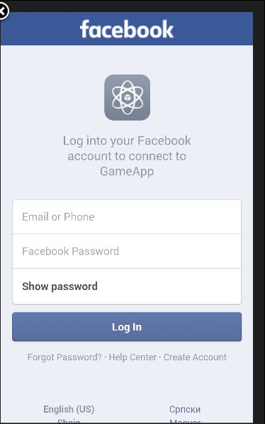
Ionic - Cordova InAppBrowser
The Cordova InAppBrowser plugin is used to open external links from your app inside a web browser view.
Using Browser
It is very easy to start working with this plugin. All you need to do is to open the command prompt window and install the Cordova plugin.
C:\Users\Username\Desktop\MyApp>cordova plugin add org.apache.cordova.inappbrowser
This step allows us to start using the inAppBrowser. We can now create a button that will lead us to some external link, and add a simple function for triggering the plugin.
HTML Code
<button class = "button" ng-click = "openBrowser()">OPEN BROWSER</button>
Controller Code
.controller('MyCtrl', function($scope, $cordovaInAppBrowser) {
   var options = {
      location: 'yes',
      clearcache: 'yes',
      toolbar: 'no'
   };

   $scope.openBrowser = function() {
      $cordovaInAppBrowser.open('http://ngcordova.com', '_blank', options)

      .then(function(event) {
         // success
      })

      .catch(function(event) {
         // error
      });
   }
})
When the user taps the button the InAppBrowser will open the URL we provided.
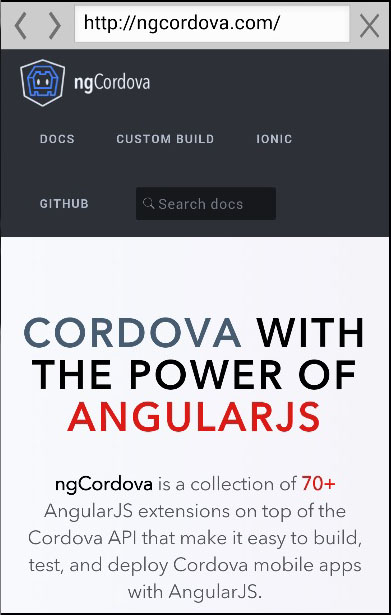
Several other methods can be used with this plugin, some of which are in the following table.
Cordova $inAppBrowser Methods
| Method | Parameters | Type | Details |
|---|---|---|---|
| setDefaultOptions(parameter1) | options | object | Used to set global options for all InAppBrowsers. |
| open(parameter1, parameter2, parameter3) | URL, target, options | string, string, object | There are three targets available. _blank will open new inAppBrowser instance. _system will open system browser and _self will use current browser instance. |
| close | / | / | Used to close InAppBrowser. |
Cordova InAppBrowser Events
This plugin also offers events that can be combined with $rootScope.
| Example | Details |
|---|---|
| $rootScope.$on('$cordovaInAppBrowser:loadstart', function(e, event)); | Called when inAppBrowser start loading the page. |
| $rootScope.$on('$cordovaInAppBrowser:loadstop', function(e, event)); | Called when inAppBrowser has finished loading the page. |
| $rootScope.$on('$cordovaInAppBrowser:loaderror', function(e, event)); | Called when inAppBrowser has encountered error. |
| $rootScope.$on('$cordovaInAppBrowser:exit', function(e, event)); | Called when inAppBrowser window is closed. |
Ionic - Cordova Native Audio
This plugin is used for adding native audio sounds to the Ionic app.
Using Native Audio
To be able to use this plugin, we first need to install it. Open the command prompt window and add the Cordova plugin.
C:\Users\Username\Desktop\MyApp>cordova plugin add cordova-plugin-nativeaudio
Before we start using this plugin, we will need audio file. For simplicity, we will save our click.mp3 file inside the js folder, but you can place it wherever you want.
The next step is to preload the audio file. There are two options available, which are −
preloadSimple − It is used for simple sounds that will be played once.
preloadComplex − It is for sounds that will be played as looping sounds or background audio.
Add the following code to your controller to preload an audio file. We need to be sure that the Ionic platform is loaded before we can preload the audio file.
Controller Code
$ionicPlatform.ready(function() {
   $cordovaNativeAudio
   .preloadSimple('click', 'js/click.mp3')

   .then(function (msg) {
      console.log(msg);
   }, function (error) {
      console.log(error);
   });

   $cordovaNativeAudio.preloadComplex('click', 'js/click.mp3', 1, 1)
	.then(function (msg) {
      console.log(msg);
   }, function (error) {
      console.error(error);
   });
});
In the same controller, we will add code for playing audio. Our $timeout function will stop and unload looping audio after five seconds.
$scope.playAudio = function () {
   $cordovaNativeAudio.play('click');
};

$scope.loopAudio = function () {
   $cordovaNativeAudio.loop('click');

   $timeout(function () {
      $cordovaNativeAudio.stop('click');
      $cordovaNativeAudio.unload('click');
   }, 5000);
}
The last thing we need is to create buttons for playing and looping audio.
HTML Code
<button class = "button" ng-click = "playAudio()">PLAY</button>

<button class = "button" ng-click = "loopAudio()">LOOP</button>
When we tap on play button, we will hear the sound once and when we tap on the loop button, the sound will loop for five seconds and then stop. This plugin works only on an emulator or a mobile device.
Ionic - Cordova Geolocation
This plugin is used for adding a geolocation plugin to the Ionic app.
Using Geolocation
There is a simple way to use the geolocation plugin. We need to install this plugin from the command prompt window.
C:\Users\Username\Desktop\MyApp>cordova plugin add cordova-plugin-geolocation
The following controller code is using two methods. The first one is the getCurrentPosition method and it will show us the current latitude and longitude of the users device. The second one is the watchCurrentPosition method that will return the current position of the device when the position is changed.
Controller Code
.controller('MyCtrl', function($scope, $cordovaGeolocation) {
   var posOptions = {timeout: 10000, enableHighAccuracy: false};
   $cordovaGeolocation
   .getCurrentPosition(posOptions)

   .then(function (position) {
      var lat  = position.coords.latitude
      var long = position.coords.longitude
      console.log(lat + '   ' + long)
   }, function(err) {
      console.log(err)
   });

   var watchOptions = {timeout : 3000, enableHighAccuracy: false};
   var watch = $cordovaGeolocation.watchPosition(watchOptions);

   watch.then(
      null,

      function(err) {
         console.log(err)
      },
	   function(position) {
         var lat  = position.coords.latitude
         var long = position.coords.longitude
         console.log(lat + '' + long)
      }
   );

   watch.clearWatch();
})
You might have also noticed the posOptions and watchOptions objects. We are using timeout to adjust maximum length of time that is allowed to pass in milliseconds and enableHighAccuracy is set to false. It can be set to true to get the best possible results, but sometimes it can lead to some errors. There is also a maximumAge option that can be used to show how an old position is accepted. It is using milliseconds, the same as timeout option.
When we start our app and open the console, it will log the latitude and longitude of the device. When our position is changed, the lat and long values will change.
Ionic - Cordova Media
This plugin allows us to record and playback audio files on a device.
Using Media
As with all the other Cordova plugins, the first thing we need to do is to install it from the command prompt window.
C:\Users\Username\Desktop\MyApp>cordova plugin add cordova-plugin-media
Now, we are ready to use the plugin. In the following code sample, src is the source mp3 file that we will use for this tutorial. It is placed in js folder, but we need to add /android_asset/www/ before it, so it can be used on android devices.
The complete functionality is wrapped inside the $ionicPlatform.ready() function to assure that everything is loaded before the plugin is used. After that, we are creating the media object by using the newMedia(src) method. The media object is used for adding play, pause, stop and release functionalities.
Controller Code
.controller('MyCtrl', function($scope, $ionicPlatform, $cordovaMedia) {
   $ionicPlatform.ready(function() {
      var src = "/android_asset/www/js/song.mp3";
      var media = $cordovaMedia.newMedia(src);

      $scope.playMedia = function() {
         media.play();
      };

      $scope.pauseMedia = function() {
         media.pause();
      };

      $scope.stopMedia = function() {
         media.stop();
      };

      $scope.$on('destroy', function() {
         media.release();
      });
   });
}
We will also create three buttons for calling play, pause and stop functions.
<button class = "button" ng-click = "playMedia()">PLAY</button>

<button class = "button" ng-click = "pauseMedia()">PAUSE</button>

<button class = "button" ng-click = "stopMedia()">STOP</button>
We need to run it on an emulator or a mobile device for this plugin to work. When the users tap on the play button, the song.mp3 will start playing.
You can see in the above example that we use src as an option parameter. There are other optional parameters that can be used for the newMedia method.
Optional Parameters
The following table will show all the optional parameters available.
| Parameter | Type | Details |
|---|---|---|
| mediaSuccess | function | Called after current play/record or stop action has completed. |
| mediaError | function | Invoked when there is an error. |
| mediaStatus | function | Invoked to show status changes. |
The next table will show all the methods available.
Available Methods
The following table will show all the methods available.
| Method | Parameters | Details |
|---|---|---|
| newMedia(parameter1) | src | Returns media object that will be used for future methods. src is an URI of the audio content. |
| getCurrentPosition | / | Returns the current position within an audio file. |
| getDuration | / | Returns the duration of an audio file. |
| play | / | Used to start or resume playing. |
| pause | / | Used to pause playback. |
| stop | / | Used to stop playing. |
| release | / | Used to release audio resources. |
| seekTo(parameter1) | milliseconds | Used to set the playback position in milliseconds. |
| setVolume(parameter1) | volume | Used to change volume. Range is from 0 to 1 |
| startRecord() | / | Used to start recording. |
| stopRecord | / | Used to stop recording. |
Ionic - Cordova Icon and Splash Screen
Every mobile app needs an icon and splash screen. Ionic provides excellent solution for adding it and requires minimum work for the developers. Cropping and resizing is automated on the Ionic server.
Adding Splash Screen and Icon
In the earlier chapters, we have discussed how to add different platforms for the Ionic app. By adding a platform, Ionic will install Cordova splash screen plugin for that platform so we do not need to install anything afterwards. All we need to do is to find two images.
The images should be png, psd or ai files. The minimum dimension should be 192x192 for icon image and 2208×2208 for the splash screen image. This dimensions will cover all the devices. In our example, we will use the same image for both. The images need to be saved to resources folder instead of the default ones. After we are done with it, all we need is to run the following in the command prompt window.
C:\Users\Username\Desktop\MyApp>ionic resources
Now, if you check resources/android or resources/ios folders, you will see that the images we added before are resized and cropped to accommodate different screen sizes. When we run our app on the device, we will see a splash screen before the app is started and we will see that a default Ionic icon is changed.
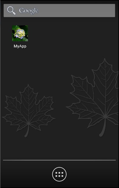
NOTE − If you want to use different images for Android and iOS, you can add it to resources/android and resources/ios instead of the resources folder.
