- Ionic - Colors
- Ionic - Content
- Ionic - Header
- Ionic - Footer
- Ionic - Buttons
- Ionic - Lists
- Ionic - Cards
- Ionic - Forms
- Ionic - Toggle
- Ionic - Checkbox
- Ionic - Radio Button
- Ionic - Range
- Ionic - Select
- Ionic - Tabs
- Ionic - Grid
- Ionic - Icons
- Ionic - Padding
- Ionic Javascript Components
- Ionic - JS Action Sheet
- Ionic - JS Backdrop
- Ionic - JS Content
- Ionic - JS Forms
- Ionic - JS Events
- Ionic - JS Header
- Ionic - JS Footer
- Ionic - JS Keyboard
- Ionic - JS List
- Ionic - JS Loading
- Ionic - JS Modal
- Ionic - JS Navigation
- Ionic - JS Popover
- Ionic - JS Popup
- Ionic - JS Scroll
- Ionic - JS Side Menu
- Ionic - JS Slide Box
- Ionic - JS Tabs
- Ionic Advanced Concepts
- Ionic - Cordova Integration
- Ionic - AdMob
- Ionic - Camera
- Ionic - Facebook
- Ionic - In App Browser
- Ionic - Native Audio
- Ionic - Geolocation
- Ionic - Media
- Ionic - Splash Screen
- Ionic Useful Resources
- Ionic - Quick Guide
- Ionic - Useful Resources
- Ionic - Discussion
Ionic - Buttons
There are several types of buttons in the Ionic Framework and these buttons are subtly animated, which further enhances the user experience when using the app. The main class for all the button types is button. This class will always be applied to our buttons, and we will use it as a prefix when working with sub classes.
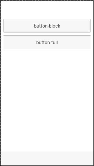
Block Buttons
Block buttons will always have 100% width of their parent container. They will also have a small padding applied. You will use button-block class for adding block buttons. If you want to remove padding but keep the full width, you can use the button-full class.
Following is an example to show the usage of both classes −
<button class = "button button-block">
   button-block
</button>

<button class = "button button-full">
   button-full
</button>
The above code will produce the following screen −
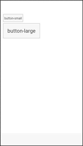
Button Size
There are two Ionic classes for changing the button size −
button-small and
button-large.
Following is an example to show their usage −
<button class = "button button-small">
   button-small
</button>

<button class = "button button-large">
   button-large
</button>
The above code will produce the following screen −
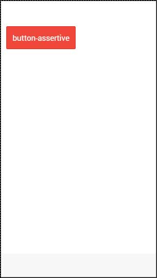
Button Colors
If you want to style your button, you just need to add appropriate color class to it. When you style your elements, you need to add your main element class as a prefix to your color class. Since we are styling the footer bar, the prefix class will be a bar and the color class that we want to use in this example is assertive (red).
<button class = "button button-assertive">
   button-assertive
</button>
The above code will produce the following screen −
You can use any of the following nine classes to give a color of your choice to your app buttons −
| Color Class | Description | Result |
|---|---|---|
| button-light | To be used for white color | |
| button-stable | To be used for light grey color | |
| button-positive | To be used for blue color | |
| button-calm | To be used for light blue color | |
| button-balanced | To be used for green color | |
| button-energized | To be used for yellow color | |
| button-assertive | To be used for red color | |
| button-royal | To be used for violet color | |
| button-dark | To be used for black color |
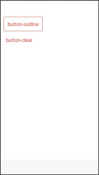
Button Outline
If you want your buttons transparent, you can apply button-outline class. Buttons with this class will have an outline border and a transparent background.
To remove the border from the button, you can use the button-clear class. The following example shows how to use these two classes.
<button class = "button button-assertive button-outline">
   button-outline
</button>

<button class = "button button-assertive button-clear">
   button-clear
</button>
The above code will produce the following screen −
Adding Icons
When you want to add Icons to your buttons, the best way is to use the icon class. You can place the icon on one side of the button by using the icon-left or the icon-right. You will usually want to move your icon to one side when you have some text on top of your button as explained below.
<button class = "button icon ion-home">
</button>

<button class = "button icon icon-left ion-home">
   Home
</button>

<button class = "button icon icon-right ion-home">
   Home
</button>
The above code will produce the following screen −
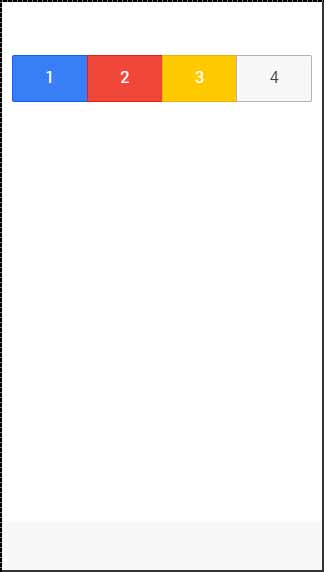
Button Bar
If you want to group a couple of buttons together, you can use the button-bar class. The buttons will have equal size by default.
<div class = "button-bar">
   <a class = "button button-positive">1</a>
   <a class = "button button-assertive">2</a>
   <a class = "button button-energized">3</a>
   <a class = "button">4</a>
</div>
The above code will produce the following screen −