- Ionic - Colors
- Ionic - Content
- Ionic - Header
- Ionic - Footer
- Ionic - Buttons
- Ionic - Lists
- Ionic - Cards
- Ionic - Forms
- Ionic - Toggle
- Ionic - Checkbox
- Ionic - Radio Button
- Ionic - Range
- Ionic - Select
- Ionic - Tabs
- Ionic - Grid
- Ionic - Icons
- Ionic - Padding
- Ionic Javascript Components
- Ionic - JS Action Sheet
- Ionic - JS Backdrop
- Ionic - JS Content
- Ionic - JS Forms
- Ionic - JS Events
- Ionic - JS Header
- Ionic - JS Footer
- Ionic - JS Keyboard
- Ionic - JS List
- Ionic - JS Loading
- Ionic - JS Modal
- Ionic - JS Navigation
- Ionic - JS Popover
- Ionic - JS Popup
- Ionic - JS Scroll
- Ionic - JS Side Menu
- Ionic - JS Slide Box
- Ionic - JS Tabs
- Ionic Advanced Concepts
- Ionic - Cordova Integration
- Ionic - AdMob
- Ionic - Camera
- Ionic - Facebook
- Ionic - In App Browser
- Ionic - Native Audio
- Ionic - Geolocation
- Ionic - Media
- Ionic - Splash Screen
- Ionic Useful Resources
- Ionic - Quick Guide
- Ionic - Useful Resources
- Ionic - Discussion
Ionic - Tabs
Ionic tabs are most of the time used for mobile navigation. Styling is optimized for different platforms. This means that on android devices, tabs will be placed at the top of the screen, while on IOS it will be at the bottom. There are different ways of creating tabs. We will understand in detail, how to create tabs in this chapter.
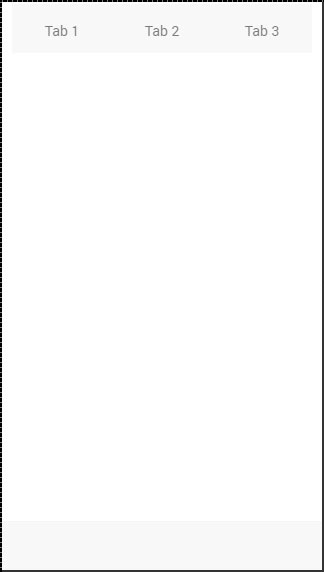
Simple Tabs
Simple Tabs menu can be created with a tabs class. For the inside element that is using this class, we need to add tab-item elements. Since tabs are usually used for navigation, we will use <a> tags for tab items. The following example is showing a menu with four tabs.
<div class = "tabs">
   <a class = "tab-item">
      Tab 1
   </a>

   <a class = "tab-item">
      Tab 2
   </a>

   <a class = "tab-item">
      Tab 3
   </a>
</div>
The above code will produce the following screen −
Adding Icons
Ionic provides classes for adding icons to tabs. If you want your tabs to have icons without any text, a tabs-icon-only class should be added after the tabs class. Of course, you need to add icons you want to display.
<div class = "tabs tabs-icon-only">
   <a class = "tab-item">
      <i class = "icon ion-home"></i>
   </a>

   <a class = "tab-item">
      <i class = "icon ion-star"></i>
   </a>

   <a class = "tab-item">
      <i class = "icon ion-planet"></i>
   </a>
</div>
The above code will produce the following screen −
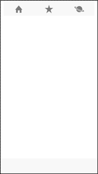
You can also add icons and text together. The tabs-icon-top and tabs-icon-left are classes that will place the icon above or on the left side respectively. Implementation is the same as the example given above, we will just add a new class and text that we want to use. The following example shows icons placed above the text.
<div class = "tabs tabs-icon-top">
   <a class = "tab-item">
      <i class = "icon ion-home"></i>
      Tab 1
   </a>

   <a class = "tab-item">
      <i class = "icon ion-star"></i>
      Tab 2
   </a>

   <a class = "tab-item">
      <i class = "icon ion-planet"></i>
      Tab 3
   </a>
</div>
The above code will produce the following screen −
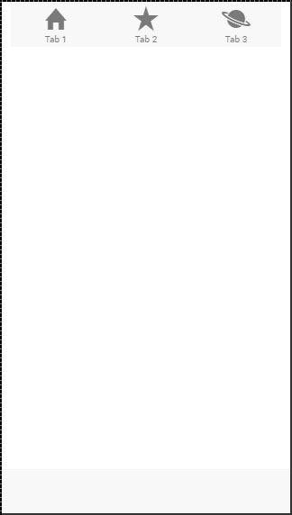
Striped Tabs
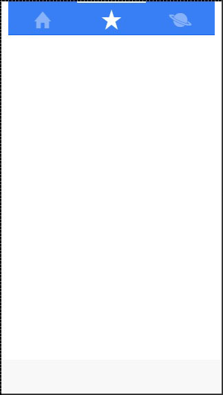
Striped Tabs can be created by adding a container around our tabs with the tabs-striped class. This class allows the usage of the tabs-background and the tabs-color prefixes for adding some of the Ionic colors to the tabs menu.
In the following example, we will use the tabs-background-positive (blue) class to style the background of our menu, and the tabs-color-light (white) class to style the tab icons. Notice the difference between the second tab that is active and the other two that are not.
<div class = "tabs-striped tabs-background-positive tabs-color-light">
   <div class = "tabs">
      <a class = "tab-item">
         <i class = "icon ion-home"></i>
      </a>

      <a class = "tab-item active">
         <i class = "icon ion-star"></i>
      </a>

      <a class = "tab-item">
         <i class = "icon ion-planet"></i>
      </a>
   </div>
</div>
The above code will produce the following screen −