- Trending Categories
Data Structure
Networking
RDBMS
Operating System
Java
MS Excel
iOS
HTML
CSS
Android
Python
C Programming
C++
C#
MongoDB
MySQL
Javascript
PHP
Physics
Chemistry
Biology
Mathematics
English
Economics
Psychology
Social Studies
Fashion Studies
Legal Studies
- Selected Reading
- UPSC IAS Exams Notes
- Developer's Best Practices
- Questions and Answers
- Effective Resume Writing
- HR Interview Questions
- Computer Glossary
- Who is Who
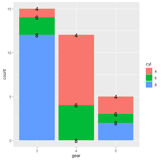
How to create the stacked bar plot using ggplot2 in R with labels on the plot?
The creation of stacked bar plot using ggplot2 can be done with the help of position="stack" argument inside geom_bar function. If we want to create the stacked bar plot then geom_text function will be used with the same position argument and the aes to define the labels as shown in the below example.
Example
Consider the mtcars data −
head(mtcars)
Output
mpg cyl disp hp drat wt qsec vs am gear carb Mazda RX4 21.0 6 160 110 3.90 2.620 16.46 0 1 4 4 Mazda RX4 Wag 21.0 6 160 110 3.90 2.875 17.02 0 1 4 4 Datsun 710 22.8 4 108 93 3.85 2.320 18.61 1 1 4 1 Hornet 4 Drive 21.4 6 258 110 3.08 3.215 19.44 1 0 3 1 Hornet Sportabout 18.7 8 360 175 3.15 3.440 17.02 0 0 3 2 Valiant 18.1 6 225 105 2.76 3.460 20.22 1 0 3 1
Example
df<−data.frame(with(mtcars,table(cyl,gear))) df
Output
cyl gear Freq 1 4 3 1 2 6 3 2 3 8 3 12 4 4 4 8 5 6 4 4 6 8 4 0 7 4 5 2 8 6 5 1 9 8 5 2
Loading ggplot2 package and creating the stacked bar plot −
Example
library(ggplot2)
Output
ggplot(df,aes(gear,fill=cyl))+geom_bar(aes(weight=Freq),position="stack")+geom_text(position="stack",aes(gear,Freq,label=cyl),size=5)
Output
- Related Articles
- How to create a stacked bar plot with vertical bars in R using ggplot2?
- How to create stacked plot with density using ggplot2 in R?
- How to create transparent bar plot using ggplot2 in R?
- How to create a bar plot with ggplot2 using stat_summary in R?
- How to create bar plot with log values using ggplot2 in R?
- How to create a bar plot using ggplot2 with percentage on Y-axis in R?
- How to create bar plot with gradient colors using ggplot2 in R?\n
- How to create a bar plot using ggplot2 with one bar having black border in R?
- Create stacked bar chart with percentages on Y-axis using ggplot2 in R.
- How to create a bar plot in R with label of bars on top of the bars using ggplot2?
- How to create bar plot using ggplot2 with structure data frame?
- How to extract axes labels for the plot drawn using ggplot2 in R?
- How to X-axis labels to the top of the plot using ggplot2 in R?
- How to create stacked bar plot in which each bar sum to 1 or 100% in R?
- How to display axes ticks and labels inside the plot using ggplot2 in R?

Advertisements