
Article Categories
- All Categories
-
 Data Structure
-
 Networking
-
 RDBMS
RDBMS
-
 Operating System
-
 Java
Java
-
 MS Excel
-
 iOS
iOS
-
 HTML
HTML
-
 CSS
CSS
-
 Android
-
 Python
-
 C Programming
-
 C++
C++
-
 C#
C#
-
 MongoDB
-
 MySQL
MySQL
-
 Javascript
-
 PHP
PHP
-
 Economics & Finance
Selected Reading
How to plot the X-axis labels on the upper-side of the plot in R?
By default, the X−axis labels are plotted on the bottom−axis of the plot and that is referred to as the first axis of axis 1, the second axis is the axis on the left−side, the third axis is the axis on the upper side of the plot, and the fourth axis is on the right−side of the plot. If we want to plot the X−axis labels on the upper−side of the plot then we can use xaxt="n" inside the plot function then define axis for upper−side using axis(3) with semi−colon.
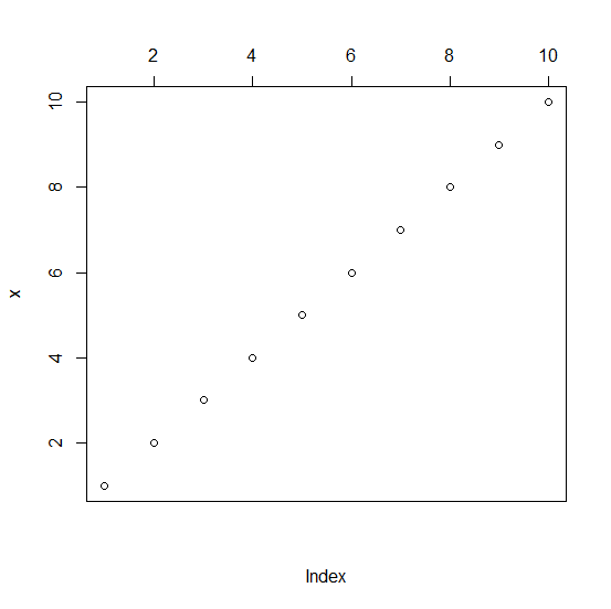
Example1
x<−1:10
plot(x,xaxt="n");axis(3)
Output
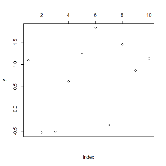
Example2
y<−rnorm(10,1,0.8)
plot(y,xaxt="n");axis(3)
Output
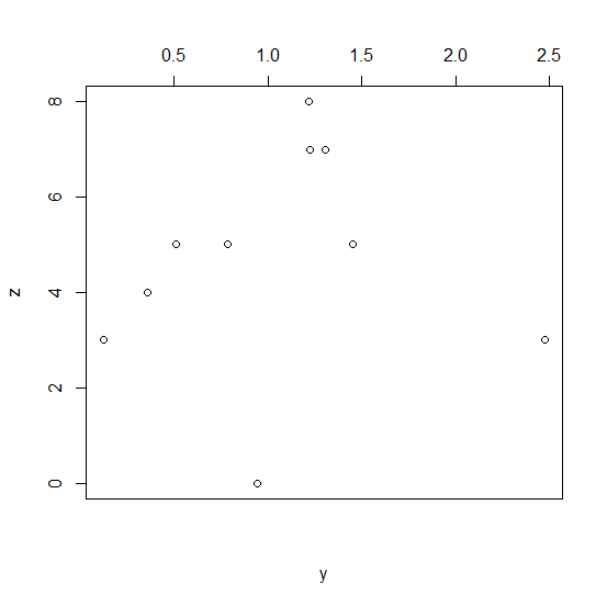
Example3
y<−rnorm(10,1,0.8)
z<−rpois(10,5)
plot(y,z,xaxt="n");axis(3)
Output

Updated on: 2020-11-07T11:52:48+05:30
1K+ Views

Advertisements